

Two Monetary Policy Graphs for the Evening
A few notes before I begin this evening. I tried posting twice, but my system failed twice, and the auto-save did not do its job faithfully. So, one reduced post, if I can get it out. Next week, I should publish a small primer on how monetary policy works. Also coming up is my next portfolio reshaping.
Well, there is certainly no more stigma in borrowing directly from the Fed. Just look at the discount window:
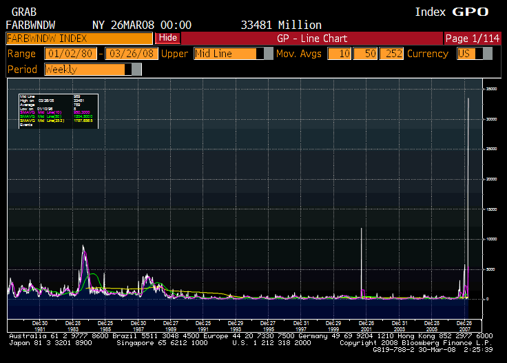
That’s a new record since the beginning of my data (1980), and more than doubles the last peak in 2001.
The following graph (look at the lower green graph) is the ratio of my M3 proxy (Total Bank Liabilities) to high-powered money (Total Fed Credit, the Monetary Base).
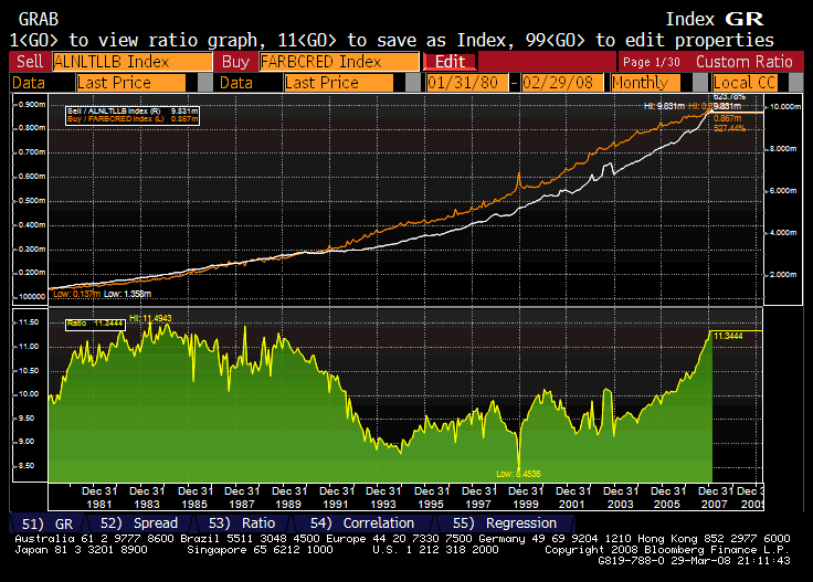
This ratio measures the willingness of the Fed to allow the banking system to lever up their deposit base relative to the size of the Fed’s own balance sheet. The data only goes back to 1980, but we are knocking at the door of a new high. The recent move up began in earnest at the beginning of the last tightening cycle, but has persisted into the loosening cycle, as the FOMC has not let the monetary base grow, but has permitted the banks to continue to gather deposits (banking, savings, CDs, money market funds). Some capital requirements have been loosened, and I suspect the bank examiners are not playing hardball at present, at least compared to the attitude 18 months ago.
After all, the banks don’t have to pay much interest to those who deposit money with them with a curve this low and steep, and many people are afraid of the equity markets, and are letting balances at the banks grow. The banks get cheap funding, and they use it to buy short-duration agency RMBS yielding 3-4%, which is a winner, at least for now.