When I start a hard project, I take out a blank piece of paper, and I write out the question, or desired goal, and start writing down what I know about the question.? The question that has been posed to me by many investors (in many different ways) boils down to: how can I be out of the markets when markets offer less potential return, and in when they offer more potential return?? Other names for this: Tactical Asset Allocation, or Market Timing.
This question comes while the markets are regarded by many but not all to be high.? Since I am trying to manage as business that had as its initial concept managing long-only stock portfolios, this perception creates a headwind.
So what did I think of as factors as I approached this?? The first thing that came to mind was the credit cycle.? Recall my stylized version of the credit/equity cycle from last time:
- After a washout, valuations are low and momentum is lousy.? People/Institutions are scared to death of equities and any instruments with credit exposure.? Only rebalancers and deep value players are buying here.? There might even be some sales from leveraged players forced by regulators, margin desks, or ?Risk control? desks.? Liquidity is at a premium.
- But eventually momentum flattens, and yield spreads for the survivors begin to tighten.? Equities may have rallied some, but the move is widely disbelieved.? This is usually a good time to buy; even if you do get faked out, and momentum takes another leg down, valuation levels are pretty good, so the net isn?t far below you.
- Slowly, but persistently the equity market rallies.? Momentum is strong.? The credit markets are quicker, with spreads tightening to normal-ish levels.? Bit-by-bit valuations rise until the markets are fairly valued.
- Momentum remains strong.? Credit spreads are tight. Valuations are high, and most value-type players have reduced their exposures.? Liquidity is cheap, and only rebalancers are selling. ?(This is where we are now.)
- The market continues to rise, but before the peak, momentum flattens, and the market meanders.? Credit spreads remain tight, but are edgy, and maybe a little volatile.? This is usually a good time to sell.? Remember, tops are often a process.
- Cash flow proves insufficient to cover the debt at some institution or set of institutions, and defaults ensue.? Some think that the problem is an isolated one, but search begins for where there is additional weakness.? Credit spreads widen, momentum is lousy, and valuations fall to normal-ish levels.
- The true size of the crisis is revealed, defaults mount, valuations are low, credit spreads are high.? A few institutions and investors fail who you wouldn?t have expected.? Momentum is lousy.? We are back to part 1 of the cycle.? Remember, bottoms are often an event.
The transition from phase 5 to phase 6 is the key, as is recognizing when we are in phase 1/7.? What metrics could be useful?
- Credit spreads, implied volatility, actual volatility
- Direction of credit spreads
- Earnings yields or P/E, and variations thereon.
- Earnings yields less yields on Baa bonds
- Momentum of prices, and variations thereon.
- Momentum of earnings, and variations thereon.
I did a variety of experiments using the same data set as before, melding the Moody?s Bond yields with Robert Shiller?s S&P 500 data.? Before the experiments started, my expectation was that the final result would be a combination of a valuation factor and a momentum factor, with other factors playing lesser roles.? I wasn?t disappointed.
Preliminaries
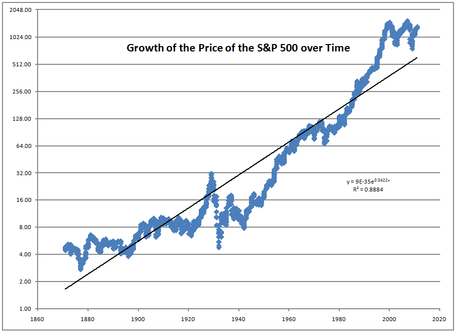
Since 1871, the price of the S&P 500 has risen at a rate of 5.17% annualized.? This doesn?t include dividends, which would add another 3.61%, which sums to an 8.78% annualized total return.? Yes, dividends have added that much in the past.? Now consider how earnings have done over the same period:
Earnings grow at a 4.87% annualized rate, very similar to the rate of price increase, but over 130 years, it results in a rise in the P/E of 45% in terms of the trend.? Interest rates are lower now, so that may explain it.
The logarithmic graphs accentuate the panic and euphoria as it was felt at the time.? Distances up and down measure percentage changes.? Doing the graphs in multiples of two makes it easy to see each series as it doubles.
The two graphs look very similar ? makes one remember Peter Lynch?s comment ?Earnings drive the market.?? It would be tempting to create an indicator out of the amount above or below the trend line, but no one could see the trend line in the past, and a series of shorter trendlines would likely prove deceptive.? Mean reversion tends to play at longer periods.
Regarding Double Factor Quintile Analysis (as I do it)
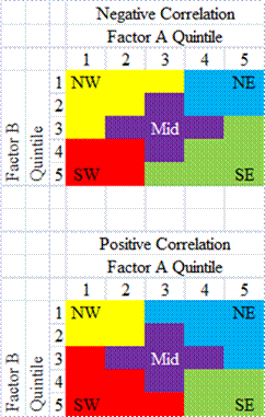
Doing an analysis of quintiles using two factors creates a five-by-five grid.? More often than not, the two factors are somewhat correlated.? The easy way is see is which diagonal is more populated:
- Northwest to Southeast (negative)
- Southwest to Northeast (positive)
Because individual cells are statistically insignificant, creating larger groups can help solidify the aggregate effects.? Adding more cells to off-diagonal groups can lead to statistically significant groups that help tell a story of what is going on.
Averages along the horizontal and vertical are useful for telling how an individual factor performs, but what is more valuable is when we see performance improve diagonally, because it shows how the two factors interact.
On to the Factors ? Bonds
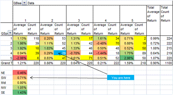
Horizontal factor: Yield on Baa bonds ? Hypothesis: When yields are high, stock valuations tend to be low.
Vertical factor: spread of Baa bond yields over Aaa bond yields ? Hypothesis: When spreads are high, stock valuations tend to be low.
The variable being analyzed is the return of the S&P 500 over the next month, including dividends.? This is the same for all the analyses that follow.
Analysis: This was surprising.? Neither seemed to have a significant impact.? Spread had no discernible impact on returns, and the Baa yield effect was nonlinear, almost like a smile ? highest and lowest do best , with the middle doing less well.
The diagonal effects are weird, the market does the best when yields and spreads are high or when yields and spreads are low.? When there are high spreads and low yields (like now), or low spreads and high yields, the market doesn?t do so well.? That may be the market?s way of saying that we like normal-ish bond markets, and that we don?t like times when Treasury yields are too low or too high.
I take that conclusion with a grain of salt, but it seems more reasonable than my initial hypotheses.? I don?t think I would manage money off that conclusion.
Earnings Momentum
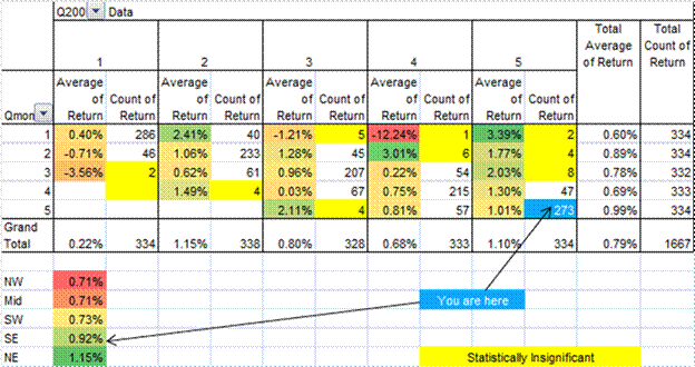
Horizontal factor: Percentage that earnings are over/under their 10-month moving average ? Hypothesis: The faster earnings rise, the faster the market rises.
Vertical factor: Percentage that earnings have risen over the last 10 months ? Hypothesis: The faster earnings rise, the faster the market rises.
Analysis: These variables are highly correlated, so the NW-SE diagonal is packed.? But leaving aside that the market doesn?t do too well in the first quintile of either, these variables don?t discriminate too well.? Being in the fifth quintile for both measures may be a good sign for performance, but I would not put too much confidence in that.? Of my five ?groups? the difference from best to worst is small.
Price Momentum
Horizontal factor: Percentage that stock prices are over/under their 10-month moving average ? Hypothesis: The faster prices rise, the faster the market will rise.
Vertical factor: Percentage that stock prices have risen over the last 10 months ? Hypothesis: The faster prices rise, the faster the market will rise.
Analysis: These variables are highly correlated, so the NW-SE diagonal is packed.? But that leaving aside, both of these variables discriminate well, and they seem to work well together.? Strong price momentum tends to produce strong markets in the short run.
CAPE10 and CAPE Tri-5
Horizontal factor: Dr. Shiller?s Cyclically Adjusted P/E (Ten year average earnings divided by price) Hypothesis: The higher the CAPE10 earnings yield, the faster the market will rise.
Vertical factor: My Cyclically Adjusted P/E (Five year trailing triangular average earnings divided by price) Hypothesis: The higher the CAPE Tri-5 earnings yield, the faster the market will rise.
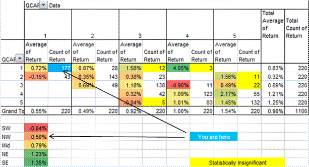
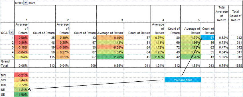
Analysis: These variables are highly correlated, so the NW-SE diagonal is packed.? But that leaving aside, both of these variables discriminate well, but the CAPE10 is better.? CAPE Tri-5 was an effort to put more weight on present earnings, with progressively less weight until we are five years in the past, as a kind of compromise between CAPE10 and current P/E.? Current P/E should work well, but doesn?t.? CAPE10 gives a lot more weight to the past, implicitly assuming mean-reversion.? Much as I was not crazy about CAPE10 in the past, I think it is a keeper.? But what it implies is that average people who look at the current P/E for guidance on the market are looking at a measure that is influenced too heavily by near-term expectations for a long term asset.
CAPE10 and CAPE10 Risk Premium
Horizontal factor: Dr. Shiller?s Cyclically Adjusted P/E (Ten year average earnings divided by price) less the Baa bond yield.? Hypothesis: The higher the CAPE10 risk premium over bonds, the faster the market will rise.
Vertical factor: Dr. Shiller?s Cyclically Adjusted P/E (Ten year average earnings divided by price) Hypothesis: The higher the CAPE10 earnings yield, the faster the market will rise.
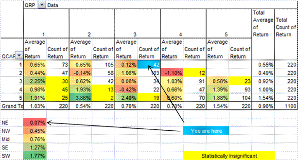
Analysis: These variables are highly correlated, so the NW-SE diagonal is packed.? But that leaving aside, CAPE10 discriminates well, while the risk premium variable displays a smile as it did in the bond test.? The market has done best when Baa yields have been high or low.
That said, the risk premium factor shows that the largest gains tend to come in the southwest quadrant: low equity valuations and high Baa bond yields, which is a perfect set-up for mean reversion.? It?s a pity that we are in the opposite quadrant now.
Valuation Plus Momentum ? The Impossible Dream?
Horizontal factor: Percentage that stock prices are over/under their 10-month moving average ? Hypothesis: The faster prices rise, the faster the market will rise.
Vertical factor: Dr. Shiller?s Cyclically Adjusted P/E (Ten year average earnings divided by price) Hypothesis: The higher the CAPE10 earnings yield, the faster the market will rise.
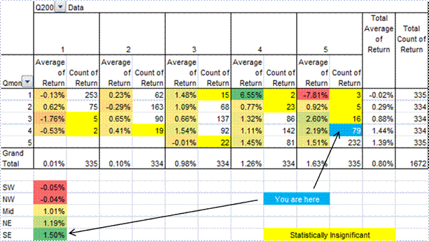
Analysis: These two factors are slightly negatively correlated.? Thus, NW-SE are triangles, while SW-NE are squares, unlike the other analyses.? But for practical purposes, they are uncorrelated, which is shown by the relatively even count of cells in the five-by-five grid.
In general, returns get better heading Southeast.? The best expected market returns come from cheap valuations and strong momentum.? Second best is high valuations and strong momentum.
Now, I didn?t do this for the others, but how volatile are the returns by quintile?? The standard deviation of returns is highest for cheap valuations and negative momentum.? For the most part, volatility drops as the market heads northeast, though once you are out of the ?L? that makes up the bottom and left of the grid, it doesn?t improve much.? Credit market volatility is highest in the ?L.?? It also highlights the uncertainty that happens when valuations are low, regardless of momentum.
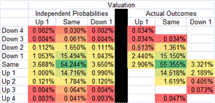
Transition Probabilities
| Momentum | Valuation | |
| Down 4 | 0.03% | |
| Down 3 | 0.07% | |
| Down 2 | 1.87% | |
| Down 1 | 17.59% | 5.93% |
| Same | 61.58% | 88.08% |
| Up 1 | 16.71% | 5.99% |
| Up 2 | 2.02% | |
| Up 3 | 0.07% | |
| Up 4 | 0.05% |
But one might ask, when in a given cell, how likely is it to shift to another cell the next month?? Valuation moves a lot less than Momentum ? Valuation never moves by more than one quintile in a month, and the odds of moving up or down one quintile are around 6%.? 96% of the time Momentum moves one quintile or stays the same.? It only moves three or four quintiles 0.22% of the time.? That?s about once every 37 years or so.
Statistically, there is a slight correlation in the movements of valuation and momentum.? When momentum is positive for a while, valuations get higher, and when momentum is negative for a while, valuations get lower.? But this effect is so small that it is not statistically significant, as seen in the table below.
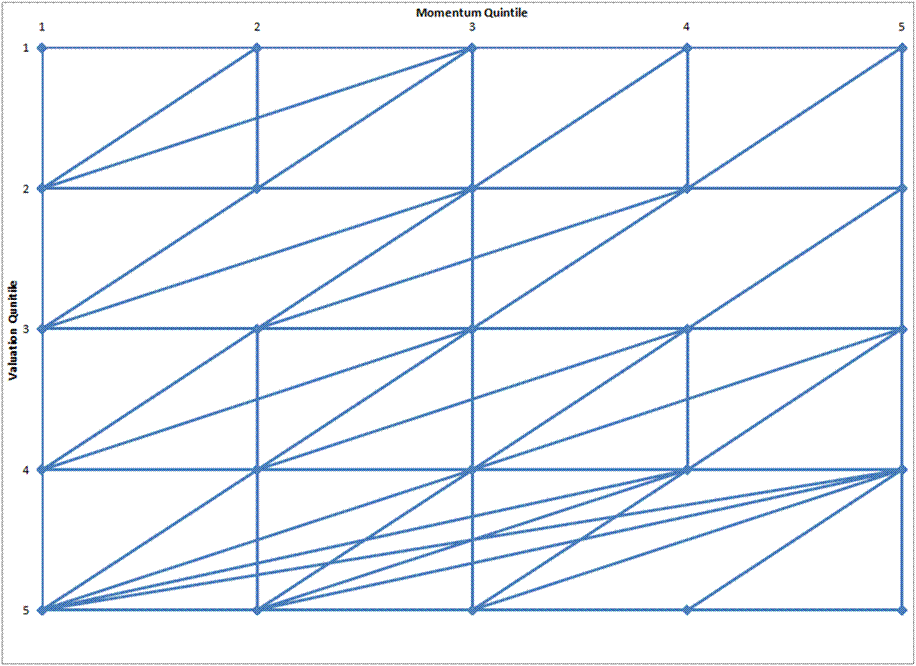
This portrays graphically how jumps between cells happen.? Pity I could not create thicker lines for higher occurrences.? Note how the big momentum jumps happen in the cheap valuation quintile.
So What?s It All Worth?
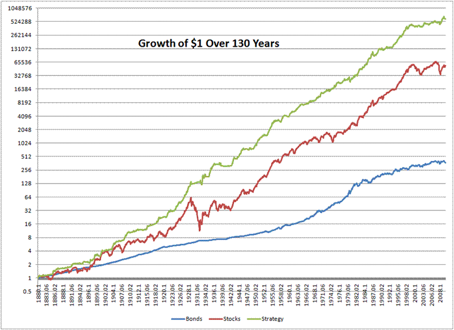
It?s potentially worth a lot.? Look at this return graph:
The logarithmic scale makes it look small, but the strategy trounces the stock market over the last 130 years.? Wait, strategy, what strategy?
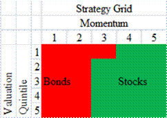
First and second quartiles for stock momentum: own bonds.
Fourth and fifth quartiles for stock momentum: own stocks.
Third quartile for stock momentum: own stocks, unless in the first quartile for valuation (expensive) own bonds.
Here are the stats:
| Bonds | Stocks | Strategy | |
| Return | 4.67% | 8.78% | 10.79% |
| Std. Dev. | 4.30% | 14.50% | 9.39% |
That is two percent over stocks with more than five percent less volatility.? Quite a performance.? Now ask me, what are the limitations?
Limitations
1)? Some of these strategies were known already, and may indicate data-mining.? Yes, CAPE10 came from Shiller, and the ten month moving average of prices came from Mebane Faber.?? But no one put them together before, at least, no one that I know of.
2) This is just a backtest; you wedged this result. I used the ideas of two bright guys, Faber, and Shiller ? I did not use any sort of advanced technique ? quintiles are ancient.? My ability to finagle matters was constrained.?? All that said, all illustrated returns deserve distrust ? there are too many ways to make the results come out in a way favorable for the investment advisor.
I made two passes on the data.? One to find the momentum indicator, and one for valuation.? Aside from that, I did little to ?optimize? the strategy.
3) Transaction costs would eat up some of the returns.? So would taxes.
Final notes
1) Though I think it could be applied more broadly than to just the S&P 500, valuation-based investors can do better by:
- buying once momentum flattens after a bust
- waiting for momentum to flatten after a rally
- being willing to exit the market even when valuations look good if momentum heads south
- enter if momentum is strong, even if valuation doesn?t seem compelling.
2) If this is such a great strategy, why would I reveal it?? One thing I learned as a professional bond and equity investor is that few people and firms are willing to change their ways.? Value investors will not do this.? Trend-followers will not pay attention to valuation.? Tactical asset allocators will find it thin gruel.? So, I?m not concerned about a large amount of money in the market doing this.
3) For clients that want a tactical approach that enters and exits the stock market, this is how I will do it.? But will I use it for my account?? Maybe a little.? But I?ve been good industry and stock picker over time, and I don?t care about volatility so much.? Buffett said something to the effect of ?I?d rather have a bumpy 15% than a smooth 12%.?? I agree, so, though I might hedge my taxable account on occasion, I will likely remain long only, trying to scoop up bargains when momentum is negative; it has worked in the past for me.? That?s where I have gotten some of my biggest winners.? And if I won?t likely use it, that may be the greatest reason for not worrying about publishing this.
4) If I were to augment this, I would add in something on bond yields; there is something significant going on there, but I?m not sure how I would use it.



David, this is quite impressive work. Obviously you have a passion for it, and I enjoy reading your posts. Keep it up, and best wishes for your large family!
http://www.liquidinvestor.blogspot.com
Hi David,
This is really an amazing piece of work and reminds me of how I started reading your blog in the first place (your variation on the “Fed Model”). One question I have is, where do you gather data for this stuff now that you don’t have a bloomberg screen?
I can’t afford the cost of bloomberg, and while certain things are available freely out there (Yahoo Finance, FRED S&P etc.), a whole lot others are not. I was wondering if you were using any commercial data vendors that you would recommend as a decent value for someone that, like yourself, works for a small practice and wants access to the most useful tools available within a constrained budget.
Well done with this post and your illustration of the credit cycle in asset allocation. A couple of helpful pieces that I have read are http://www.cfapubs.org/doi/pdf/10.2469/faj.v62.n2.4083 page 57 and this http://stats.oecd.org/mei/bcc/default.html or maybe http://timelyportfolio.blogspot.com/2011/04/great-faj-article-on-statistical_6197.html.
Thanks so much for the very good work you do here. Best of luck in money management.
Wow. This is impressive, but it’s a bit confusing for a non-mba type. Can you please explain more about the quintiles? I’ve looked and looked for 2 days and I don’t know where the numbers come from, how you determined which number goes into each box or what they mean.
And how do you determine the “You are Here” conclusions in the quintile charts?
Explaining just one in greater detail would probably allow me an ‘aha’ moment.
And of course, it’s a nit, but your first charts titled S&P500 are not really the 500. The S&P500 was created in 1957.
Thank you.
Most MBAs would not get this either, so don’t worry. Quintiles: divide a variable up into five equal-sized groups, from lowest to highest. 0-20, 20-40, 40-60, 60-80 and 80-100%. It is a way of dividing a sample into groups so that the variable’s effect on the the output in question can be analyzed.
You are here indicates which quintiles current data indicated we were in when I wrote the piece in April.
Yes, the S&P 500 was created then, but the S&P folks went back and estimated a capitalization-weighted index back to 1926, and Shiller extended it back to 1871.
Thank you. A dim light came on, even though I already knew what qunitles are. What’s becoming clearer is the you used Shiller’s database to populate your Earnings Momentum, Price Momentum, etc quintile charts. I’ll look again and see if it becomes clearer to me.
BTW, my remark about the S&P was meant to be a suggestion that perhaps you might want to drop the “500” out of the titles.
Thanks again for the post. It must have taken a massive amount of energy and brain power. I applaud you.
For any long term investment strategy, the question is: could people have run it in real time? In this case, the quintiles seem to be the issue, since I assume they’re based on the full date range. An investor in 1976 wouldn’t have the same quintiles as we do now.
Of course, it should be possible to backtest with quintiles that get updated only with data up until that point in time. E.g. in 1976 the quintiles only use data up to 1976. It’s probably painful to do with a spreadsheet, I had to write some custom software to do that sort of thing.
Another caveat: IIRC Shiller’s data is monthly *averages*, not end-of-month values, so you wouldn’t necessarily have been able to buy at those values once you decided stocks vs. bonds, even assuming index funds.
Yes, that’s a liability of the method. Against that, it fits my a priori view of cycles, and the performance is pretty consistent. Someone armed with the idea that high momentum would do well (Livermore), and low valuation would do well (Graham) would have succeeded. The improvement going from NW to SE is notable…
Also, averages will work on average… that’s not a problem, especially over so many years it averages out…
One more question: other than the momentum=3/valuation=1 square, this is a purely momentum driven strategy. How do the results look if you just do momentum, i.e. stocks on momentum 3-5 and bonds on momentum 1-2?
I’m not going to test that, because I was only going to make one pass over the data. I could have picked <34 as the strategy, not <32, and with the strong move from NW to SE, one would have a lot more confidence in the SE than the NE.