
=====================
Before I start this evening, I want to state again that I welcome comments at this blog. It may not seem so from the last few months, but I have shaken the bugs out of the software that protects my blog, which was hypersensitive on comments. The only thing I ask of commenters is that you be polite and clean in your speech. Disagree with me as you like — hey, even I have doubts about my more extreme positions. 😉
Limitations
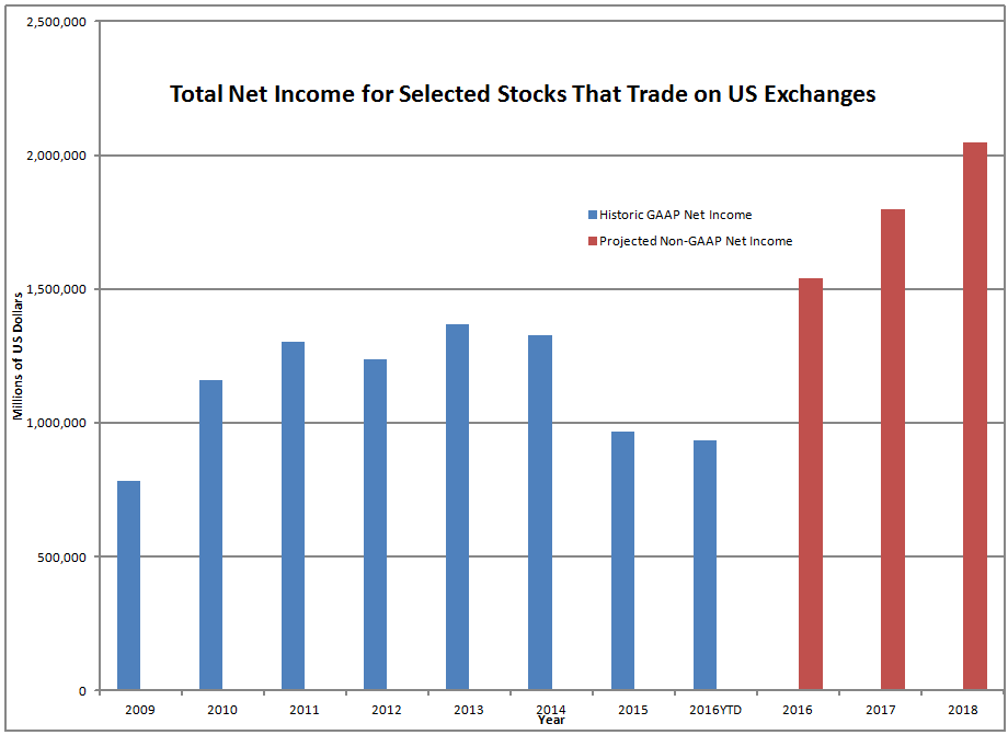
The graph above and the text explaining it could very easily be misused, so I am giving a detailed explanation of how I calculated the figures so that people looking at them can more easily critique them and perhaps show me where they are wrong. ?Please use the above figures with care.
I summed up the net income data for 2706 firms in the Media General database used in the AAII Stock Investor Pro screening software. ?Those firms had:
- Seven years of historical earnings data (2009-2015)
- Earnings estimates that go out to 2018, and
- An estimate of the diluted common shares of each
In short, it is all of the firms trading on US exchanges (that Media General covers) that have seven years of earnings history, and significant analyst coverage extending out for two years. ?Please note that not all fiscal years are equivalent, and that the historic data is on fiscal years, aside from 2016YTD, which is a trailing twelve months figure. ?That means 2016YTD is largely from the first half of calendar 2016 and the last half of calendar 2015.
Note that companies that went out of existence between 2009 and today are not reflected in these figures. ?They represent only the companies that exist as publicly traded firms today. ?Also note that foreign firms trading on US exchanges are in these figures.
The projected Non-GAAP earnings are the product of average sell-side earnings estimates and the most recent estimate of fully diluted common shares. ?2016, 2017 & 2018 are the current, next year, and two years ahead estimates of adjusted earnings, which are?Non-GAAP.
Remember that sell-side estimates are designed (in theory) to eliminate transitory factors and provide an estimate of run rate earnings for the future. ?Whether that is true in practice is another matter, as we may see here.
There is one more piece of data that you need before you can interpret the above graph: because of foreign firms that are included, the total market capitalization underlying the graph is $28.8 Trillion.
Analysis
After my recent piece?Practically Understanding Non-GAAP Earnings Adjustments, I felt there was something more to say, because regularly I would see earnings estimates that were higher than historic earnings by a wide margin, which would make me say “How does it get from here to there?” ?The answer is simple. ?It doesn’t.
Why? ?We’re comparing apples and oranges. ?GAAP earnings deduct many expenses out that were incurred in prior periods, but deferred. ?GAAP earnings also have?unusual and extraordinary charges that are expected not to occur. ?Non-GAAP earnings exclude those (among other things, sometimes excluding interest and taxes). ?As such, they are considerably higher than GAAP earnings.
Take a look at this table of price-earnings ratios.
| Year |
2009 |
2010 | 2011 | 2012 | 2013 | 2014 | 2015 | 2016YTD | 2016 | 2017 |
2018 |
| P/E |
36.61 |
24.84 | 22.13 | 23.26 | 21.01 | 21.70 | 29.69 | 30.68 | 18.68 | 16.02 |
14.06 |
Note: the same warning on the graph applies to this table.
Note that the current market capitalization is being applied against historic net income 2009-2016YTD. ?2016-2018 are on projected non-GAAP net income estimated by the sell-side. ?Obviously, in 2009 the market capitalization was much lower, and so the P/E then would have been higher. ?Survivorship bias will have some impact here, but I’m not sure which way it would go.
See how much lower the P/Es are for the sell-side estimates (these would be bottom-up, not top-down). ?Figures like this get cited by pundits who say the market isn’t that expensive.
Also, note how GAAP earnings have shrunk since 2014, and haven’t grown much since 2009. ?I know only the media compares actual to prior, which is an anachronism, but maybe we need to do that more.
Summary
That leaves us with a few sticky questions:
- Which is a better measure for growth in value? ?GAAP or non-GAAP earnings? ?(I think the answer varies by industry, and how long of a period you are considering.)
- Should we allow non-GAAP earnings to be published? (Yes, after all management is going to explain the non-GAAP adjustments orally as they explain why the quarter was good or bad.)
- Does this mean that the market is overvalued? ?(Not necessarily. ?Rational businessmen are still buying some firms out, which partially validates current levels. Also, free cash flow is not affected by accounting rules, so questions of overvaluation should not rely on accounting methods. ?If it is overvalued on one, it should be overvalued on all, etc.)
- Should we create a fifth main statement for GAAP accounting, that formalizes non-GAAP and gives it real rules? (Probably, but like most of GAAP, there will be some flexibility and industry-specific rules.)
As for me, this will give me a little help in making adjustments to earnings estimates as I try to think through valuation issues, and give me some rough idea as to whether the hockey stick that the sell side illustrates is worth considering or not, or to what degree.
Again, comments are welcome. ?Please note that my findings are tentative here.