Category: Quantitative Methods

Should You Become an Actuary?

Image credit: Word Cloud by Epic Top 10 || It is a great profession, but for most people, the exams are tough.

Note: at the end of this article, there is a note on GameStop.

Here’s a letter from a reader:

David,
I am a longtime reader of your blog, which I enjoy greatly. I will retire from the military in about three years and am considering becoming an actuary via self-study and taking the requisite exams. Given your experience in the field, I would like to ask you some questions:

1.       If I do this, will anyone hire me, or is this field one that strictly recruits new graduates from certain established schools?  My degrees are in Chemical and Aeronautical Engineering (BS & MS respectively) if that matters.

2.        If this is a reasonable path to take, which organization’s certifications should I pursue (SoA or CAS)?

3.       How do I go about applying for positions outside of a formal recruitment process (e.g. one established for recent graduates)?

Thank you for your time and attention.

Recent email

I haven’t gotten an email like that in a while. You can become an actuary if you are good at math, statistics, quantitative methods, and are reasonably good at taking exams. That can get you in the door, but oddly, there ‘s another set of skills that the best actuaries have. Let me phrase it in terms of questions:

  • Do you like solving business problems?
  • Can you write and speak well in the language of the company that you want to work for?
  • Can you come up with creative solutions to problems?
  • Do you like solving mysteries, without forgetting that time is limited?
  • It is helpful to have a few ancillary skills like programming, knowledge of accounting, investing, business, economics, law, etc. You can pick up a lot on the way. At certain companies with foreign subsidiaries, knowing a foreign language could help.

I was a generalist life actuary who could do almost everything, but I had a specialization in investing long before that became valuable. That made me very valuable to a few life insurers that I served, as well as one hedge fund that focused on financial stocks. Eventually, I got called a “Non-traditional actuary” because I no longer worked directly in insurance or employee benefits. And I eventually dropped my FSA credential because I couldn’t justify the cost, AND the continuing education requirements, which were not relevant to what I was doing.

My guess is that you have sufficient math ability to pass the exams. Note that the actual amount of math that you need to know for work is well below what the exams test for. I never used calculus or statistics with calculus in all the time I was an actuary. The highest level math that I ever used was a quadratic equation, and that was once. Don’t get me wrong, there was a lot of math, but it was all add, subtract, multiply, and divide repeatedly, with exponentials for discounting.

Don’t pass too many exams before you seek work. Companies often don’t know what to do with those who have many exams, but no experience. Passing the first exam is enough to show the company that you are smart.

Insurance isn’t like certain investment firms that tend to be clubby, and only hire from one school. If you put your mind to it, you can likely get hired. Many firms want well-rounded actuaries that aren’t merely math nerds. Getting a mathematical result is one thing, but can you express it in such a way that marketers, underwriters and service staff can understand? Can you understand the business processes that produce the numbers? Can you tear apart the results that come out of the operating computer system for the enterprise, reverse-engineer them, and prove them to be true or false? Can you take the data from financial reporting, and feed it back to pricing, so that they can figure out whether their pricing assumptions are correct? Many insurance computer systems are inadequately designed, and being able to manipulate data for analysis can be a challenge.

A few more notes: your degrees will not hurt you… actuaries have all manner of different majors. Mine was economics. It s even possible that your degrees could come in useful at a company that writes specialty lines of property and liability insurance for various industrial firms… and engineering background can be applied in a lot of different ways.

As such, I would recommend that you join the Casualty Actuarial Society, and not the Society of Actuaries. Both are great organizations, but your background would fit the Casualty mold better. There are two other reasons to join the CAS. 1) I always found CAS members to be more businesslike than most members of the SOA. 2) There is more growth potential in P&C insurance, unless interest rates rise to the point life insurers can invest in long duration bonds to make a profit. Even then, there are so many niches in P&C insurance, whereas in life insurance and pensions opportunities are limited.

In looking for work, there are two ways to go. I have used both of them.

  1. Use a recruiter. Look at the ads in the National Underwriter, or any other major insurance publication and look for the ads from recruiters. Call them and talk to them. Jacobson and Associates is pretty big. But remember that the employer has to pay more for your services for the first year because of the recruiter. It could affect your salary.
  2. Analyze the insurers that you might want to work for. Call the Chief Actuary and ask for an informational interview (a la What Color is Your Parachute?) Talk to him, be honest, tell him what you would like to do, and ask for his honest advice. That in its own right could get you a job. It did for me as a 25-year old grad student whose Ph. D. dissertation was foundering. In many ways I seemed overqualified, but they took a chance on me at Pacific Standard Life, which three years later would be the biggest life insurance insolvency of the 1980s.

Some final notes: realize that there are a lot of insurers and actuarial consulting firms out there. Some are public, some are private, and some are mutual. If you are able to look at a membership list of the CAS or SOA, you can get quite a view of where actuaries get hired, and how many of them. You can ask the SOA or CAS to see such a document. In the old days, all actuaries received one. I don’t know what they do today.

Get a sense of where you would like to live, and what insurance-related enterprises are there. Or, do it the other way, and look at the insurance companies you might like to work for, and ask yourself if you would like to live there.

I wish you the best in your job hunt. The important thing is to get your foot in the door, and after that, demonstrate competence.

==========

To my readers: Regarding GameStop — in some ways, this is like the Go-go years of the sixties, where speculation was rampant, or like the period from 1900-1929, where wealthy men manipulated the markets for their own ends, trying to snare profits in the process, much as penny stock operators have done in the last ten years. What I would be concerned with here is that the SEC might do something stupid, and regulate stock prices the way some futures prices are regulated: if the price for the futures moves by more than a given amount, the market closes for the day. Note that that does not get rid of the volatility; it only shifts it into the future.

One more note for GameStop management (I know you read me, right?): the best thing you could do is to do a PIPE (Private investment in Public Equity) overnight and issue 30 million shares at ~$200/share to a variety of institutional investors not including Fidelity or Blackrock (unless they want to play). What would this do?

  • All of your 10%+ holders would be free to sell their shares, because their stakes would be below 10%.
  • You would have more than enough money to retire all of your debt and then some.
  • With the remaining $5 billion bucks, you could be assured of a happy outcome where the GME stock price is over $50, and you would have time to consider how to restructure the firm into some business that actually has a future. The only ones that lose are the idiots who believe in magic, and think that stock prices don’t reflect economic realities, only trading values.

Anyway, what I said last night still applies — in the long run the price of GME will fall. Bubbles can only be sustained by an ever-larger amount of money buying in, which is impossible. Eventually, people need the money to live, rather than speculate.

Estimating Future Stock Returns, June 2020 Update

Image Credit: Aleph Blog || Really, do you want to earn 3 1/2% for the next 10 years?

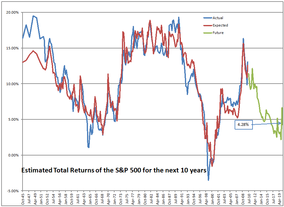
At present, the S&P 500 is priced to return 3.51%/year over the next ten years. Now if you were buying some ten-year investment grade corporate bonds, you might expect something around 2%. Is that 1.5% over corporates worth it?

Truly, I don’t know. That said, you have choices. The most overpriced segment of the market now is the large cap growth FANGMAN stocks, which accounts for around 25% of the S&P 500. You can choose safer areas:

  • Small cap stocks
  • Value stocks
  • Cyclical stocks
  • Foreign stocks, including emerging markets
  • Financial stocks, and maybe if you dare, energy stocks

Now I know that what I said here embeds an idea that GDP will start to grow again. Even with the lousy economic policy at present, over the next twelve months, under most conditions, the economy will grow as government reactions to the C19 virus decrease.

That said, the actions of the Fed in providing credit zoomed through the markets, and pushed stock prices up. Good for the wealthy, less good for ordinary people. Remember, I don’t think it is proper for the Fed to target the stock market. But that is what they are doing through QE.

Image Credit: Aleph Blog

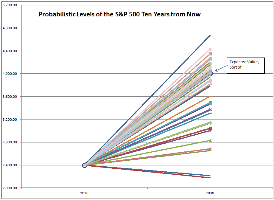
The graph above shows what returns typically come when expected return level are as low as they are today. You shouldn’t be expecting much here. What?! You think the market will rise to the heights of the dot-com bubble and beyond?

Look, even if the big tech companies are profitable, having the S&P 500 in the mid-4000s is not sustainable. The companies will never grow into those valuations even if the economy recovers.

This is a time to lighten risk positions, or at least to move to stocks that have not been the leaders. Take this opportunity, and lessen your risks. Don’t drive through the rear-view mirror. Look to the mean-reversion that will come, as it did in 2000-2001.

Continuing An Optimistic Assessment of COVID-19, Redux

PIcture credit: Aleph Blog, and the same for all the graphs and charts in this post. All liability for mistakes here is mine.

Since then I never pay attention to anything by “experts”. I calculate everything myself.

Dr. Richard Feynman, Part 5: “The World of One Physicist”, “The 7 Percent Solution”, p. 255, quoted here.

Outline

  • Summary
  • Introduction
  • On the Limitations of this Model
  • The Graphs — Second Wave, FInishing the First Wave, Coming to the Turning Point, Problem Children (Turkey, USA, Canada, Iran, UK, Brazil, and France)
  • Closing

Summary

Though the USA model has lagged considerably, and a some of the other modeled countries have lagged a little, the central thesis still stands. Things are getting better faster than most of the politicians, policymakers and media have been forecasting.

Introduction

To those reading me for the first time, you should read the following articles to get up to speed. Those who have read me for a long time know that natively I am a pessimist, so it is unusual for me to be writing as I am doing now.

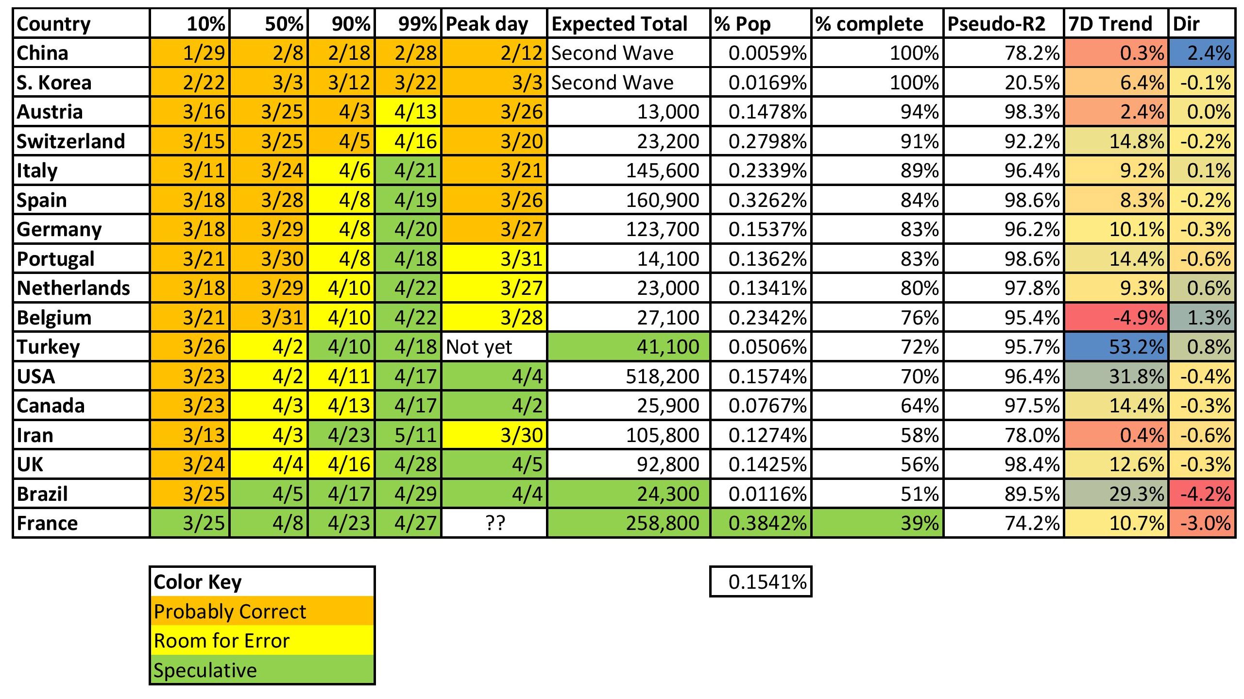
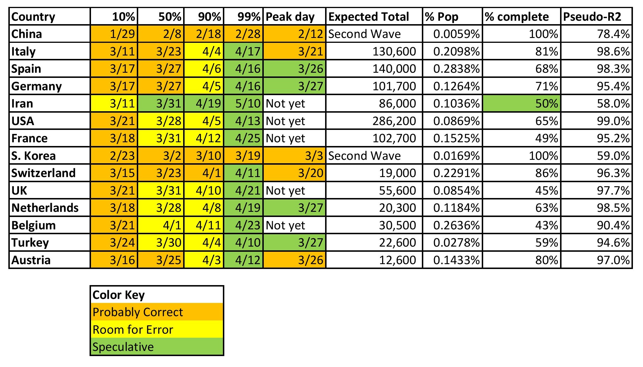
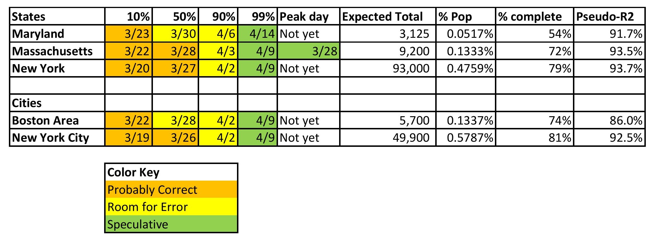
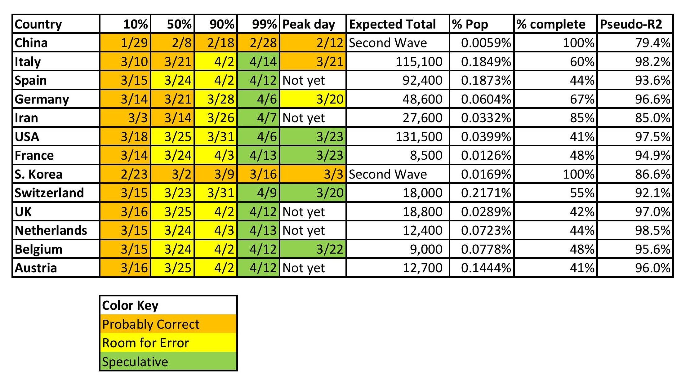
Before I go on, I want to explain what the two rightmost columns on the tables above and below mean.

  • 7D Trend — the seven day sum of forecast errors as a ratio of the number of cases at the beginning of the seven days. Positive means the model has been underestimating. Negative, overestimating.
  • Dir — Direction of the seven days of forecast errors — beta coefficient of the forecast errors versus time as a ratio of the number of cases at the beginning of the seven days.

The idea is to try to point out where the model is persistently missing, how large is it, and is it correcting or getting worse?

On the Limitations of this Model

All models have limitations. This model, being used to extrapolate, definitely has limitations. Extrapolation, as I have said, is dangerous. It’s dangerous because we know the past data with some degree of error, and the future not at all. Extrapolation, even if the underlying functional form used for estimation is right, assumes that all processes generating the values estimated are not shifting. If that is a good approximation to the reality that comes, luck will come marching in as genius.

This is a time series model. There are many structural models out there, and the “experts” estimate and use them. They have more data than I do. Those models suffer many of the same problems that complex economic models do. There are too many parameters to estimate, and they face the same problem I do with the future shifting, and errors in past data, as well as functional form issues. They are also subject to social and economic pressures that I don’t have to the same degree.

Scientists need the approval of their peers in order to publish and for general happiness. They need to be able to make money to survive. It is difficult to get tenure, and most scientists won’t take chances with that process.

It gets worse when science is being used for policy purposes, and gets picked up by the media. Caution is ordinarily a good thing,, but not when it misstates what is going on in order to achieve the ends of third parties. Tell the truth, and then let the politicians, policymakers, lawyers, businessmen, etc. figure out what they will do. The media almost always prefers sensational, sharp, easy-to-tell stories, over the complexity of what is true. The same is true of most average people who would rather not think hard, but just imitate the behavior of others.

Thus I tend to distrust “experts” whose ideas are used for political or policy purposes, and get trumpeted in the media. Their incentives are skewed — once you get close to fame, power, and maybe even money, you’d like to keep it, and that is a snare for many.

Practically, for this model, the difficulty comes around the middle, where the shift is happening — new cases peaking, growth in total cases decelerates. Why is it difficult? Small changes make a big difference to the shape and height of the curve. The prior day’s curve is anticipating a certain amount of deceleration in the growth in total claims. When the data arrives with more new cases than anticipated, the new curve will be taller and longer. VIce-versa if less new cases arrive. That is why for some areas that I modeled, the process seems to stall around 40-60%.

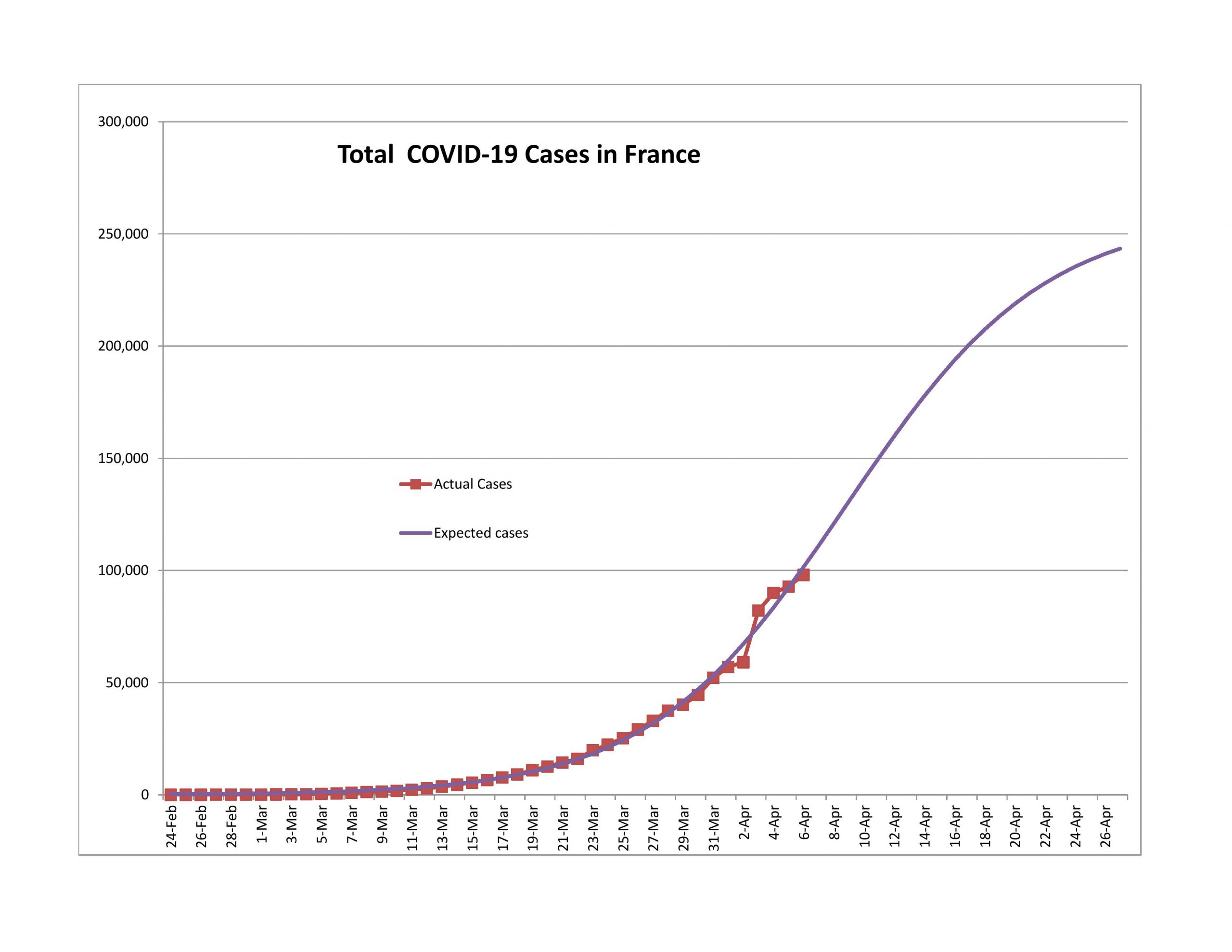
Now, there are raw data errors as well, like China on 2/12 and France on 4/3. There are nations like Iran where the political turmoil may have led to delayed reporting.

But for the most part, the models have worked well, just not so well for the US yet. We’ll get to that later. Before I do, I want to state a few things I have learned as I have gone through the modeling, which has been a learning process for me.

  • Look at the percentage of population that the model is projecting for reported infections. If it’s not high enough, the model is wrong. Unless a nation jumped on the problem immediately, you won’t get results like South Korea.
  • The nations that tested more as a percentage of population, particularly early in the epidemic, did a lot better.
  • Repeated forecast errors in the same direction indicate the process for new claims is changing, and the model is trying to adjust.
  • In that situation, if we?re only getting better at finding those infected, the upper part of the curve should tail off sharply.? On the other hand, if the if the ratio of new cases to total cases is protractedly rising because more infections are occurring, that?s an increase in the ultimate level of reported cases.
  • Once a nation gets to the 10% point, getting to the 90% point takes three weeks or so. Getting to the 99% point takes 4-5 weeks.
  • The markets will anticipate the end, with false starts, and a lot of noise.
  • As Buffett says (something like): I’d rather be approximately right than precisely wrong… or, Rule 65: “The second-best plan that you can execute is better than the best plan that you can?t execute.” My goal was to get some idea of when the market might turn. In that sense, this has been a success.

The Graphs

As in prior posts, I will run through the graphs now.

Second Wave

Finishing the First Wave

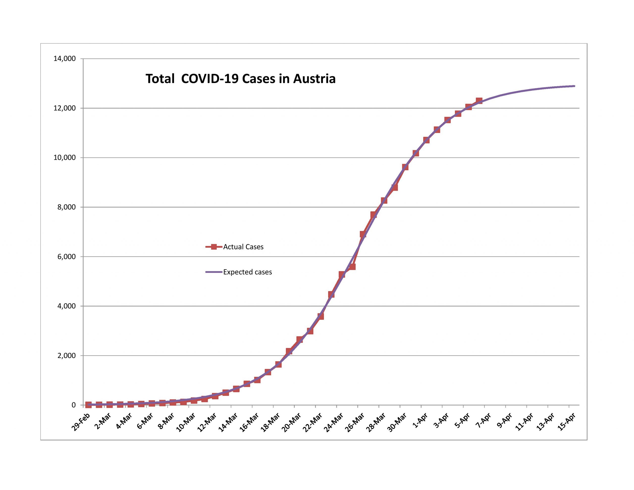
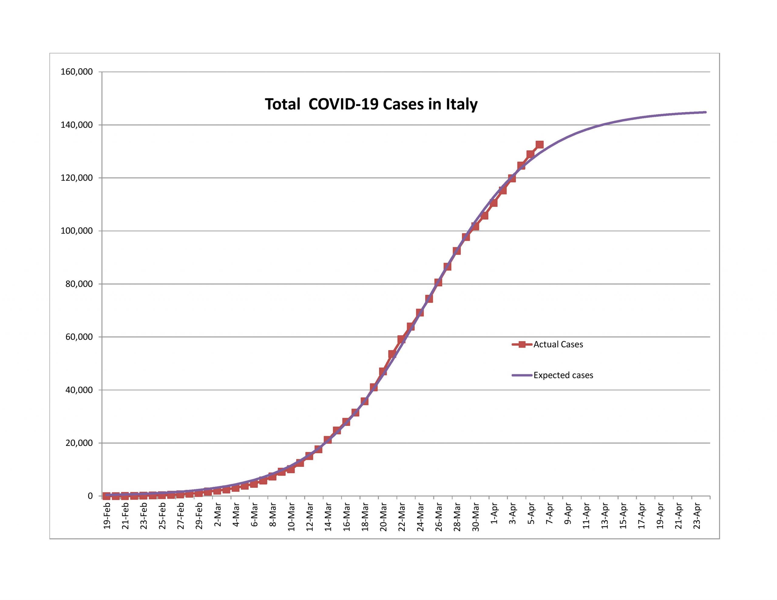
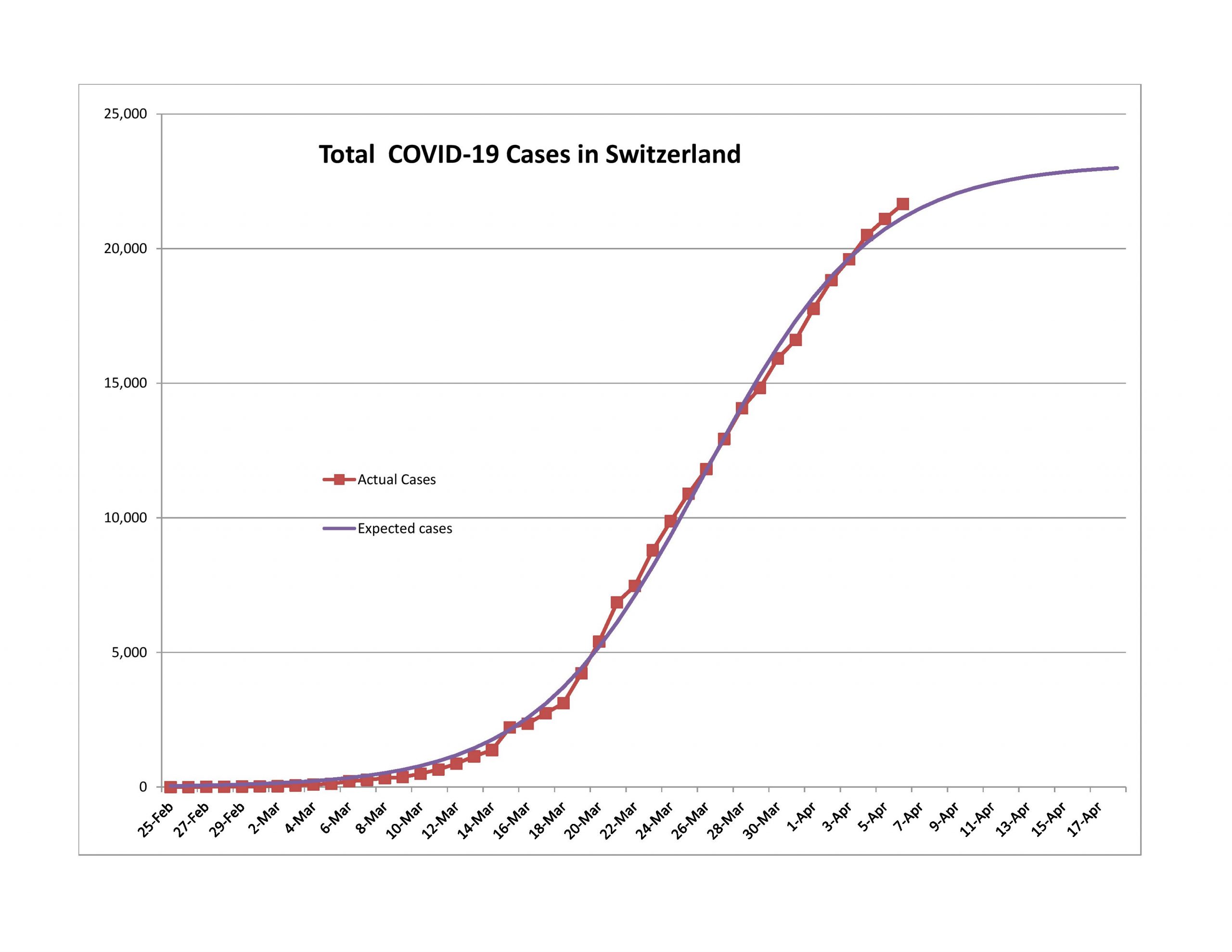
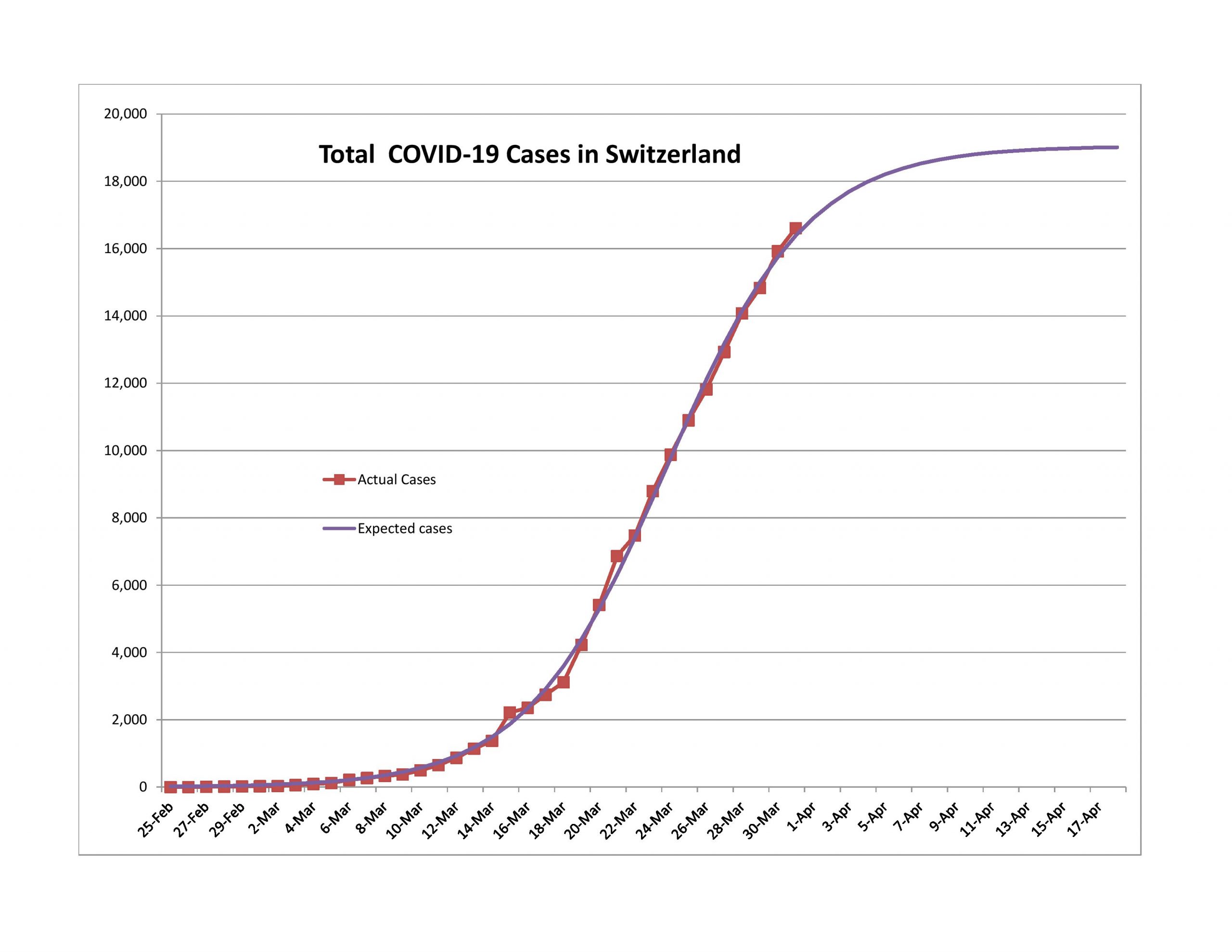
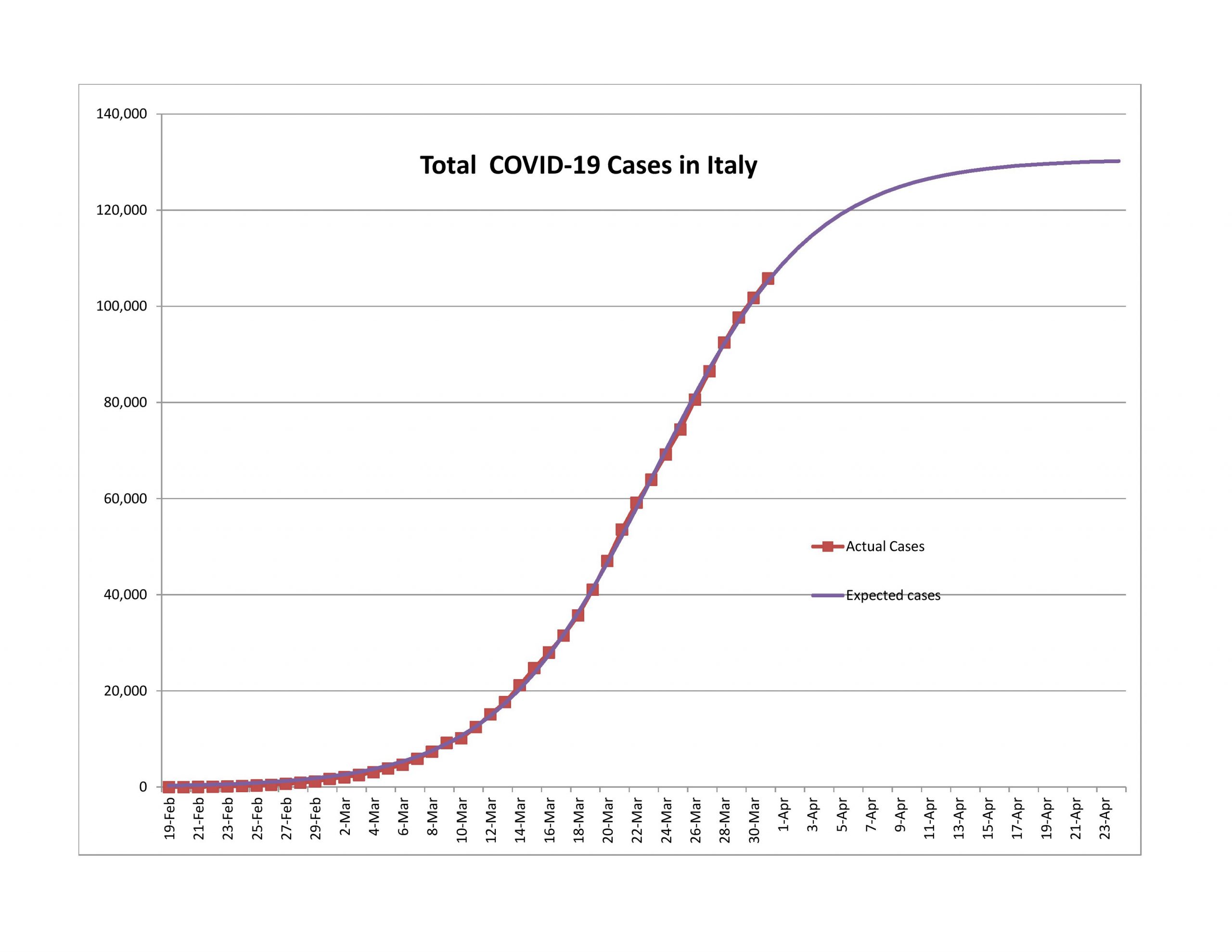
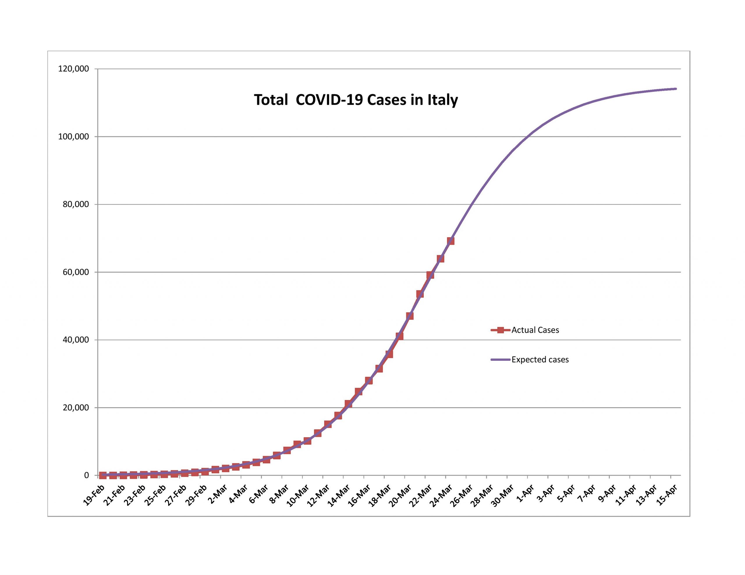
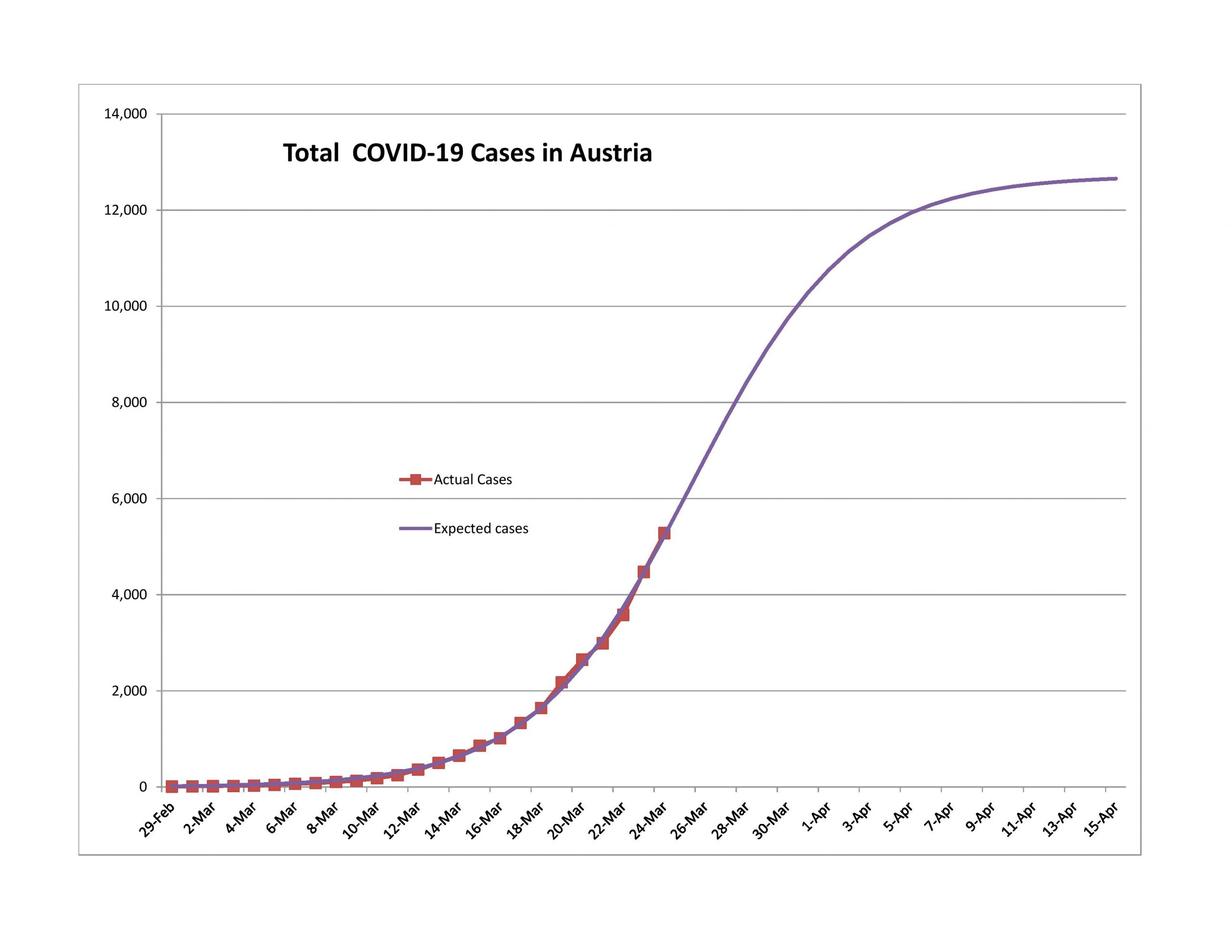
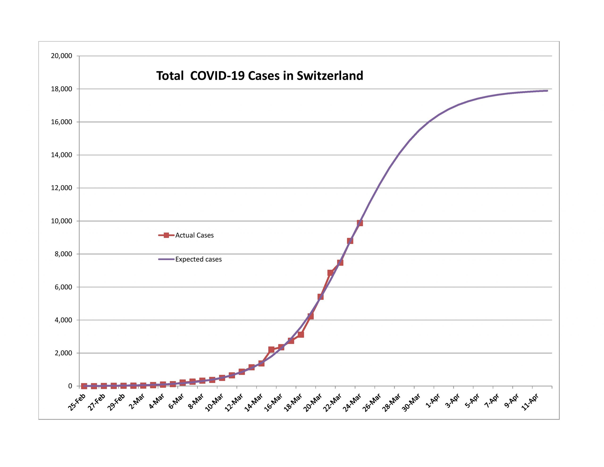
I write this with a little concern that I might be early on Italy and Switzerland, but new cases have been slowly rapidly for the two of them and Austria. Note that all three of them did a lot more testing per capita than most nations. You can see that here. The table sorts itself if you click on the top of the columns.

Coming to the Turning Point

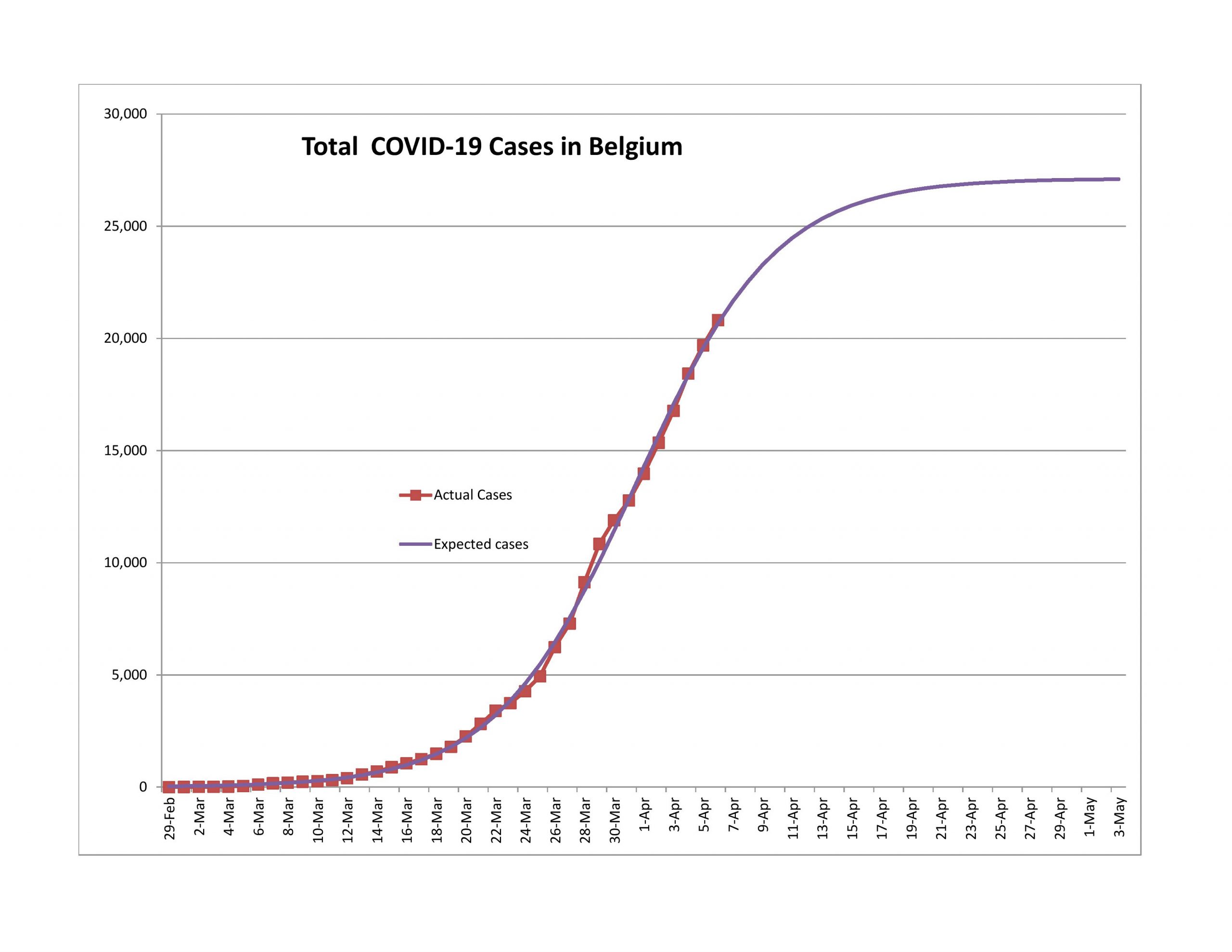
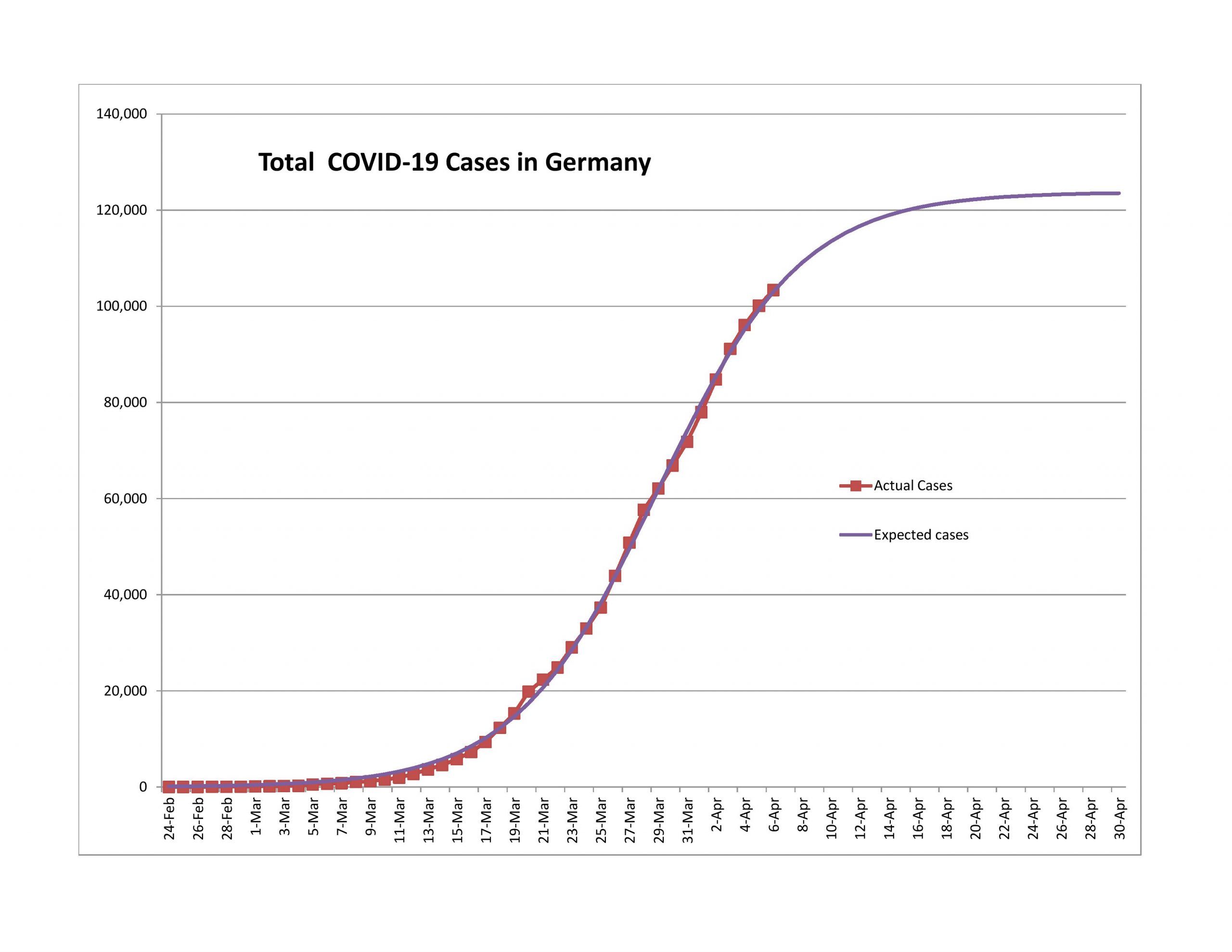
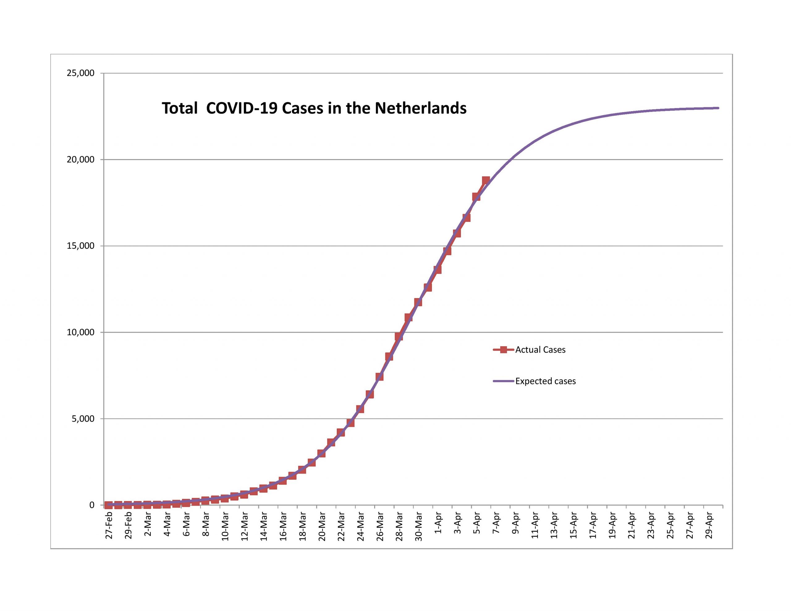
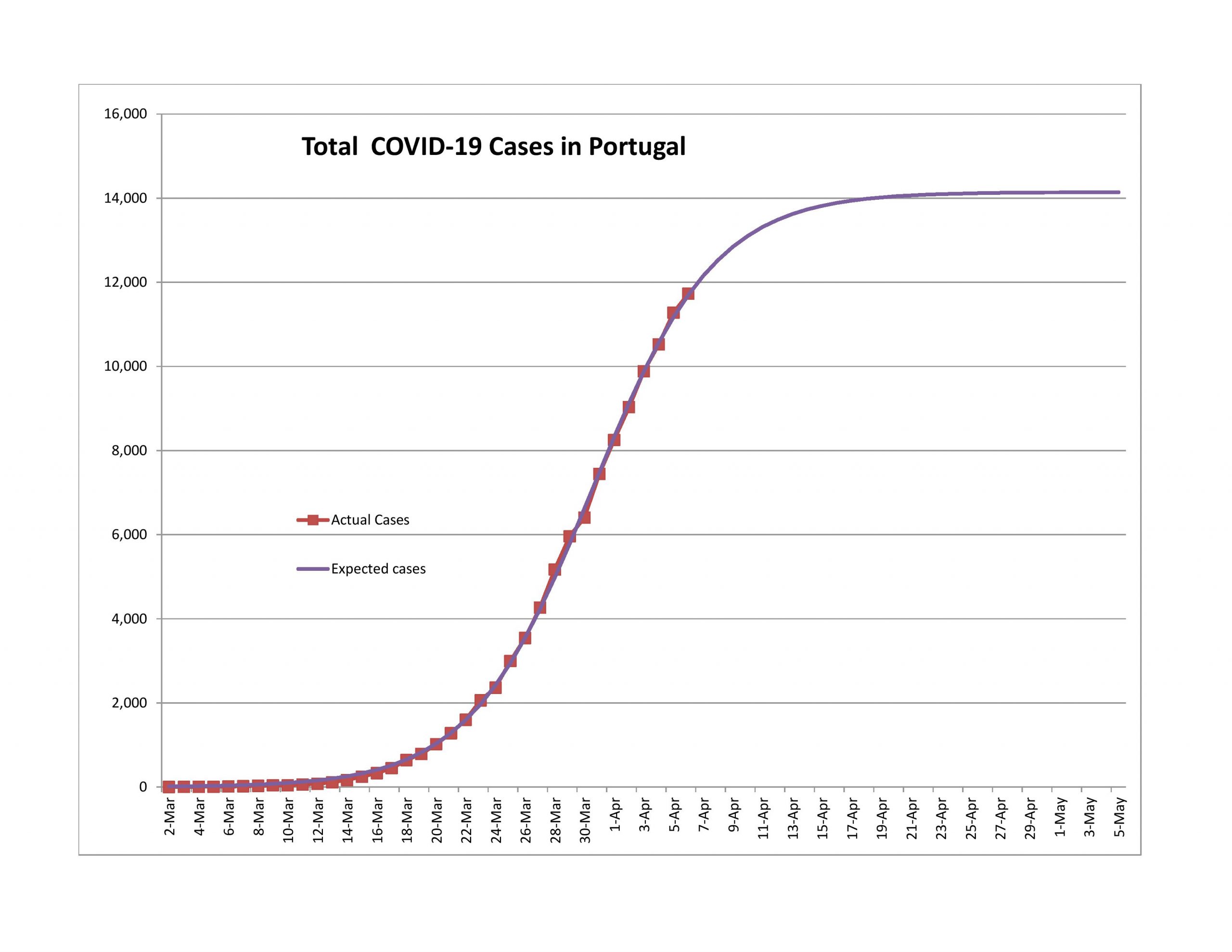
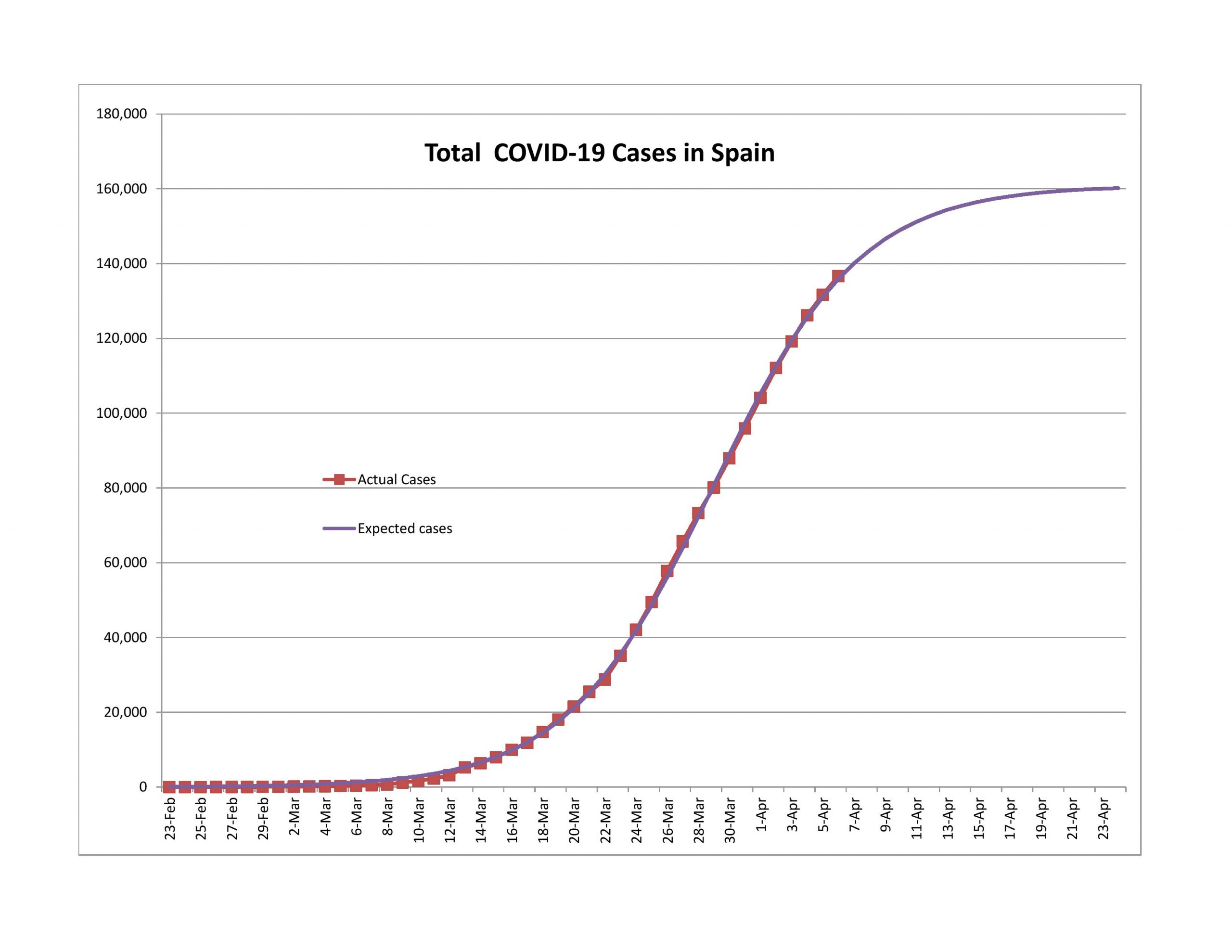
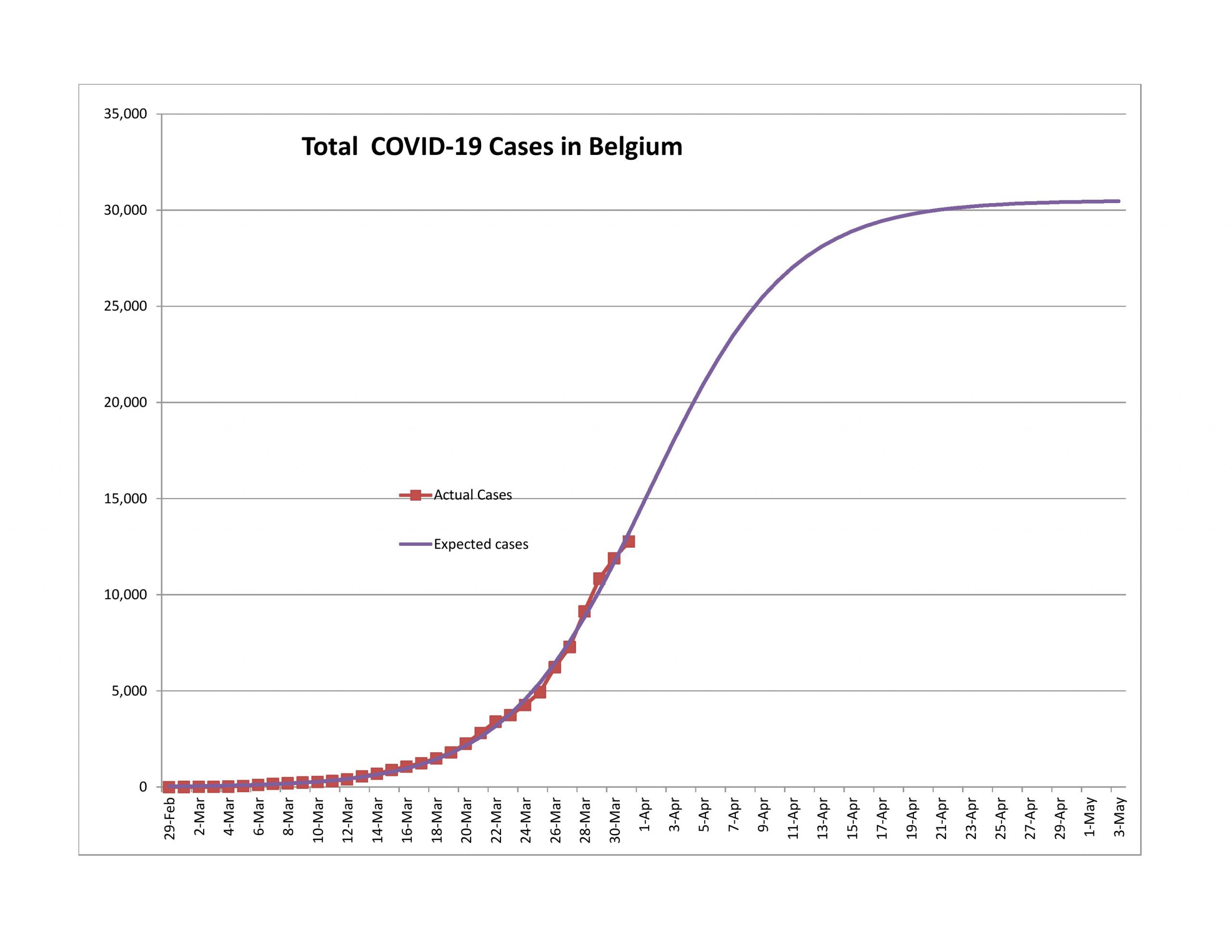
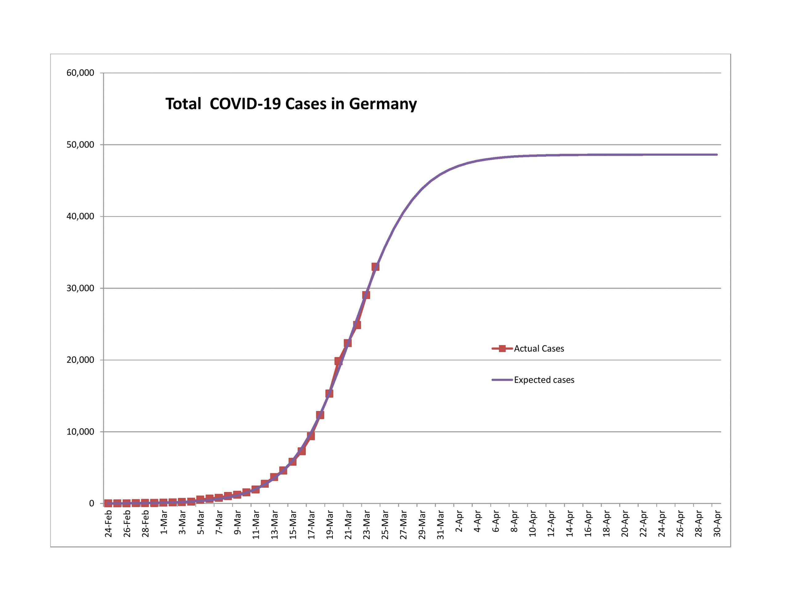
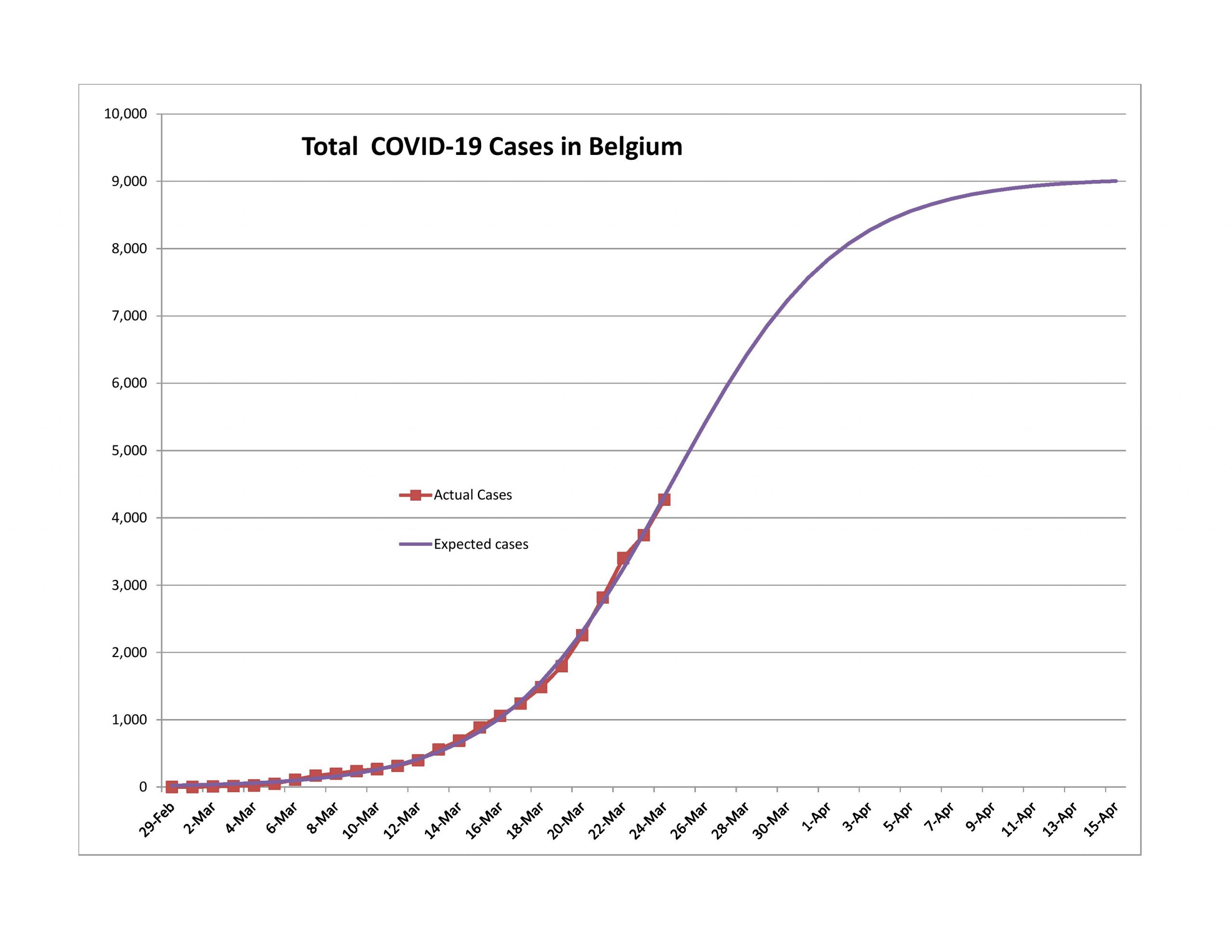
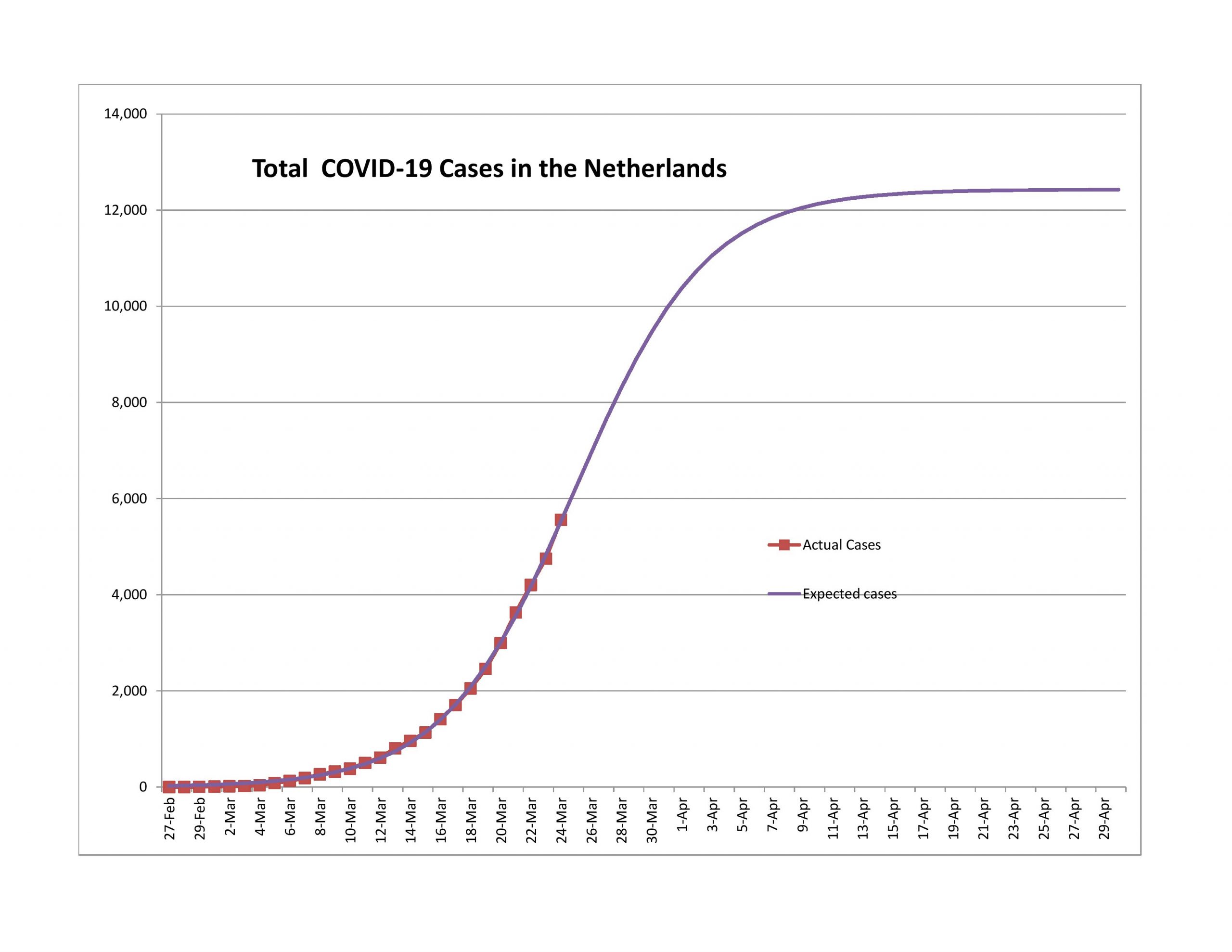
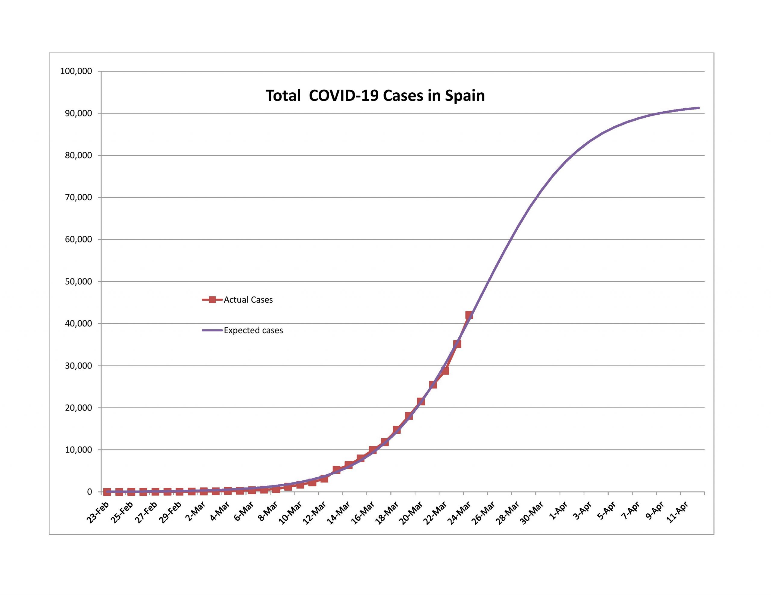
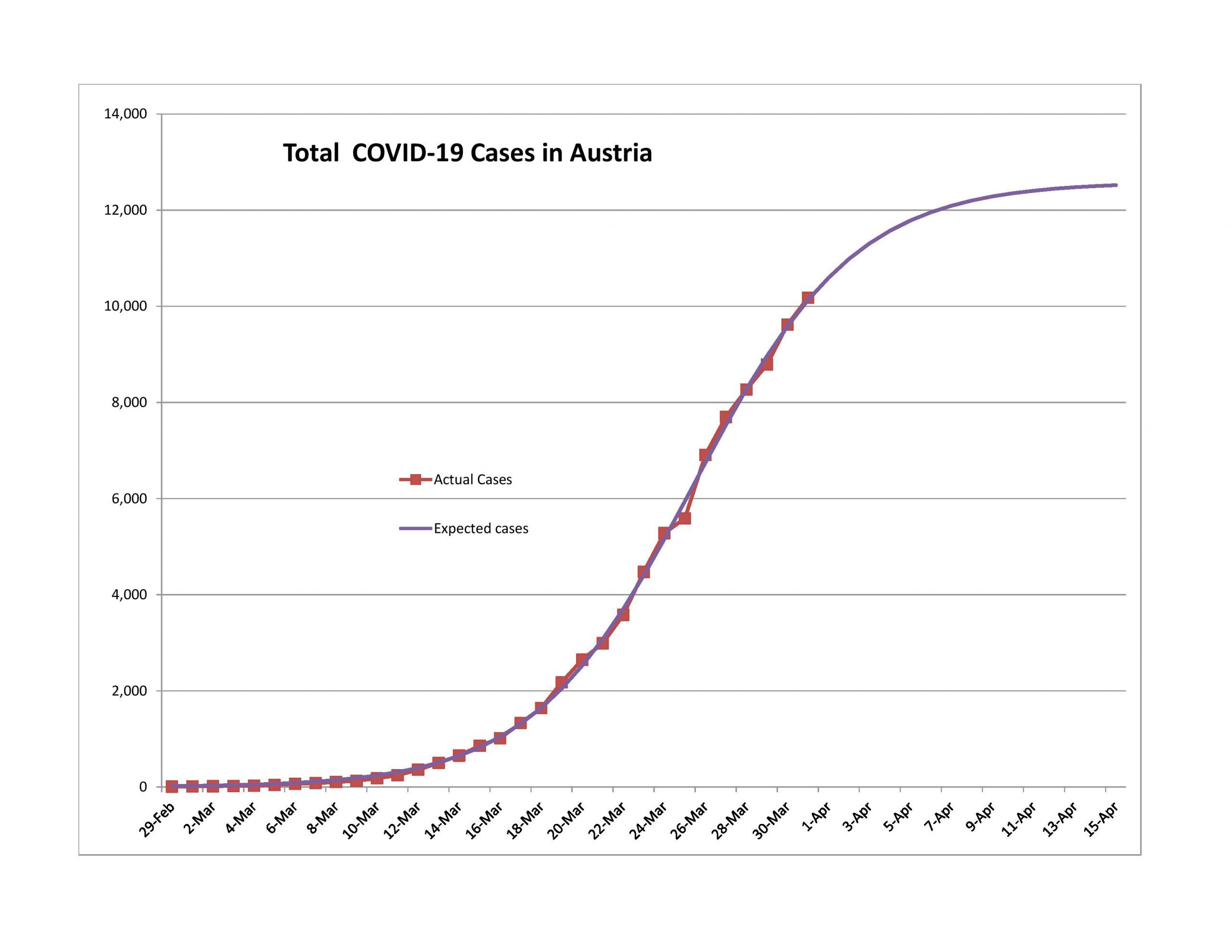
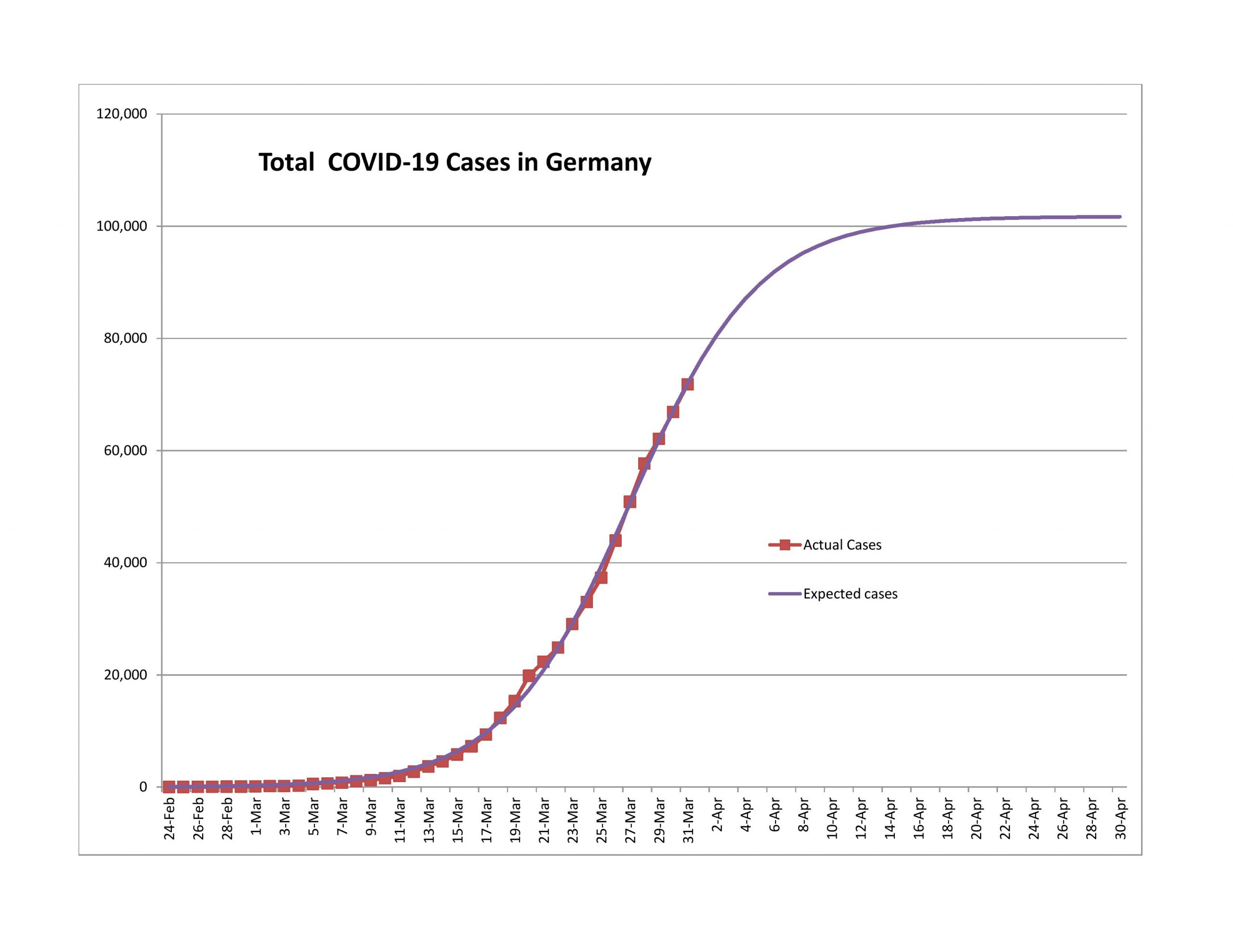
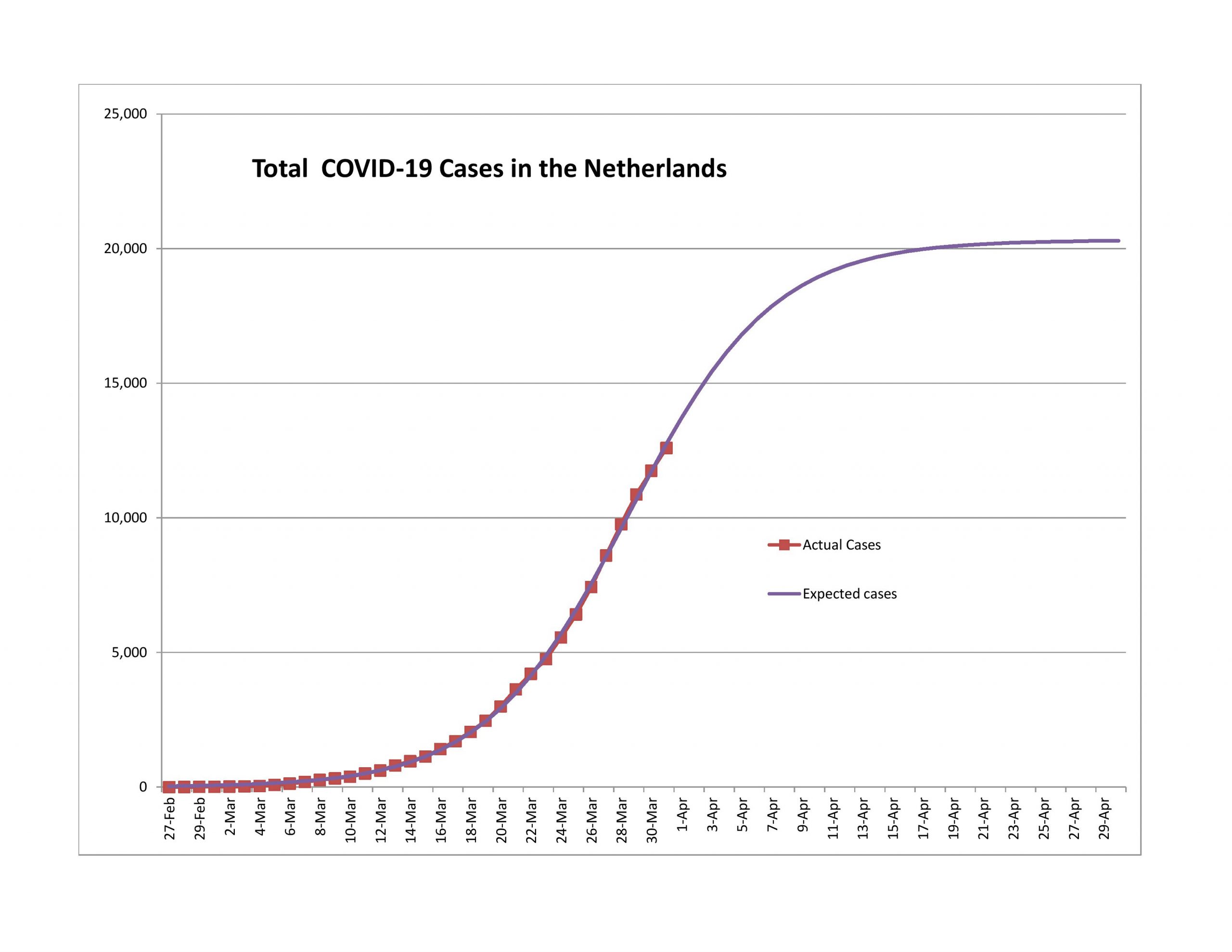
For Belgium, Germany, Netherlands, Portugal and Spain, new cases are declining, though not as rapidly as the model would predict. Even with that, it seems likely to me that all will pass the 90% point within a week.

Problem Children

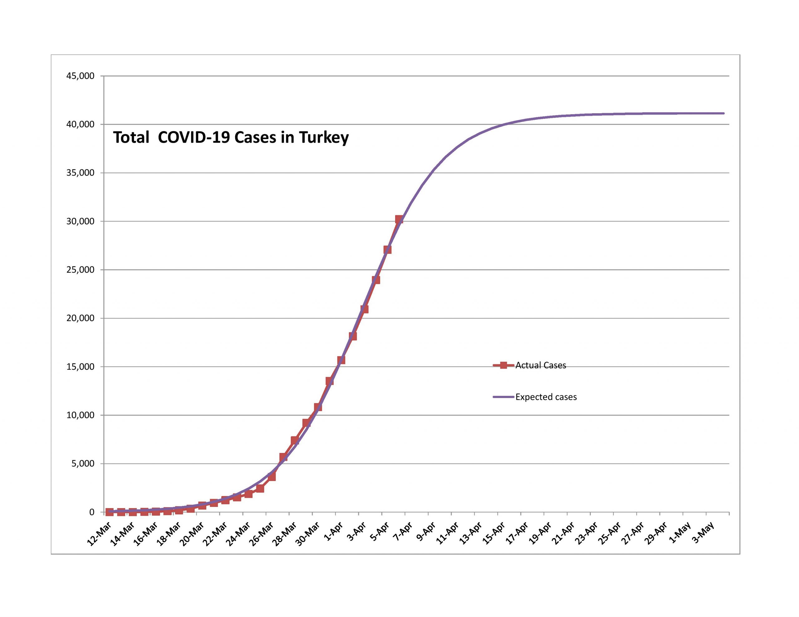
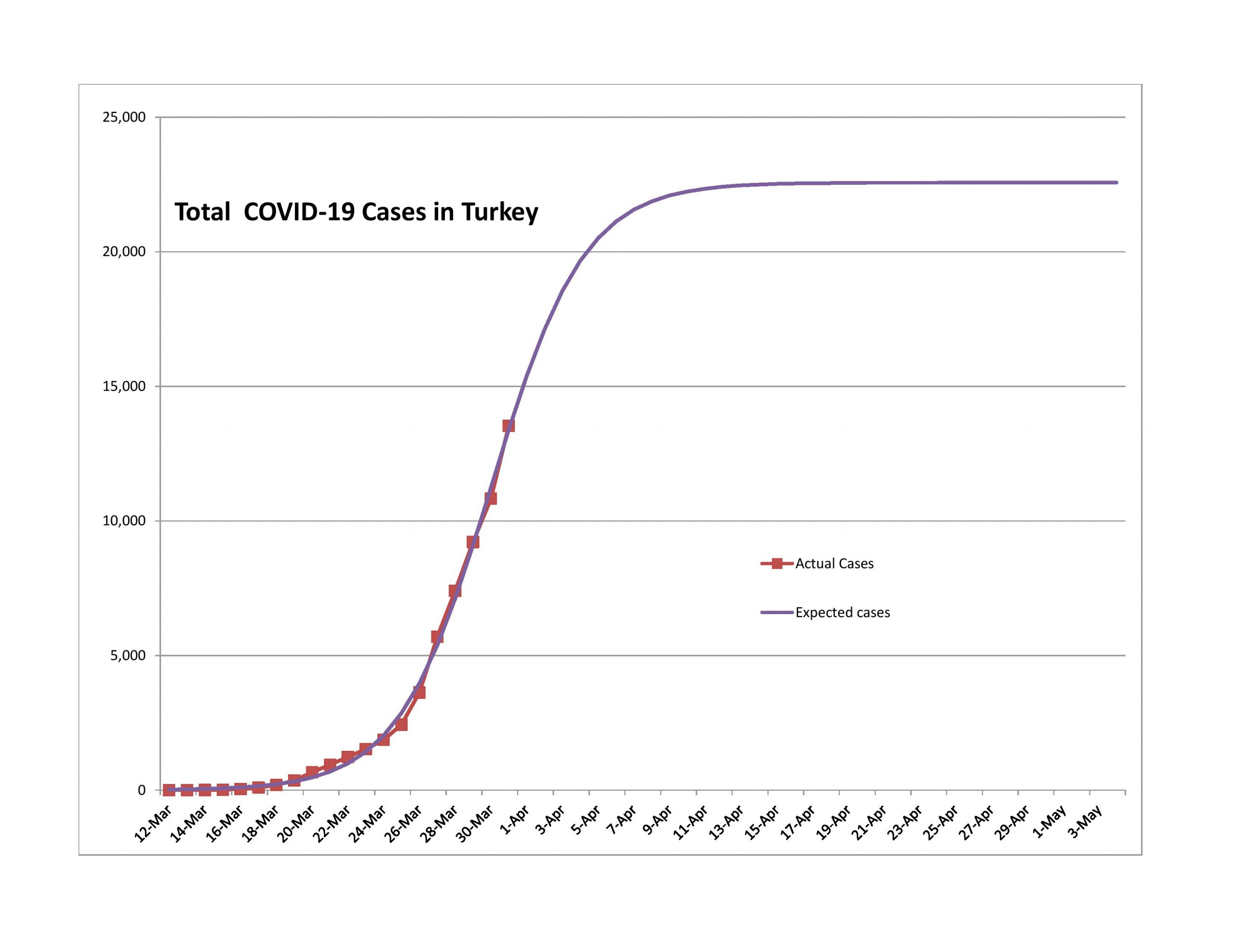
Turkey

My problem with Turkey is that the expected total population infected is too low. They got to the game late, and the curve looks too sharp. I would expect this to not turn as quickly as the model says.

United States of America with some States and Cities

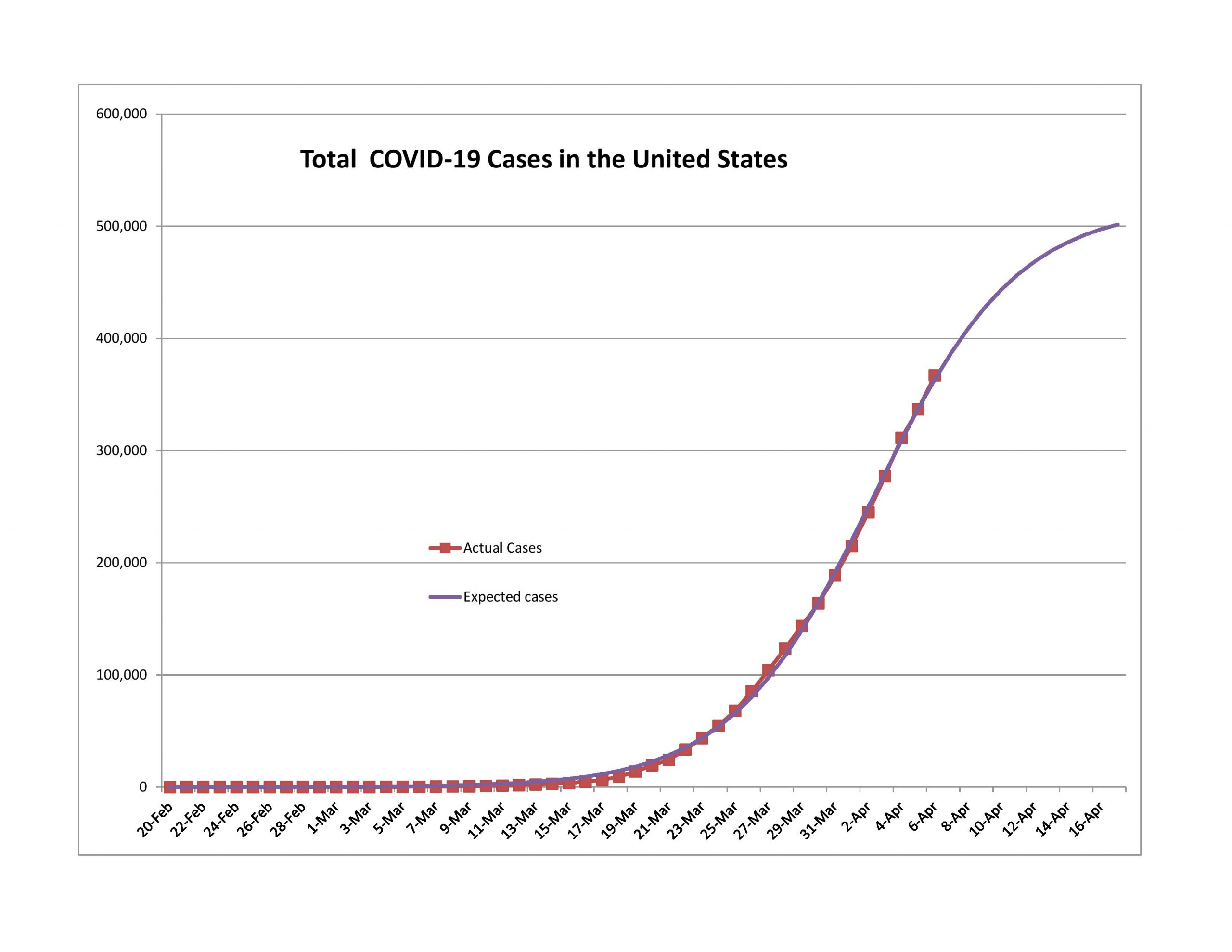
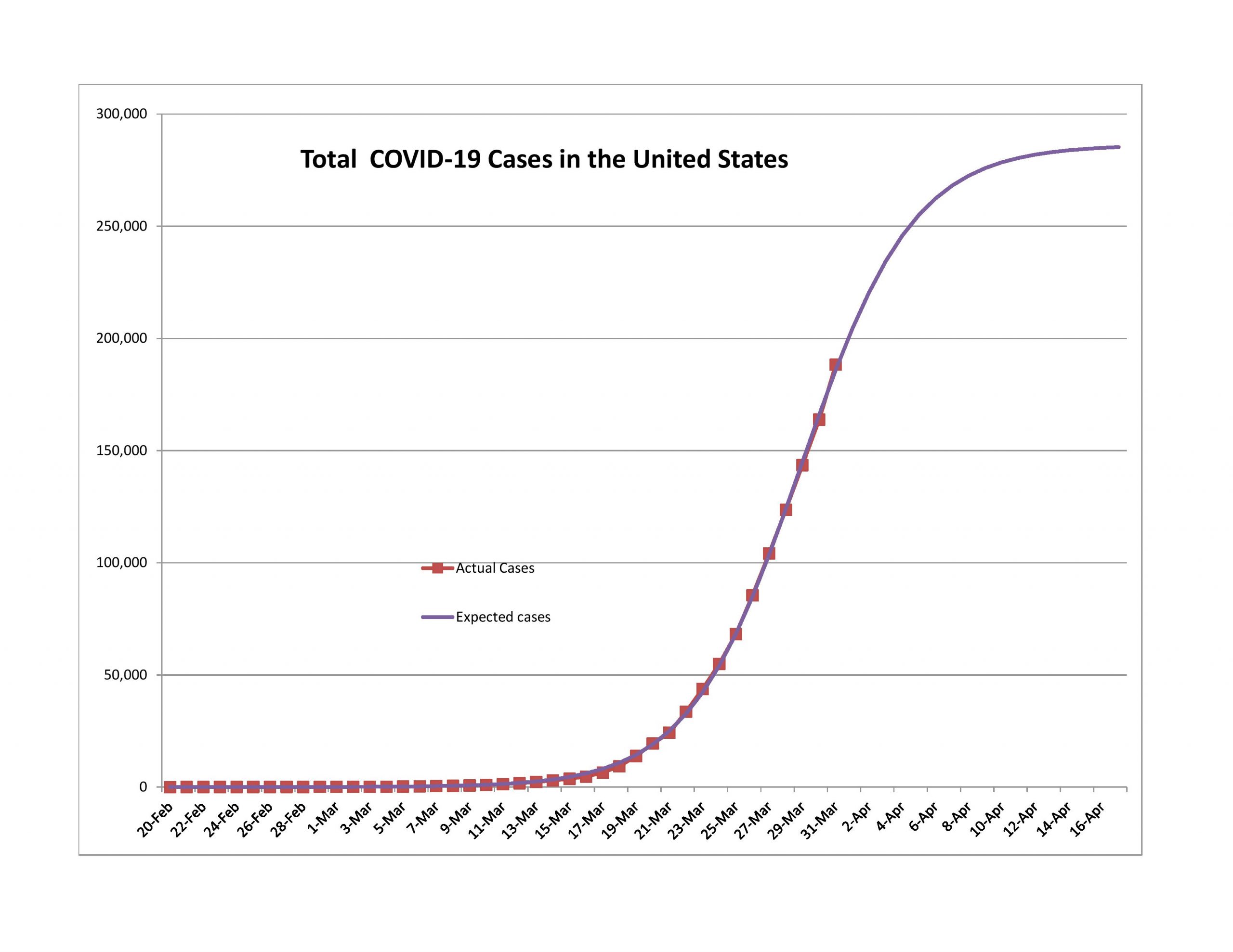
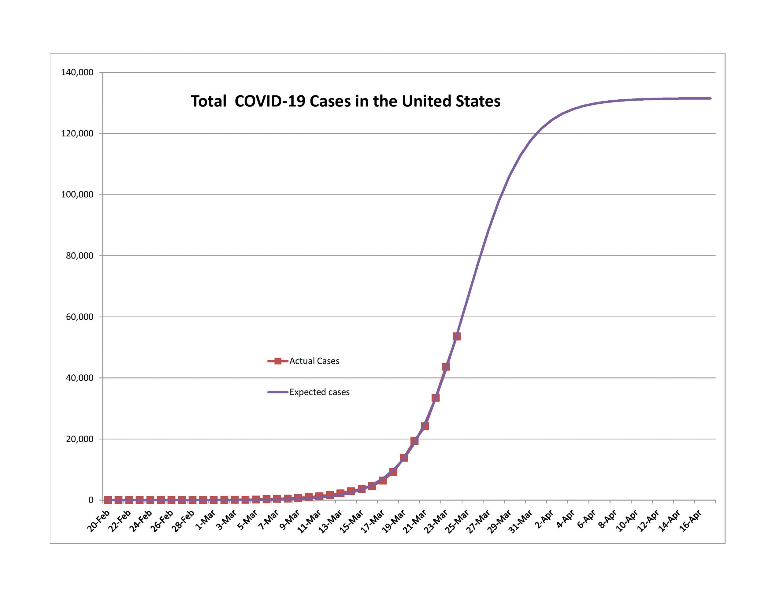
Yes, the USA has been slower than I expected, and I think I have a good reason for it. I gained the reason while trying to model the world as a whole for the COVID-19 pandemic. Using the logistic equation as my functional form, I could not even in the slightest achieve a positive pseudo-R-squared. Why?

If you add together a bunch of logistic curves with varying timing, height and sharpness, there is no guarantee that you will end up with a logistic curve. The US is a big place, and the population is spread out, with many different large population centers. Much as would have killed me timewise unless I had better software, I think it would have made more sense to model the US as a bunch of logistic curves state-by-state, and add them up.

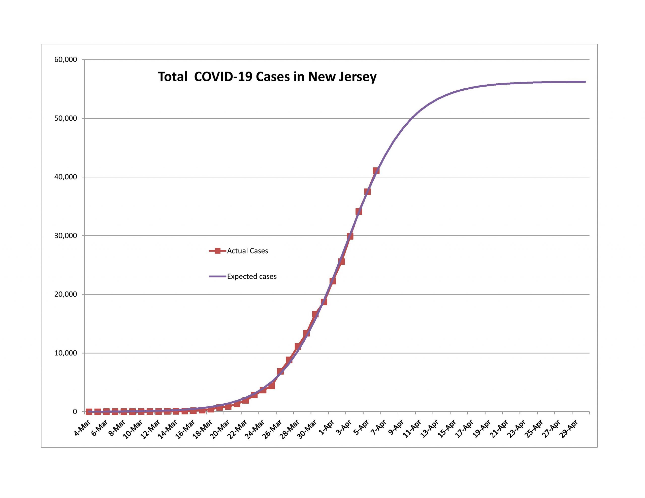
Here’s a demonstration for the past week: if I take the forecast errors of New York State and New Jersey, they are roughly 65% of the forecast errors for the US as a whole. Together they have 47% of all reported COVID-19 cases.

There have been statements by some politicians that there will be a lot of new “hotspots” across the US, it’s a tempest in a teapot. The dense and large cities like New York City and Boston have a lot harder of a time preventing the spread of an epidemic. Areas that are smaller and less dense won’t have the same impact, not even proportionate to their sizes.

The US has been making progress, just not as fast the model predicted. I would be surprised if the US weren’t at the 90% point by what is normally tax day. It takes three weeks or so to get from 10% to 90% and another week or two to get to 99%. We will likely see the practical end of this in April. It’s just a question of when.

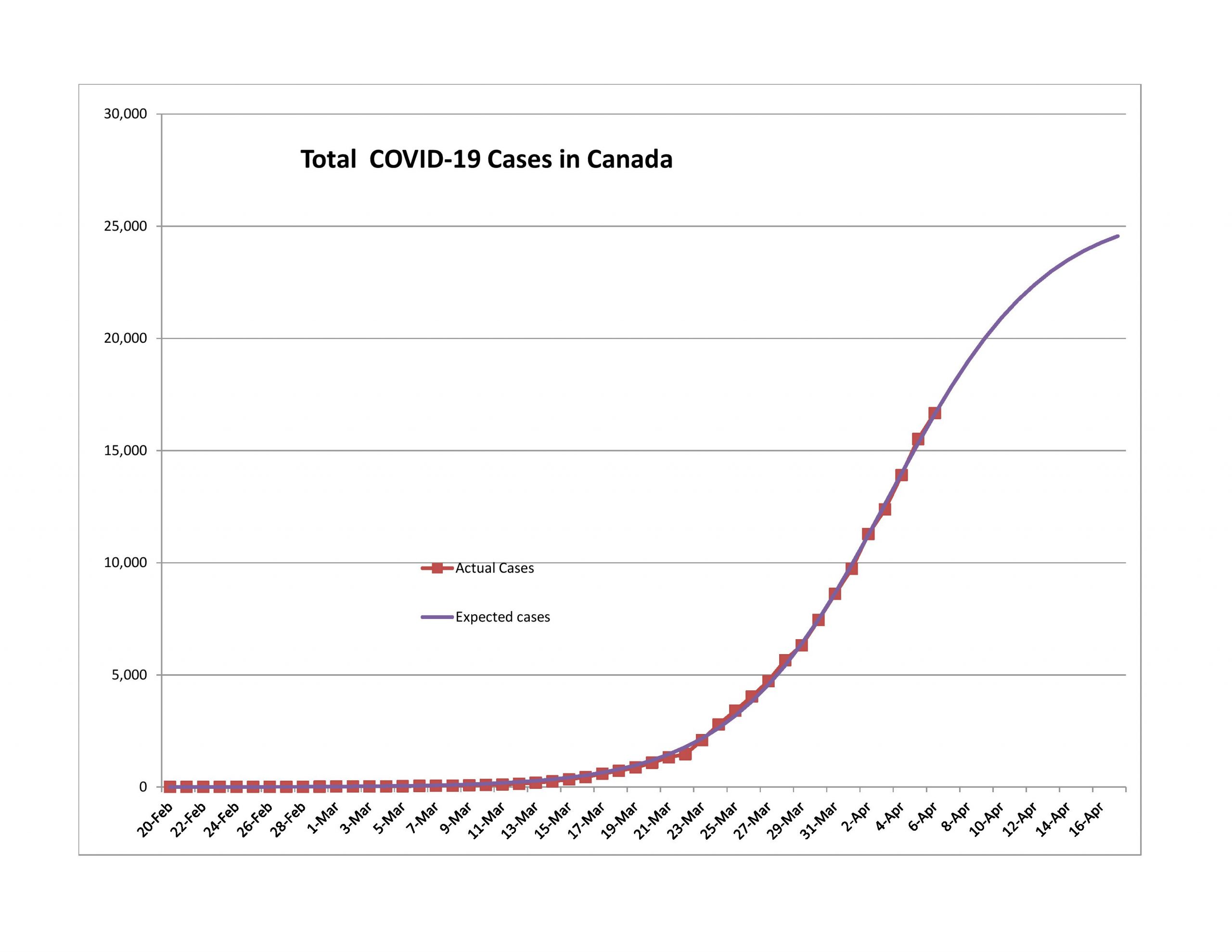
Canada

I place Canada in the same boat as Turkey. Too few ultimate cases. It will likely revise upward. That said, their population is more spread out, so it will likely have fewer cases per capita than the US.

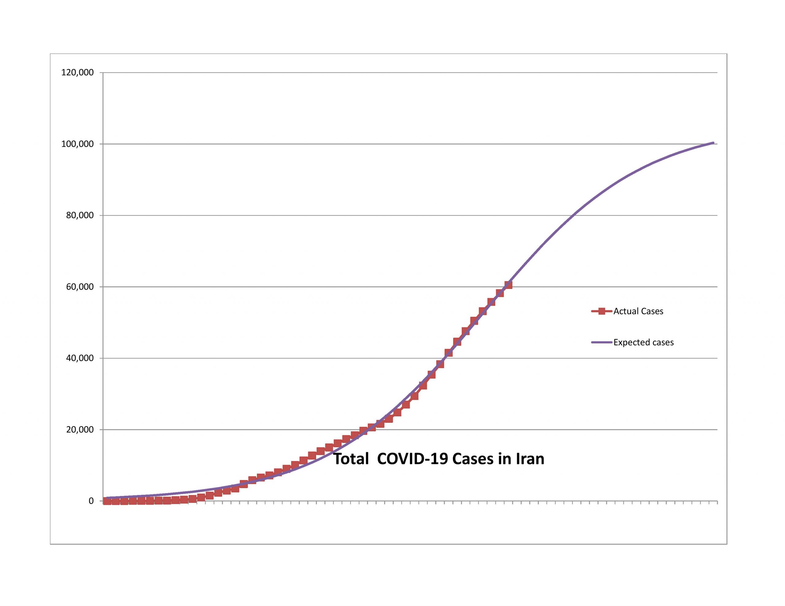
Iran

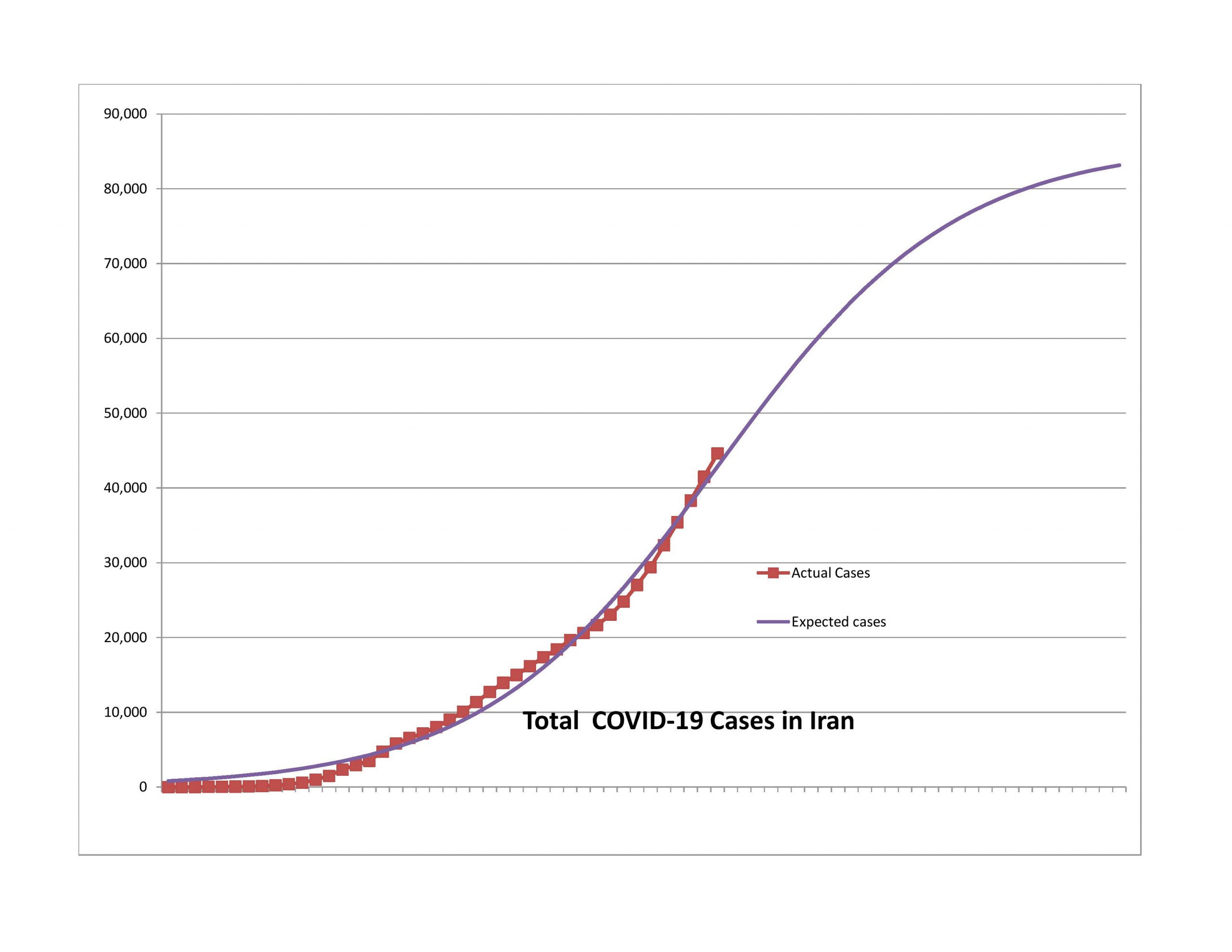
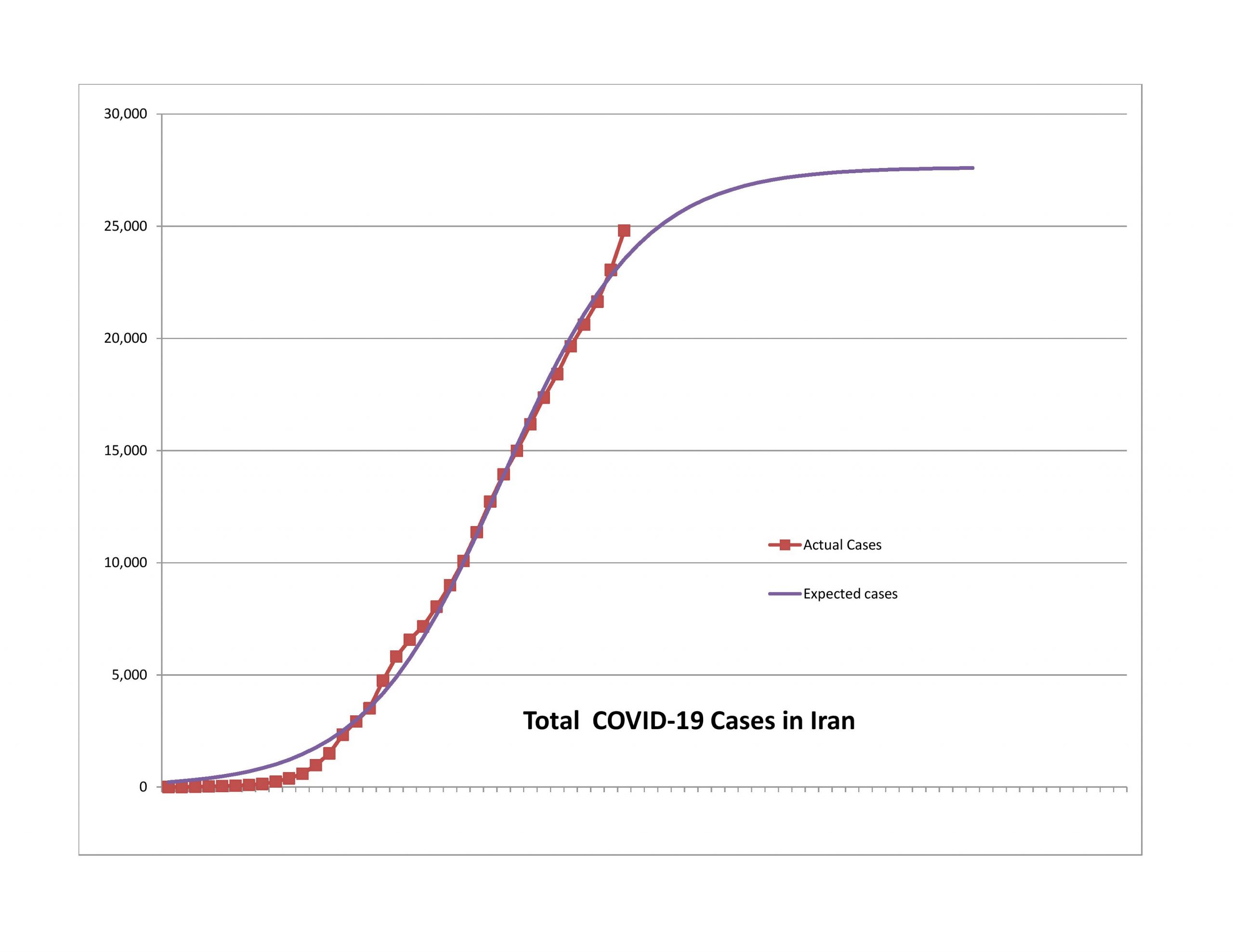
After several weeks of having claims far higher than the model would predict, the curve for Iran has regained a normal shape. The expected ultimate number of reported cases is on the low side of reasonable, and the model is finally tracking well. This is a watch and see sort of thing because of the instability in Iranian society, particularly amid the epidemic.

United Kingdom

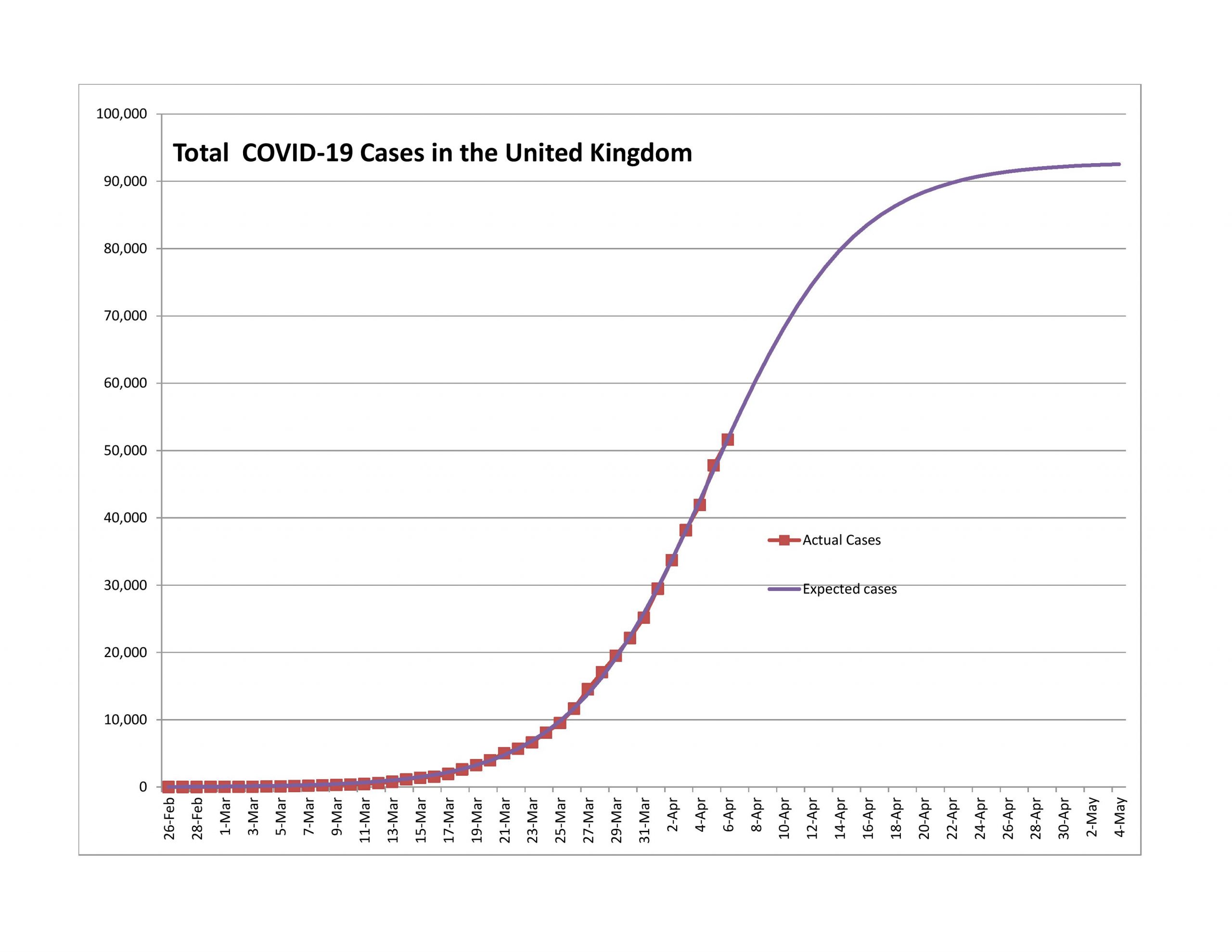
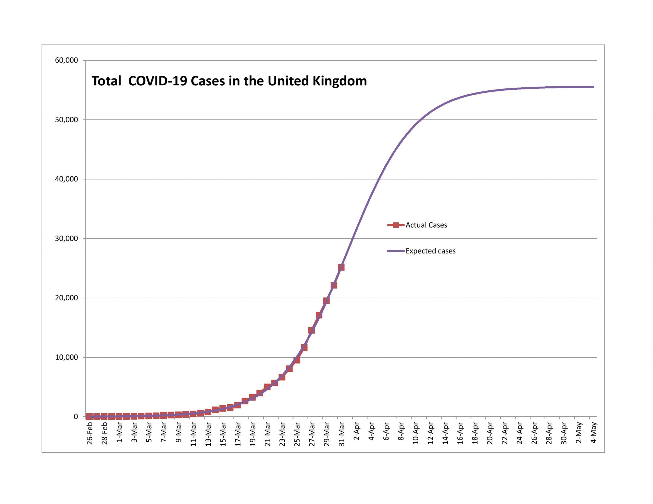
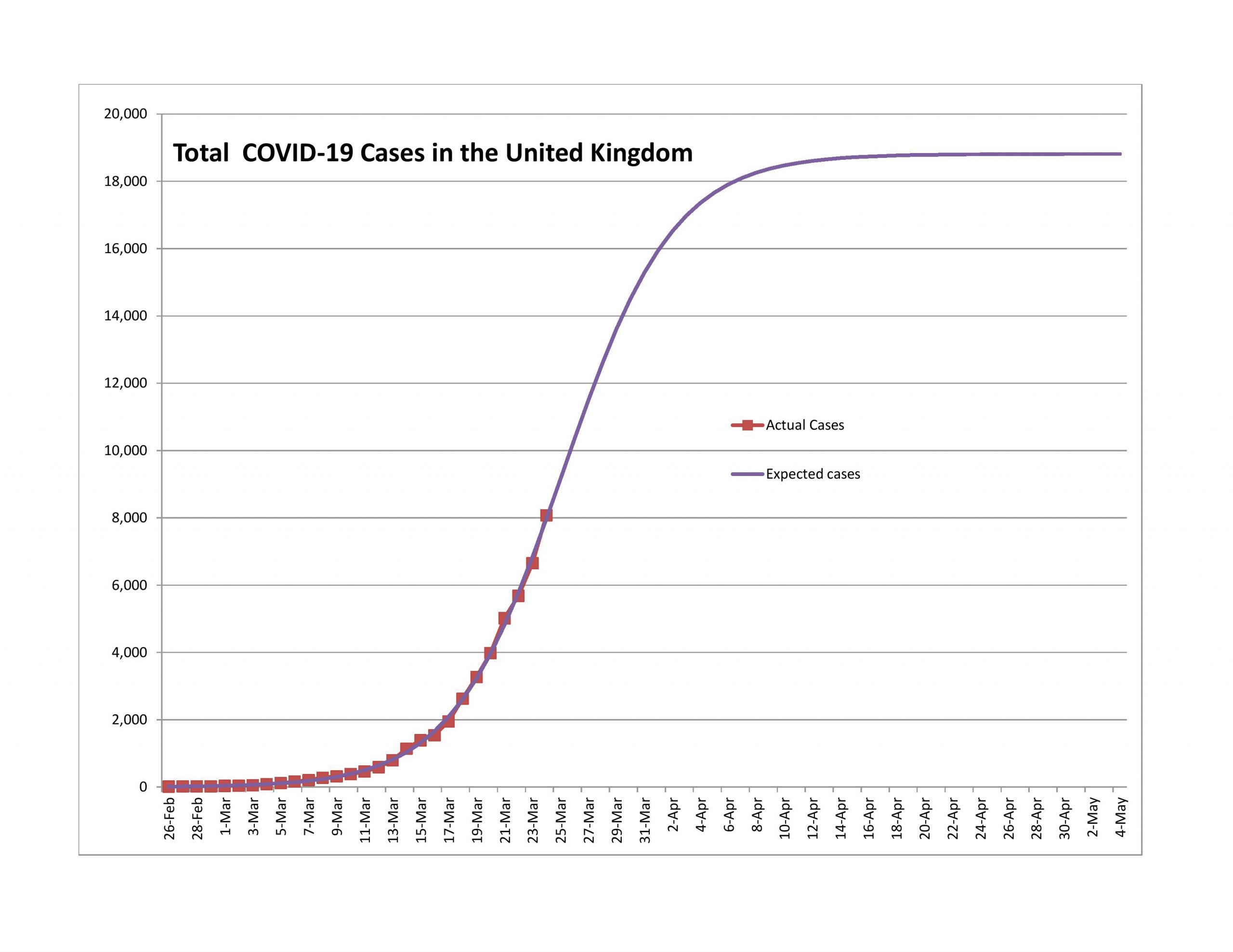
The UK is on the same path as the USA, only 5-11 days behind. Their new case rate is decelerating slowly, but it is decelerating.

Brazil

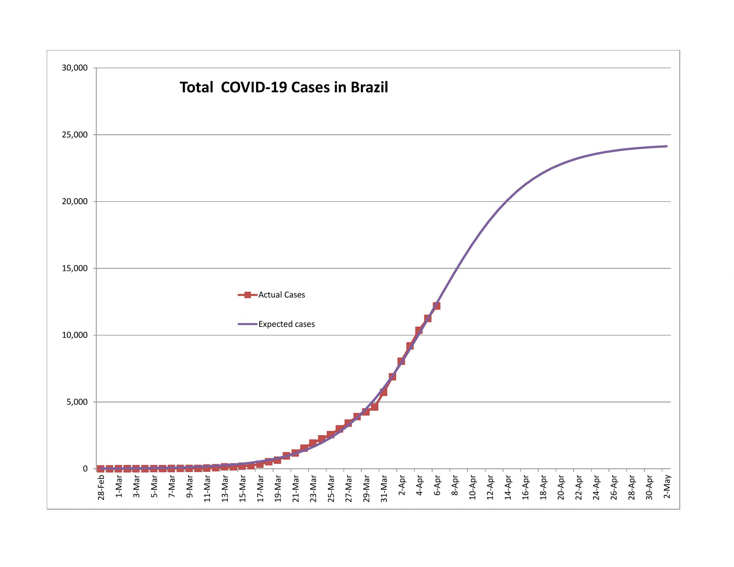
The expected ultimate number of reported cases is too low, and the model is too new. Conditions in Brazil are less than orderly, so I would expect this model to revise significantly upward.

France

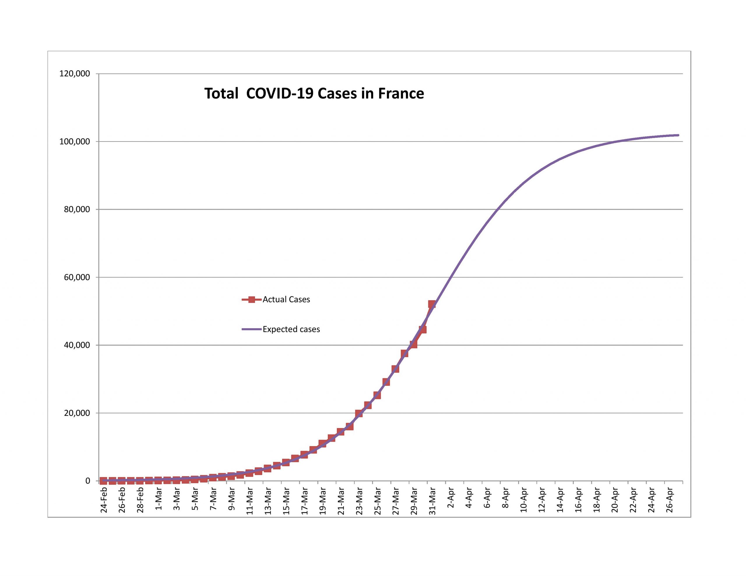
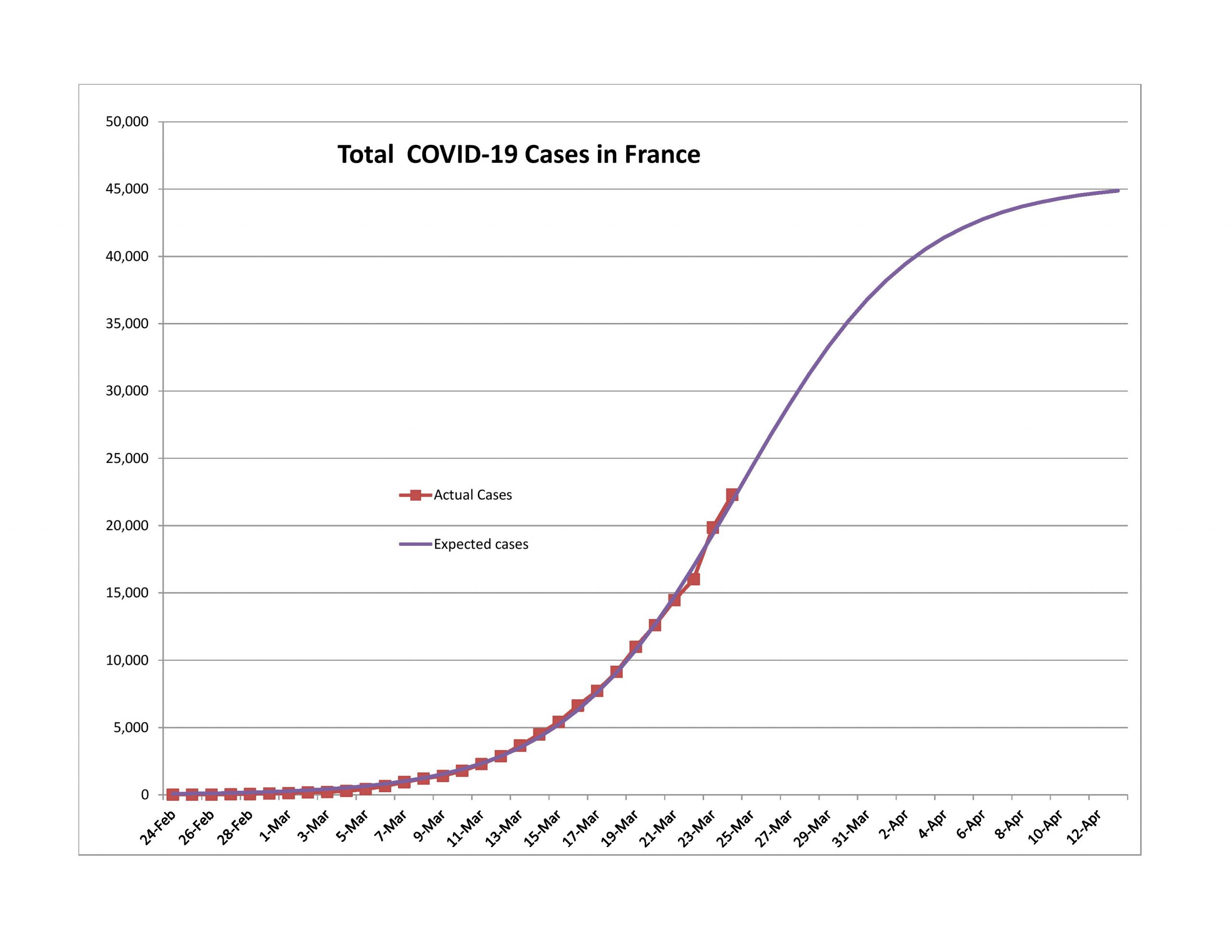
On 4/3 of the French government announced that they had only been counting deaths in hospitals and as such reported 23,000 new cases. Since that time the model for France has been posting negative forecast errors, and is slowly returning to a normal shape. I would expect in a week that the curve will look normal, and that the crisis in France would end about the same time as for the US.

Closing

That’s all for now. For those talking about these posts on Facebook, please note that I don’t interact there much. It’s best to comment at my blog or email me if you want my attention.

Continuing An Optimistic Assessment of COVID-19

PIcture credit: Aleph Blog, and the same for all the graphs and charts in this post. All liability for mistakes here is mine.

Recommendations and Comments

  • To the National Governments and Central Banks: don’t create a lot of policies that you might need to reverse. This crisis is coming to an end faster than most are reporting/proclaiming. If a policy is easily reversible, get ready. Start planning for dealing with the second wave of the pandemic.
  • To US State Governments and city/county governments: start figuring out how you will targetedly let up on the restrictions that you have imposed before you realize that you are behind the curve (again). Start planning for dealing with the second wave of the pandemic. It would be better to let younger people go back to work, and shelter those more likely to get a deadly case of COVID-19. (Aside: if this ends early, note the people who told you that it would long and big, and remove them as advisors.)
  • To the media: please calm down. This is one of those situations where it gets worse before it gets better. We are through most of the worse, but to the average observer, they don’t see the better, even though the point of maximum pessimism has passed.
  • To individuals: if you don’t have a lot, take heart that this first wave likely won’t be here much longer. Use your money carefully. To those who do have money, as a nation moves from 50% to 75% complete in the first wave of the virus, it might be a good time to own a little more stock. I don’t usually encourage speculation, but it might be warranted here. Remember, don’t invest anything you can’t afford to lose.
  • Last, my models last week were too optimistic, but not by much. The growth rate of total cases is generally dropping pretty quickly, but you couldn’t tell that from what you are hearing from politicians and the media.

Introduction

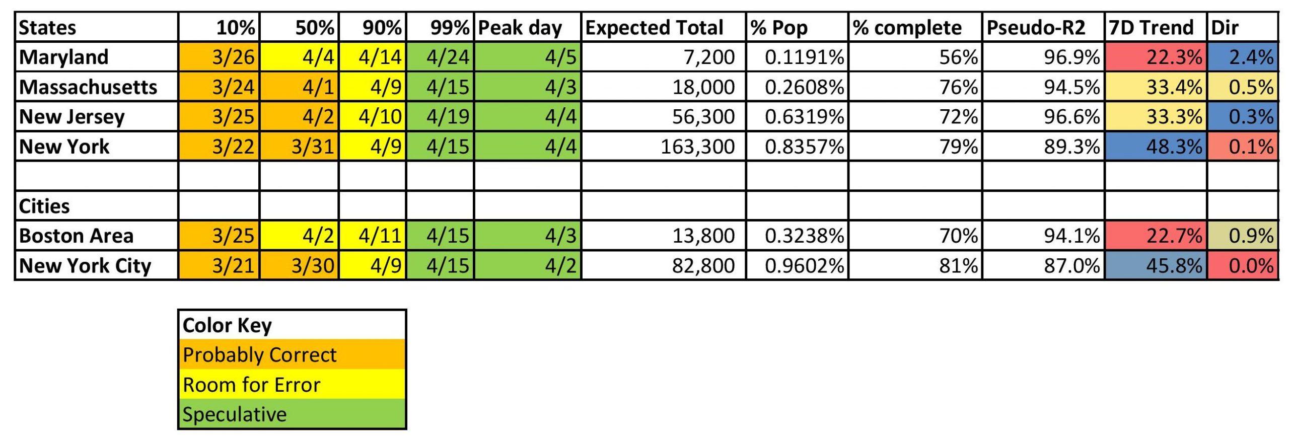
Before I start, I want to explain what the tables above and below mean.

  • The figures underneath the percentages are dates. The dates are estimates of when the country, state or city will have experienced 10%, 50%, 90%, and 99% of the total COVID-19 cases that they will experience in the first wave.
  • The peak day is the day each has the most new claims.
  • “Expected Total” is my estimate for the total number of reported COVID-19 claims in the first wave.
  • “% pop” is the percentage of each population that will be reported as infected with COVID-19.
  • “% complete” is the ratio of estimated current total cases to estimated final total cases fo the first wave.
  • Pseudo-R2 is the percentage of the total variation in the total cases explained by my three-parameter nonlinear regression. Because the regression is nonlinear, it is not an F-statistic, and gives us only a spit-in-the-wind sense for how good the regression is. Some have asked if I could add error bands to my models and the answer is no, because the nonlinearity of the equation makes that difficult. I’m only working with Excel, and looking through my old Econometrics texts, they don’t have an answer for this one. Maybe I should start modeling in R.

You’ll note that I added six additional models to this post.

  • One country: Turkey (I am modeling any country that gets more total cases than S. Korea.)
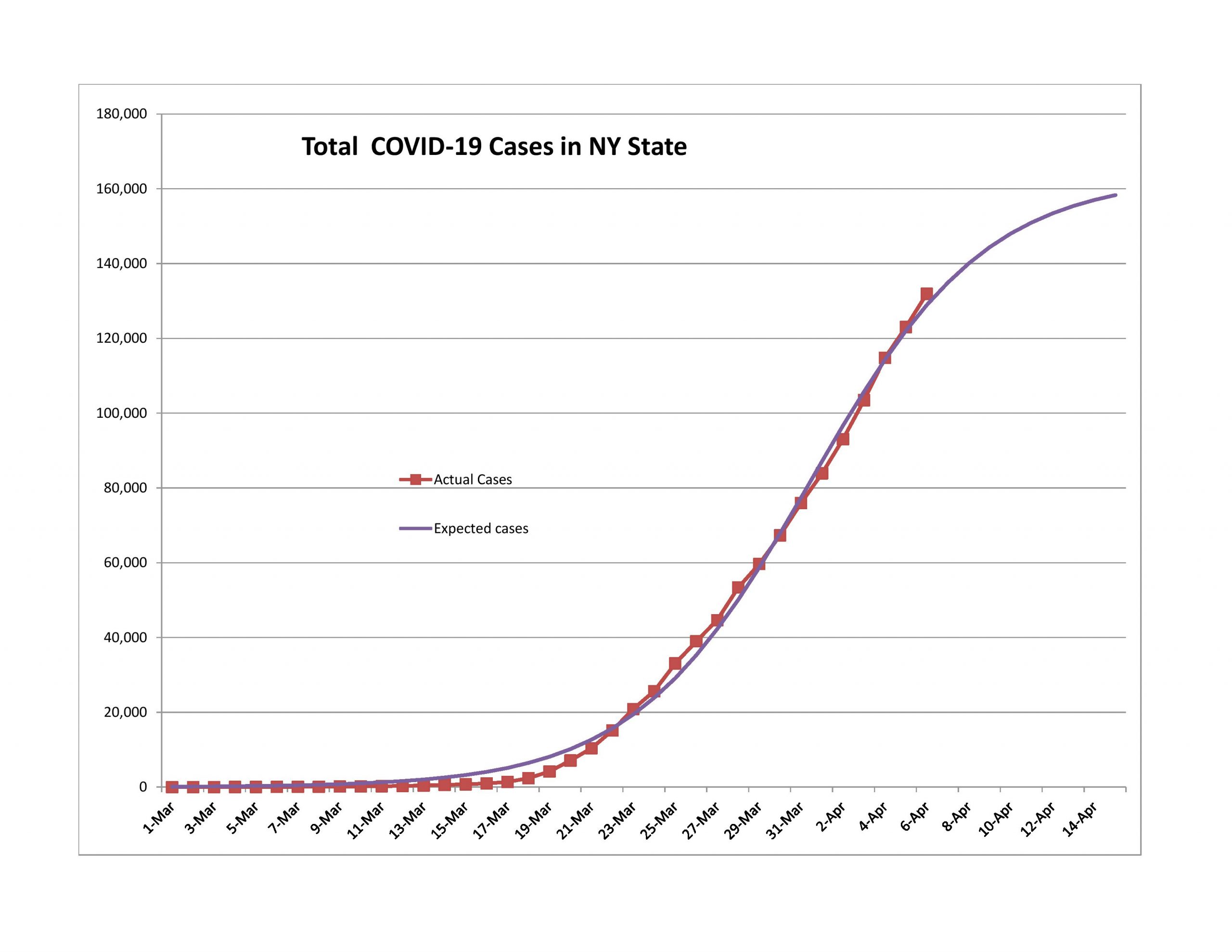
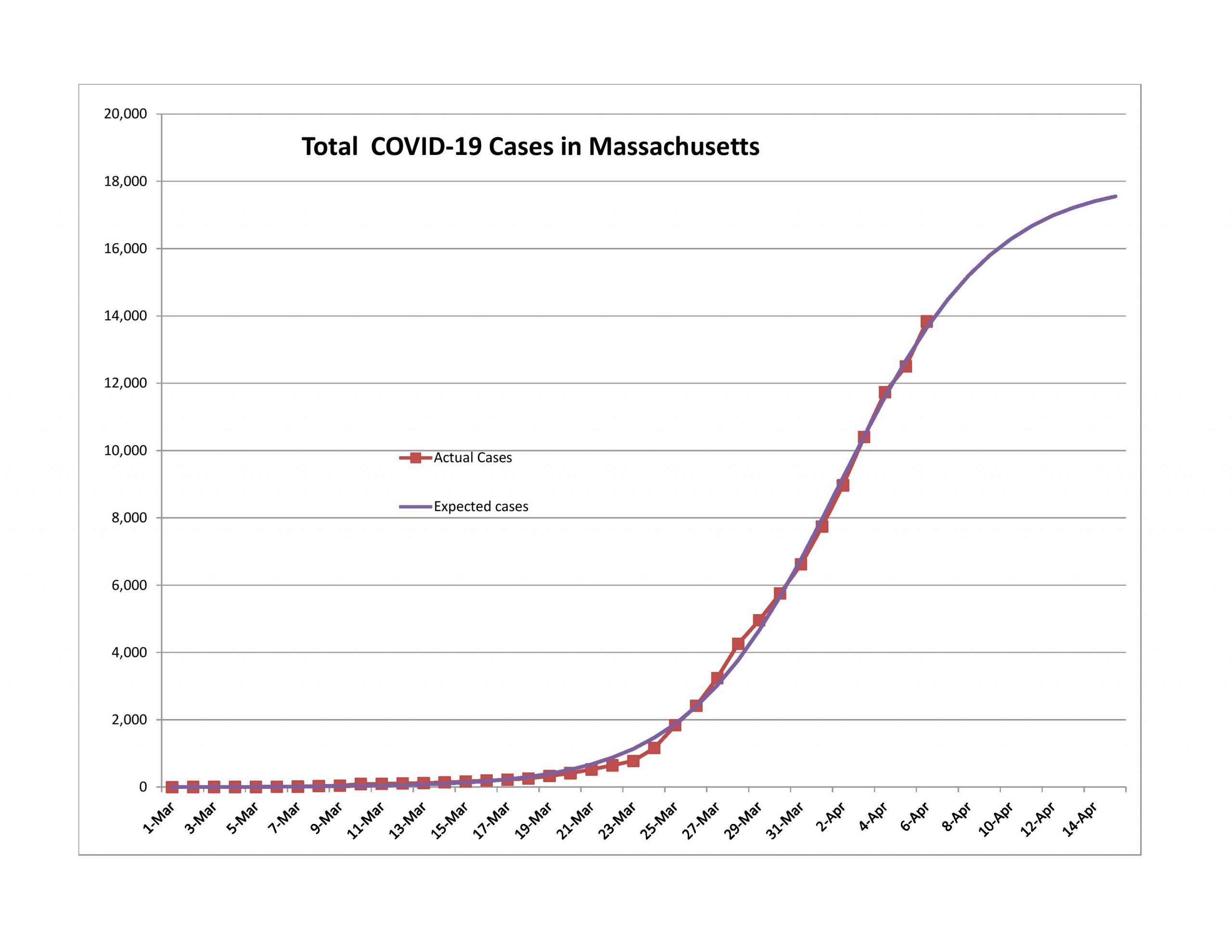
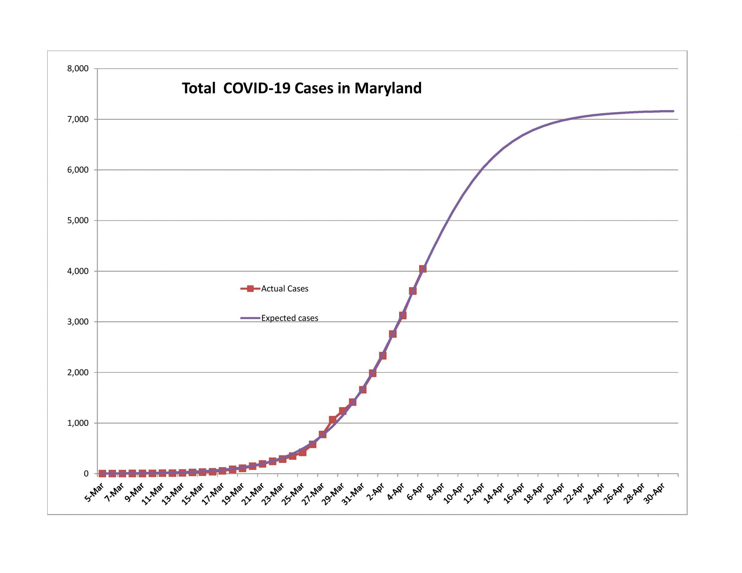
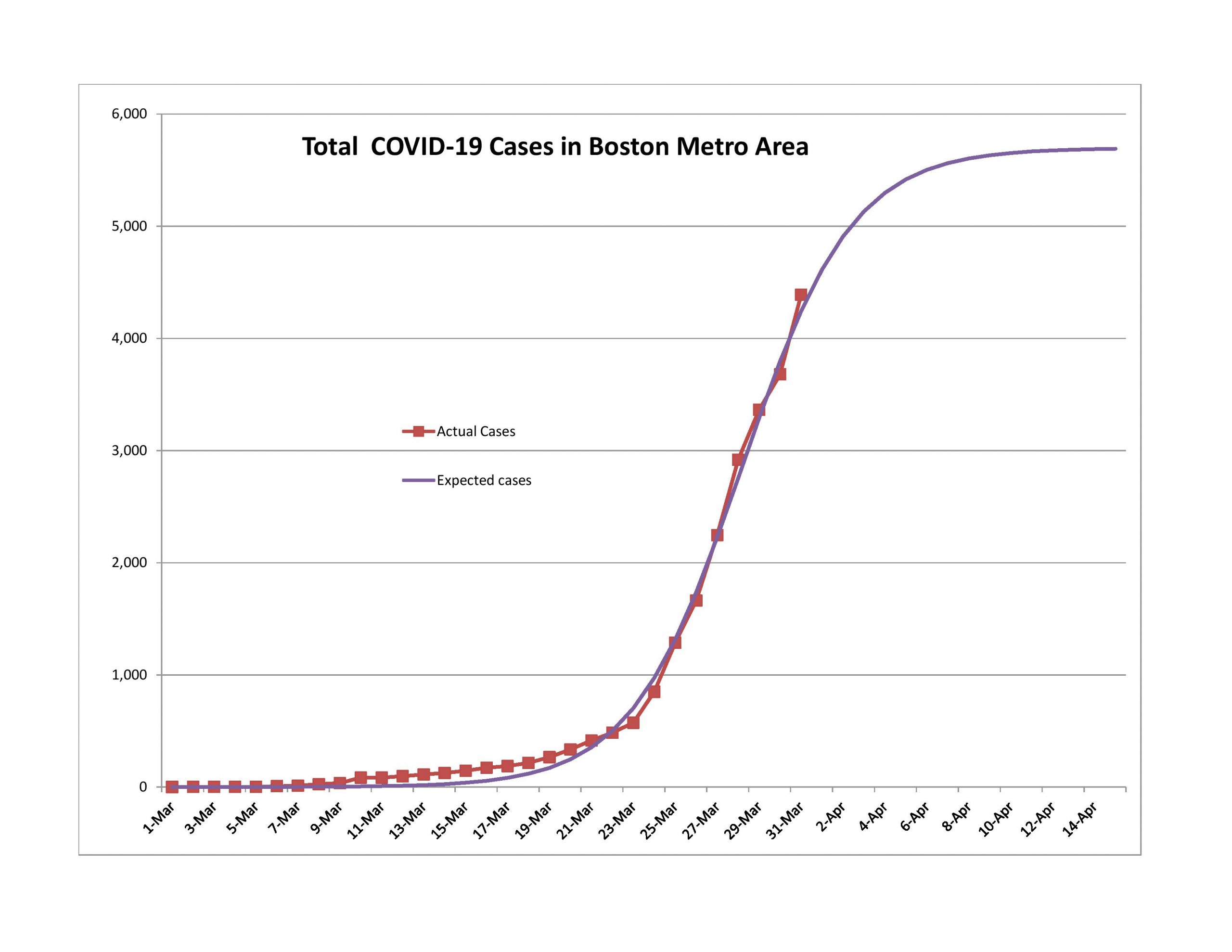
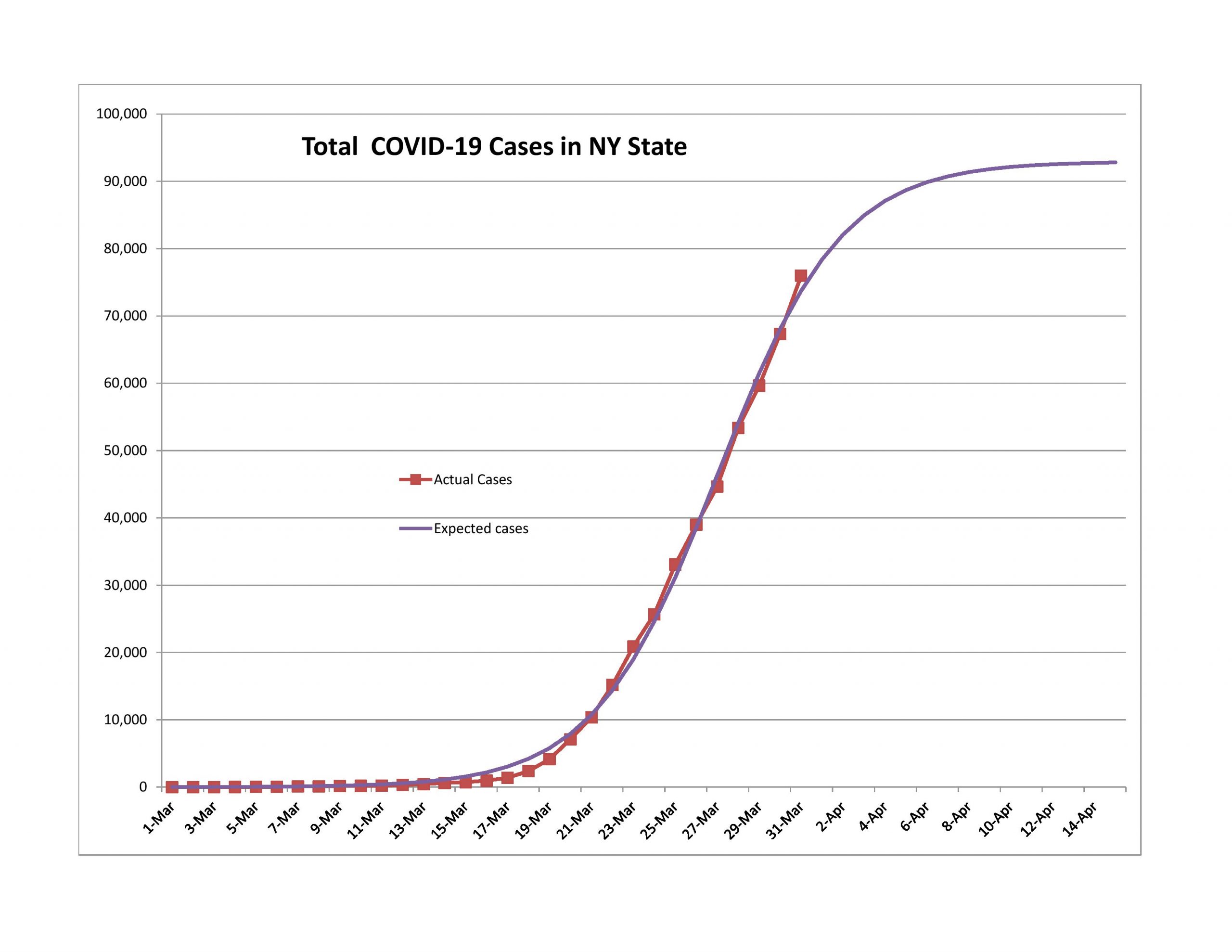
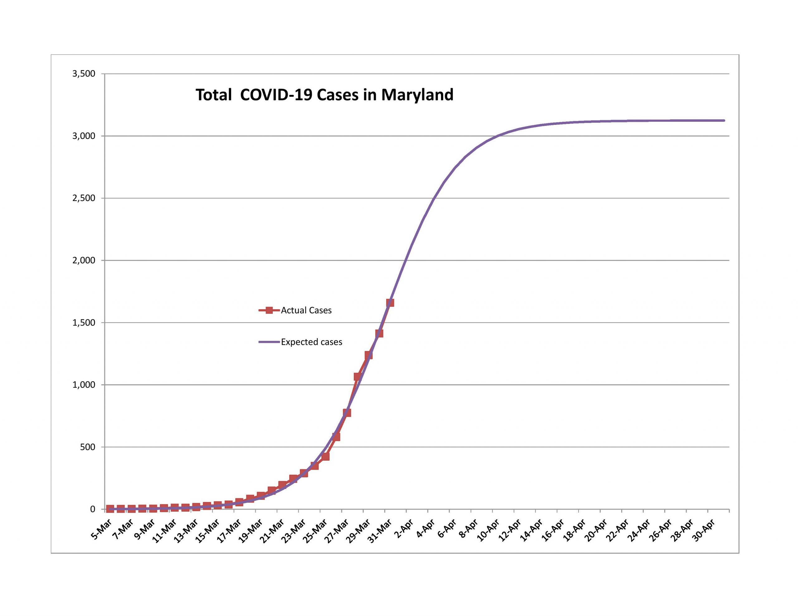
  • Three states: Maryland, Massachusetts, and New York. I’m modeling my home state, Maryland, Massachusetts for a friend, and New York because it has the most cases of any state.
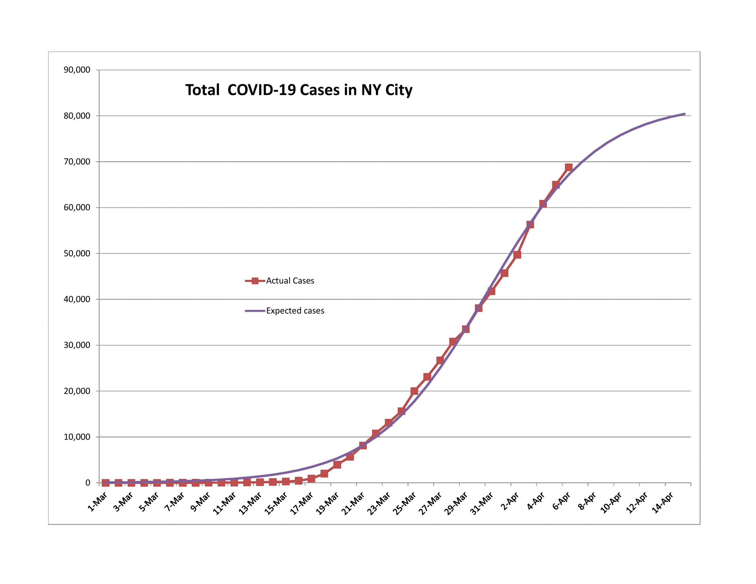
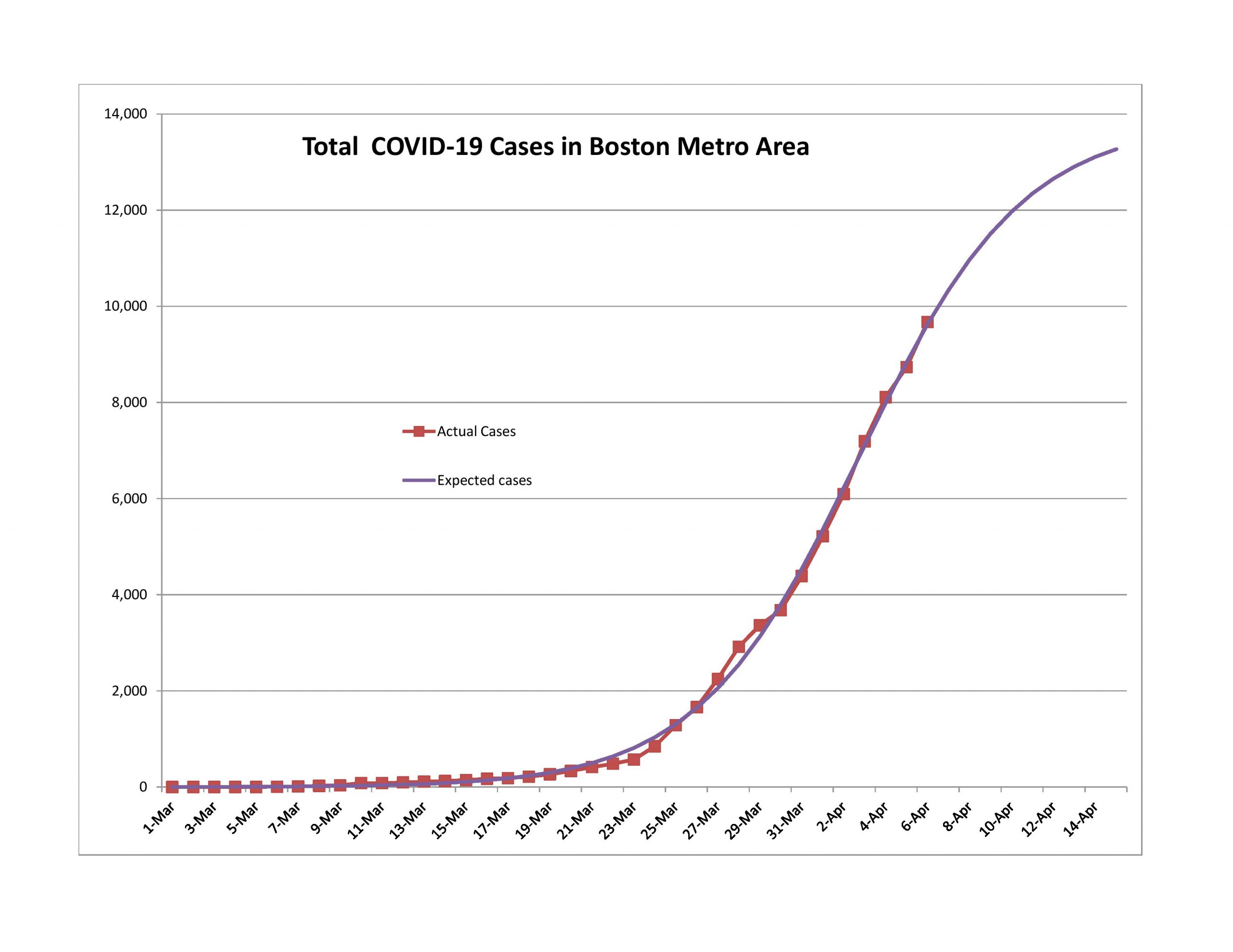
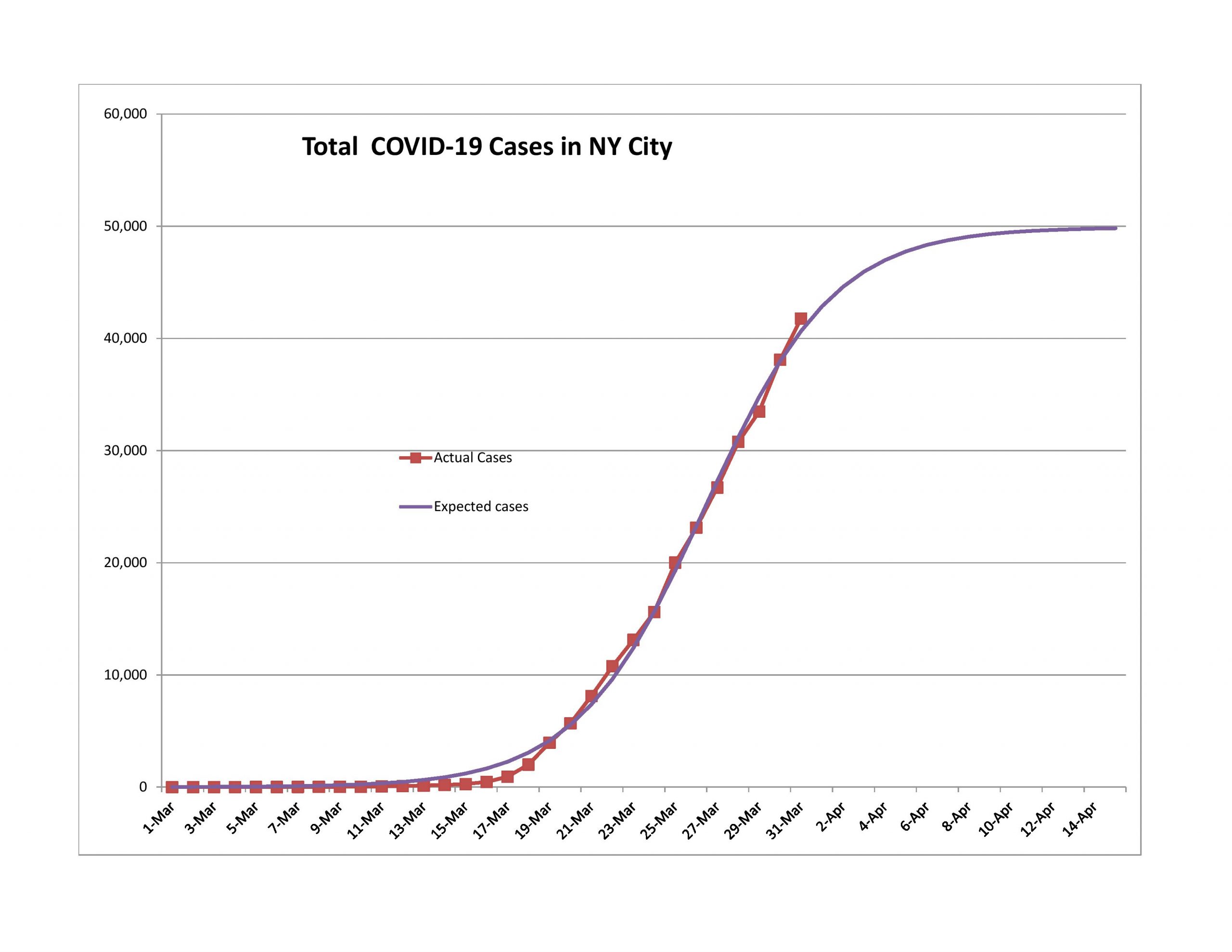
  • Two cities: New York City and the Boston Area, which is the five counties near Boston (Essex, Middlesex, Plymouth, Suffolk and Worcester). New York City, because it has the most cases of any city, and Boston, because of the aforementioned friend.

Data and Resources

Before I go on, I want to point out some useful sites for getting data and resources. If you think you have other useful resources, please post them in the comments.

Limitations of what I am Writing About

I am forecasting one variable in each geographic area — reported total claims as of a given date. I am forecasting this for several reasons.
  • It is relatively easy to do. If I tried to estimate medical resource usage or even deaths, I would need more data that I don’t have access to in order to do reasonable models in that area. (Now that said, a hidden assumption of the analyses is that there is some regularity to how cases get reported. If that changes, the models will be less accurate.)
  • Reported total claims is a leading indicator for other variables of interest. In addition to those mentioned in the first point, total reported claims is a leading indicator for the economy, lifting of government restrictions, and the financial markets.
  • It’s not as if there aren’t complexities that could mess with an analysis like this. When testing becomes common, you might see total cases go up a lot from all of the asymptomatic or low symptomatic people who are suddenly found and are no longer infected. That sort of shift would give the appearance of COVID-19 taking off, when we realize that that data belongs to the past, even though it is reported in the present.
  • No one wants to say it, but there are tradeoffs involved in having governments be too ham-fisted in their regulations. Those regulations are impoverishing a lot of people, and many of the restrictions are not needed in order to have the same level of societal safety.
  • There are also tradeoffs of life and money… and this is not new. Life is precious, no doubt, and money can often be replaced, but where does the money come from? Would it be right to be Robin Hood and push 100 unrelated people out of work in order to save a life? Perhaps it would be better ask for volunteers. It would be more ethical for the government to raise taxes, than to put on restrictions that harm the economy a lot, with few additional lives saved.

This is an economics, investing and finance blog. I focus on those matters. It’s not a healthcare blog. When I think of my average reader, that person is not thinking a lot about the problems from medical resource shortages, except perhaps the lack of ability to test for COVID-19. It’s different if you are in the medical profession or if you are sick. You would care a lot about these issues then, and my heart goes out to you, because you are having a challenging time with short resources.

As an aside, when you think of medical efforts in the US generally, with the emphasis on trying to manage costs, hospitals and inventories of supplies and equipment are light because in normal times, those were easy places to save money. Few would complain much (except closing rural hospitals) because there would be enough resources under 99%+ of all circumstances. This is fine, until you experience the low probability and high severity event. This is common to other disaster scenarios as well — there is often a complaint over lack of redundancy or robustness of some resource. (Not enough policemen, firefighters, ice, electricity, phone connectivity, emergency shelter, etc.)
I am not saying my analysis is the whole enchilada, but it is an important part of it. And with that, on to the graphs:
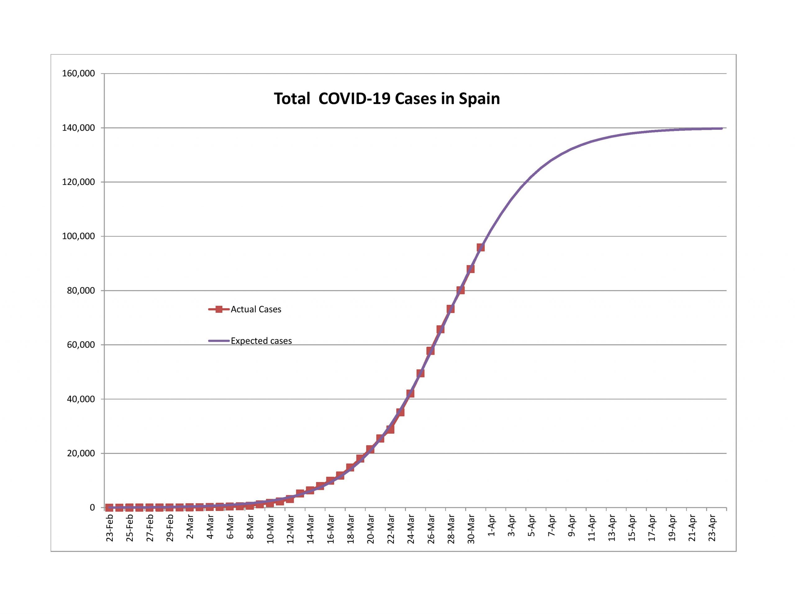
Past the First Wave, in the Second Wave

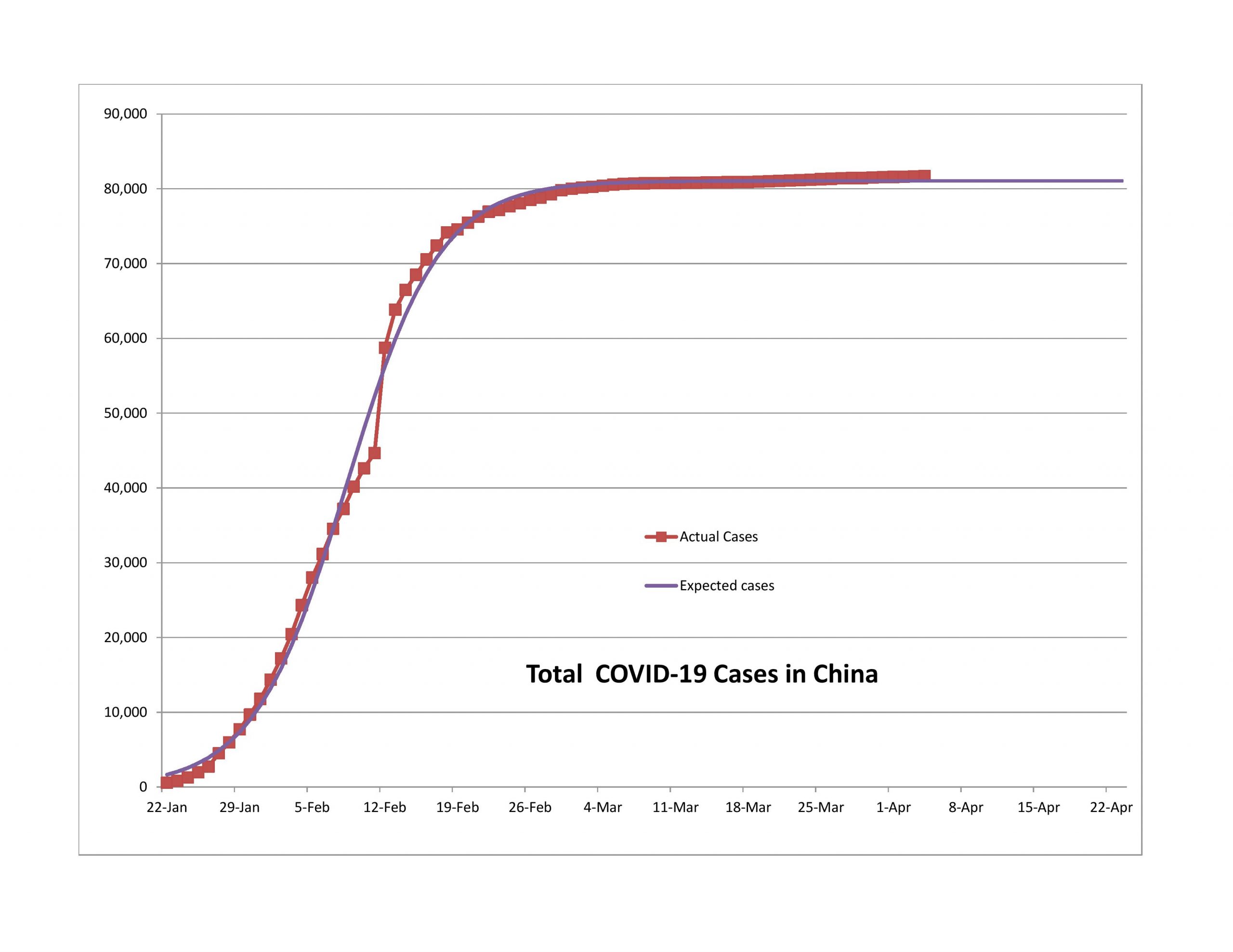
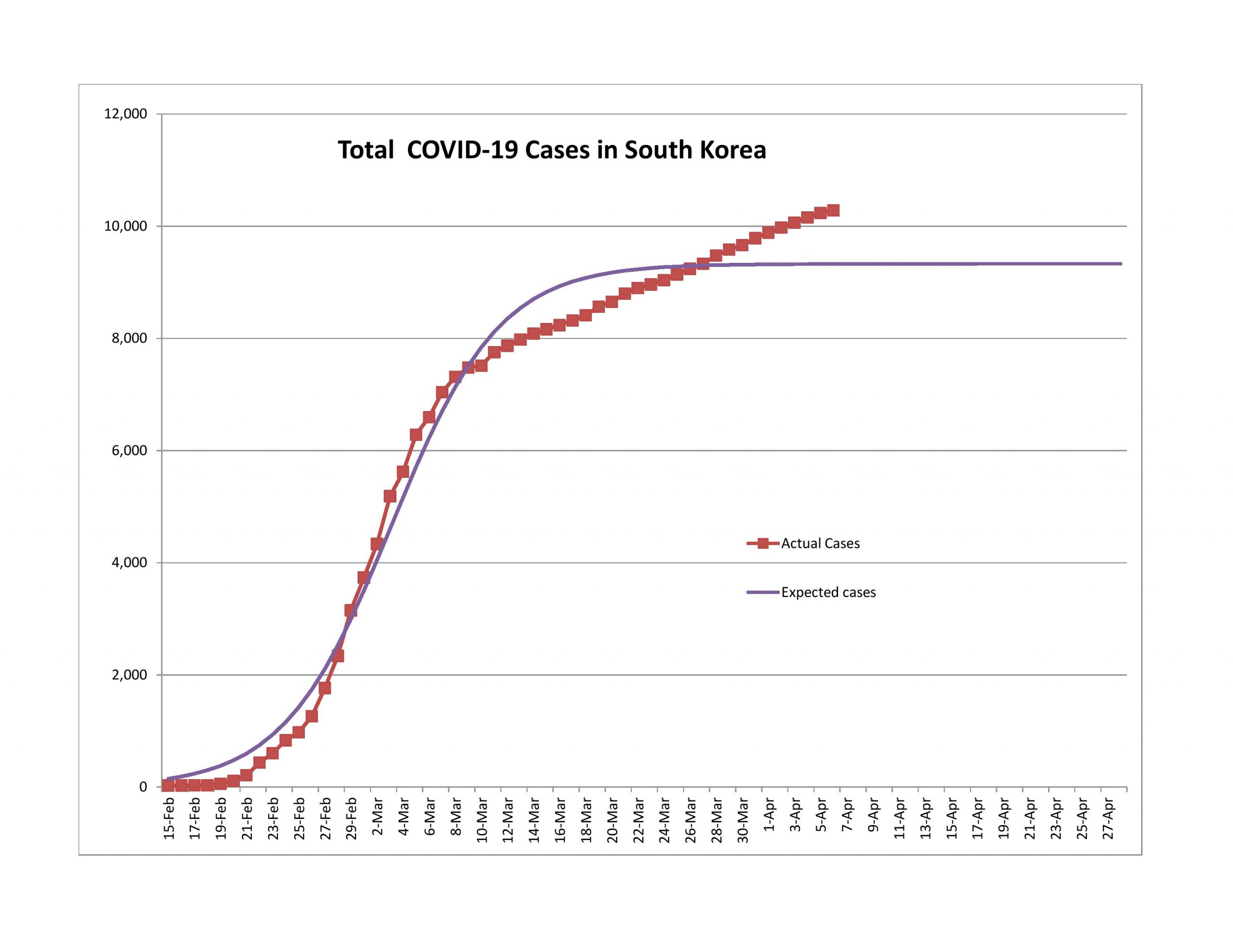
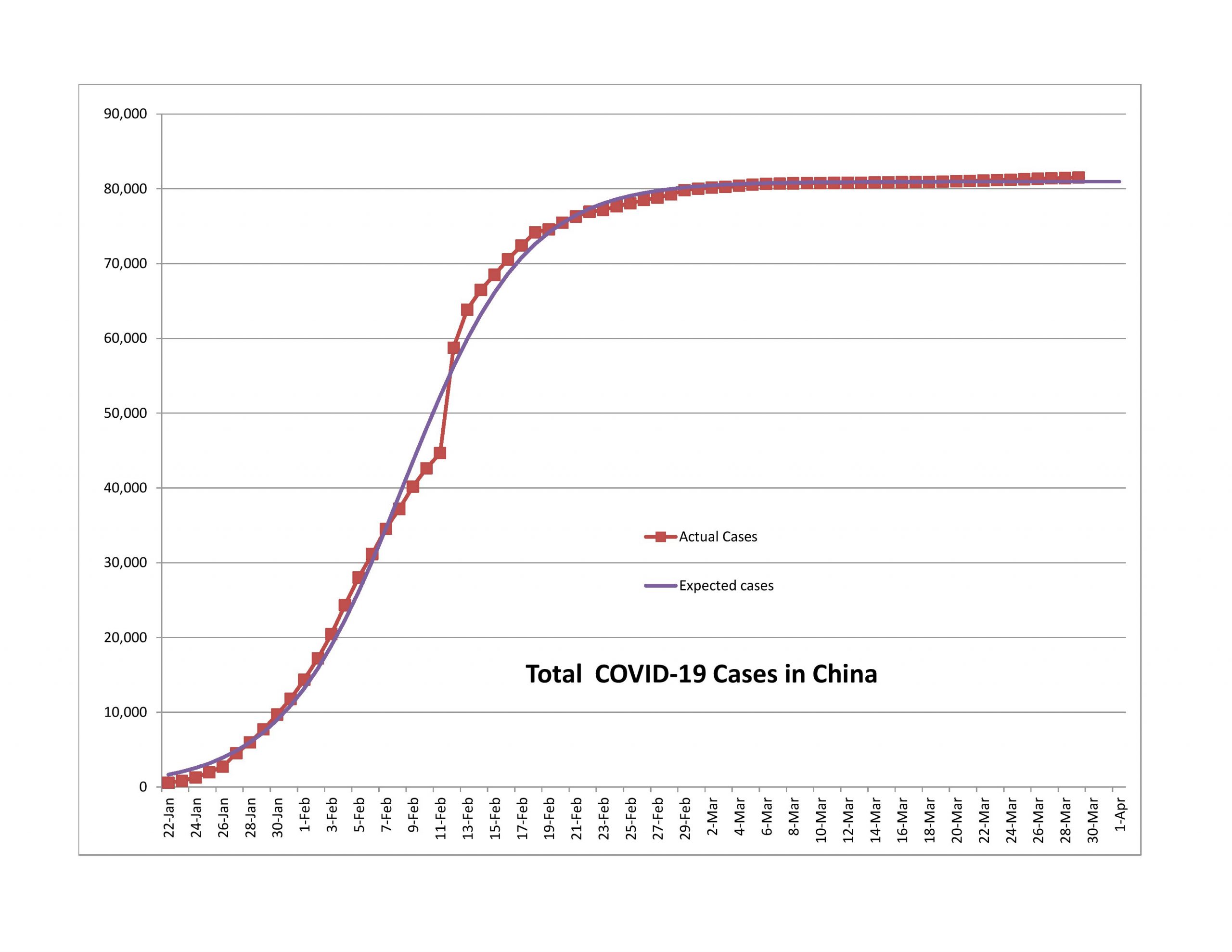
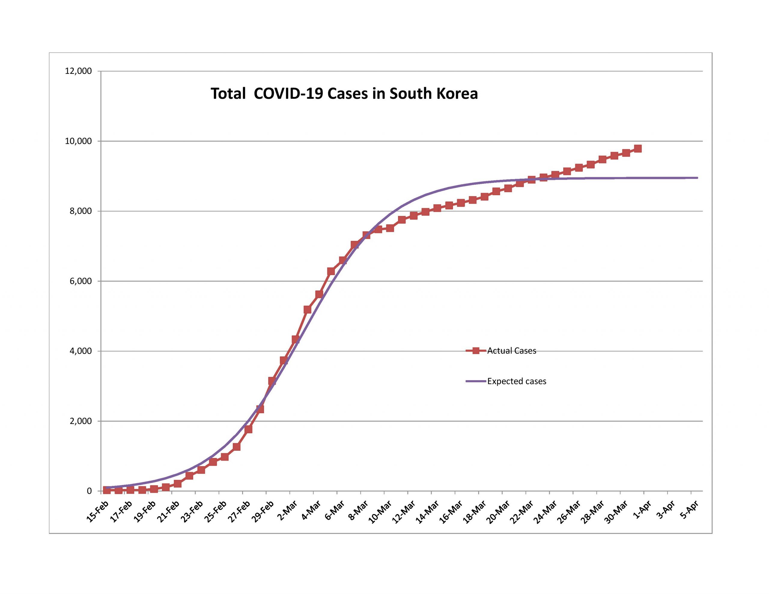
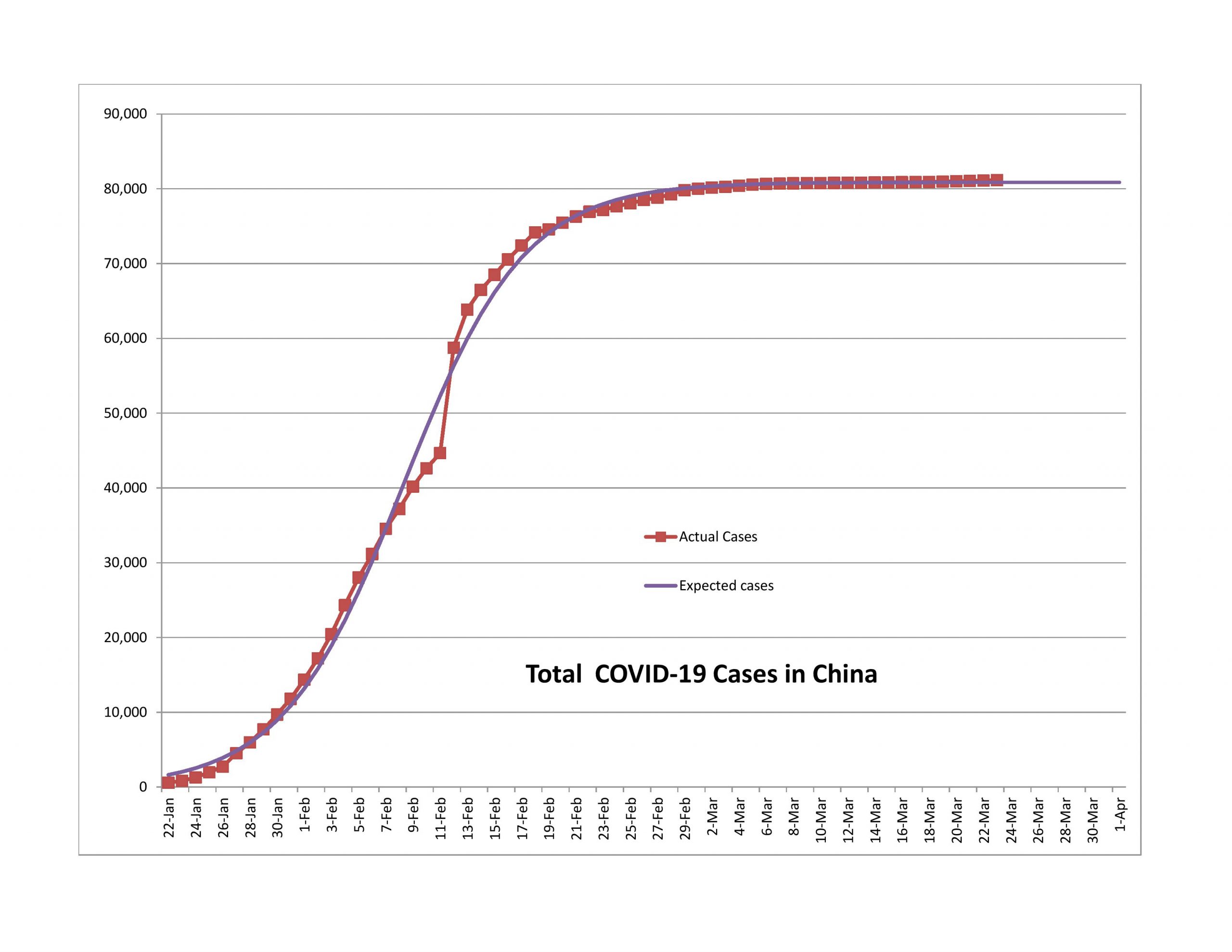
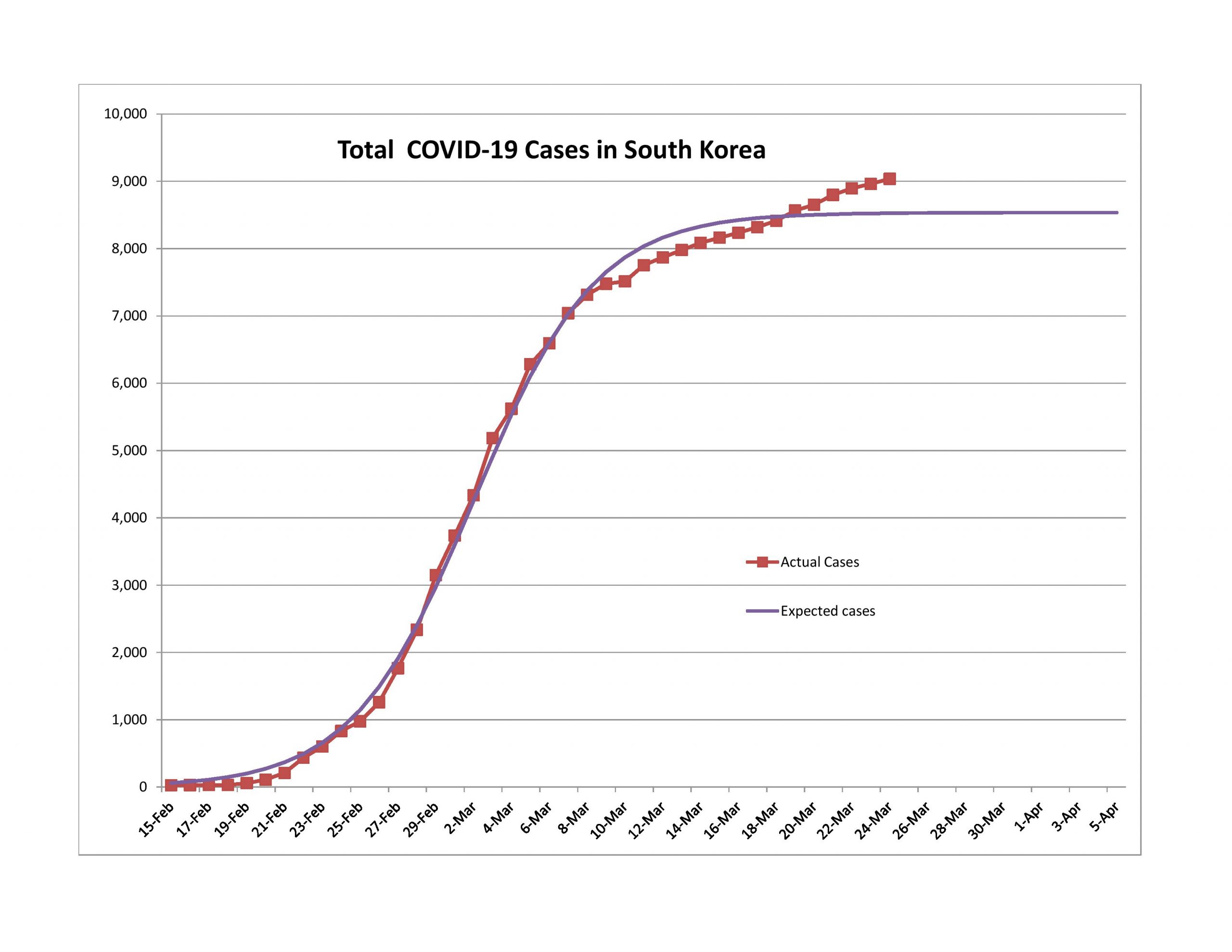
China has averaged 55 new cases of the past 10 days, and South Korea that figure is 99. The trend seems to be up, but with a lot of variability. I liken the second wave to what needs to be done after the main battle with a forest fire is done. You still have to put out some minor fires before they turn into something major. Eventually, like say in a month or two, most nations will be dealing with this.

Because of this situation, the models fit less and less well. I could add in a second logistic curve that starts where the first one ends… though it seems like overkill from a modeling standpoint. It wouldn’t be difficult to do.

Approaching the End of the First Wave

Austria, Switzerland and Italy are most likely past the 80% point. By that point reported new cases are declining quickly, and total cases are growing at around a 4% daily rate, and the growth rate is falling quickly.

As an aside, this is a good time to talk of how the media, and sometimes even policy makers who should know better, are practically innumerate in terms of the verbs that they use. They look at the raw increase in cases and say that they are soaring. It varies by geographic area, but the daily percentage growth in total cases and daily percentage growth in new cases is like this:

Percentage Completed Daily % Growth in Total Cases Daily % Growth in New Cases
0-10%18-35% nearly constant daily growth, but absolute numbers are low.Exceptionally high and erratic, 30-50%/day , but absolute numbers are low.
10-50%Rate of growth falls into the teens of percentages. If the starting percentage is lower in this interval, so will the ending percentage. Absolute numbers sound large, especially nearing the halfway mark.Rate of growth falls rapidly to zero by the end of this period
50-90%Rate of growth continues to fall to the low single digits of percentages, say 2-4%. Absolute numbers sound large but rapidly get smaller toward the end of this interval.Rate of growth is negative, and gets more negative as the interval gets to the 90% mark.
90-100%Growth is very low. Absolute numbers are low.Growth is negative and erratic. Absolute numbers are low.

It’s in the middle two zones where the absolute numbers are high that the rhetoric gets shrill. Compare that to me where at 8PM Eastern Time, I sit down and update my models and comment on how close they came to the modelled estimates. The absolute numbers of total cases, new cases, total deaths and new deaths make great headline fodder, but the real news should be looking at the percentage rates of growth of total cases and new cases. But I suspect that would be a tough thing to see change.

Middle of the Pack

Germany, the Netherlands, Spain, and the US are the next group. New cases are either rising at a low rate or declining. Growth in total cases is in the high single digits of percentage. These countries aren’t out of the woods yet, but are likely past the halfway point.

Some of these had high new case surprises over the last week, but on the whole showed improvement.

Bringing up the Rear

Each of these had significant upward surprises in terms of new cases reported. The growth rate of reported total cases is in the mid-to-high teens.

Too Early to Tell

I did not model Turkey in the last article. It has a really sharp takeoff and deceleration of growth that looks too good to be true. (The US is that way to a lesser extent.) I need more data before I can be definite about this.

Problem Child

Compared to last week, Iran has gone backward. New cases have been growing more rapidly, and the growth in total cases shows no sign of slowing. It will be interesting to see how this develops — it doesn’t fit the model well, unless….

Unless you think of it as several logistic curves in different areas that have taken off and leveled at different points in time. Now that said, from what little I have read, there seems to be a lot of disagreement in Iran over what to do. And to some degree, a populace that doesn’t trust the government much… so it’s not a recipe for constructive collective action.

States and Cities

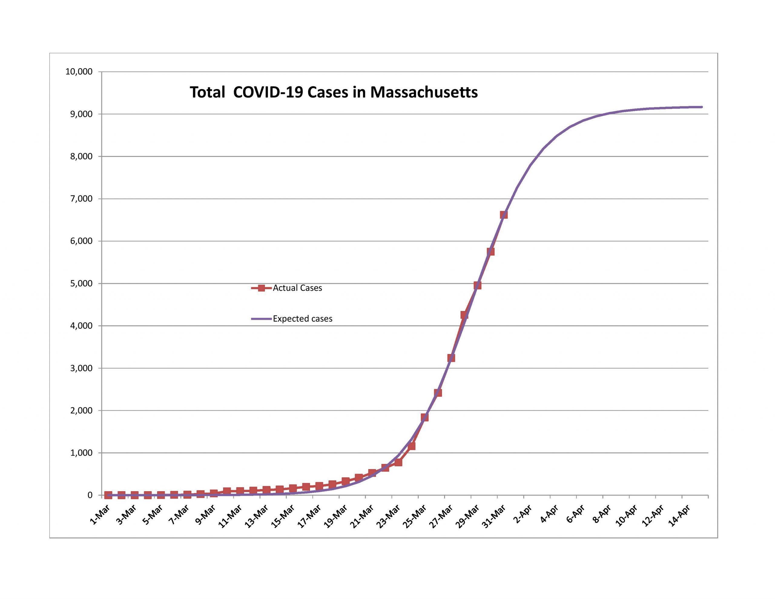
Massachusetts and Boston Area
New York State and New York CIty
Maryland

The logistic curves for smaller, more homogeneous areas tend to be shorter and sharper than those for broader areas. The data also tends to be more noisy, but that’s what the regression analysis is for — smoothing out the data in a theoretically consistent way, and allowing tracking to be done so that a policymaker could estimate if they are doing better or worse than expected. It would certainly calm some politicians down if they had an idea of how things are likely to develop, and if a deviation happened, they could try to explain why, allowing for the level of uncertainty in analyses like this.

And so at the end, can I offer a happy surprise to New Yorkers, both those in the city, and those that are upstate? There will still be problems for a while, but it really seems like you are getting to the end of the trail. In two weeks, you should be a lot happier. And the same will likely be true in Massachusetts and Boston, and in my adopted home state, Maryland.

But here’s the key question. How ready will the politicians and policymakers be to accept the good news? I fear they will not be happy with it at all, but will remain cautious in the wrong way too long. There is kill, and there is overkill. Kill is enough.

I would encourage the politicians to have us continue to do social distancing, but to reopen businesses, requiring them to follow certain sanitary and distancing procedures. Perhaps those who are infirm, or are over 60, 65, 70, or so should continue remain at home, or only go to necessary places a while longer.

There is a price to everyone staying home. There is a political price to politicians that maintain it too long. Better to modify policy such that it is a sniper rifle, and no longer a blunderbuss.

An Optimistic Assessment of COVID-19

PIcture credit: Aleph Blog, and the same for all the graphs and charts in this post. All liability for mistakes here is mine.

This post is different than any other I have done at Aleph Blog. I will try to write this in a nice way even though it is a strong and out-of-consensus opinion on a topic that many are edgy about.

I realize I might be wrong here, but I will present to you what I think, along with what I think are the limitations of my analysis. Part of my reason for writing this is that I think that most of the reporting on COVID-19 is subject to a bias common in our culture among politicians, lawyers, bureaucrats, and the media: an extreme bias toward safety because the costs of being wrong on the optimistic side are high than the rewards for being right. (Example: NOAA overpredicts disasters, and so do most hurricane forecasters.)

This post will be structured like this:

  • Summary of findings and recommendations
  • Limitations of the analysis
  • Breaking down the results by groups of countries
  • A discussion of the “Second Wave,” with policy recommendations
  • Closing comments
  • Appendix for math nerds

Summary of findings and recommendations

  • The First Wave of the crisis will pass more quickly than most expect. Most countries with a large number of COVID-19 cases will have 99% of their First Wave cases reported by mid-April.
  • Of the 13 countries with the most cases of COVID-19, the least of them has reported 41% of their likely First Wave cases. Of those same nations, none are expected to have more than 0.3% infected with COVID-19.
  • The real challenge will come in dealing with the Second Wave of the crisis. How do governments deal with a smallish number of new cases, and keep them from growing into a new epidemic?
  • In the Second Wave, governments should selectively tell some to stay home, while telling most people to get about their normal work.
  • Quarantine those who are sick with COVID-19 and those who have been with them, until they are tested and have a negative result. Continue to disallow international travel, or insist on a two week quarantine upon returning.
  • Let healthy people return to their work. All businesses are necessary businesses.
  • Avoid bizarre stimulus programs that are harmful in the long run. Tell the Fed that monetary policy can’t solve everything, and not to play favorites.

Limitations of the analysis

  • I am not a public health specialist. I am a statistician with a background in econometrics, which has its similarities with biometrics.
  • My analysis assumes that processes for finding new cases of COVID-19 are constant, or mostly so. That is not always true — an example is when China announced a large amount of new cases all at once.
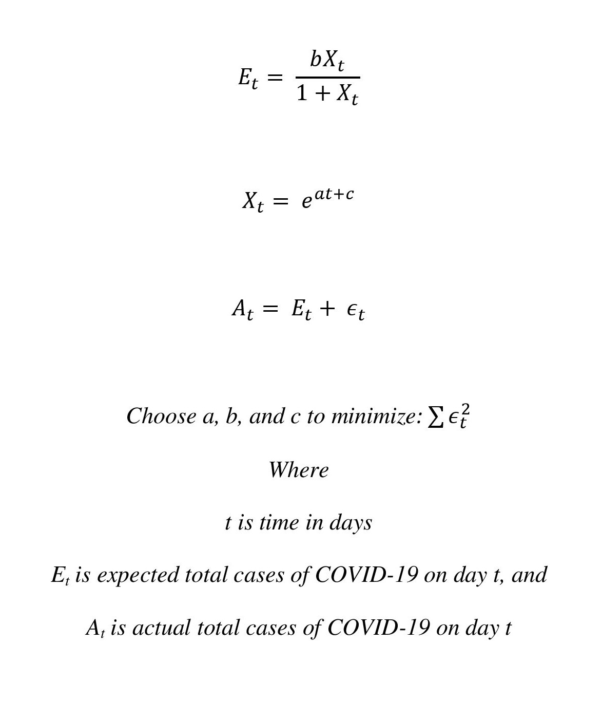
  • I use an inverse logistic curve for my analysis. All functional forms have their limitations, and for the nations analyzed as of this date, the minimum pseudo-R-squared is 79.4%, and the highest is 98.5%. That said, this is a common functional form for epidemics.
  • The model assumes that there is one wave. That will not prove to be true, as can be seen from China and South Korea.
  • All sorts of things can go wrong that are not in the data now — mutations, civil disobedience, large bureaucratic errors, large policy errors, etc.

Analysis By Group

Those that are though the First Wave

We have two in this group: South Korea and China. I don’t trust China’s data. In each case, though, you have the First Wave go through their nation and burn out, followed by an excess number of new cases where the public health authorities may not be catching up with what could be the Second Wave. I’ll talk more about the Second wave below.

The unusual case of Iran

Really, I don’t know what is going on in Iran on COVID-19 but it looks like the initial new cases started to slow down, and then they let up on restrictions too soon. New cases hit a new high yesterday, which doesn’t fit the paradigm of a consistent response the the crisis. COVID-19 seem to be out of control in Iran.

Those that are close to done

Italy and Germany are past the halfway mark in the epidemic, and are having lower new cases on average daily.

In general, the policy responses of a nation influence the amount of the population subject to infection, and the ability of the infected to interact with the broader society.

The rest

These are the nations that have not certainly passed the 50% mark as of today as I estimate the infection. As I have watched this develop over the last week, the most difficult aspect of estimation comes when you are near the halfway point. Small changes in actual new cases make a big difference in estimated new cases. An example is the United States, who has had significantly lower new cases than expected for a preponderance of the last week. The US got off to a slow start in its reaction to the crisis, but seemingly has caught up and then some.

WIth these countries, the odds of being wrong is the highest. Thus all conclusions with them must be considered tentative. But with so many of them following nearly the same pattern, despite very different responses to the crisis, gives more certainty to this analysis.

A discussion of the “Second Wave,” with policy recommendations

When you look at the data of CHina and South Korea, you see how the epidemic went through the s-curve, and then has persistently high new cases thereafter. I call this the “Second Wave.” Iran seems to be a case where their society inadequately stops transmission, and so instead of following an s-curve of an exponential, it seems to keep increasing in a way that is almost quadratic — slow but steady.

This will be the grand problem for most countries. How do you eradicate the virus after you have had large success in interrupting its transmission? Looking at the relative success of South Korea in the First Wave I would say that you do the following:

  • Test and quarantine aggressively.
  • Of those who test positive for COVID-19, quarantine all of their contacts, and test them. Continue quarantine for those who test positive, and quarantine/test their contacts as well. Repeat as needed.
  • But don’t quarantine everyone. Let those who are healthy work. Encourage those who are old or have compromised immune systems to stay home for the duration of the crisis, and give some assistance to them.
  • Don’t assist all of society because that is way too expensive and not needed — get them back to work. Don’t give into the idea of denying people work and then offering meager assistance. It is an inferior idea for those who are healthy.
  • This applies to the actions of the Federal Reserve as well — don’t harm the value of capital by artificially creating more capital that has no earnings capacity.

Closing comments

This analysis shows the the slowest of the nations written about here is passing the middle of the crisis quite rapidly, and the practical end of the crisis is in mid-April, when 99% of all First Wave new cases will have been realized. The real challenge will come in dealing with the cases after that, which will be sporadic and localized. How do we keep that from becoming a semi-permanent bother to the world, because the cost of putting life on hold is high, as is the cost of losing lives.

Quarantining and testing aggressively is the best solution, together with letting the healthy work. This should be the guiding star for all policymakers, because we need to strike the right balance between breaking the social connections that lead to disease transmission, and allowing people to labor to support themselves. We are not trying to save the financial markets; we are trying to protect people who work.

Appendix for math nerds

The above was how I structured my analysis. It followed a logistic curve, which has the following benefit: infections begin exponentially, but get retarded by two factors: one is that even if people do almost nothing as in 1918, the uninfected population shrinks, which blunts further growth. Second, people act to blunt further growth. They separate themselves from each other, and particularly those who are infected. This is is akin to removing fuel from the fire.

The logistic curve has a number of advantages for estimation. It notices the slowing down of the percentage growth in total cases, while media and politicians continue to panic.

Remember that that the media and politicians selfishly like to maximize their influence, and try to create panics — it is good for them to maximize fear. The same is true for many in public health. Truly, we should spend more on public health, but it is one of those things that governments naturally neglect… because they are short-sighted, and will not spend money on something the lowers risk, but does not bring any present good. (Note to Christians: in the Old Testament public health was a function of their government via the priests. It should be a normal function of government to deal with contagion.)

Final note: I did not write this with Donald Trump in mind. I did not vote for him and will not vote for him. That said, he is on the right track when he says the cure should not be worse than the disease.

It is foolish to warp monetary policy and fiscal policy when healthy people are perfectly capable of working. Don’t destroy ordinary incentives and rack up tons of debt by keeping people idle. Test, quarantine, test, quarantine, etc. , but leave the main body of society alone, particularly for a virus that does not harm the healthy working population much.

To that end, I ask that Republicans be real Republicans, and not expand the deficit further. I ask that the Federal Reserve stop trying to be God, and be content with merely having a currency with a consistent value.

Government is best when it is small. We are not facing the Black Death, nor the Spanish Flu. We will get through this, God willing. We don’t need to panic.

Estimating Future Stock Returns, December 2019 Update

Graphic Credit: Aleph Blog, natch… same for the rest of the graphs here. Data is from the Federal Reserve and Jeremy Siegel

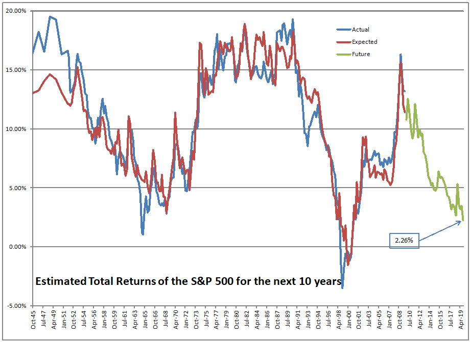
Here’s my once a quarter update. If you owned the S&P 500 at the end of 2019, it was priced to give you a return of 2.26%/year over the next 10 years. That said, the market has changed a lot in the last 2.6 months –as of the close of business on March 18th the market was priced to give you a return of 7.28%/year over the next 10 years. Finally, you have a chance to double your money over the next ten years, while a 10-year Treasury would give you 1.5%/year over the same horizon. To match the expected returns on stocks at this point in bonds, you would have to invest in junk debt, but junk typically doesn’t go longer than 10 years, and who knows what the defaults will be over the next two years?

Now, actual returns from similar levels have varied quite a bit in the past, so don’t take the 7.28%/year as a guarantee. WIth a 2%/year dividend yield, price returns have ranged from -0.95%/year to 6.89%/year, with most scenarios being near the high end.

At the end of 2019, valuations were higher than any other time in the past 75 years, excluding late 1964, and the dot-com bubble. It is not surprising there was a bear market coming. Because “there was no alternative” to stocks, though, it took an odd external event or two (COVID-19, oil price war) to kick bullish investors into bear mode. This was not a supply and demand issue in the primary markets. This was a shift in estimates of investors regarding the short-term effects of the two problems extended to a much longer time horizon.

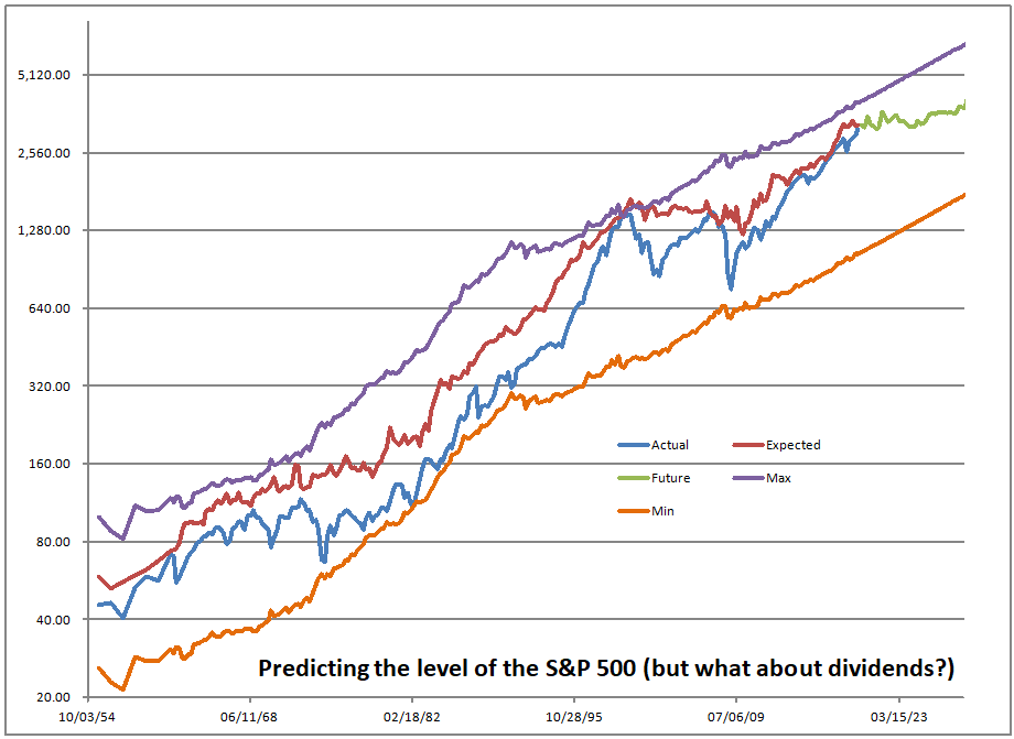
Two more graphs, and then some commentary on portfolio management. First, the graph on the channel the market travels in, subject to normal conditions:

This graph shows how the model estimates the price level of the S&P 500. It is most accurate at the present, because the model works off of total returns, not just the price level. The gap between the red and blue lines is mostly the effect of the present value of future dividends, which are reflected in the red line and not the blue.

The maximum and minimum lines have hindsight bias baked into them, but it gives you a visual idea of how high the market was at any given point in time — note the logarithmic scale though. If you are in the middle using linear distance, you are a little closer to the bottom than the top.

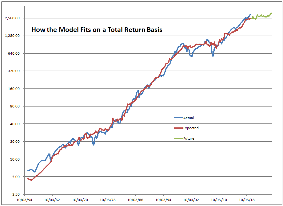
And finally, that’s how well the model fits on a total return basis. Aside from the early years, it’s pretty tight. The regression explains more than 88% of the total variation in returns.

Implications for Asset Allocation

If you haven’t read it, take a look at my article from yesterday. I am usually pretty disciplined about rebalancing, but this bear market I waited a while, and created two schedules for my stock and balanced fund products to adjust my cash and bond versus stock levels. I decided that I would bring my cash levels to normal if the market is priced to give its historical return, i.e. 9.5%/year over the next ten years. That would be around 2100 on the S&P 500. Then I would go to maximum stock when the market is offering a 16%/year return, which is around 1300 on the S&P 500.

The trouble is this is psychologically tough to do when the market is falling rapidly. I am doing it, but when I rebalance at the end of the day I sometimes wonder if I am throwing my money into the void. Remember, I am the largest investor in my strategies, and if my ideas don’t work, I will lose clients, so this is not an idle matter for me. I’m doing my best, though my call on the market was better during the first decade of the 2000s, not the second decade.

In the process, I bought back RGA at prices at which I love to have it, and have been reinvesting in many of the companies I own at some really nice levels… but for now, things keep going down. That’s the challenge.

In summary, we have better levels to invest at today. Stocks offer better returns, but aren’t screaming cheap. Some stocks look dirt cheap. Most people are scared at the speed of the recent fall. I view my job as always doing my best for clients, and that means buying as the market falls. I will keep doing that, but I have already lost a few clients as a result of doing that, even though I tell them in advance that I will do that. So, I will soldier on and do my best.

Full disclosure: long RGA for clients and me

The S-Curve, Once More, with Feeling

Photo Credit: Lars Plougmann || Indeed, this seems like a race, and the S-Curve is a major challenge to drive through

This will be brief, because I am still working on it, but it is my weak conviction that as far as the markets are concerned, the COVID crisis will largely be over by next Friday. How certain am I? Not very — I give it a probability value of around 30%.

If my thesis is correct, reported new cases of COVID-19 in the US will peak by Friday of this week, and will be 90% complete by next Friday. I will be watching how many new cases are reported. New cases tend to peak when total cases increase at a mid-teens percentage rate over the prior day. Because reporting is noisy, you don’t see that so easily, but the inverse logistic curves I am estimating are consistent on that figure for all the countries I have modeled so far.

I’ve run models for South Korea and Italy as well, and I’ll run them for a few more countries tomorrow. They are all pretty consistent with each other. Italy’s new cases should peak tomorrow, if they haven’t already.

I know everything is dark and gloomy now. Even if my modeling is wrong, which is a significant likelihood (I am extrapolating), I find it difficult to believe that we will still be in crisis mode by tax day.

So, cheer up. The number of COVID-19 cases is unlikely to be overwhelming, and we are all likely to survive this. The markets will revive, though maybe not energy stocks for six months. Those are a separate issue.

And if new cases track my estimates, I will put more money into the market. That’s all for now.

Limits

Photo Credit: David Lofink || Most things in life have limits, the challenge is knowing where they are

I was at a conference a month ago, and I found myself disagreeing with a presenter who worked for a second tier ETF provider. The topic was something like “Ten trends in asset management for the next ten years.” The thought that ran through my mind was “Every existing trendy idea will continue. These ideas never run into resistance or capacity limits. If some is good, more is better. Typical linear thinking.”

Most permanent trends follow a logistic curve. Some people call it an S-curve. As a trend progresses, there are more people who see the trend, but fewer new people to hop onto the trend. It looks like exponential growth initially, but stops because as Alexander the Great said, “There are no more worlds left to conquer.”

Even then, not every trend goes as far as promoters would think, and sometimes trends reverse. Not everyone cares for a given investment idea, product or service. Some give it up after they have tried it.

These are reasons why I wrote the Problems with Constant Compound Interest series. No tree grows to the sky. Time and chance happen to all men. Thousand year floods happen every 50 years or so, and in clumps. We know a lot less than we think we do when it comes to quantitative finance. Without a doubt, the math is correct — trouble is, it applies to a world a lot more boring than this one.

I have said that the ES portion of ESG is a fad. Yet, it has seemingly been well-accepted, and has supposedly provided excess returns. Some of the historical returns may just be backtest bias. But the realized returns could stem from the voting machine aspect of the market. Those getting there first following ESG analyses pushed up prices. The weighing machine comes later, and if the cash flow yields are insufficient, the excess returns will vaporize.

In this environment, I see three very potent limits that affect the markets. The first one is negative interest rates. There is no good evidence that negative interest rates stimulate economic growth. Ask those in nations with negative interest rates how much it has helped their stock markets. Negative interest rates help the most creditworthy (who don’t borrow much), and governments (which are known for reducing the marginal productivity of capital).

It is more likely that negative rates lead people to save more because they won’t earn anything on their money — ergo, saving acts in an ancient mold — it’s just storage, as I said on my piece On Negative Interest Rates.

Negative interest rates are a good example of what happens you ignore limits — it doesn’t lead to prosperity. It inhibits capital formation.

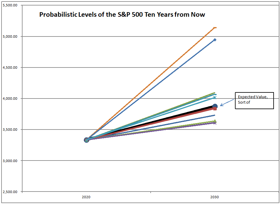
Another limit is that stock prices have a harder time climbing as they draw closer to the boundary where they discount zero returns for the next ten years. That level for the S&P 500 is around 3840 at present. To match the all time low for future returns, that level would be 4250 at present.

Here’s another few limits to consider. We have a record amount of debt rated BBB. We also have a record amount of debt rated below BBB. Nonfinancial corporations have been the biggest borrowers as far as private entities go since the financial crisis. In 2008, nonfinancial corporations were one of the few areas of strength that the bond markets had.

One rule of thumb that bond managers use if they are unconstrained is that the area of the bond market that will have the worst returns is the one that has grown the most during the most recent bull part of the cycle. To the extent that it is possible, I think it is wise to upgrade corporate creditworthiness now… and that applies to bonds AND stocks.

Of course, the other place where the debt has grown is governments. The financial crisis led them to substitute public for private debt in an effort to stimulate their economies. The question that I wonder about, and still do not have a good answer for is what will happen in a fiat money world to overleveraged governments.

Everything depends on the policies that they pursue. Will the deflate — favoring the rich, or inflate, favoring the poor? No one knows for sure, though the odds should favor the rich over the poor. There is the unfounded bias that the Fed botched it in the Great Depression, but that is the bias of the poor versus the rich. The rich want to see the debt claims honored, and don’t care what happens to anyone else. The Fed did what the rich wanted in the Great Depression. Should you expect anything different now? I don’t.

As such, the limits of government stimulus are becoming evident. The economic recovery since the financial crisis is long and shallow. The rich benefit a lot, and wages hardly rise. Additional debt does not benefit the economy much at all. We should be skeptical of politicians who want to borrow more, which means all of them.

One of the greatest limits that exists is that of defined benefit pension plans vainly trying to outperform the rate that their risky assets are expected to earn. They are way above the level expected for the next ten years, which is less than 3%. Watch the crisis unfold over the next 15 years.

Finally, consider the continued speculation that shorts equity volatility. You would think that after the disaster that happened in 2018 that shorting volatility would have been abandoned, but no. The short volatility trade is back, bigger and badder than ever. Watch out for when it blows up.

Summary

Be ready for the market decline when it comes. It may begin with a blowout with equity volatility, but continue with a retreat from risky stocks that offer low prospective returns.

No es ESG

Picture Credit: David Merkel || E & S are hollow, G is solid

There are fads in investing. They eventually go away. Remember ARM funds? The Americus Trusts? (Neat idea, killed by a legal change). The nifty fifty? Hot industries that produce a lot of IPOs?

I also think cryptocurrencies are a fad, and also factor and volatility investing, at least in terms of the ETFs that are offered to retail investors.

And, I think ESG is a fad, at least in terms of the way it is being deployed today. My main point is that E (environmental) & S (social) are mostly subjective, and not related to investment returns or risk control. G (governance) is mostly objective and related to investment returns and risk control.

Now some will say “But wait, there are all these journal articles showing that ESG produces better volatility-adjusted returns.” Quantitative finance has a laundry list of problems:

  • We have only one world, one history, one data set. We’ve gone over the data set numerous times, knowing its proclivities. It’s not hard to tease “alpha” out in a study, but it is difficult to realize alpha in real life.
  • Researchers often take multiple passes over the data set as they do their analyses. Only the ones with results supporting the expected conclusions get a paper published.
  • Neutral observers don’t exist — their pay and social standing get determined by producing a series of statistically significant results, regardless of whether they tortured the data to get there or not. (Aside: when I read some of the macroeconomic crud out of the Federal Reserve, and I see the abstruse technique employed to get a result, I know the data has been tortured, and of course the model does not predict well.)
  • And more — you can read this for the rest of the problems. I don’t think I even get all of the issues with academic-style research in that article.

As such, I don’t trust the research on ESG. The limited history that we have for general inquiries is even shorter for ESG analyses. The likelihood of picking up spurious correlation is high. As such, unless I have a good mental model for how environmental or social issues affect long-term growth in value, I can’t use them as a fiduciary. I have those mental models for governance, so I use them — just not the same way as some of the quantitative governance models do.

Governance issues are perennial; they are not a fad. The agency problem, where corporate managements pursue goals that are in their interests, but not in the interests of shareholders never goes away. It can be reduced by a variety of measures, like splitting the CEO and Chairman positions. removing management influence over the audit and compensation committees, end things like that.

That said, there are exceptions to the rules, and certain strong managers running companies with highly focused and ethical cultures might be allowed more running room. Berkshire Hathaway doesn’t fit most of the rules, and in general it has done well. One size fits most, but not all.

It’s similar to the way I view management use of free cash flow. With a talented and honest management team, I want the management to have the freedom to retain all of the cash flow for growth if they see the opportunities. But most managements aren’t that good, and they should pay a dividend. Buybacks should only be done when the stock is notably cheap compared to the private market value of the firm, and the balance sheet remains solid.

That’s why I think many simple governance scores are mistaken. You have to take a look at the management team and culture in order to do a broader evaluation of the governance. I for one a comfortable buying stakes in a company where there is a control investor if the control investor is known for treating the outside passive minority investors fairly, and does not scrape too much off the top.

I expect companies that I own to follow the laws of the countries that they work in, and engage in ethical behavior. My rule is simple: if a company tries to cheat one set of stakeholders, the odds are higher that they will cheat shareholders at some point. Most of my significant losses have stemmed from some sort of fraud issue… this is etched in my mind.

But many of the details of environmental and social factors seem utterly tangential to me — I don’t see how they drive value. Let the government press its claims on corporations to avoid discrimination and limit pollution. That is the proper locus for these issues, particularly if you are a fiduciary. What is in the best financial interests of your clients should be your guiding principle.

Note as well that the implementation of E, S, and G are nowhere near standardized. G is probably the closest. (This also applies to factor investing as well, which is constantly engaging in new specification searches sharpening their statistical analyses.) Even if I wanted to do E & S, how would I know that I have the right figures? How would I know that they weren’t a product of backtest biases?

Also, as Matt Levine points out, many applications of ESG don’t make a lot of sense, even if these were desirable goals. As such, I look at many of the ESG products being put out there are marketing fads to take the attention of retail away from earning returns… after all, it is tough to beat the market, and ESG will give you many ways to have have a built-in excuse.

Do I know that I am in a minority for my views here? Yes. But I am often in a minority, and I would argue that the degree of agreement with ESG is paper-thin. It’s good while it brings in assets to manage, but the moment it doesn’t bring home the bacon, it will be jettisoned.

I’m in the minority for now. I expect the majority to come my way, not vice-versa. No illusions — it will take time for that to happen.

We Eat Dollar Weighted Returns ? III (Update)

Photo Credit: Sitoo || No, you can’t eat money. But without money farmers would have a hard time buying what they need to grow crops, and we would have a hard time bartering to buy the crops

Data obtained from filings at SEC EDGAR

Tonight I am going to talk about one of the most underrated concepts in finance — the difference between dollar-weighted and time-weighted returns, and why it matters.

So far on this topic, I have done at least seven articles in this series, and you can find them here. The particular article that I am updating is number 3, which deals with the granddaddy of all ETFs, the SPDR S&P 500 ETF (SPY), which has been around now for almost 27 years. It is the largest ETF in the world, as far as I know.

From the end of January 1993 to the end of March 2019, SPY returned 9.42%/year on a time-weighted or total return basis. What that means is that if you had bought at the beginning and held until the end, you would have received an annualized return of 9.42%. Pretty good I say, and that is an advertisement for buy and hold investing. It is usually one of the top investing strategies, and anyone can do it if they can control their emotions.

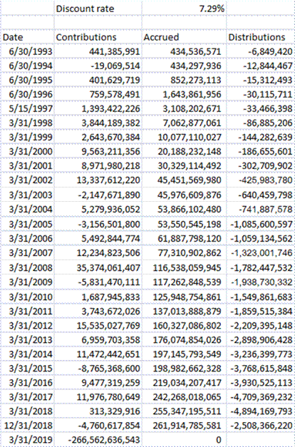
Over the same period, SPY returned 7.29%/year on a dollar-weighted basis. What this means is if you took every dollar invested in the fund and calculated what it earned over the timespan being analyzed, they would have received an annualized return of 7.29%.

That’s an annualized difference of 2.13%/year over a 26+ year period. That is a serious difference. Why? Where does the difference come from? It comes partially from greed, but mostly from panic. More shares of SPY get created near market peaks when everyone is bullish, and fewer get created, or more get liquidated near market bottoms. Many investors buy high and sell low — that is where the difference comes from. This also is an advertisement for buy and hold investing, albeit a negative one — “Don’t Let This Happen To You.”

Comparison with the 2012 Article

Now, I know few people actually look at the old articles when I link to them. But for the sharp readers who do, they might ask, “Hey, wait a minute. In the old article, the difference was much larger. Time-weighted was 7.09%/year and dollar-weighted was 0.01%/year. Why did the difference shrink?” Good question.

The differences between time- and dollar-weighted returns stems mostly from behavior at turning points. As I have pointed out in prior articles, typically the size of the difference varies with the overall volatility of the fund. People get greedy and panic more with high-volatility investments, and not with low-volatility investments.

That said, most of the effects of the difference are created at the turning points. During the midst of a big move up or down, the amount of difference between dollar- and time-weight returns is relatively small. The big differences get created near the top (buying) and the bottom (selling).

So, since the article in 2012, the fund has grown from $80 billion to over $260 billion at the end of March 2019. There have been no major pullbacks in that time — it has been a continuous bull market. We will get to see greater divergence after the next bear market starts.

Be Careful what you Read about Dollar-Weighted Returns

I’m not naming names, but there are many out there, even among academics that are doing dollar-weighted returns wrong. They think that differences as cited in my articles are too large and wrong.

The idea behind dollar-weighted return is to run an Internal Rate of Return calculation. To do that you have to have a list of the inflows and outflows by date, together with the market value of the fund at the end as an outflow, and calculate the single rate that discounts the net present value of all the flows to zero. That rate is the dollar-weighted return, and you can use the XIRR function is Excel to help you calculate it. (Note that my calculations use a mid-period assumption for when the cash flows.)

The error I have seen is that they try to make the dollar-weighted calculation like that of the time-weighted, creating period by period values. Now, there is a way to do that, and you can see that in the appendix below. As far as I can tell, they are not doing what I will write in the Appendix. Instead, they treat each year like its own separate investing period and calculate the IRR of that year only, and then daisy-chain them like annual returns for a time-weighted calculation.

Now, the time-weighted calculation does not care at all about investor-driven cash flows, like purchases and sales of fund shares, aside from dividend payments and things like that. It does not care about the size of the fund. It just wants to calculate what return a buy and hold investor gets. [Just remember the rule that an NAV must be calculated any time there is a cash flow of any sort, otherwise some inequity takes place.]

The dollar-weighted calculation cares about all investor cash flows, and ultimately about the size of the fund at the end of the calculation. It doesn’t care about when the returns are earned, but only when the cash flows in and out of the investment.

The odd hybrid method is neither fish nor fowl. Time-weighted corresponds to buy and hold, and dollar-weighted to the returns generated by each dollar in the fund. The hybrid says something like this: “We will calculate the IRR each year, but then normalize the fund size each year to the same starting level so that the fund flows at tops and bottoms do not compound. Then we show them year-by-year so that the returns are comparable to the total returns for each year.

As H. L. Mencken said:

Explanations exist; they have existed for all time;?there is always a well-known solution to every human problem?neat, plausible, and wrong.

Source: Quote Investigator citing Mencken’s book “Prejudices: Second Series”

In an effort to make a simple annual comparison between the two, they eradicate most of the effects of selling low and buying high. More in the Appendix.

Summary

Be aware of the difference between dollar-weighted and time-weighted returns. If you have a strong control on your emotions, this is not as important. If you tend to panic, this is very important. It is more important if you buy highly volatile investments, and less so if you size your volatility to your ability to bear it.

To fund managers I would say this: if you are tired of all of the inflows and outflows, and are tired of getting whipsawed by your clients, maybe you should take a step back and lower the overall risks you are taking. This will benefit both you and your clients.

Appendix

Here’s how to run an annual calculation of dollar weighted returns that be correct. For purposes of simplicity, I will assume a simple annual calculation that has multiple cash flows inside it. (If we are working with a US-based mutual fund, there would be reporting of change in net assets every six months.)

Calculate the first year (dw1) the way the hybrid method does. No difference yet. Then for the second year, run the IRR calculation for the full two-year period (IRR2). Then the second year only dollar-weighted return (dw2) would be:

((1+ IRR2) ^2) / (1+dw1) -1 = dw2

and for each successive period it would be:

(1+IRR[n])^n(1+IRR[n-1])^(n-1) – 1 = dw[n]

That is more complex than what they do, but it would preserve the truths that each entail. It would make the values for the yearly dollar-weighted returns look odd, but hey, you can’t have everything, and the truth sometimes hurts.

Full disclosure: a few of my clients are short SPY as part of a hedged strategy.

Theme: Overlay by Kaira