There was an interesting post on Bloomberg regarding asset class correlations, and a lot of blogs wrote about it, including Abnormal Returns, which did a nice summary, and expanded the argument to university endowments.? Part of the issue here is that under conditions of stress, assets separate into two simple categories — safe and risky.? To what degree can an asset be turned into cash at anything near its fair value under stressed conditions?
I ran into something similar back in 2006, so I wrote this CC post:
| David Merkel | ||
| Make the Money Sweat, Man! We Got Retirements to Fund, and Little Time to do it! | ||
| 3/28/2006 10:23 AM EST |
What prompts this post was a bit of research from the estimable Richard Bernstein of Merrill Lynch, where he showed how correlations of returns in risky asset classes have risen over the past six years. (Get your hands on this one if you can.) Commodities, International Stocks, Hedge Funds, and Small Cap Stocks have become more correlated with US Large Cap Stocks over the past five years. With the exception of commodities, the 5-year correlations are over 90%. I would add in other asset classes as well: credit default, emerging markets, junk bonds, low-quality stocks, the toxic waste of Asset- and Mortgage-backed securities, and private equity. Also, all sectors inside the S&P 500 have become more correlated to the S&P 500, with the exception of consumer staples.
In my opinion, this is due to the flood of liquidity seeking high stable returns, which is in turn driven partially by the need to fund the retirements of the baby boomers, and by modern portfolio theory with its mistaken view of risk as variability, rather than probability of loss, and the likely severity thereof. Also, the asset allocators use “brain dead” models that for the most part view the past as prologue, and for the most part project future returns as “the present, but not so much.” Works fine in the middle of a liquidity wave, but lousy at the turning points.
Taking risk to get stable returns is a crowded trade. Asset-specific risk may be lower today in a Modern Portfolio Theory sense. Return variability is low; implied volatilities are for the most part low. But in my opinion, the lack of volatility is hiding an increase in systemic risk. When risky assets have a bad time, they may behave badly as a group.
The only uncorrelated classes at present are cash and bonds (the higher quality the better). If you want diversification in this market, remember fixed income and cash. Oh, and as an aside, think of Municipal bonds, because they are the only fixed income asset class that the flood of foreign liquidity hasn’t touched.
Don’t make aggressive moves rapidly, but my advice is to position your portfolios more conservatively within your risk tolerance.
Position: none
Hmm… in early 2006, we were considerably in advance of the peak that would come in late 2007, but considerably above where we are now.? In my opinion, given my longer timeframe, a good call.
But maybe correlations might rise during times when everyone is anxious to buy risky assets, not just when the want to throw them away.? Do asset correlations rise near peaks for risky assets?
My model on correlations relies on the major industry sectors of the S&P 500:
- Consumer Discretionary
- Consumer Staples
- Energy
- Financials
- Health Care
- Industrials
- Information Tech
- Materials
- Telecom Services
- Utilities
If lots of money is getting thrown at stocks, won’t the correlations between sectors rise?? And if so, won’t future returns be low or negative?
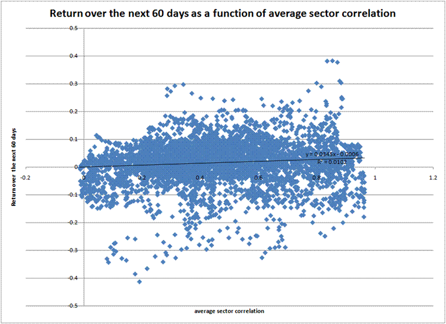
Here is a graph showing the price return on the S&P 500 over the next 60 days as a function of the average sector correlation over the last 60 days:
Not much of a relationship, huh?? 1% R-squared.? And it goes the wrong way — high correlations very weakly favor higher returns.
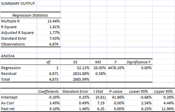
But what if we do a regression where future S&P 500 returns are regressed on past S&P 500 returns and average sector correlations?
Wow, we get a 2% R-squared! 😉 It also shows that momentum persists, and higher average sector correlation has a similar effect to the above model, still positive on future returns.
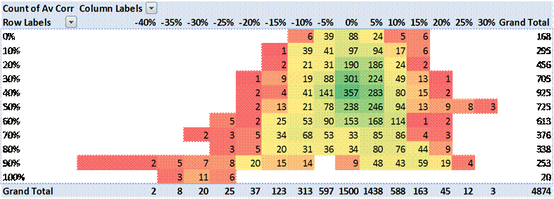
Here is a heat map where the average 60-day past return is on the horizontal axis, and average sector correlation is on the vertical axis, and the variable displayed is frequency of occurrence.
Looks pretty average, with the two effects being fairly separate, with an odd southwestern quadrant.
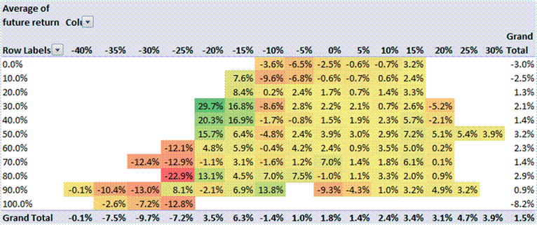
Here is a heat map where the average 60-day past return is on the horizontal axis, and average sector correlation is on the vertical axis, and the variable displayed is average future 60-day returns.
Here are my tentative findings:
- Price momentum persists.? 60 days of weakness/strength tends to beget 60 more days of weakness/strength.
- Extremely high or low average sector correlations seem to go along with low returns.? Middling average sector correlations seem to go along with higher returns.
- Low average sector correlations and lousy past price performance seems to beget excellent future performance.
- High average sector correlations and lousy past price performance seems to beget lousy future performance.
- When past price momentum is high, average sector correlation doesn’t seem to matter as much.
- If past trends continue, average returns over the the next 60 days are around 2.5% with a very wide error band.? Current average sector correlation is 50%, and past 60 days returns are 9%.
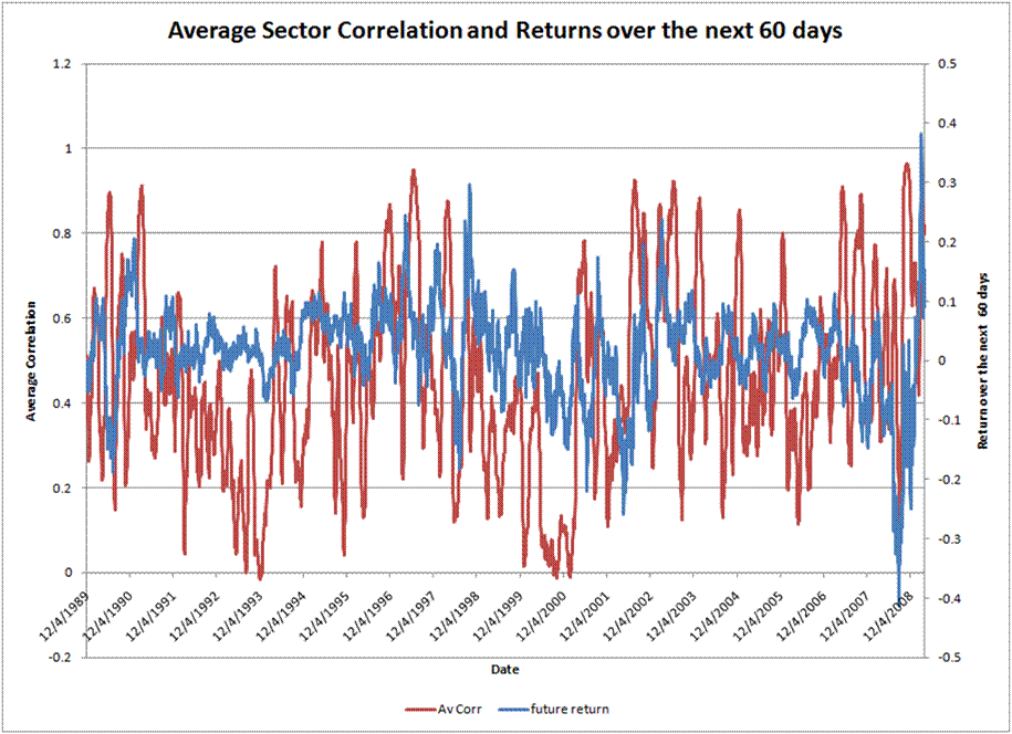
One final graph:
Do you see a pattern here where high average sector correlations come before market peaks?? I don’t.
All that said…
I know the earlier articles dealt with asset class correlations, rather than correlations with stock market sectors.? I would have expected the same result.? Maybe there is aonther way to do this analysis separating out safe sectors from risky sectors.
But what are safe sectors?? Utilities? Consider 2001-2003.? Telephone services? Also 2000-2003.? Financials? 2007-?? Perhaps Consumer Staples is the only truly safe sector… or maybe it should be energy? Consider the early ’90s.
This is one article where I end scratching my head, but publish anyway, because:
1) My readers may help me.
2) It is valuable to know where research dead ends exist.
After all this, I don’t see average sector correlations as a valuable variable in investing.? Maybe that is not true of asset classes.? If anyone has the proper data to send to me on that, I will reproduce an analysis like this, and tell you what I find.

can you smooth out the bottom graph?
I tried. Weekly and monthly smoothing did not materially change the graph.