PIcture credit: Aleph Blog, and the same for all the graphs and charts in this post. All liability for mistakes here is mine.
Recommendations and Comments
- To the National Governments and Central Banks: don’t create a lot of policies that you might need to reverse. This crisis is coming to an end faster than most are reporting/proclaiming. If a policy is easily reversible, get ready. Start planning for dealing with the second wave of the pandemic.
- To US State Governments and city/county governments: start figuring out how you will targetedly let up on the restrictions that you have imposed before you realize that you are behind the curve (again). Start planning for dealing with the second wave of the pandemic. It would be better to let younger people go back to work, and shelter those more likely to get a deadly case of COVID-19. (Aside: if this ends early, note the people who told you that it would long and big, and remove them as advisors.)
- To the media: please calm down. This is one of those situations where it gets worse before it gets better. We are through most of the worse, but to the average observer, they don’t see the better, even though the point of maximum pessimism has passed.
- To individuals: if you don’t have a lot, take heart that this first wave likely won’t be here much longer. Use your money carefully. To those who do have money, as a nation moves from 50% to 75% complete in the first wave of the virus, it might be a good time to own a little more stock. I don’t usually encourage speculation, but it might be warranted here. Remember, don’t invest anything you can’t afford to lose.
- Last, my models last week were too optimistic, but not by much. The growth rate of total cases is generally dropping pretty quickly, but you couldn’t tell that from what you are hearing from politicians and the media.
Introduction
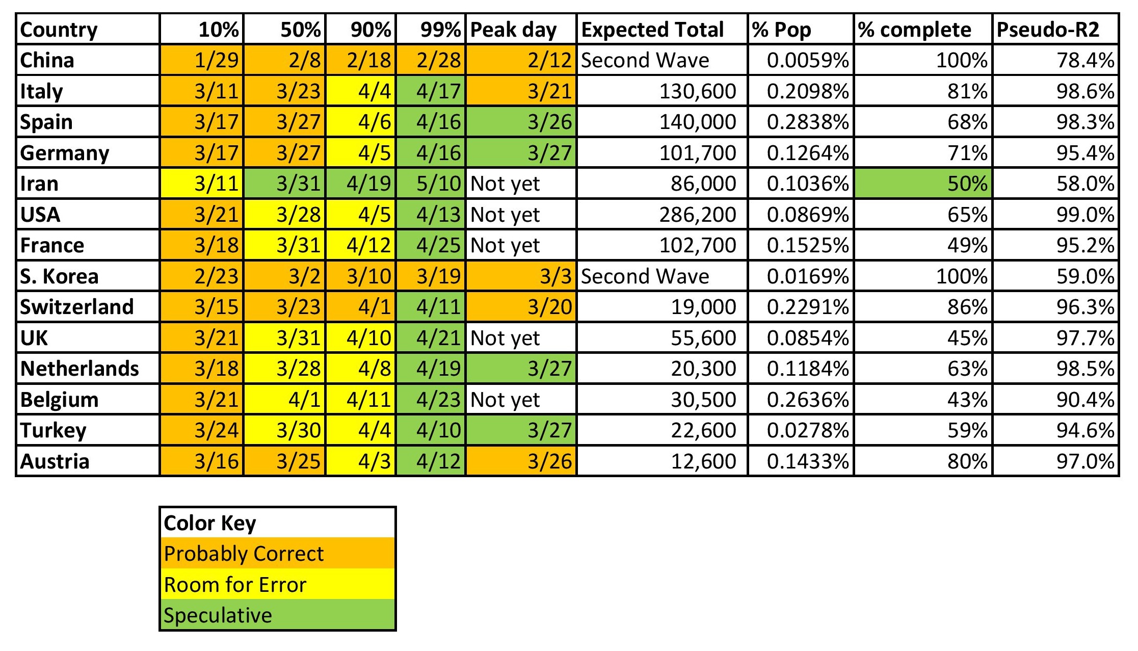
Before I start, I want to explain what the tables above and below mean.
- The figures underneath the percentages are dates. The dates are estimates of when the country, state or city will have experienced 10%, 50%, 90%, and 99% of the total COVID-19 cases that they will experience in the first wave.
- The peak day is the day each has the most new claims.
- “Expected Total” is my estimate for the total number of reported COVID-19 claims in the first wave.
- “% pop” is the percentage of each population that will be reported as infected with COVID-19.
- “% complete” is the ratio of estimated current total cases to estimated final total cases fo the first wave.
- Pseudo-R2 is the percentage of the total variation in the total cases explained by my three-parameter nonlinear regression. Because the regression is nonlinear, it is not an F-statistic, and gives us only a spit-in-the-wind sense for how good the regression is. Some have asked if I could add error bands to my models and the answer is no, because the nonlinearity of the equation makes that difficult. I’m only working with Excel, and looking through my old Econometrics texts, they don’t have an answer for this one. Maybe I should start modeling in R.
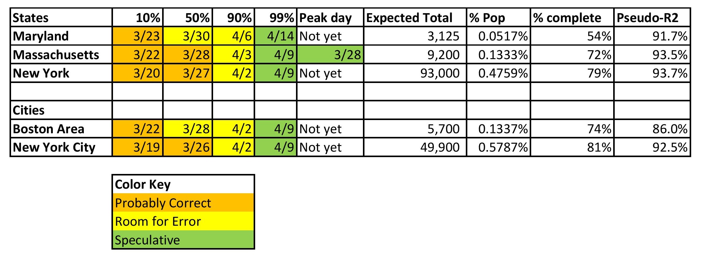
You’ll note that I added six additional models to this post.
- One country: Turkey (I am modeling any country that gets more total cases than S. Korea.)
- Three states: Maryland, Massachusetts, and New York. I’m modeling my home state, Maryland, Massachusetts for a friend, and New York because it has the most cases of any state.
- Two cities: New York City and the Boston Area, which is the five counties near Boston (Essex, Middlesex, Plymouth, Suffolk and Worcester). New York City, because it has the most cases of any city, and Boston, because of the aforementioned friend.
Data and Resources
Before I go on, I want to point out some useful sites for getting data and resources. If you think you have other useful resources, please post them in the comments.
- Courtesy of the New York Times, you can get state and county total cases and deaths on a day-by-day basis. (Main page) (state data) (county data) Data is in a Comma Separated Values [CSV] file format.
- Worldometer is an excellent website for all manner of COVID-19 data. I particularly use their country data pages. They provide links to most of their data sources. I also think this page that breaks out mortality rates for those who have caught COVID-19 by age, sex, and pre-existing conditions is pretty neat.
- Finally, you can look at my models if you like. Here’s the country model. Here is the states and cities model. Now you can look at what I am doing, and play with it yourselves. Note that you will have to activate the Solver application inside of Excel.
Limitations of what I am Writing About
I am forecasting one variable in each geographic area — reported total claims as of a given date. I am forecasting this for several reasons.
- It is relatively easy to do. If I tried to estimate medical resource usage or even deaths, I would need more data that I don’t have access to in order to do reasonable models in that area. (Now that said, a hidden assumption of the analyses is that there is some regularity to how cases get reported. If that changes, the models will be less accurate.)
- Reported total claims is a leading indicator for other variables of interest. In addition to those mentioned in the first point, total reported claims is a leading indicator for the economy, lifting of government restrictions, and the financial markets.
- It’s not as if there aren’t complexities that could mess with an analysis like this. When testing becomes common, you might see total cases go up a lot from all of the asymptomatic or low symptomatic people who are suddenly found and are no longer infected. That sort of shift would give the appearance of COVID-19 taking off, when we realize that that data belongs to the past, even though it is reported in the present.
- No one wants to say it, but there are tradeoffs involved in having governments be too ham-fisted in their regulations. Those regulations are impoverishing a lot of people, and many of the restrictions are not needed in order to have the same level of societal safety.
- There are also tradeoffs of life and money… and this is not new. Life is precious, no doubt, and money can often be replaced, but where does the money come from? Would it be right to be Robin Hood and push 100 unrelated people out of work in order to save a life? Perhaps it would be better ask for volunteers. It would be more ethical for the government to raise taxes, than to put on restrictions that harm the economy a lot, with few additional lives saved.
This is an economics, investing and finance blog. I focus on those matters. It’s not a healthcare blog. When I think of my average reader, that person is not thinking a lot about the problems from medical resource shortages, except perhaps the lack of ability to test for COVID-19. It’s different if you are in the medical profession or if you are sick. You would care a lot about these issues then, and my heart goes out to you, because you are having a challenging time with short resources.
As an aside, when you think of medical efforts in the US generally, with the emphasis on trying to manage costs, hospitals and inventories of supplies and equipment are light because in normal times, those were easy places to save money. Few would complain much (except closing rural hospitals) because there would be enough resources under 99%+ of all circumstances. This is fine, until you experience the low probability and high severity event. This is common to other disaster scenarios as well — there is often a complaint over lack of redundancy or robustness of some resource. (Not enough policemen, firefighters, ice, electricity, phone connectivity, emergency shelter, etc.)
I am not saying my analysis is the whole enchilada, but it is an important part of it. And with that, on to the graphs:
Past the First Wave, in the Second Wave
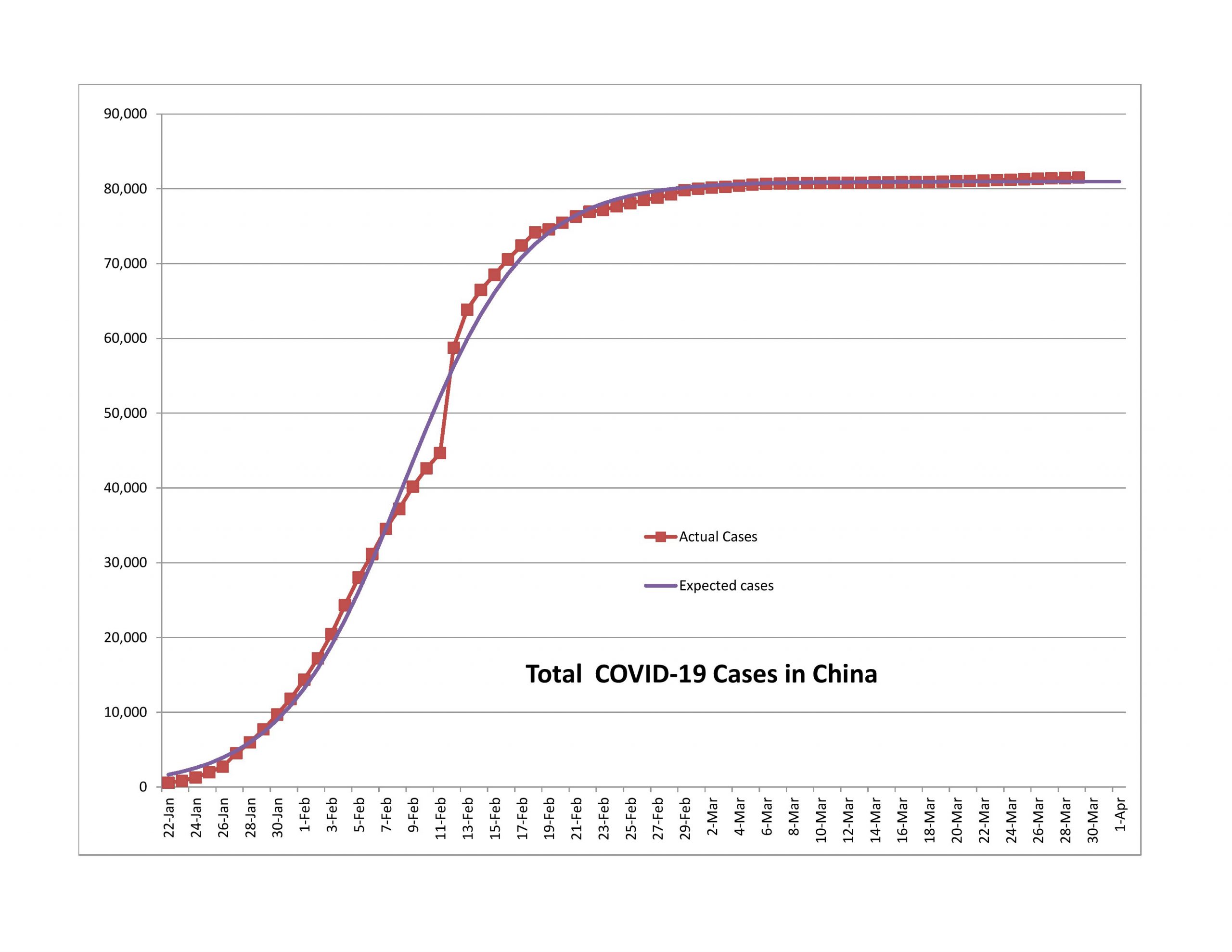
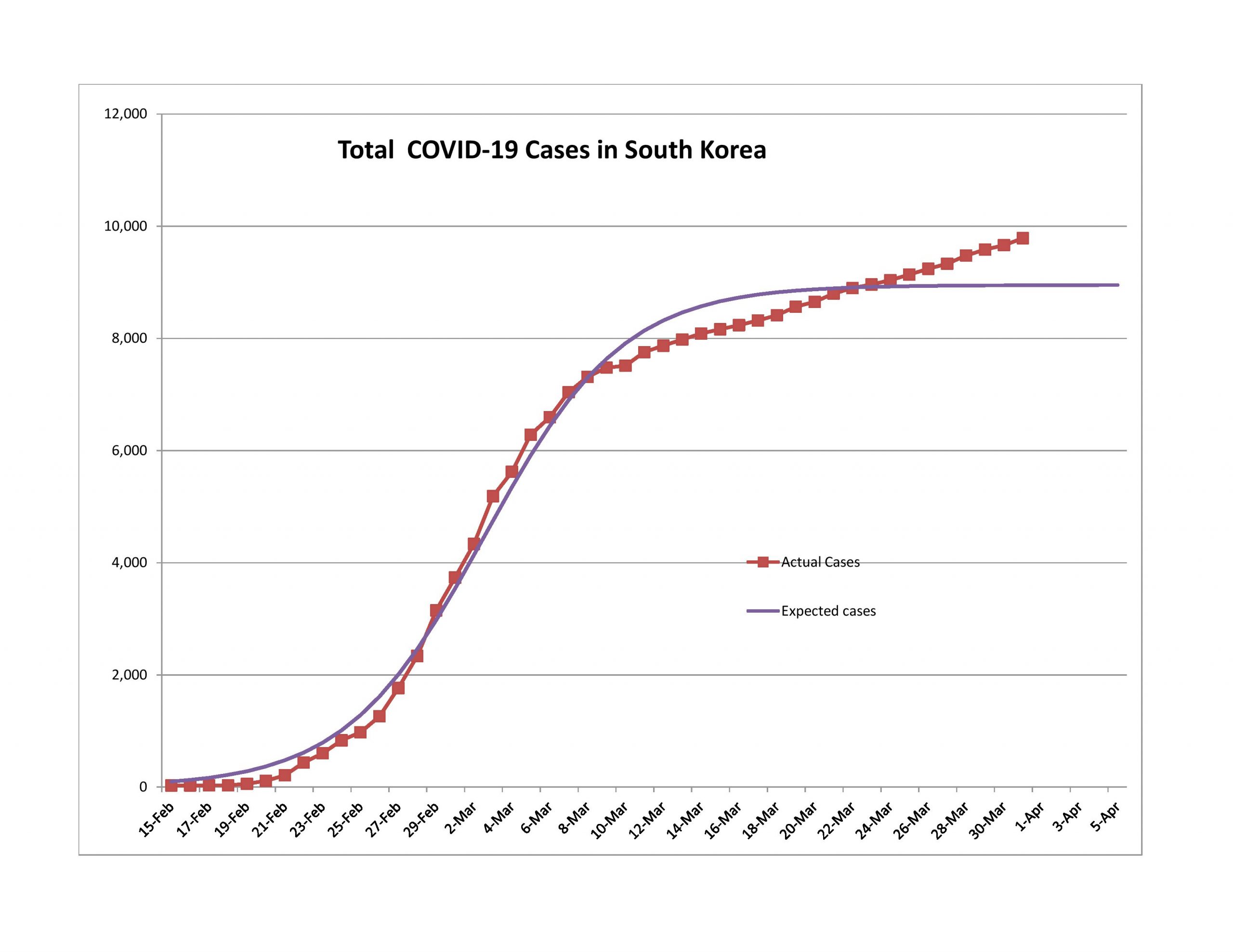
China has averaged 55 new cases of the past 10 days, and South Korea that figure is 99. The trend seems to be up, but with a lot of variability. I liken the second wave to what needs to be done after the main battle with a forest fire is done. You still have to put out some minor fires before they turn into something major. Eventually, like say in a month or two, most nations will be dealing with this.
Because of this situation, the models fit less and less well. I could add in a second logistic curve that starts where the first one ends… though it seems like overkill from a modeling standpoint. It wouldn’t be difficult to do.
Approaching the End of the First Wave
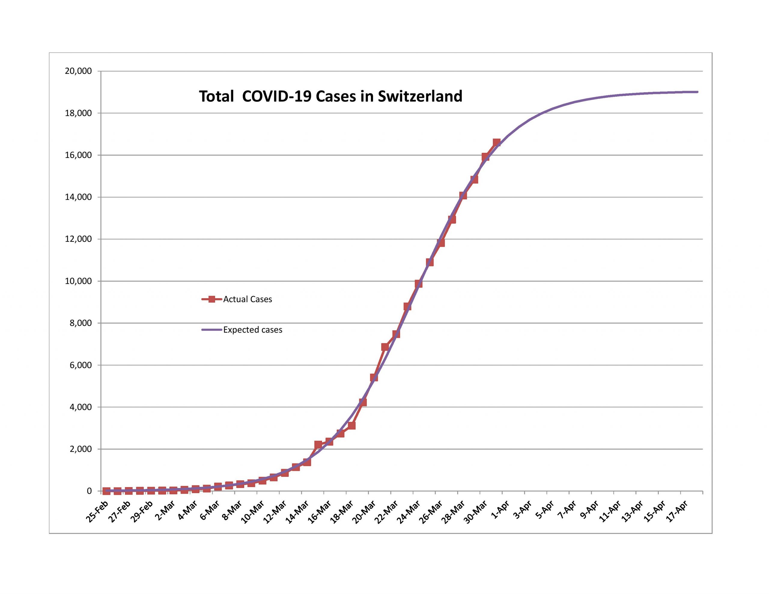
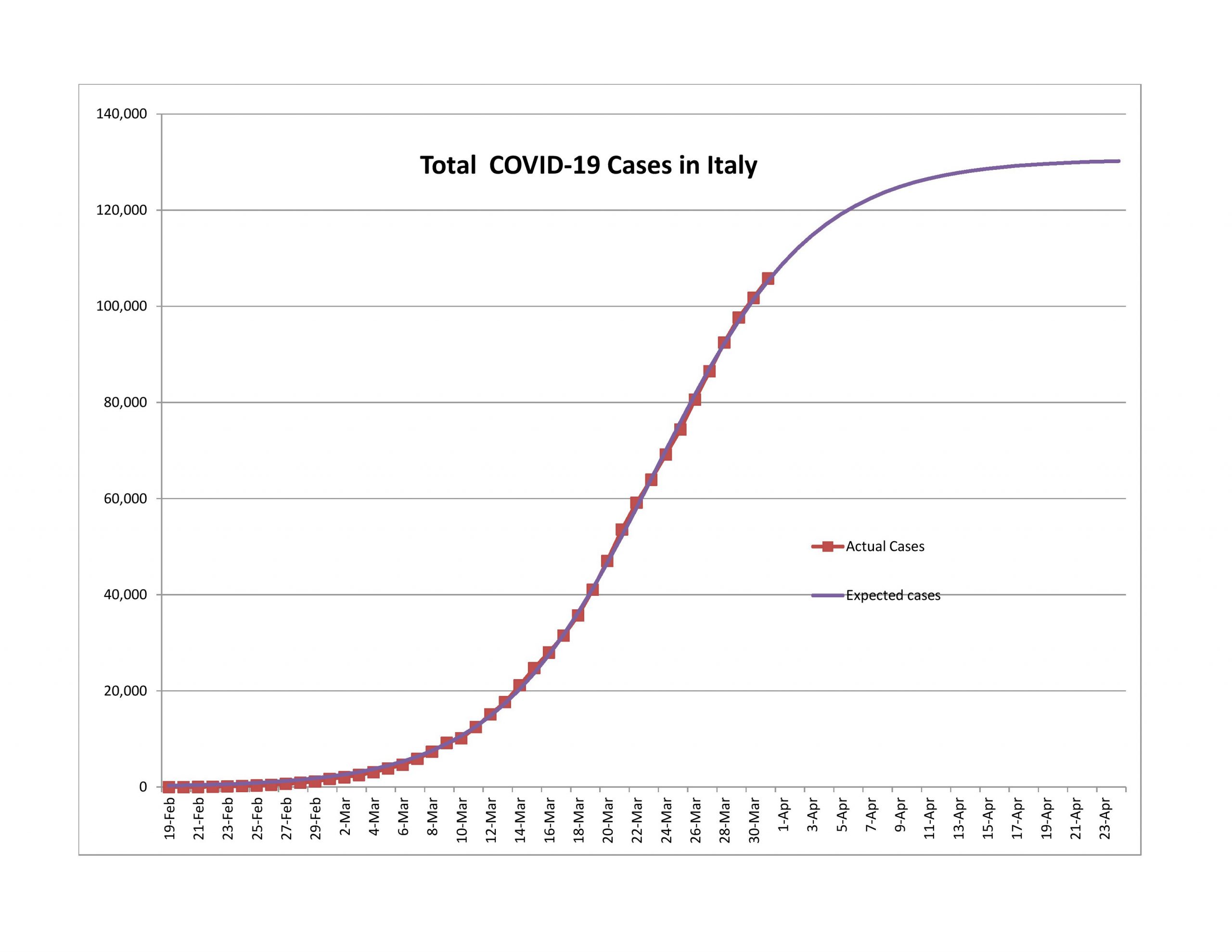
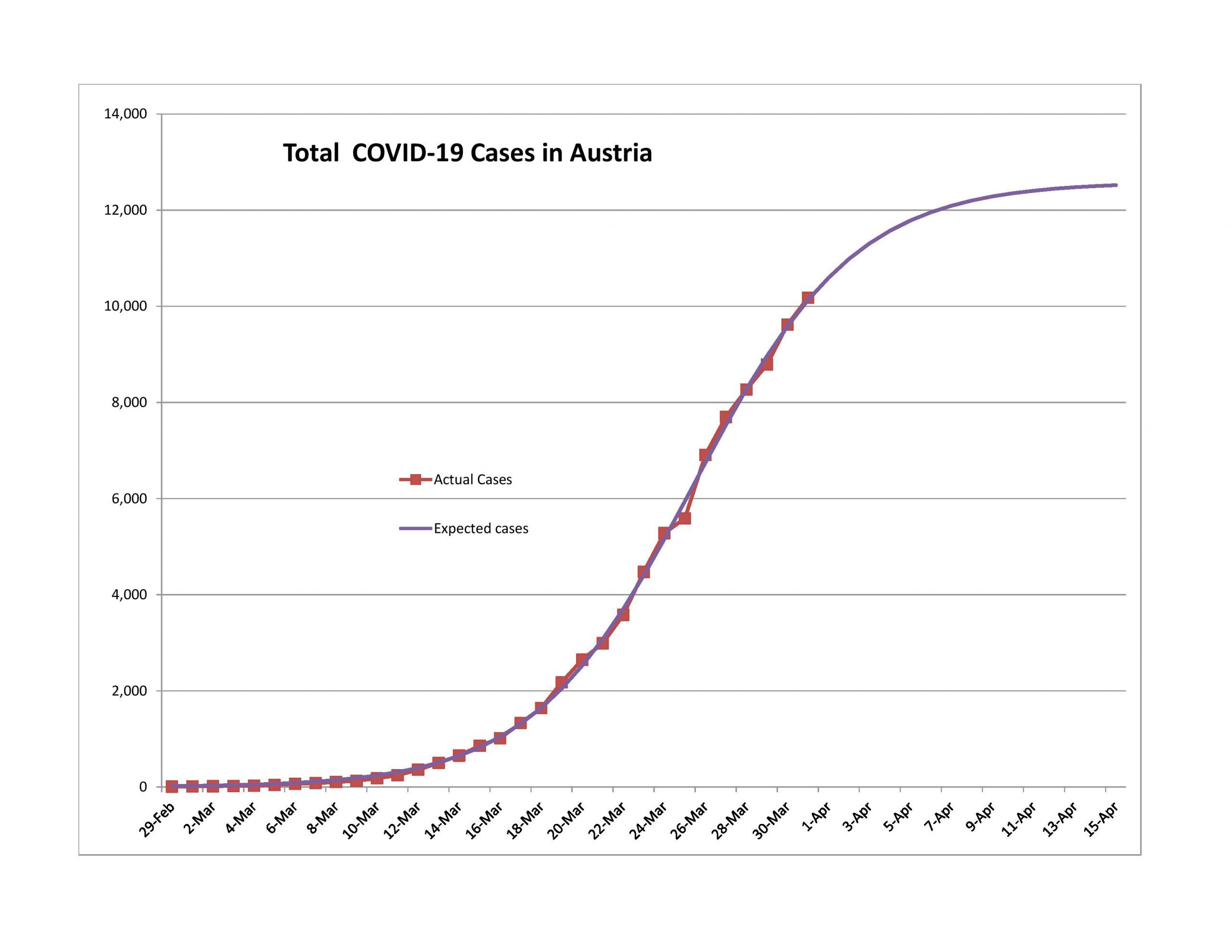
Austria, Switzerland and Italy are most likely past the 80% point. By that point reported new cases are declining quickly, and total cases are growing at around a 4% daily rate, and the growth rate is falling quickly.
As an aside, this is a good time to talk of how the media, and sometimes even policy makers who should know better, are practically innumerate in terms of the verbs that they use. They look at the raw increase in cases and say that they are soaring. It varies by geographic area, but the daily percentage growth in total cases and daily percentage growth in new cases is like this:
| Percentage Completed | Daily % Growth in Total Cases | Daily % Growth in New Cases |
| 0-10% | 18-35% nearly constant daily growth, but absolute numbers are low. | Exceptionally high and erratic, 30-50%/day , but absolute numbers are low. |
| 10-50% | Rate of growth falls into the teens of percentages. If the starting percentage is lower in this interval, so will the ending percentage. Absolute numbers sound large, especially nearing the halfway mark. | Rate of growth falls rapidly to zero by the end of this period |
| 50-90% | Rate of growth continues to fall to the low single digits of percentages, say 2-4%. Absolute numbers sound large but rapidly get smaller toward the end of this interval. | Rate of growth is negative, and gets more negative as the interval gets to the 90% mark. |
| 90-100% | Growth is very low. Absolute numbers are low. | Growth is negative and erratic. Absolute numbers are low. |
It’s in the middle two zones where the absolute numbers are high that the rhetoric gets shrill. Compare that to me where at 8PM Eastern Time, I sit down and update my models and comment on how close they came to the modelled estimates. The absolute numbers of total cases, new cases, total deaths and new deaths make great headline fodder, but the real news should be looking at the percentage rates of growth of total cases and new cases. But I suspect that would be a tough thing to see change.
Middle of the Pack
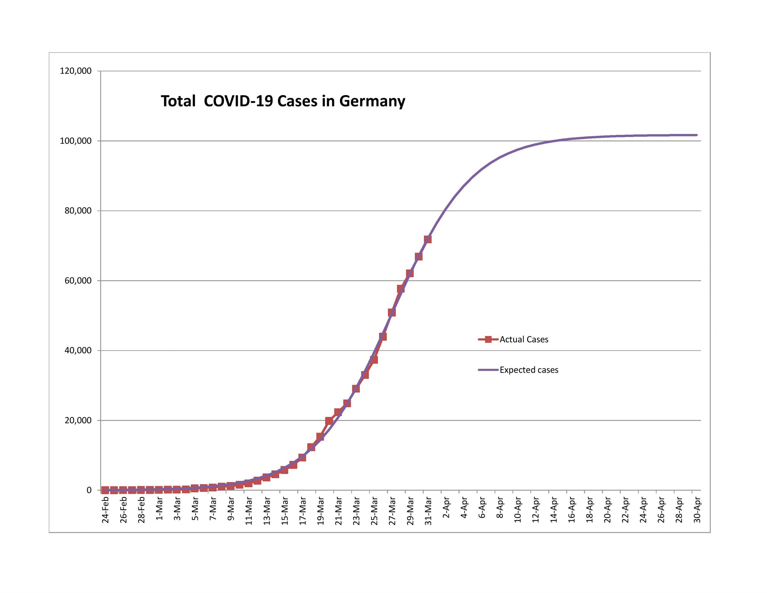
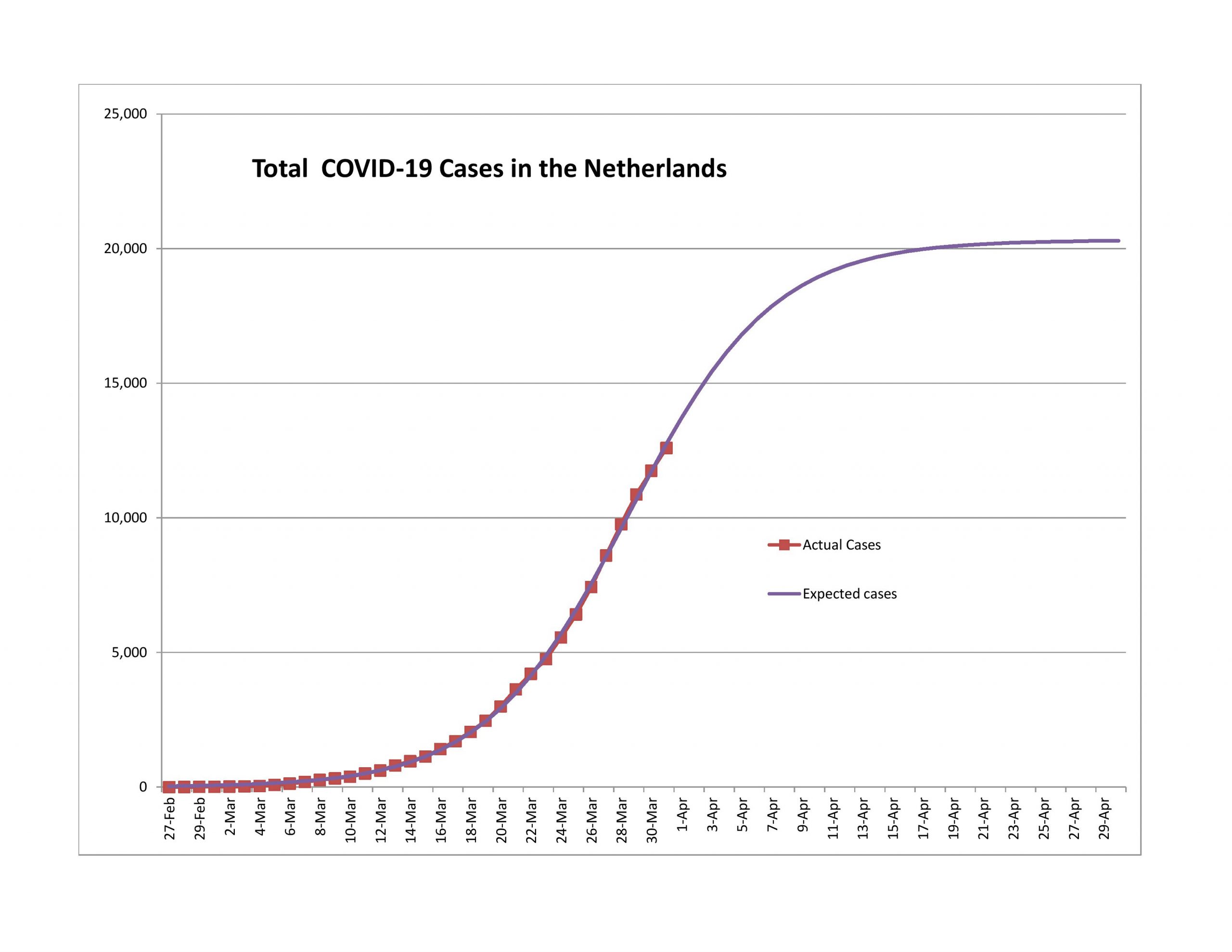
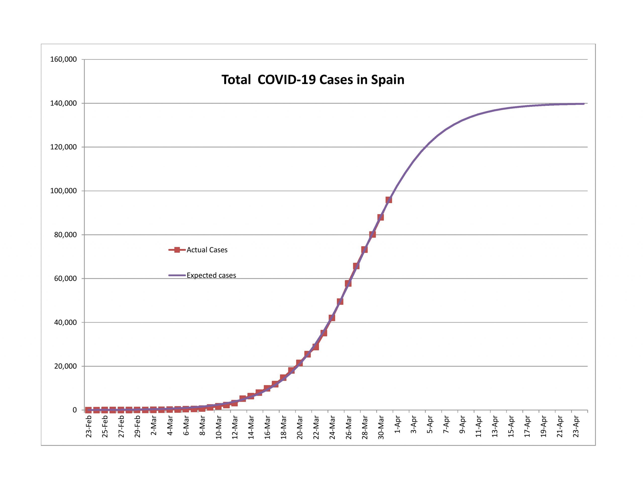
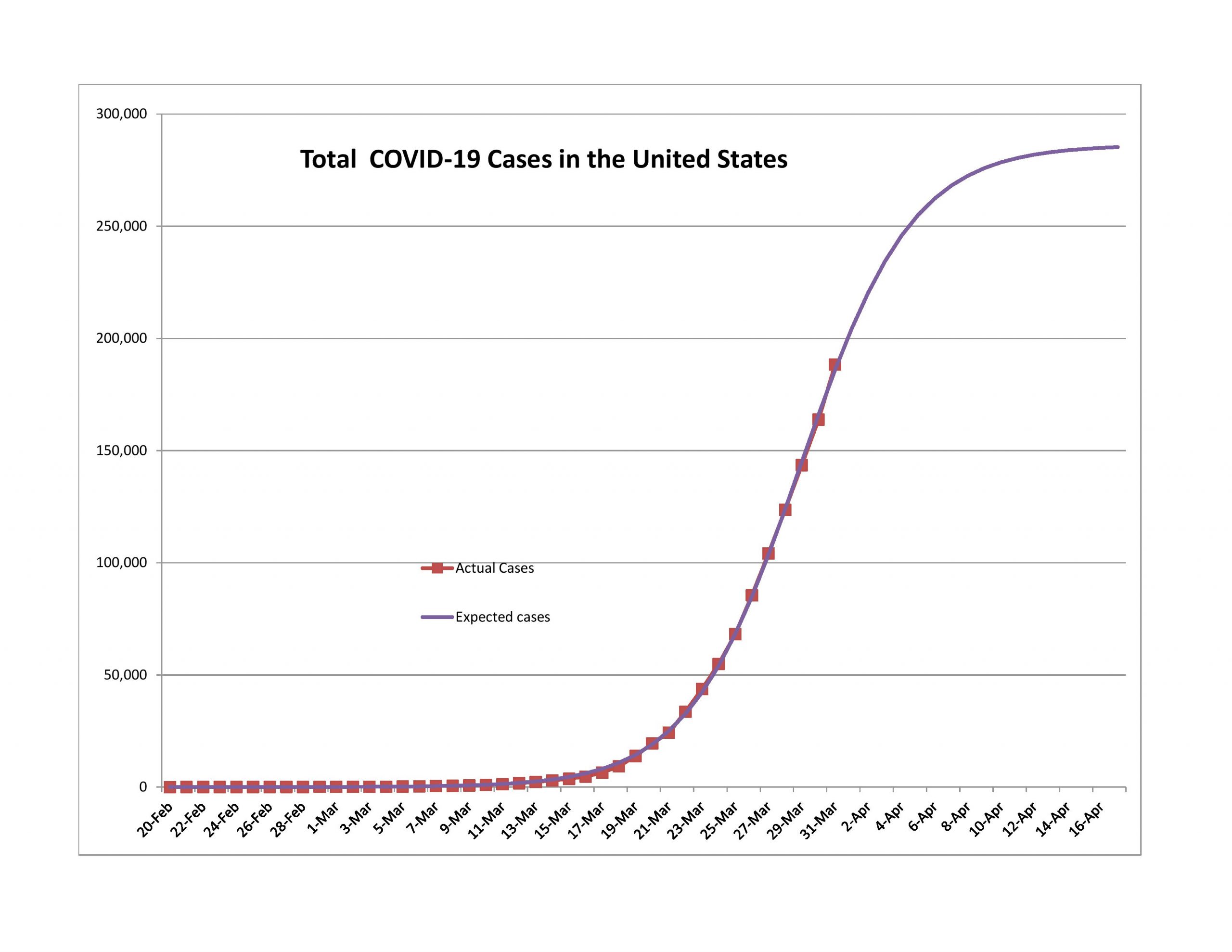
Germany, the Netherlands, Spain, and the US are the next group. New cases are either rising at a low rate or declining. Growth in total cases is in the high single digits of percentage. These countries aren’t out of the woods yet, but are likely past the halfway point.
Some of these had high new case surprises over the last week, but on the whole showed improvement.
Bringing up the Rear
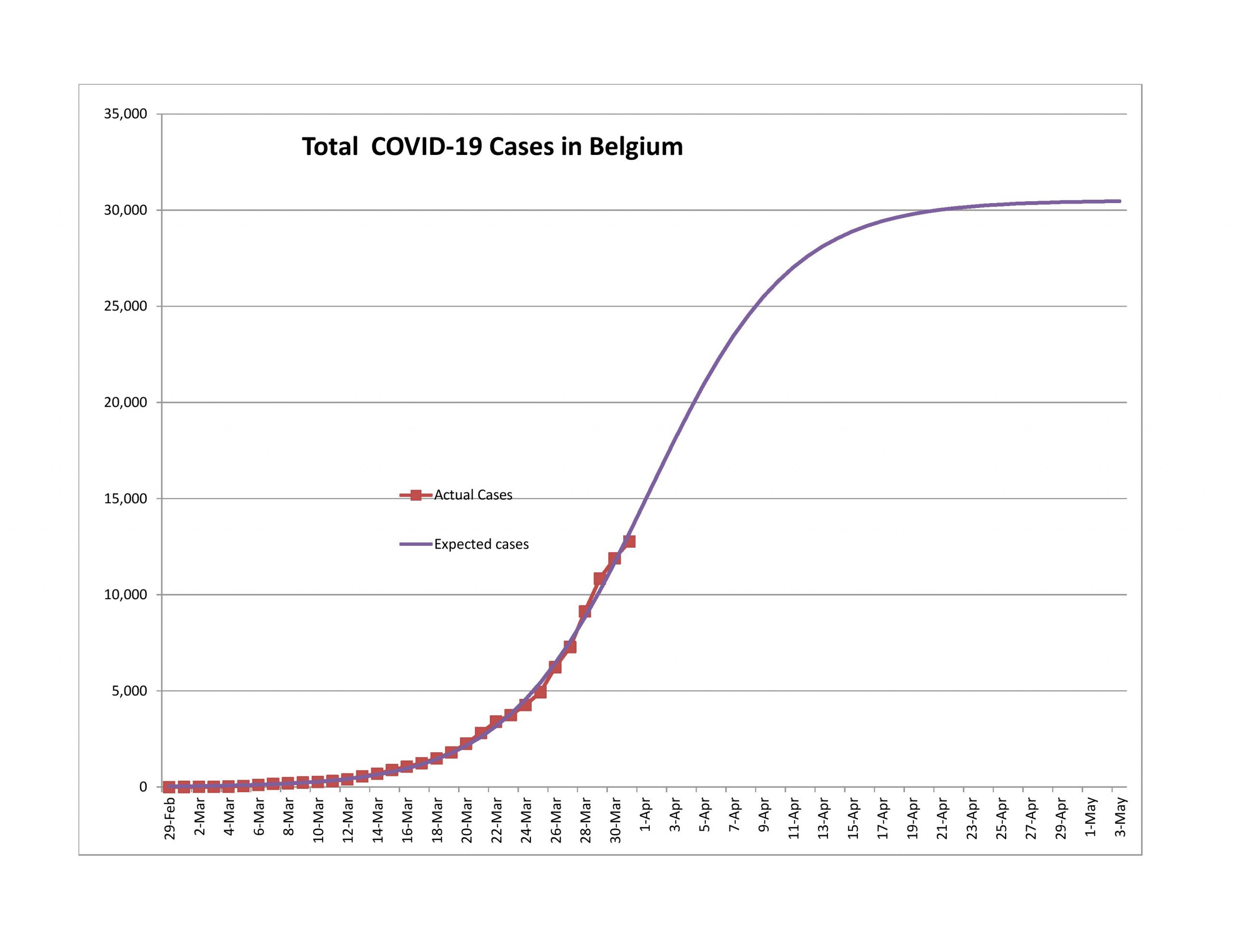
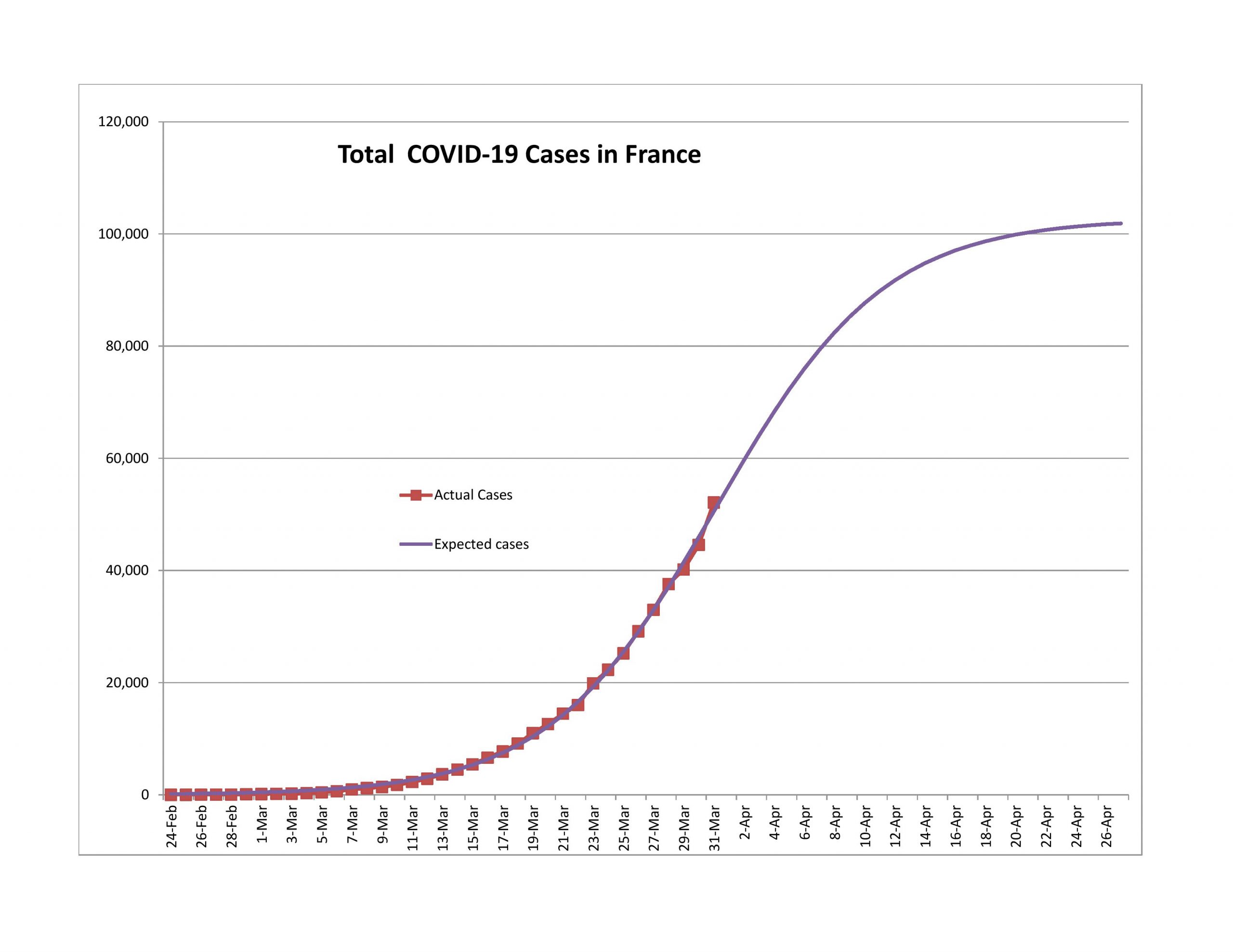
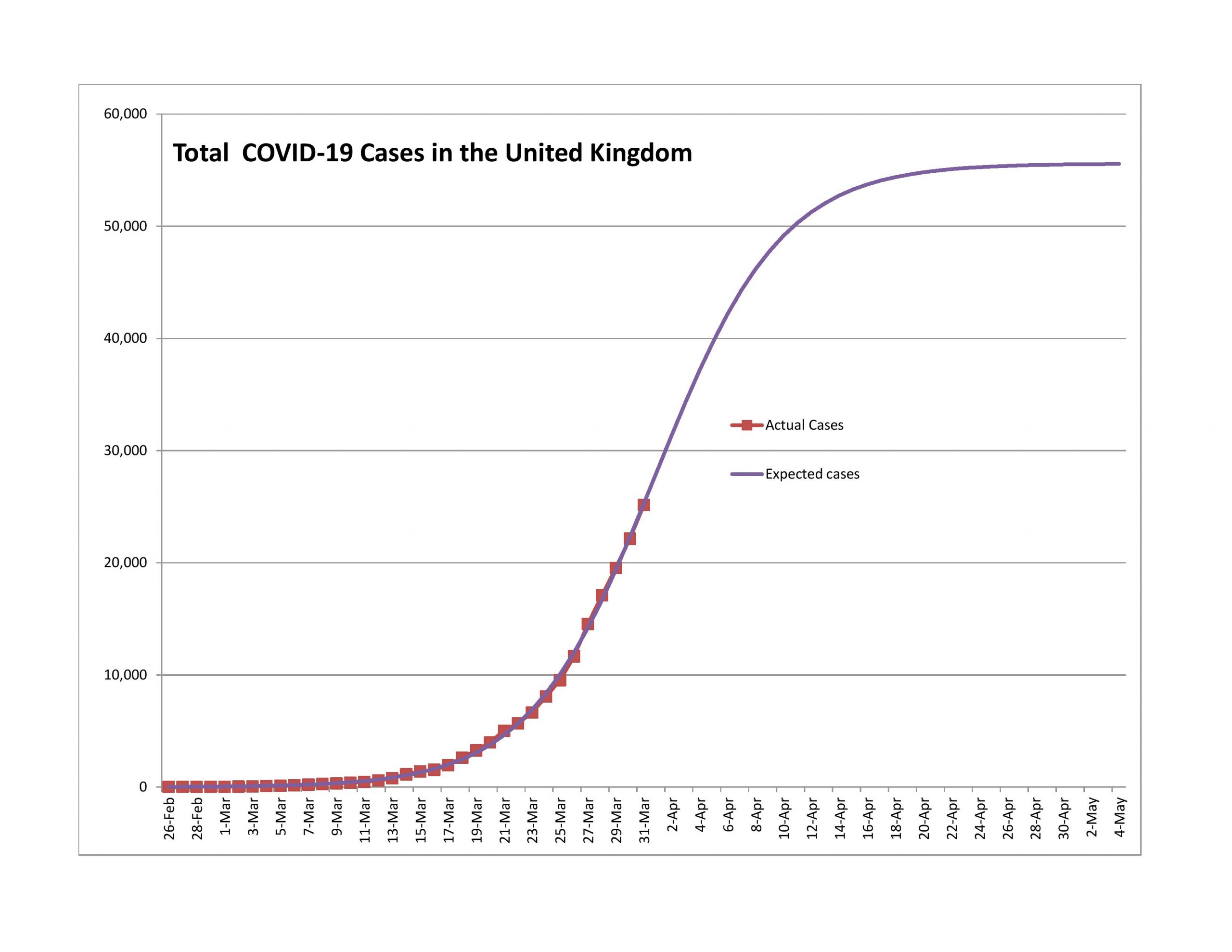
Each of these had significant upward surprises in terms of new cases reported. The growth rate of reported total cases is in the mid-to-high teens.
Too Early to Tell
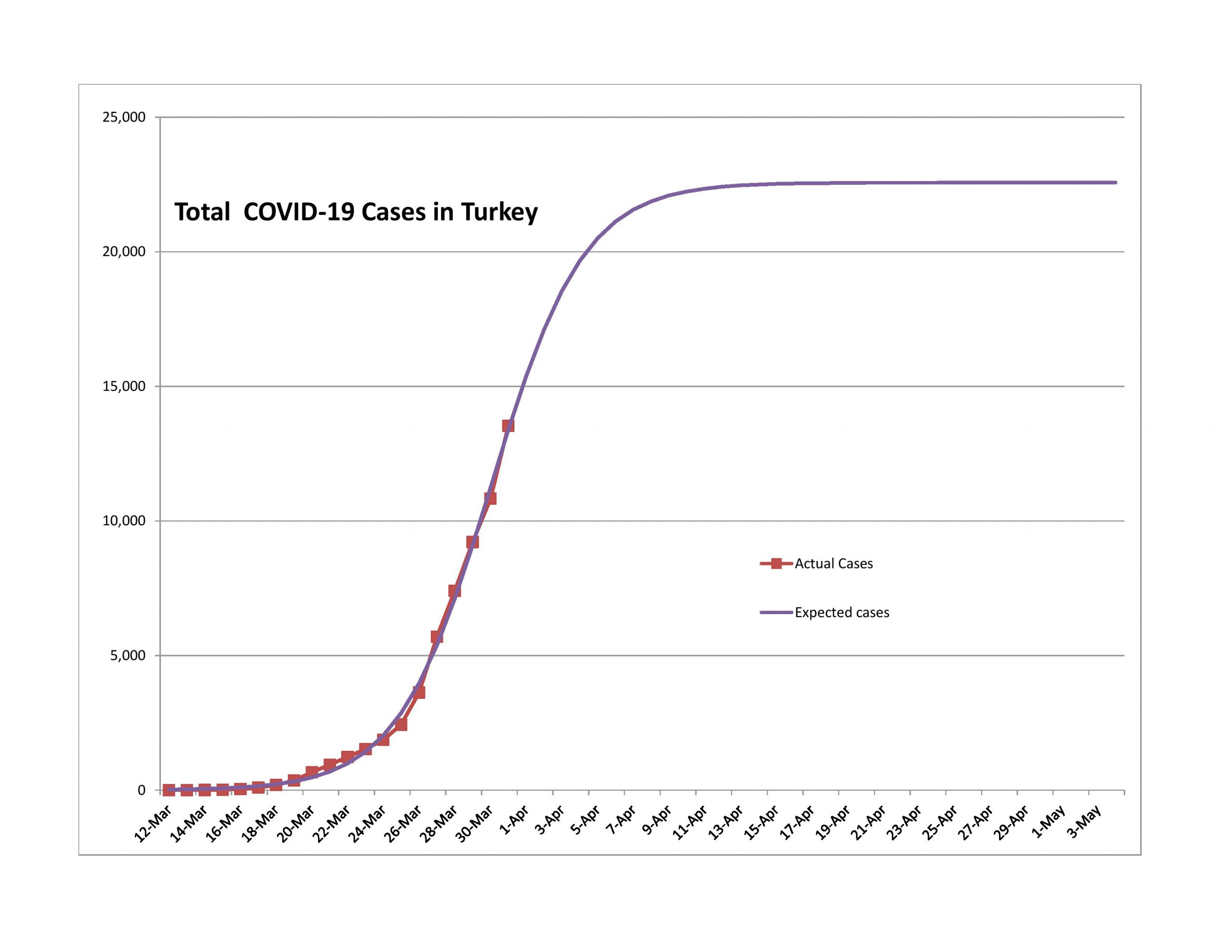
I did not model Turkey in the last article. It has a really sharp takeoff and deceleration of growth that looks too good to be true. (The US is that way to a lesser extent.) I need more data before I can be definite about this.
Problem Child
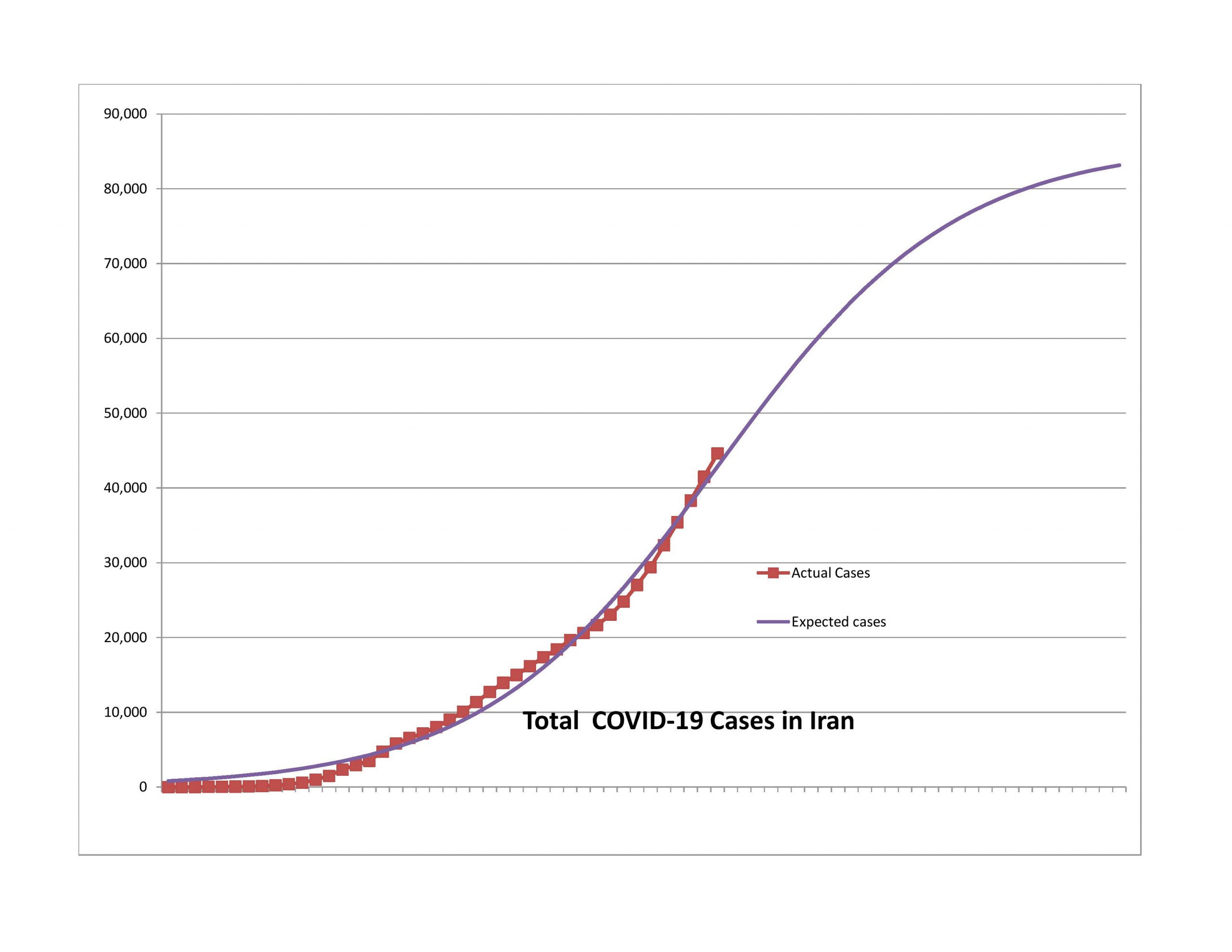
Compared to last week, Iran has gone backward. New cases have been growing more rapidly, and the growth in total cases shows no sign of slowing. It will be interesting to see how this develops — it doesn’t fit the model well, unless….
Unless you think of it as several logistic curves in different areas that have taken off and leveled at different points in time. Now that said, from what little I have read, there seems to be a lot of disagreement in Iran over what to do. And to some degree, a populace that doesn’t trust the government much… so it’s not a recipe for constructive collective action.
States and Cities
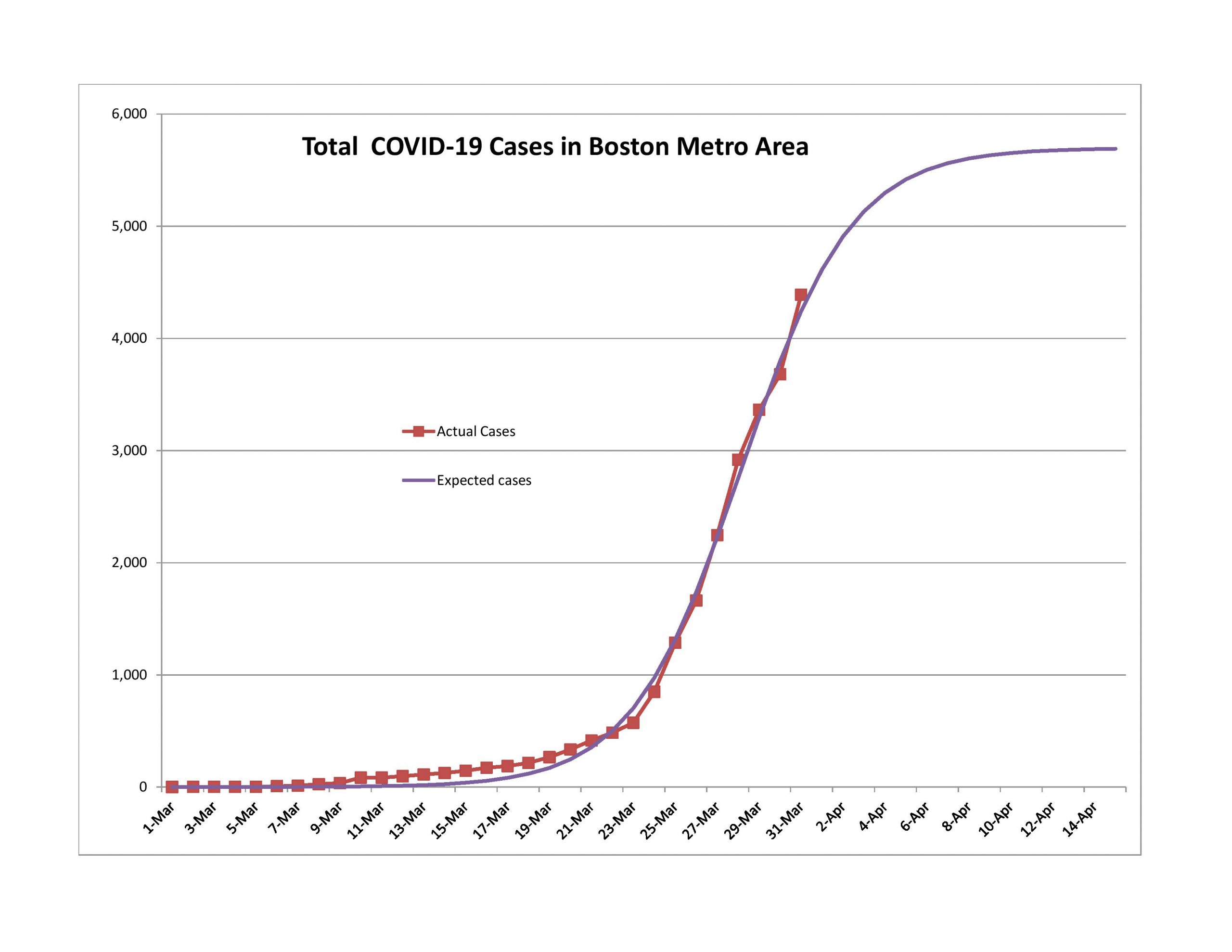
Massachusetts and Boston Area
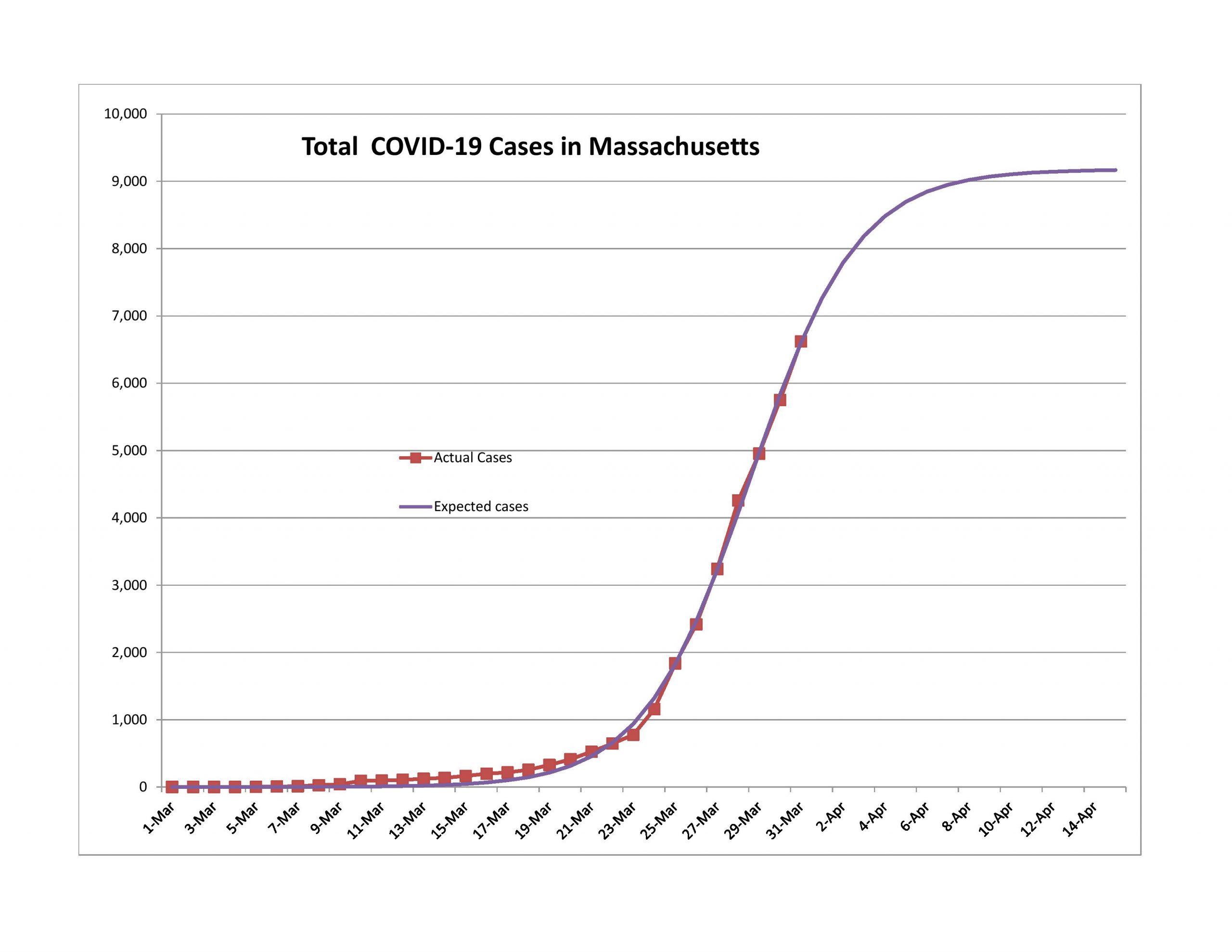
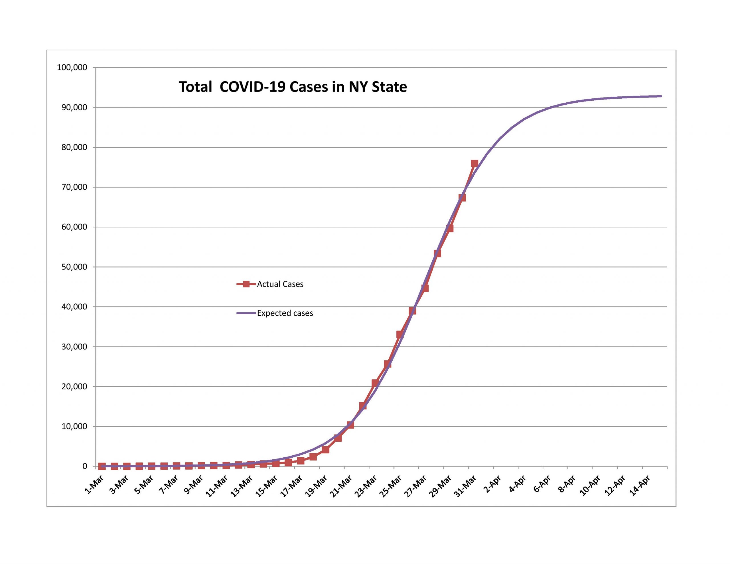
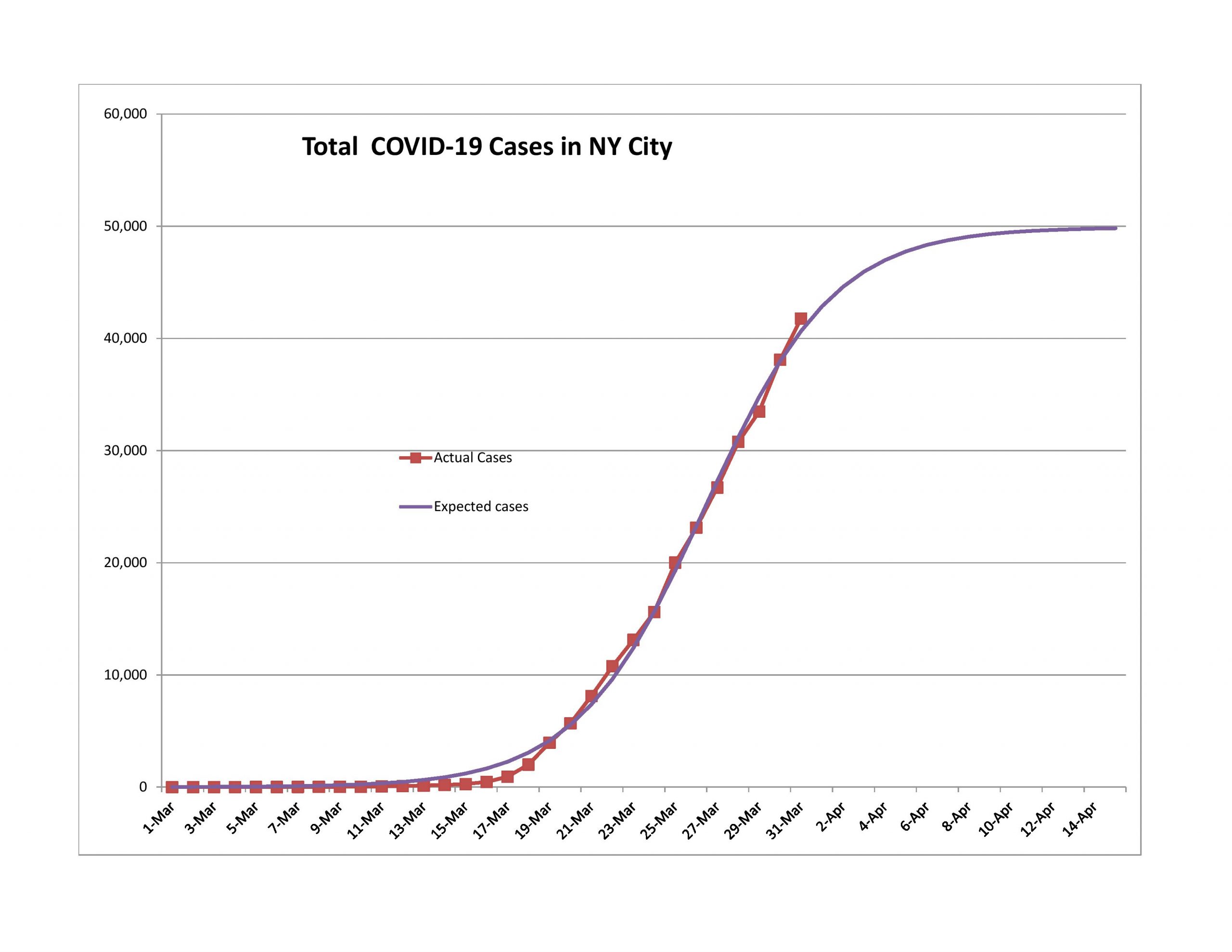
New York State and New York CIty
Maryland
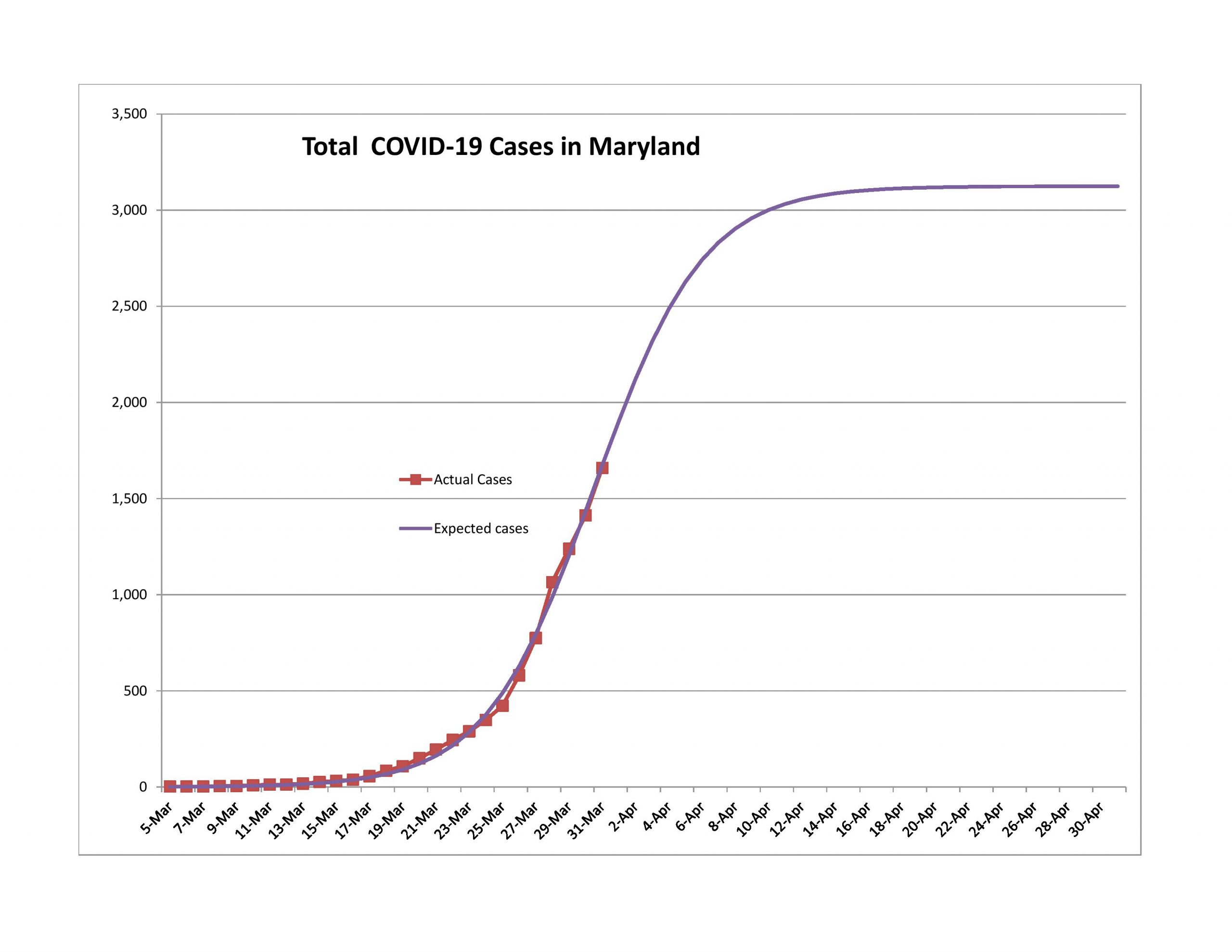
The logistic curves for smaller, more homogeneous areas tend to be shorter and sharper than those for broader areas. The data also tends to be more noisy, but that’s what the regression analysis is for — smoothing out the data in a theoretically consistent way, and allowing tracking to be done so that a policymaker could estimate if they are doing better or worse than expected. It would certainly calm some politicians down if they had an idea of how things are likely to develop, and if a deviation happened, they could try to explain why, allowing for the level of uncertainty in analyses like this.
And so at the end, can I offer a happy surprise to New Yorkers, both those in the city, and those that are upstate? There will still be problems for a while, but it really seems like you are getting to the end of the trail. In two weeks, you should be a lot happier. And the same will likely be true in Massachusetts and Boston, and in my adopted home state, Maryland.
But here’s the key question. How ready will the politicians and policymakers be to accept the good news? I fear they will not be happy with it at all, but will remain cautious in the wrong way too long. There is kill, and there is overkill. Kill is enough.
I would encourage the politicians to have us continue to do social distancing, but to reopen businesses, requiring them to follow certain sanitary and distancing procedures. Perhaps those who are infirm, or are over 60, 65, 70, or so should continue remain at home, or only go to necessary places a while longer.
There is a price to everyone staying home. There is a political price to politicians that maintain it too long. Better to modify policy such that it is a sniper rifle, and no longer a blunderbuss.

Thanks for your usual thoughtful approach. Appreciated.
Hi David, thank you for providing the inputs, the rationale and the output of your model. Alltough I share your optimism about the amount of confirmed infections (which is not telling the complete story due to lack of testing) I would be more weary being optimistic about the correlation between the number of confirmed cases and returning to business as usual.
You already mention the possibilty of a second wave of the virus and in The Netherlands the Dutch CDC (RIVM) is already warning about the effects of lifting the measuares too soon. I anticipate they will advise to continue the measusres untill september to avoid a second wave. The economic effects of continuing the so called “smart lockdown” in The Netherlands are in my opinion not fully priced in. Furthermore, if measures are lifted too soon and there is a second wave of infections I think economic activity will be even further reduced compared to now. So alltough I share your view concerning the disease itself, I think stocks and credit are still expensive due to not fully pricing in the period of lockdown needed to see this through.
If you are interested in the technical briefings the RIVM is giving you can find the most recent one here. (It is in Dutch but you well get the grist of it). https://www.tweedekamer.nl/sites/default/files/atoms/files/powerpoint_rivm_1_april_2020.pdf
If you are interested in modelling the spread of the virus you might be interested in this paper:
https://www.sciencedirect.com/science/article/pii/S1755436519300350
All the best and stay healthy
Don’t you think you should have spent more time on why your model was wrong within days of you publishing it the first time? You’re clearly out of your element here and probably shouldn’t be weighing in on this topic. It would be one thing if you approached this with any measure of objectivity, but it’s clear that you’re letting your political opinions cloud your judgment.
The model is a lot closer to right than most of the models out there. All models are by nature wrong. They are abstractions. Some the countries did better than I expected, some worse. In aggregate, new cases were a little higher than expected. As I said in today’s piece, I have no way of creating error bands for the models, so it is quite possible that “errors” are merely short-term deviations. That’s why I wait; overages are often followed by underages, and vice-versa.
Posts like this take 5x the amount of time of a normal post, maybe more. I will only post on this twice a week at most. And, they are free; this is NOT a client communication. Read my disclaimer for more where I say that I make mistakes.
I am a very good statistician, and trying to be unbiased as possible. I am not out of my league. Final note: the only reason I have ever banned anyone in the past was for suggesting that I act with impure motives. What I tell you is that I am always a truth seeker. If the facts change, I will change my mind. But right now, the data is trending closer to the logic of my models, and not those of the “experts.”
I’m curious as to how much the variation in the timing of ‘stay at home’ policies from state to state muddles the model. The most population dense areas mostly had restrictions earlier than other areas (notable exceptions being Florida and whatever Texas is doing) which intuitively supports the gross numbers in the model. On the other hand there are large rural areas with little or late restrictions that numerically won’t add a lot to the overall numbers but at the same time increase the risk of secondary spread to contained areas that come off restriction too early.
Comments?
Another way to say it — if you think I am an idiot, say so, I won’t mind. I will mind if you call me a rogue, if for no other reason than you can’t know that, and I think it is incompatible with the character that I have displayed at my site.
Thanks David. If there is anyone on this whole freakin’ internet that is less a rogue and less an idiot than you, I haven’t found her (or him).
Even if, in this case, I think you are underestimating the challenges of managing the second wave.
Please never stop writing.
“Clear you’re letting political opinions cloud your judgment”. I don’t see that and perhaps your own political views are clouding yours. The attempt here seems reasonable and done in good faith and I applaud the author for trying provide perspective. There are also ample disclaimers. David, keep up the good work.
David’s earlier models proved to be fairly accurate, given the data available at the time. For the billions of dollars, euros, yen, rembi and general taxpayer wampum that gets wasted by the WHO, NIH and CDC, the data should have been higher quality. Actually, skip that. Instead of wasting taxpayer wealth on reporting how many people are infected or dead, close down the failed organizations (all of them) and use some of the taxpayer money spared to stock pile respiratory masks, protective gowns, and other supplies. There will be another hurricane; there will be other pandemics (ebola, SARS, bird flu, west nile, etc etc) — and when the &*)( hits the fan I would rather have a protective mask than a bunch of innumerate doom-sayers on TV.
Speaking of math… It should be noted that David modeled the infections as a sigmoid function, instead of the dim-witted hysteria in the media claiming infections would grow exponentially forever. The so-called “experts” need a refresher math course.
As for politics Brian… your kind have been throwing an infantile temper tantrum for 3.5 years. Grow up. Trump is an imperfect human, just like the 44 imperfect humans who held the office before him. We got through the other 44 without the infantile screaming, try and act like you are an adult.
In 4.5 years (because Biden is senile, and socialism is stupid no matter what label one uses for it), we will get a new president. The next guy/gal in the oval office will be an imperfect human too.
I am far more worried about the incompetent bureaucracy that every president must rely on to implement policy. If you mess up the french fries at McDonalds, you will get fired. And you should get fired. But when a bureaucrat screws up ebola and SARS and go on TV ranting about the end of the world — they get a book deal? When do we get rid of these incompetent fools? Why do we hold the “fry chef” at McDonalds to a higher standard than the head of the NIH?
Unlike the so-called “experts” and NIH / WHO witch doctors doing self promotional press conferences on TV — David correctly modeled infections as a sigmoid curve. His model was pretty close to correct given the data available at the time.
Infections were never going to follow the exponential curve mistake that the so-called “experts” were pushing to help sell their books, get their next promotion, or puff up their next budget request. The so-called experts need a basic math review class.
Imagine if we the taxpayers took the money we currently waste on these quacks at NIH / CDC / WHO — and spent OUR money to stock pile masks, protective gowns, and basic medicines? We could store them on OUR decommissioned military bases, which already have freight train and truck access, and many have huge runways capable of landing huge transport planes. Former airplane hangers big enough to protect B-52 bombers could easily store thousands of pallets of emergency supplies. And we the taxpayers already own these bases, not the corrupt bureaucrats who erroneously think otherwise.
It is telling of our society that, if a kid messes up the french fries at McDonalds, he gets fired. No one blinks. He screwed up, he deserves it. But when bureaucrats screw up, we hear endless excuses why the NIH and CDC and WHO should not be held to the same high standards as the french fry guy. How does that make any sense?
PS – if I were going to make one critique about David’s model… it wouldn’t really be a critique because I know he has a paying day job, and writes this blog gratis as a side hobby… but if I were to offer constructive criticism? Its not really criticism at all, its just pointing out the other part of the discussion.
Any discussion about lock-downs or quaratines needs to weigh the long term costs. It is a known scientific and medical fact that poverty is a major threat to one’s health. This isn’t about access to a high cost medical facility and claiming the costs don’t matter because they are laundered through an insurance scheme. This is about losing a job, depleting one’s savings (if any), and the health costs of having to struggle every day.
Poor people don’t eat the same diet as middle class or wealthy, often leading to obesity. They have more stress (bills?). They often get less sleep (stress? working too many hours?). They have less leisure time, which hurts sleep and adds to stress. And they frequently have more debt, which has to be serviced.
Guess what causes the chronic health problem known as poverty? Loss of a paying job.
Destroying jobs is a bad thing. Period. Destroying small businesses is a bad thing. Period. Adding $2 TRILLION in debt, on top of the trillion budget deficit and the previously existing $21 trillion debt? VERY BAD. And how does anyone think this debt will be paid if not with extra hours worked in the future? Extra stress, less sleep, fast food, more obesity. The alleged cure (shutting down the economy) will kill more people than the virus. Obesity killed ten times more people since January than CV-19 did.
Closing down the NIH and WHO, and using that money to stock pile emergency supplies will save lives. Its a much lower cost to the taxpayer to put the entire NIH staff on welfare.
LOL, I look forward to your periodic Coronavirus Modeling updates ALMOST as much as I do the daily COVID-19 Briefings from the White House Task Force. Some would consider that high praise; others would characterize it differently.
I especially appreciate your honesty and transparency in these COVID-19 posts, as well as with everything else you publish on your blog. With respect to these projections regarding the spread and peak of diagnosed Coronavirus cases, they may turn out to be close to correct, or they may not, as you’ve previously stated multiple times. But they do provide nourishing food for thought, and since they are more optimistic than much of what we’re hearing from others, they provide a welcome “ray of sunshine” that shines a light against the darkness associated with the more grim and gloomy modeling we’re currently bombarded with. Time will tell whose numbers are closer to the final mark.
Like you, I believe we should be planning for what we do when these numbers do crest (in terms of trying to find the right balance between continuing to be cautious [and keeping folks safe and healthy] versus transitioning back toward a more normal way of doing things [getting people back to work and rebooting our economy], as well as how do we handle a second wave when that rears its ugly head). IMO, that’s just good common sense. But I’m not sure that’s how politicians and bureaucrats look at things. I suspect their views may be significantly influenced by other, more self-serving considerations. I wouldn’t be disappointed to be proven wrong regarding that supposition (or assertion). And as I said before, I hope your numbers are closer to the “right” ones, for all our sakes.
Thanks for adding your voice to the discussion about how COVID-19 may play out going forward. If you decide to add another state to your model, here’s a vote for the Commonwealth of Virginia. My son is a medical professional in Maryland, and my dearly beloved spouse and life partner is a medical professional in Virginia, so I’m especially interested in how this scenario plays out in our state (where Mom is also a resident in a LTC facility).
My mathematical husband wants to be adversarial ???? and is asking if you’ve tried increasing b by 10x, 100x, etc and then tuned the parameters a and c to fit the data. He’s concerned that multiple models/hypotheses could seem correct. Ha! Well…I needn’t have bothered. He’ll comment himself because I’m not being sufficiently technical in my explanation. ???? Thanks for providing a lively conversation starter this evening.
Hi David,
My wife Heather showed me your analysis, and asked me to reply after I expressed some skepticism 🙂
In a nutshell my concern is this: I think there might be many different hypothesis/logistic models that fit the current data well, but yield wildly different predictions. In the model you are using the parameter $$b$$ essentially determines the value of $$E_t=\frac{be^{at+c}}{1+e^{at+c}}$$ in the limit i.e., $$\lim_{t \rightarrow \infty} E_t = b$$. We can of course find parameters $$a$$, $$b$$ and $$c$$ which result in a best fit (e.g., least squares) with known data $$A_t$$ (actual number of COVID-19 cases on day $$t$$). However, there might be a completely different set of parameters $$a’$$, $$b’$$ and $$c’$$ which also fit the known data reasonably well. If $$b’ \gg b$$ then we get two wildly different predictions from the two models even though both models fit the known data well.
I haven’t actually played with the data myself (yet), but here is something you might want to try: Fix a value of $$b$$ e.g., $$b = 10^5, 10^6, 10^7$$ or even $$10^8$$ and then try to tune the parameters $$a$$ and $$c$$ to fit the known data as well as possible. Is it impossible to find a reasonable fit when $$b \geq 10^8$$? when $$b \geq 10^7$$? when $$b \geq 10^6$$.
Of course I hope that the curves flatten out quickly with smaller values of $$b$$, but if there are multiple different logistic models (defined by the parameters $$a,b,c$$) then we cannot take this prediction to the bank.
Best Wishes,
Jeremiah
Dear Jeremiah and Heather,
This isn’t ordinary least squares, where the calculation is simple to do. I use Excel’s optimization algorithm, and use it in the form that takes the most CPU cycles, which is not the default. Quadratic, central differences, conjugate search, with automatic scaling.
Now that said, since I know that local minima aren’t always global minima, particularly in severely nonlinear models like this one, I will go and adjust the initial conditions to something considerably different than the last optimization. When I look across all of the countries and other municipalities that I have run models for, I have a decent range of value to work with. AS such, I can try a flatter or sharper curve. I can start the ultimate cases for the first wave high or low.
Most of the time it converges to the same value. Occasionally it doesn’t, and I learn something.
What I have found is the estimation is most variable in the middle of the process. Many curves are close to the same there, and seemingly random variations in new cases will change the estimate dramatically. Remember — THIS IS EXTRAPOLATION WHICH IS ALWAYS DANGEROUS!
Sigh. WHat I am finding is that there are a number of countries in Europe that have come to the 80% mark, and the new cases are falling. In the US, that’s not happening, and it makes me think the we are really closer to the 50% point than the 65% point that the model indicated as late as yesterday.
Does that help? Really, I tend to be more of a skeptic when it comes to modeling, but this model has worked well for nations that are through the first wave of the crisis. of which we will have a few more in a week. The US will have it’s own issues as a country that is spread out, with many decent sized population centers, and a resistance to driving 55 mph on the highway. (I.e., we tend to ignore rules that seemingly have no basis for keeping.)
The problem with all these models is that the number of infections REPORTED on a given day is not the same as the number INFECTED on a given day. The data is the number reported, and even that is subject to the normal delays and red tape complications associated with all national statistics. Lots of people are infected but asymptomatic. Trying to model which day they decide to take their chances going to an overcrowded emergency room is a completely different question than what David’s model is looking at.
Every other pandemic in history turned out to be a sigmoid function, not exponential… and it seems appropriate to ignore the prophets of doom that think this time will be different. It isn’t.
Its an academic exercise to fight about what scaling (k) and shearing (b) to apply — one is limited by the quality of the data. Garbage in, garbage out.
The economic disruption caused by well meaning but dumb political leaders (from both parties) will injure and/or kill a lot more people than the virus ever could.
This seems like an interesting approach. It?s proven overly optimistic again after only a couple of days though. I?m wondering how this approach can really cope with varying and increasing levels of testing. It seems like modeling deaths would be easier in certain respects since there?s less variability in whether someone is dead or not (though cause of death could be misattributed and strain on health systems are difficult to model).
David – I know you have a full time job outside this blog, and I hope you got to spend the weekend with your family…
…but I wonder if you have given any thought to which state will declare bankruptcy as a result of the virus lock down? Several states (California, Illinois, NY, NJ, CT) were teetering on insolvency even before CV19. Their pensions are funded less than 40%, even when using very optimistic return expectations — all five of those states have higher assumptions than Warren Buffett, and they don’t have anything close to his track record.
With income taxes falling off a cliff, and capital gains windfalls (silicon valley especially) ending — are these states going to admit what everyone knows? What further accounting gimmickry will they employ to postpone their day of reckoning? From a political and a fairness standpoint, can the federal government favor only some states with a bailout? Given the staggering spending deficits in Washington, can the federal government really afford to bail out any state? Uncle Sam needs a bailout.
What happens to all the zombie companies (not just banks) that exist but for the grace of federal subsidies? Zombie banks, but also government motors and tesla, aerospace companies (not just boeing), etc? Uncle Sam will be forced to choose between maintaining welfare programs (including social security and medicare) or maintaining zombie subsidies or maintaining a massive military overseas. At least one of those will end.
What happens to municipalities that depend on a college or university for their existence? US students, as a group, cannot afford to pay full tuition — while foreign students (who usually pay full tuition) won’t be allowed into the country in numbers anything close to before. The USA doesn’t have an education debt problem, we have a education cost problem. To survive, colleges will need to restructure and get their costs under control — how many are willing to do so? How many are able even if willing?
A lot of colleges are going to fail. A lot of municipalities are going to fail. The last time muni bonds faced mass defaults (the collapse of NYC jumps to mind), muni bonds were largely owned directly by institutions (banks). Today they are owned by individuals.
I think stocks might get something like their historical returns (7-8% from current levels?) over the medium / long term. But they won’t get the outsized returns needed to make pensions whole. Bonds are yielding well below CPI, never mind the average cost of living.
The virus panic will end, just like every other pandemic / panic did. The economic consequences are only just beginning.
Is it really a pandemic if less than 1 percent of the population dies? Are people less rational than they were in 1957?