PIcture credit: Aleph Blog, and the same for all the graphs and charts in this post. All liability for mistakes here is mine.
Since then I never pay attention to anything by “experts”. I calculate everything myself.
Dr. Richard Feynman, Part 5: “The World of One Physicist”, “The 7 Percent Solution”, p. 255, quoted here.
Outline
- Summary
- Introduction
- On the Limitations of this Model
- The Graphs — Second Wave, FInishing the First Wave, Coming to the Turning Point, Problem Children (Turkey, USA, Canada, Iran, UK, Brazil, and France)
- Closing
Summary
Though the USA model has lagged considerably, and a some of the other modeled countries have lagged a little, the central thesis still stands. Things are getting better faster than most of the politicians, policymakers and media have been forecasting.
Introduction
To those reading me for the first time, you should read the following articles to get up to speed. Those who have read me for a long time know that natively I am a pessimist, so it is unusual for me to be writing as I am doing now.
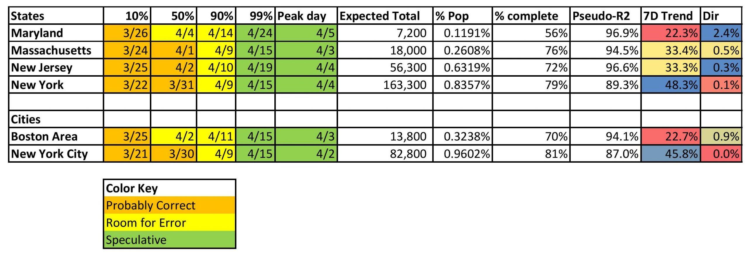
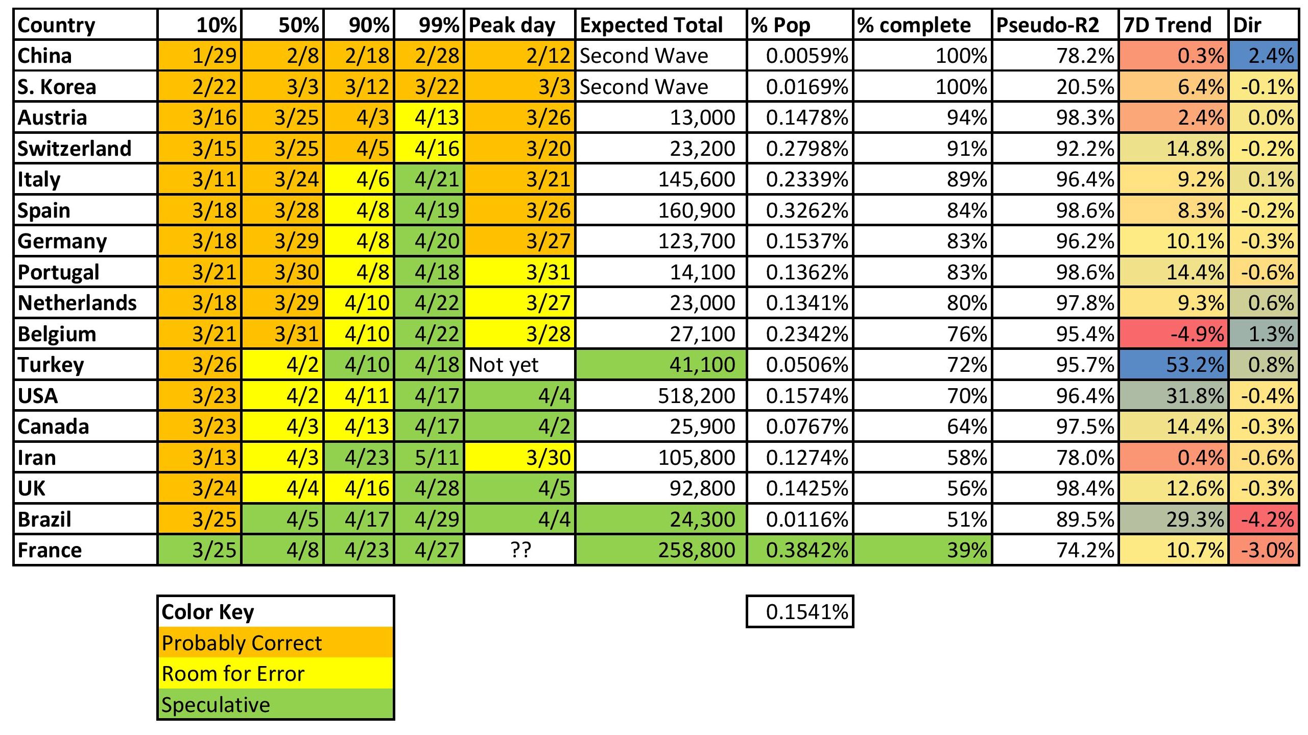
Before I go on, I want to explain what the two rightmost columns on the tables above and below mean.
- 7D Trend — the seven day sum of forecast errors as a ratio of the number of cases at the beginning of the seven days. Positive means the model has been underestimating. Negative, overestimating.
- Dir — Direction of the seven days of forecast errors — beta coefficient of the forecast errors versus time as a ratio of the number of cases at the beginning of the seven days.
The idea is to try to point out where the model is persistently missing, how large is it, and is it correcting or getting worse?
On the Limitations of this Model
All models have limitations. This model, being used to extrapolate, definitely has limitations. Extrapolation, as I have said, is dangerous. It’s dangerous because we know the past data with some degree of error, and the future not at all. Extrapolation, even if the underlying functional form used for estimation is right, assumes that all processes generating the values estimated are not shifting. If that is a good approximation to the reality that comes, luck will come marching in as genius.
This is a time series model. There are many structural models out there, and the “experts” estimate and use them. They have more data than I do. Those models suffer many of the same problems that complex economic models do. There are too many parameters to estimate, and they face the same problem I do with the future shifting, and errors in past data, as well as functional form issues. They are also subject to social and economic pressures that I don’t have to the same degree.
Scientists need the approval of their peers in order to publish and for general happiness. They need to be able to make money to survive. It is difficult to get tenure, and most scientists won’t take chances with that process.
It gets worse when science is being used for policy purposes, and gets picked up by the media. Caution is ordinarily a good thing,, but not when it misstates what is going on in order to achieve the ends of third parties. Tell the truth, and then let the politicians, policymakers, lawyers, businessmen, etc. figure out what they will do. The media almost always prefers sensational, sharp, easy-to-tell stories, over the complexity of what is true. The same is true of most average people who would rather not think hard, but just imitate the behavior of others.
Thus I tend to distrust “experts” whose ideas are used for political or policy purposes, and get trumpeted in the media. Their incentives are skewed — once you get close to fame, power, and maybe even money, you’d like to keep it, and that is a snare for many.
Practically, for this model, the difficulty comes around the middle, where the shift is happening — new cases peaking, growth in total cases decelerates. Why is it difficult? Small changes make a big difference to the shape and height of the curve. The prior day’s curve is anticipating a certain amount of deceleration in the growth in total claims. When the data arrives with more new cases than anticipated, the new curve will be taller and longer. VIce-versa if less new cases arrive. That is why for some areas that I modeled, the process seems to stall around 40-60%.
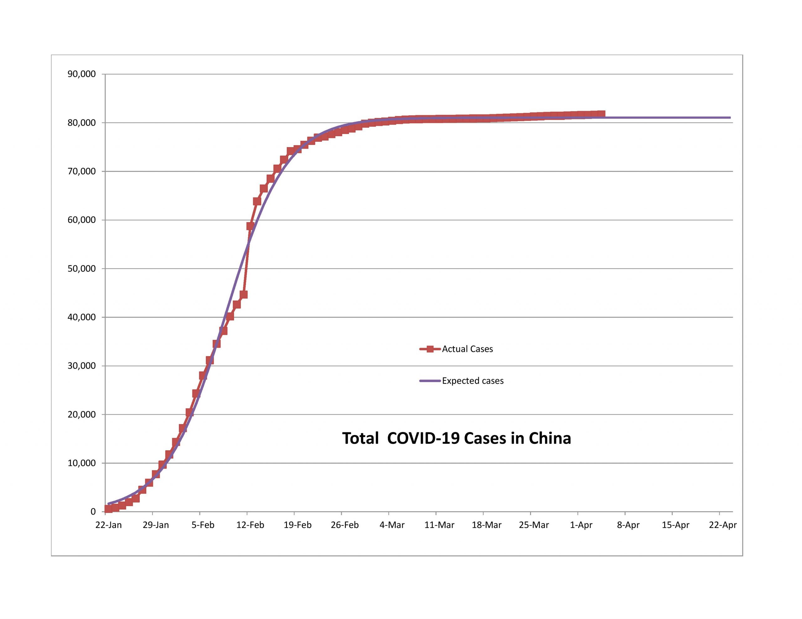
Now, there are raw data errors as well, like China on 2/12 and France on 4/3. There are nations like Iran where the political turmoil may have led to delayed reporting.
But for the most part, the models have worked well, just not so well for the US yet. We’ll get to that later. Before I do, I want to state a few things I have learned as I have gone through the modeling, which has been a learning process for me.
- Look at the percentage of population that the model is projecting for reported infections. If it’s not high enough, the model is wrong. Unless a nation jumped on the problem immediately, you won’t get results like South Korea.
- The nations that tested more as a percentage of population, particularly early in the epidemic, did a lot better.
- Repeated forecast errors in the same direction indicate the process for new claims is changing, and the model is trying to adjust.
- In that situation, if we?re only getting better at finding those infected, the upper part of the curve should tail off sharply.? On the other hand, if the if the ratio of new cases to total cases is protractedly rising because more infections are occurring, that?s an increase in the ultimate level of reported cases.
- Once a nation gets to the 10% point, getting to the 90% point takes three weeks or so. Getting to the 99% point takes 4-5 weeks.
- The markets will anticipate the end, with false starts, and a lot of noise.
- As Buffett says (something like): I’d rather be approximately right than precisely wrong… or, Rule 65: “The second-best plan that you can execute is better than the best plan that you can?t execute.” My goal was to get some idea of when the market might turn. In that sense, this has been a success.
The Graphs
As in prior posts, I will run through the graphs now.
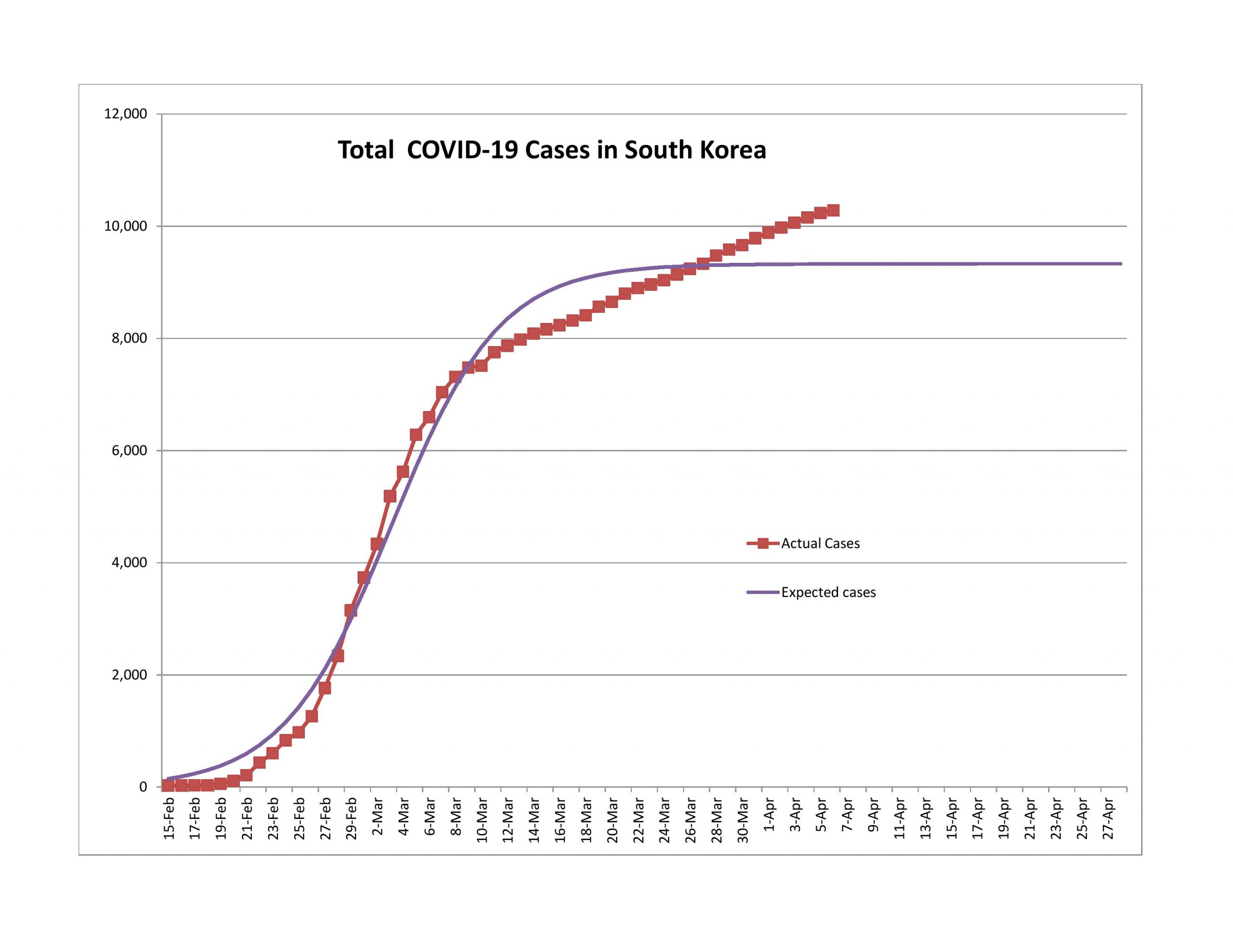
Second Wave
Finishing the First Wave
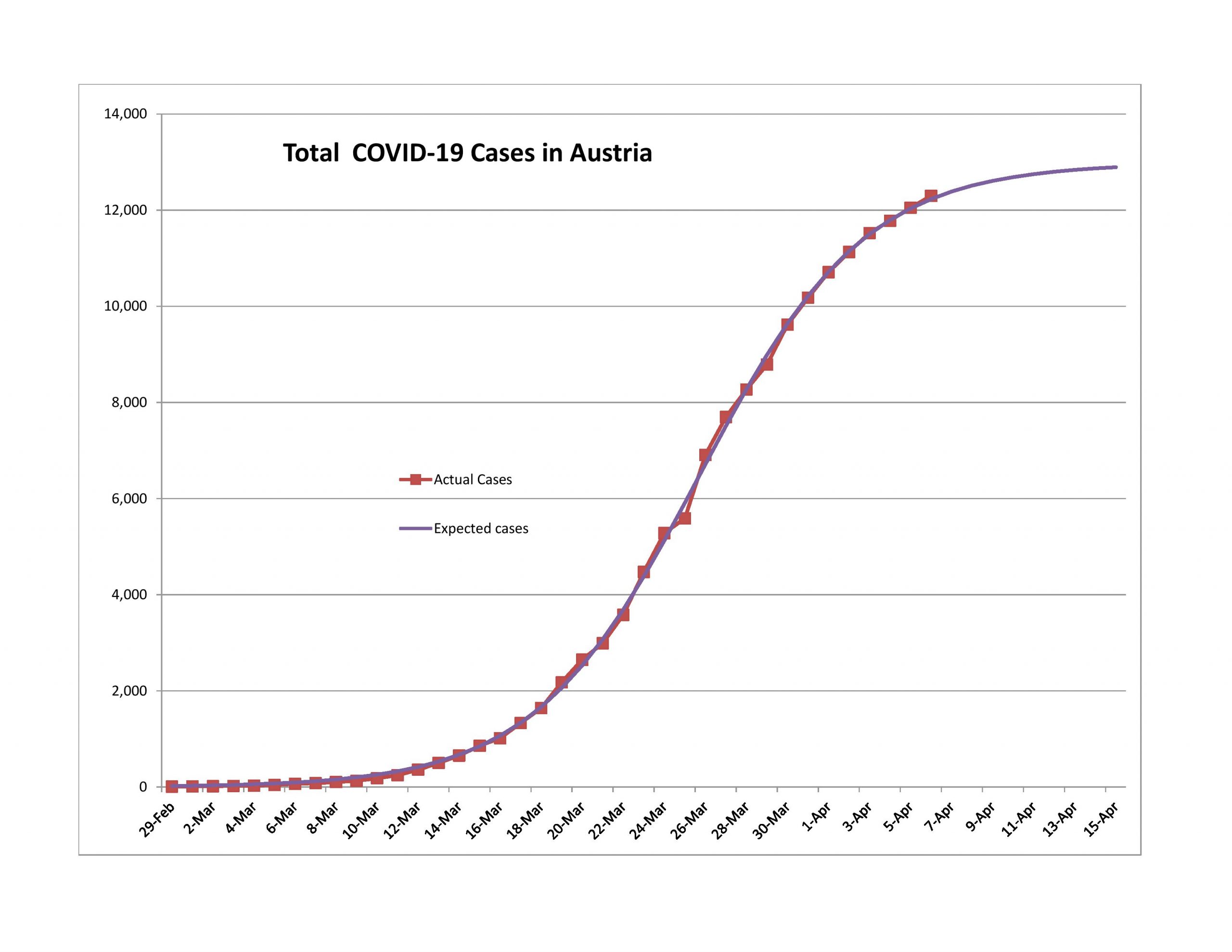
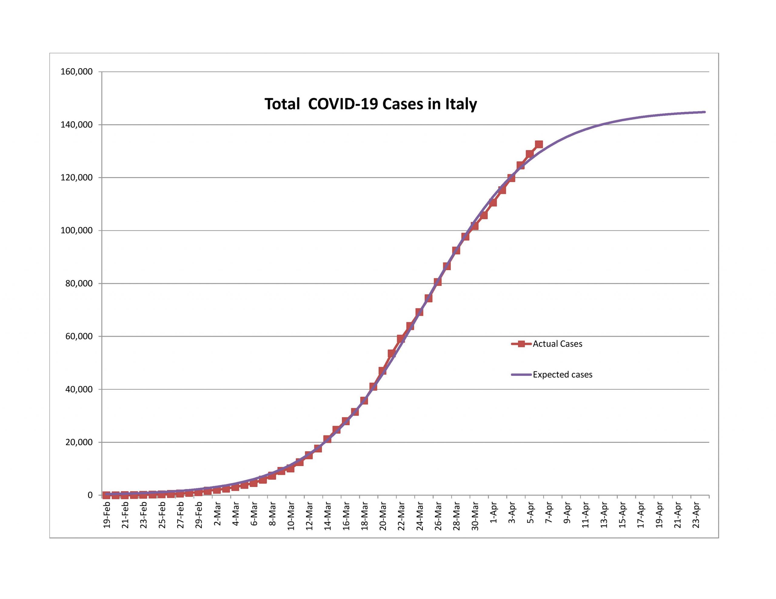
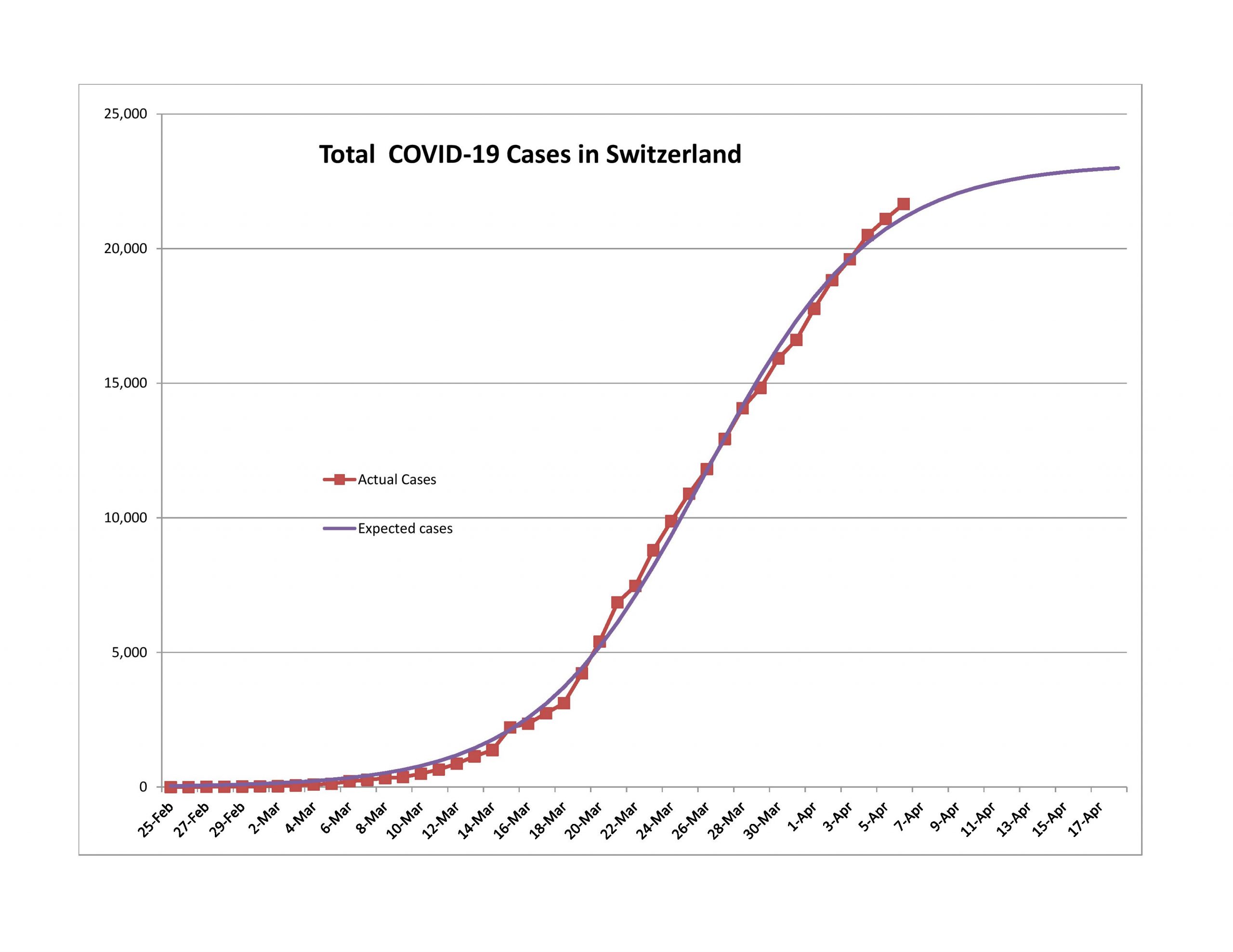
I write this with a little concern that I might be early on Italy and Switzerland, but new cases have been slowly rapidly for the two of them and Austria. Note that all three of them did a lot more testing per capita than most nations. You can see that here. The table sorts itself if you click on the top of the columns.
Coming to the Turning Point
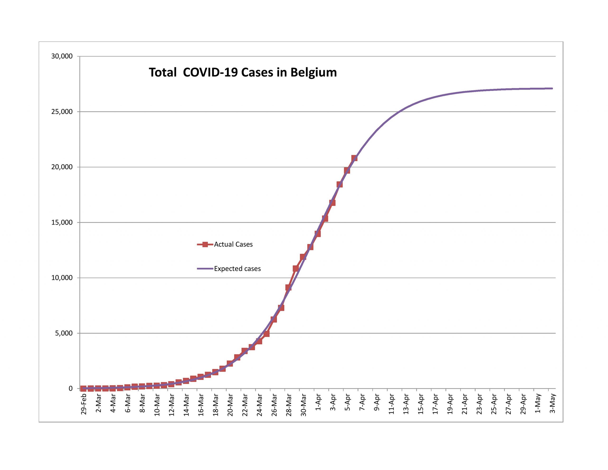
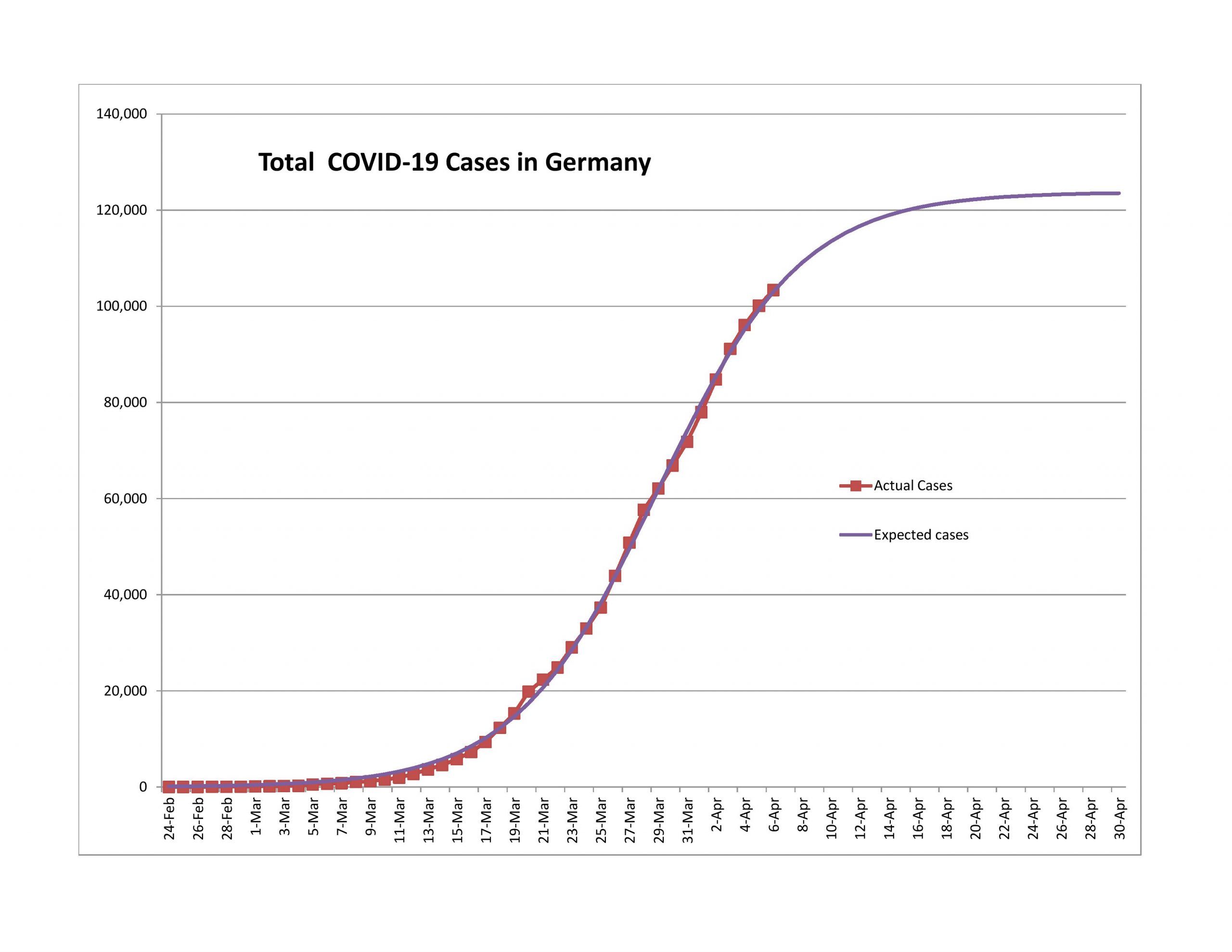
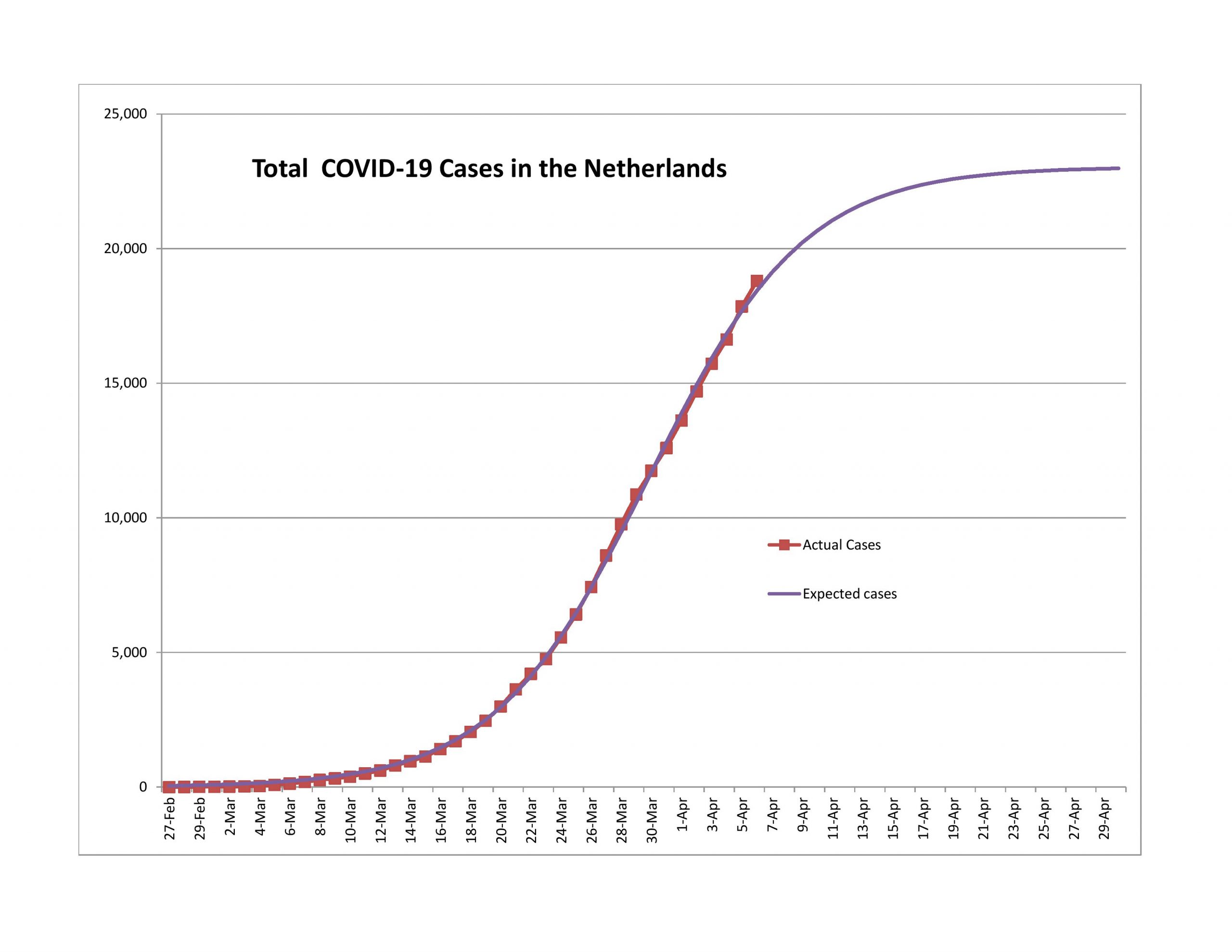
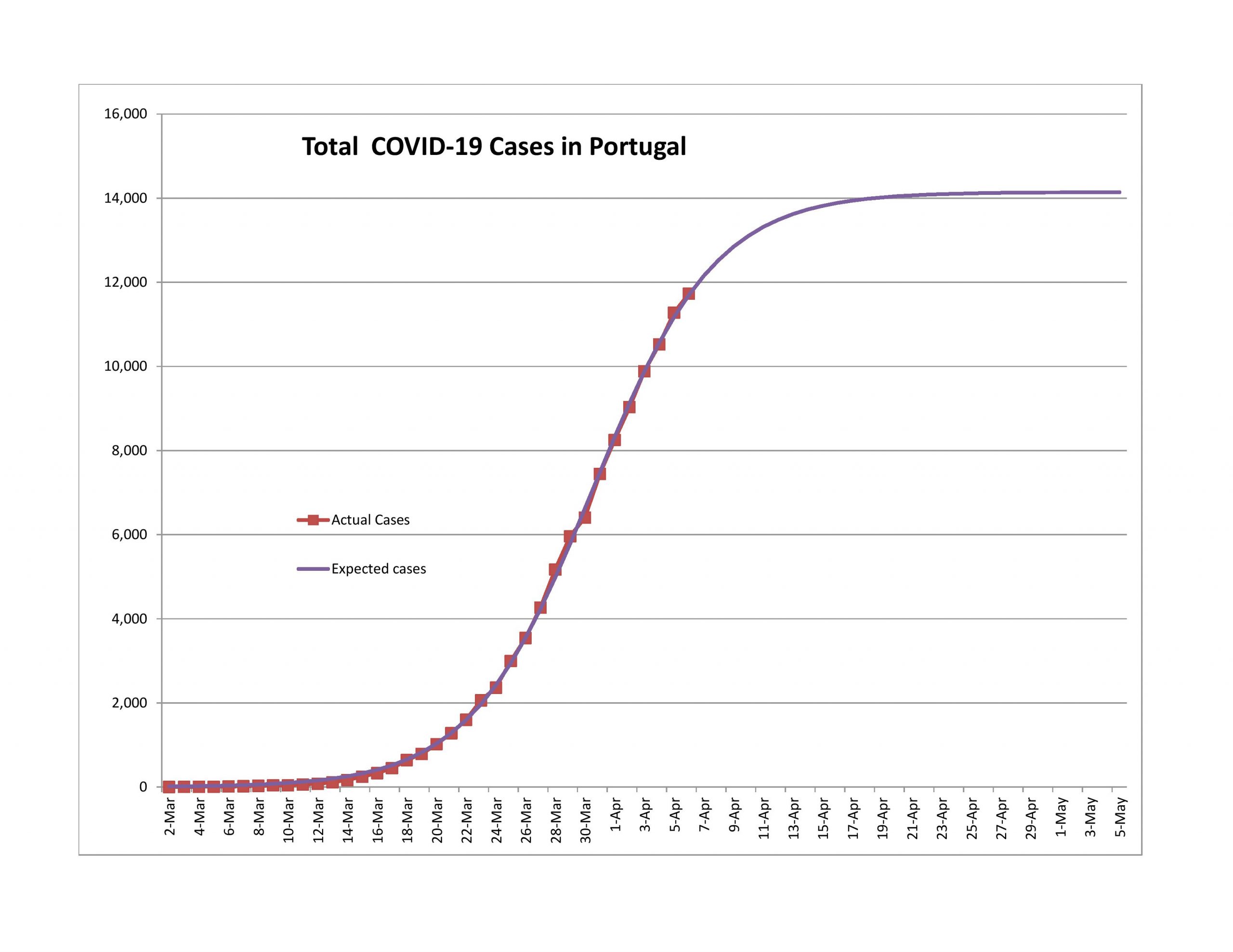
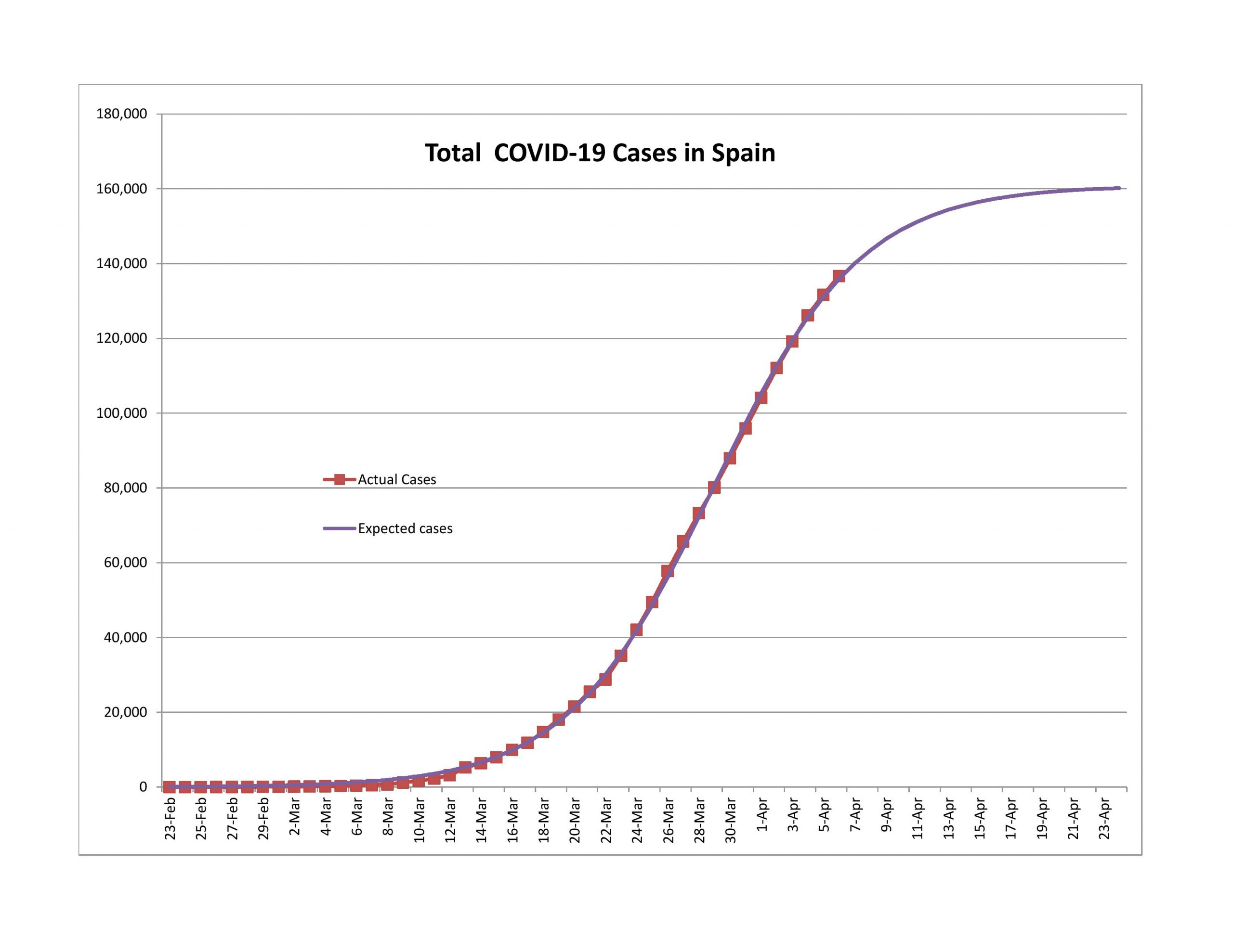
For Belgium, Germany, Netherlands, Portugal and Spain, new cases are declining, though not as rapidly as the model would predict. Even with that, it seems likely to me that all will pass the 90% point within a week.
Problem Children
Turkey
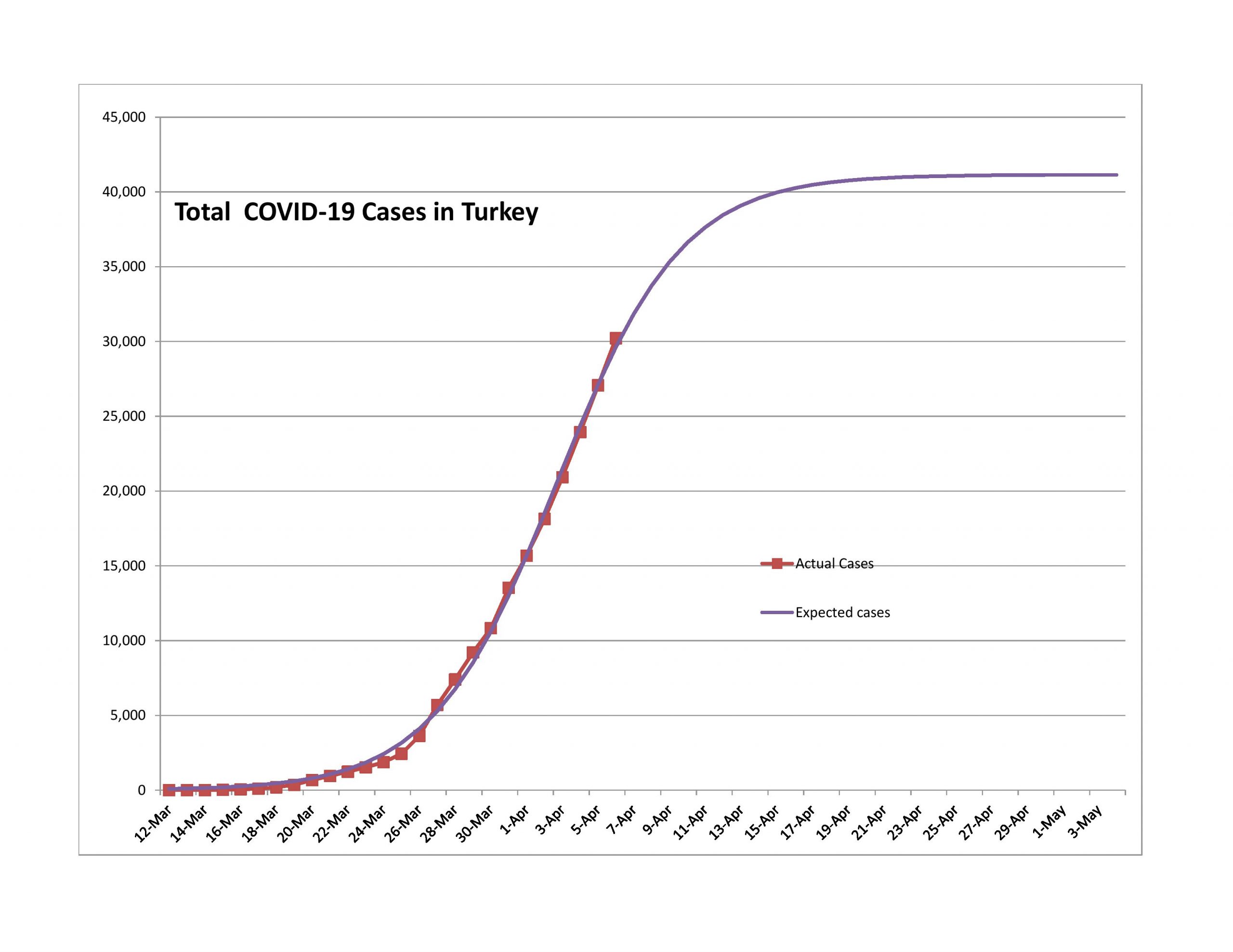
My problem with Turkey is that the expected total population infected is too low. They got to the game late, and the curve looks too sharp. I would expect this to not turn as quickly as the model says.
United States of America with some States and Cities
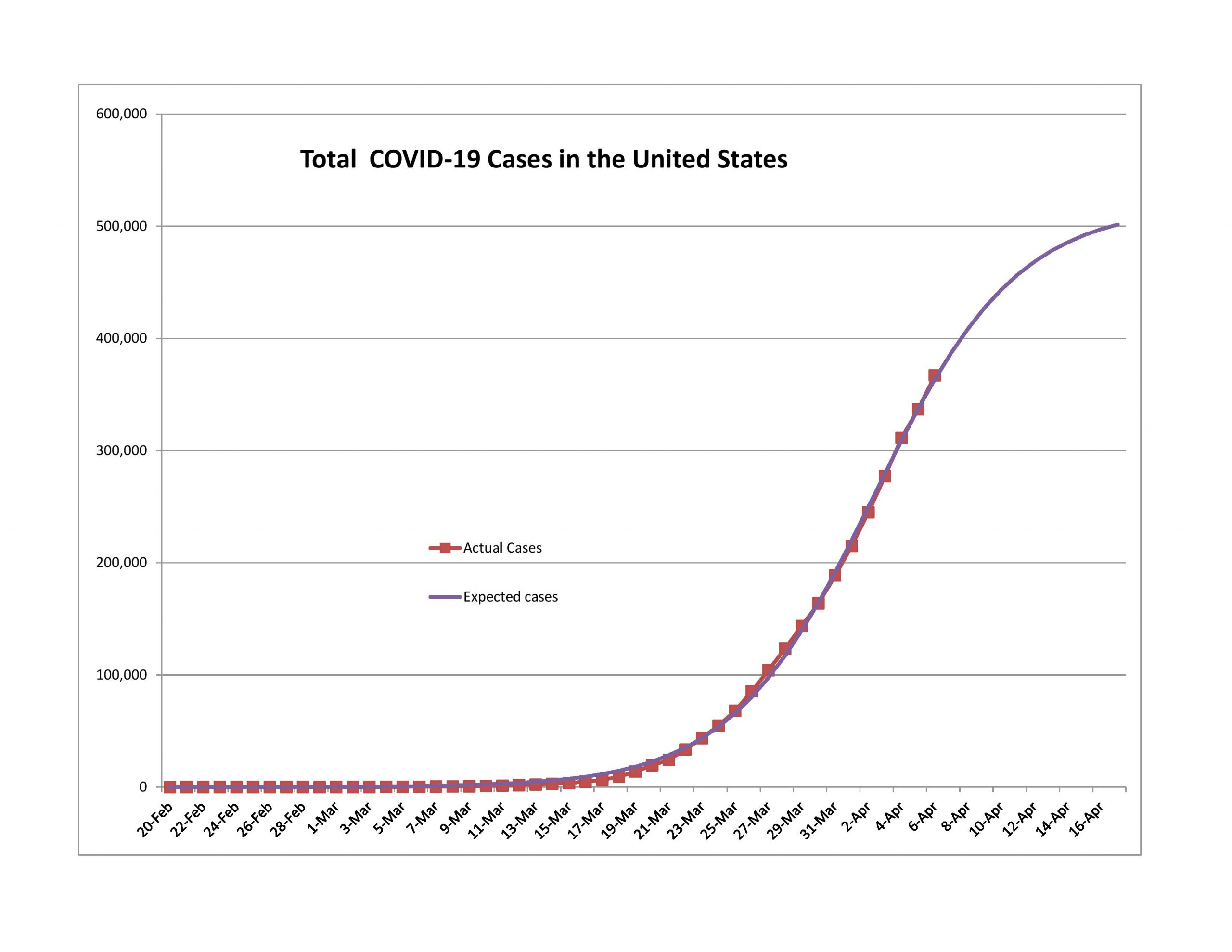
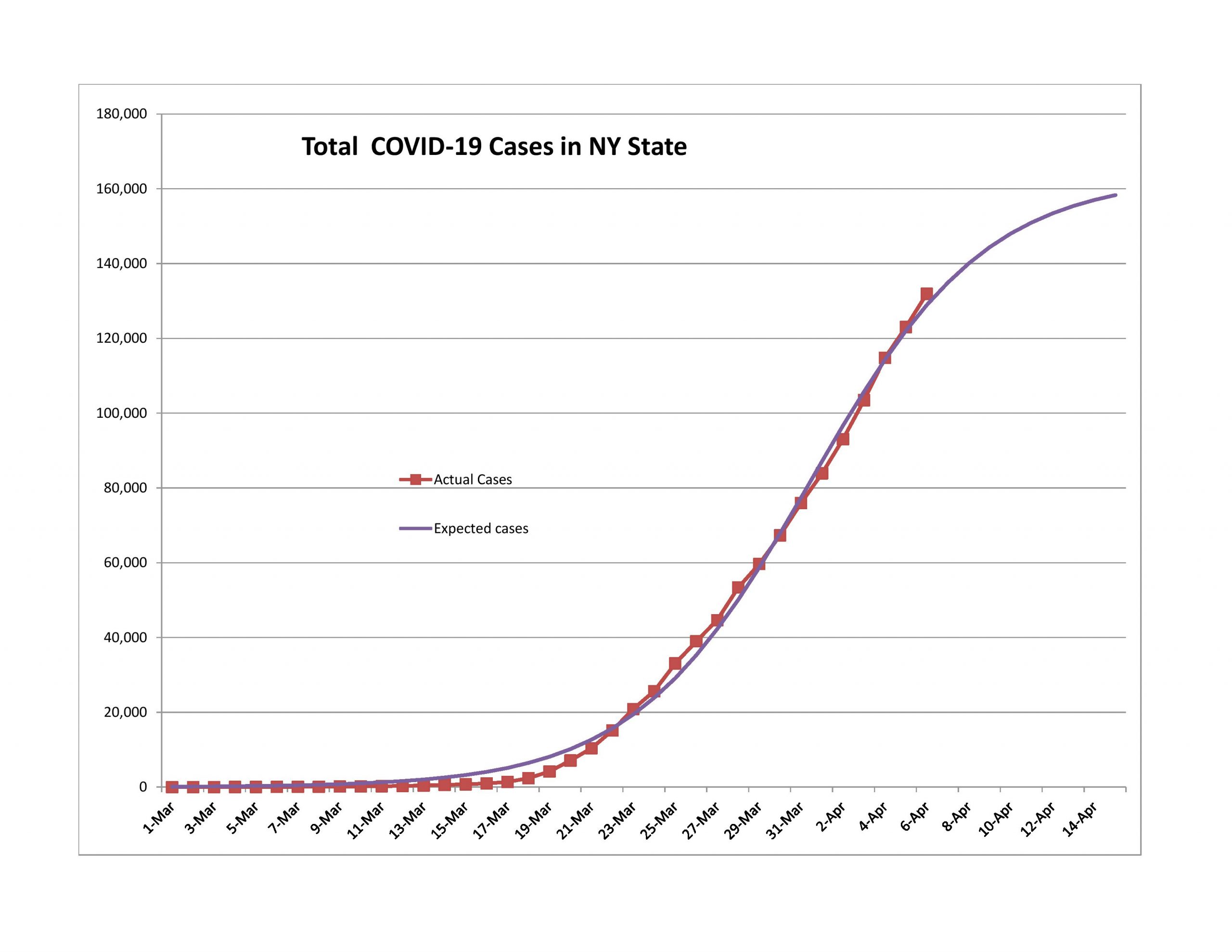
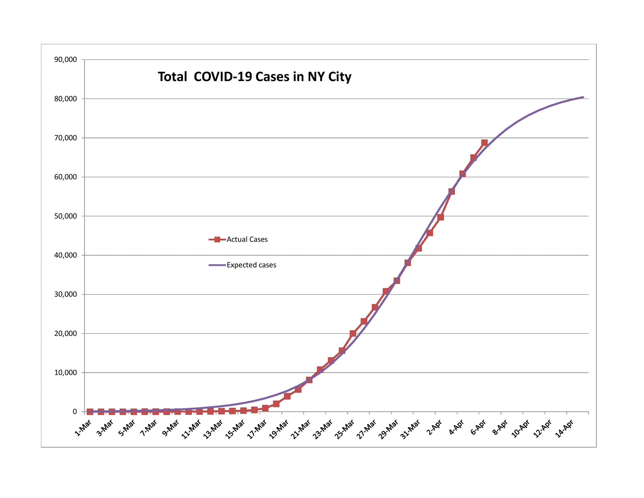
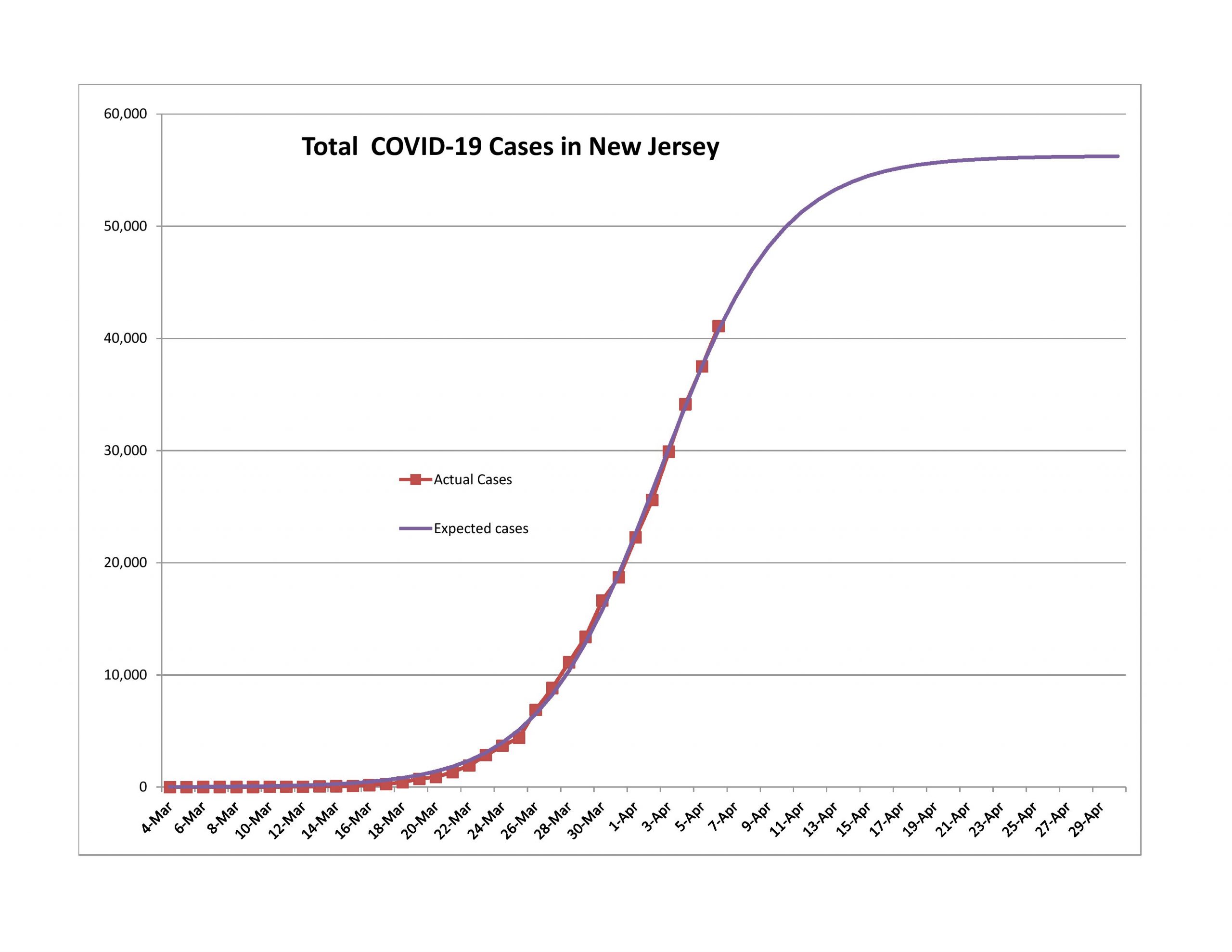
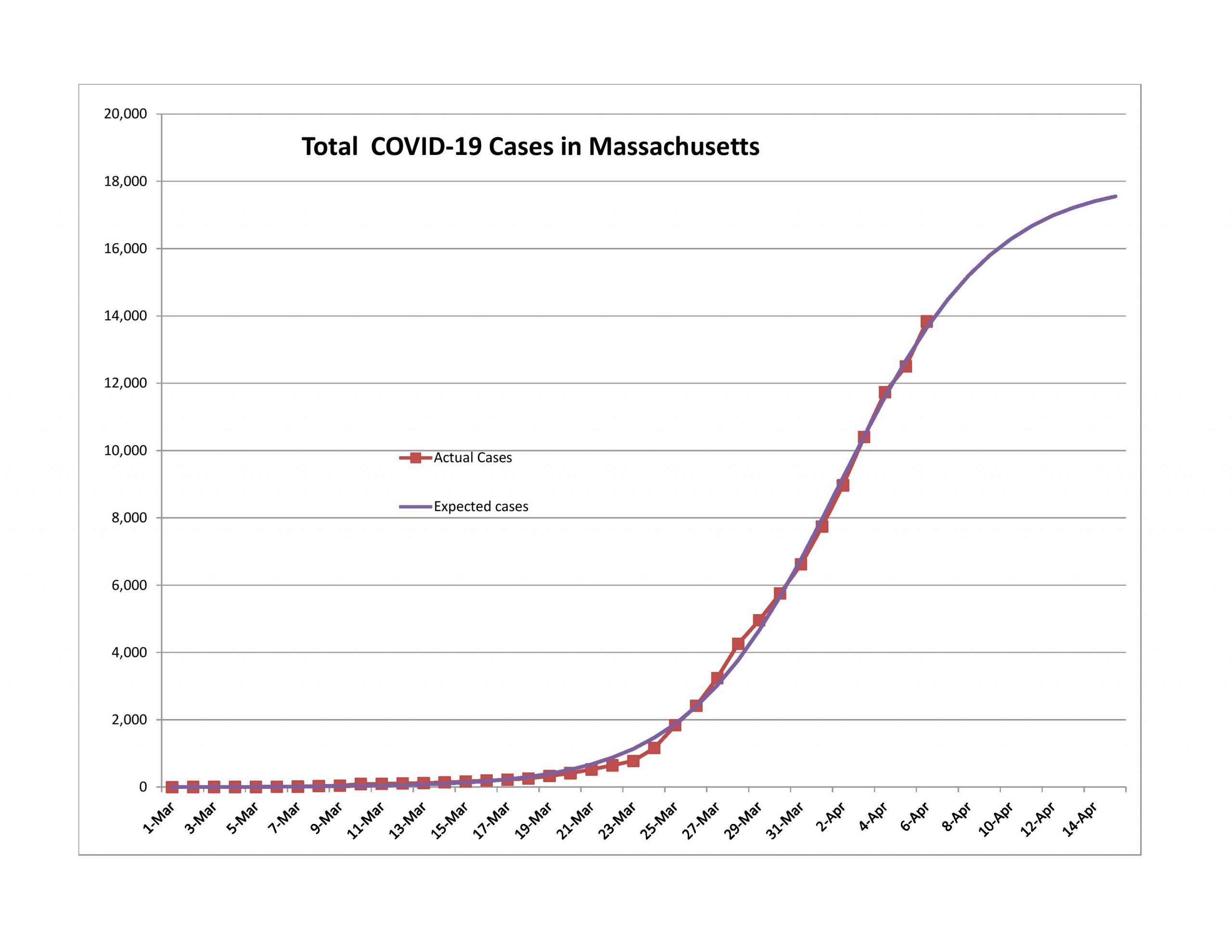
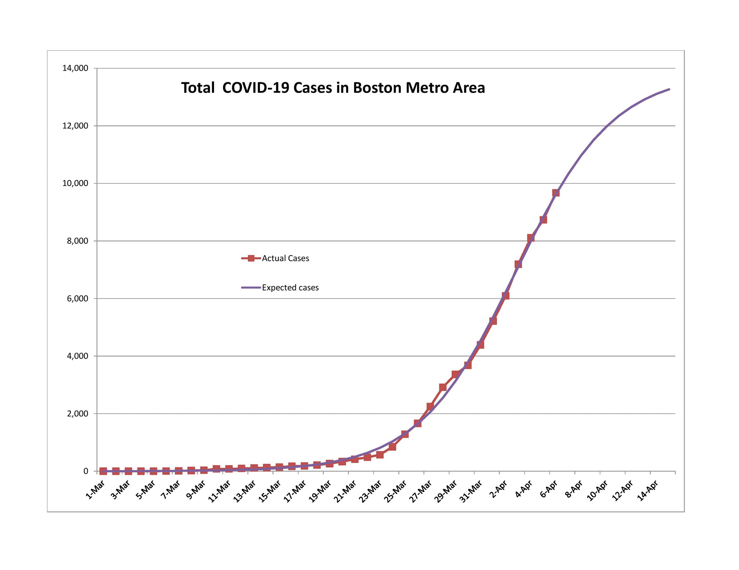
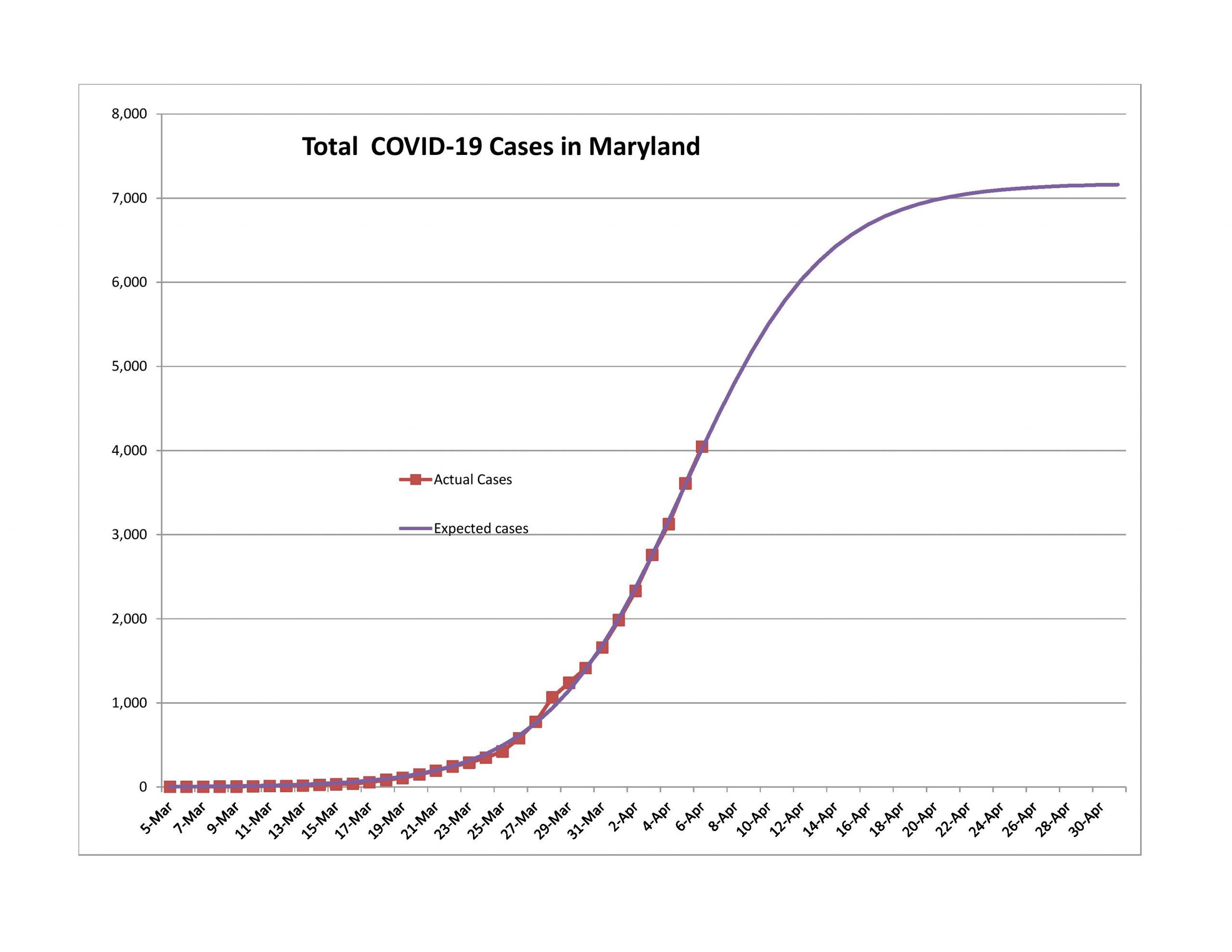
Yes, the USA has been slower than I expected, and I think I have a good reason for it. I gained the reason while trying to model the world as a whole for the COVID-19 pandemic. Using the logistic equation as my functional form, I could not even in the slightest achieve a positive pseudo-R-squared. Why?
If you add together a bunch of logistic curves with varying timing, height and sharpness, there is no guarantee that you will end up with a logistic curve. The US is a big place, and the population is spread out, with many different large population centers. Much as would have killed me timewise unless I had better software, I think it would have made more sense to model the US as a bunch of logistic curves state-by-state, and add them up.
Here’s a demonstration for the past week: if I take the forecast errors of New York State and New Jersey, they are roughly 65% of the forecast errors for the US as a whole. Together they have 47% of all reported COVID-19 cases.
There have been statements by some politicians that there will be a lot of new “hotspots” across the US, it’s a tempest in a teapot. The dense and large cities like New York City and Boston have a lot harder of a time preventing the spread of an epidemic. Areas that are smaller and less dense won’t have the same impact, not even proportionate to their sizes.
The US has been making progress, just not as fast the model predicted. I would be surprised if the US weren’t at the 90% point by what is normally tax day. It takes three weeks or so to get from 10% to 90% and another week or two to get to 99%. We will likely see the practical end of this in April. It’s just a question of when.
Canada
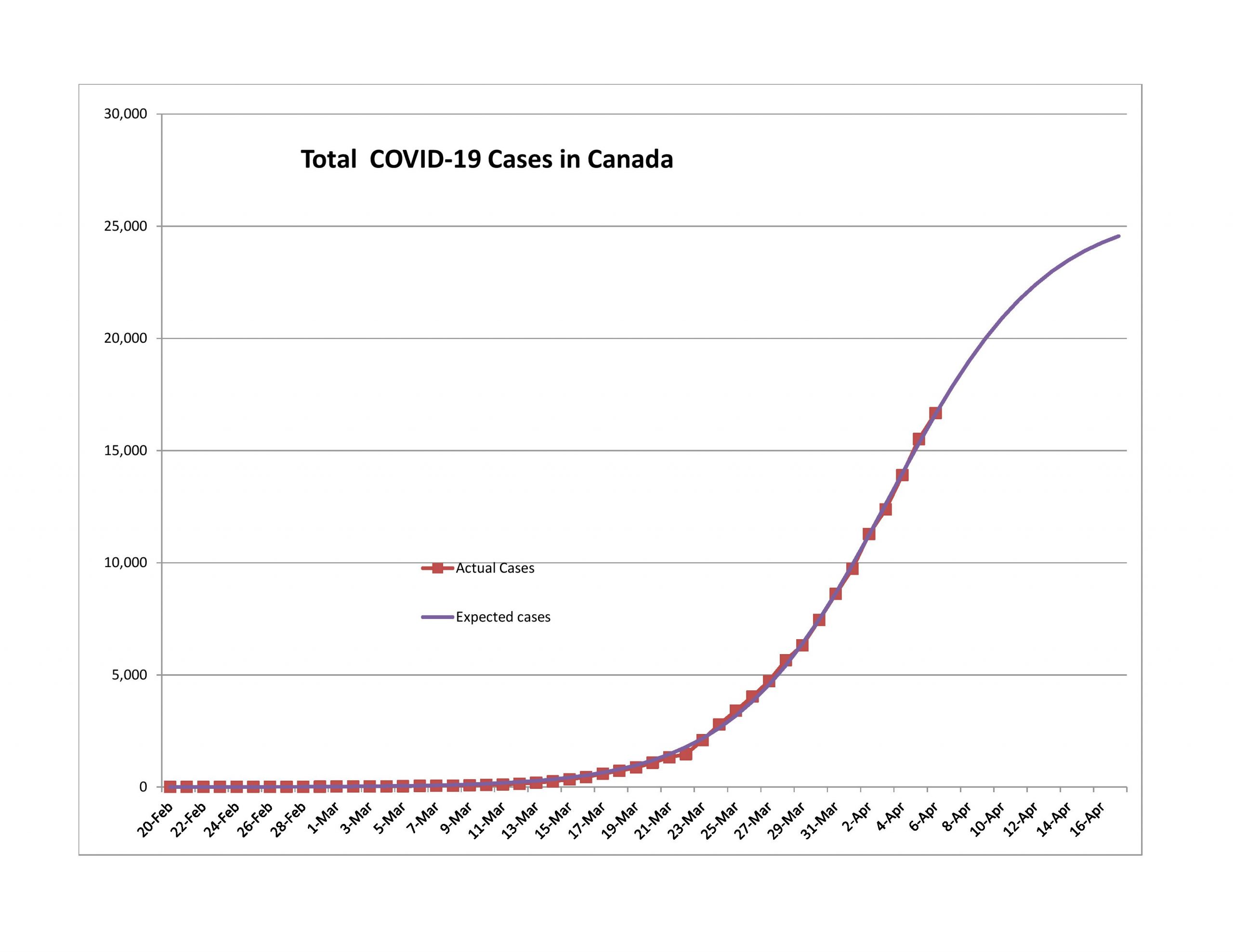
I place Canada in the same boat as Turkey. Too few ultimate cases. It will likely revise upward. That said, their population is more spread out, so it will likely have fewer cases per capita than the US.
Iran
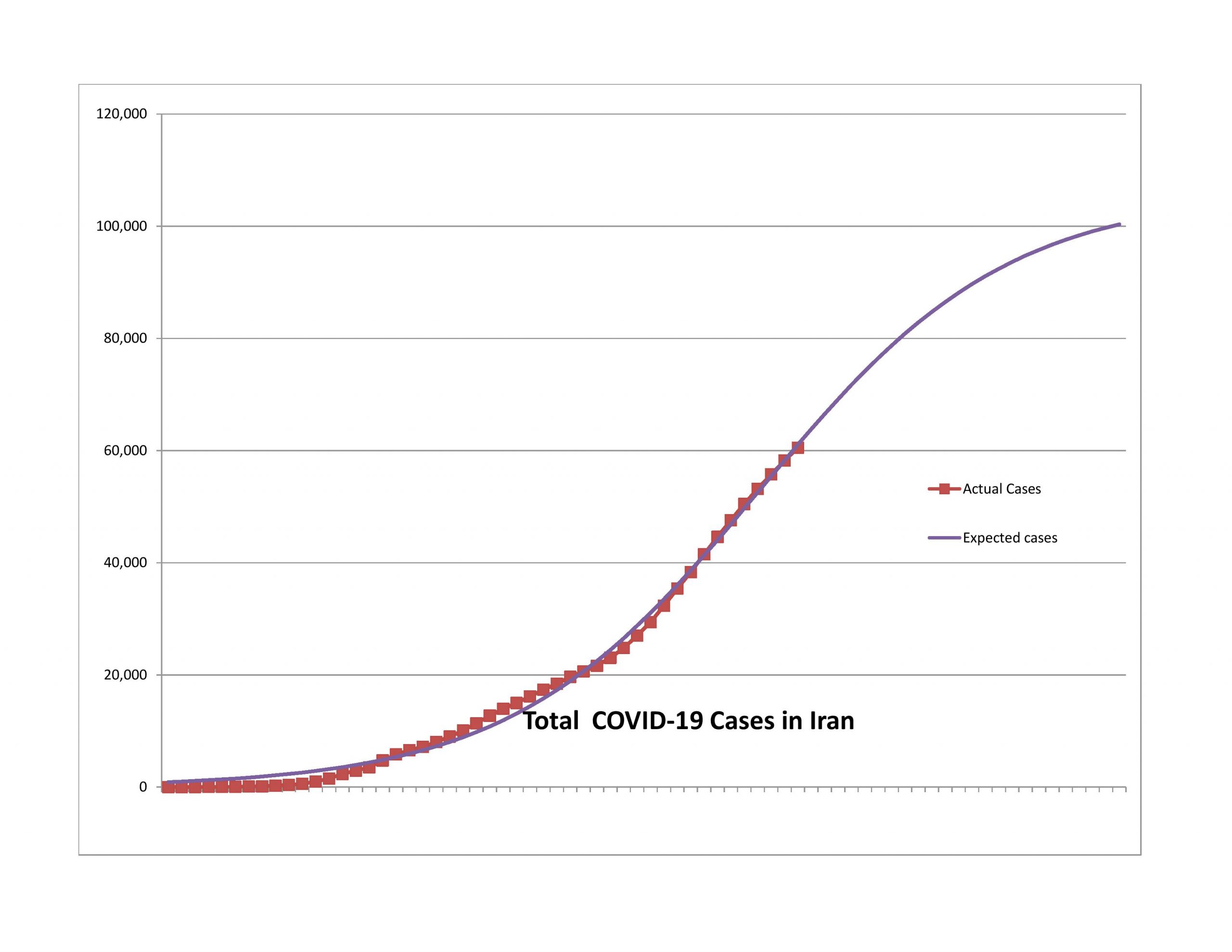
After several weeks of having claims far higher than the model would predict, the curve for Iran has regained a normal shape. The expected ultimate number of reported cases is on the low side of reasonable, and the model is finally tracking well. This is a watch and see sort of thing because of the instability in Iranian society, particularly amid the epidemic.
United Kingdom
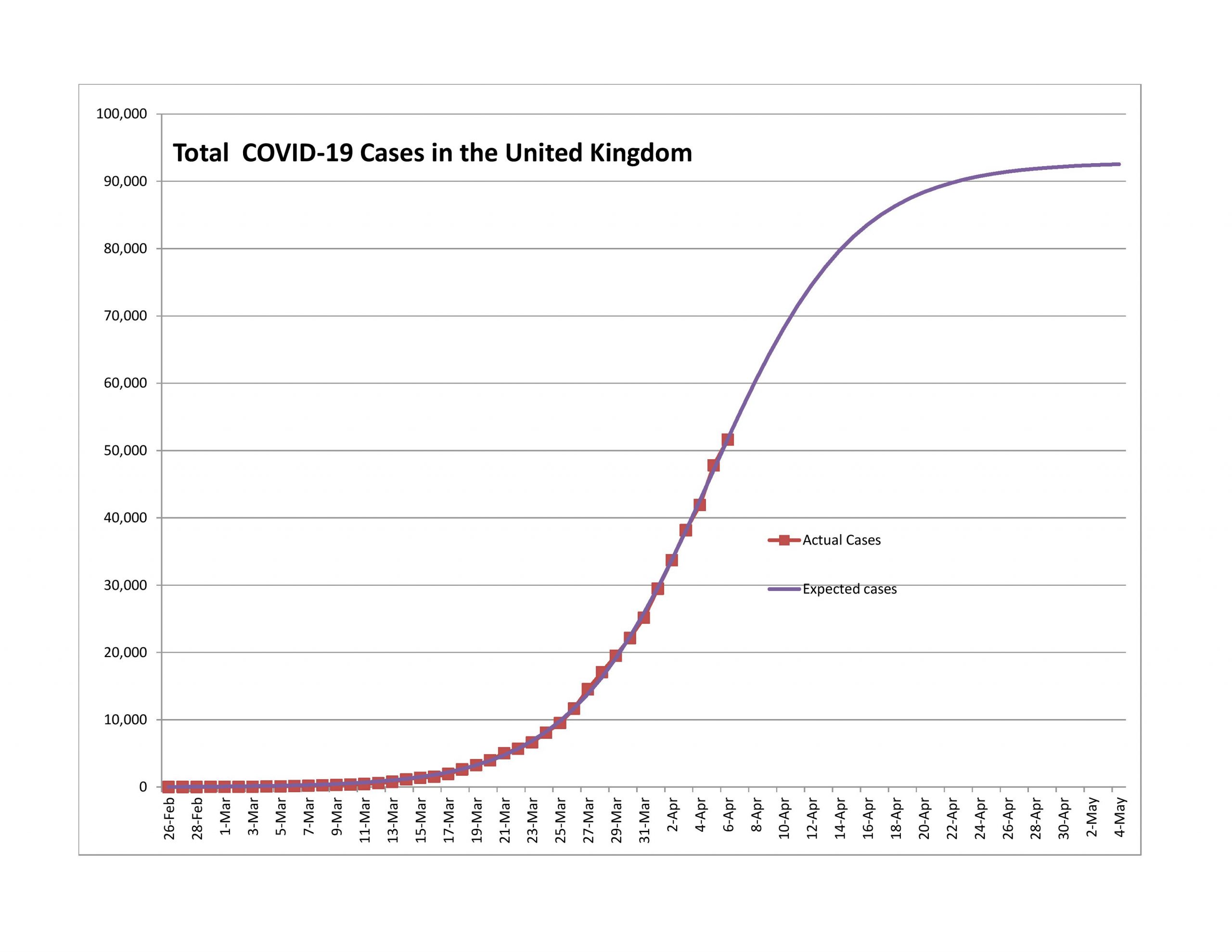
The UK is on the same path as the USA, only 5-11 days behind. Their new case rate is decelerating slowly, but it is decelerating.
Brazil
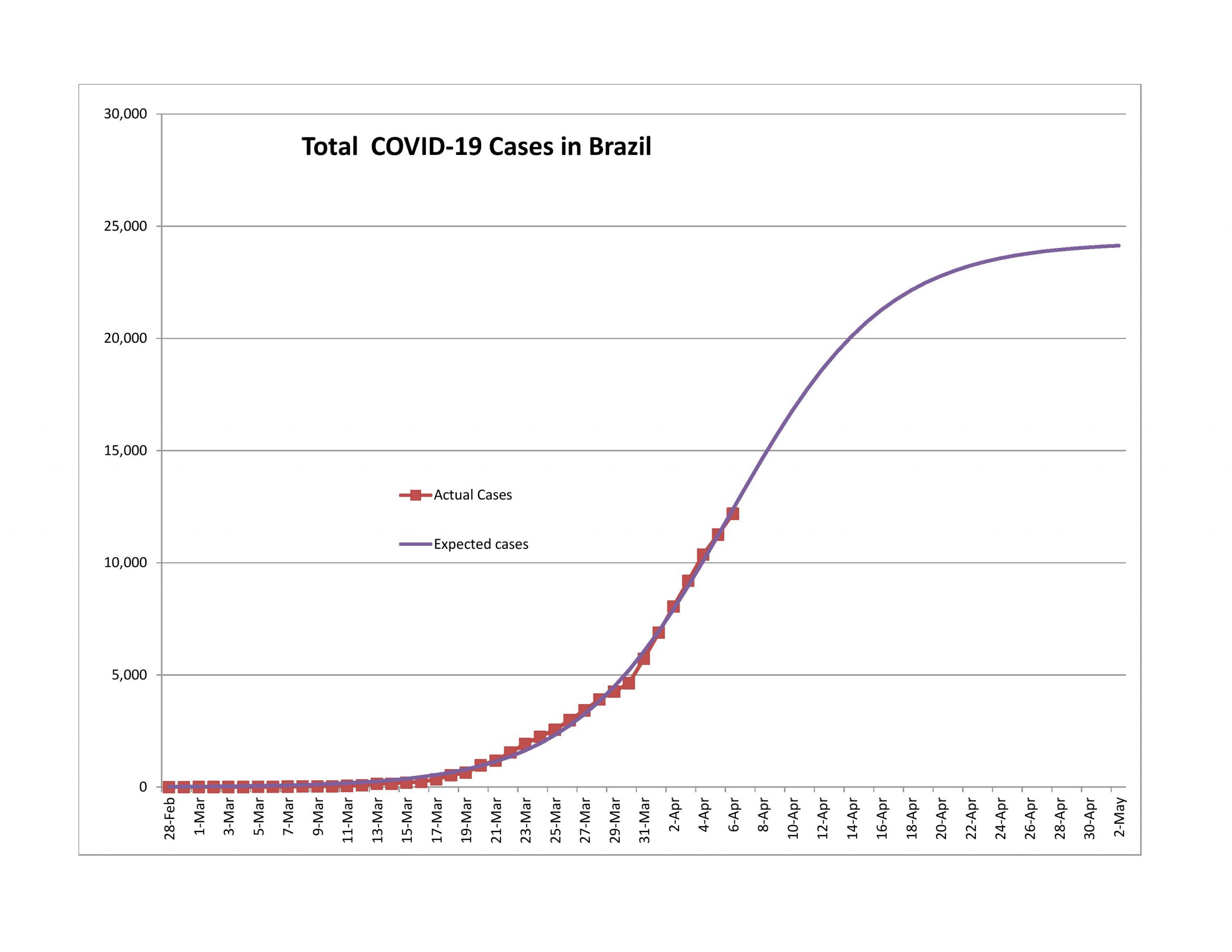
The expected ultimate number of reported cases is too low, and the model is too new. Conditions in Brazil are less than orderly, so I would expect this model to revise significantly upward.
France
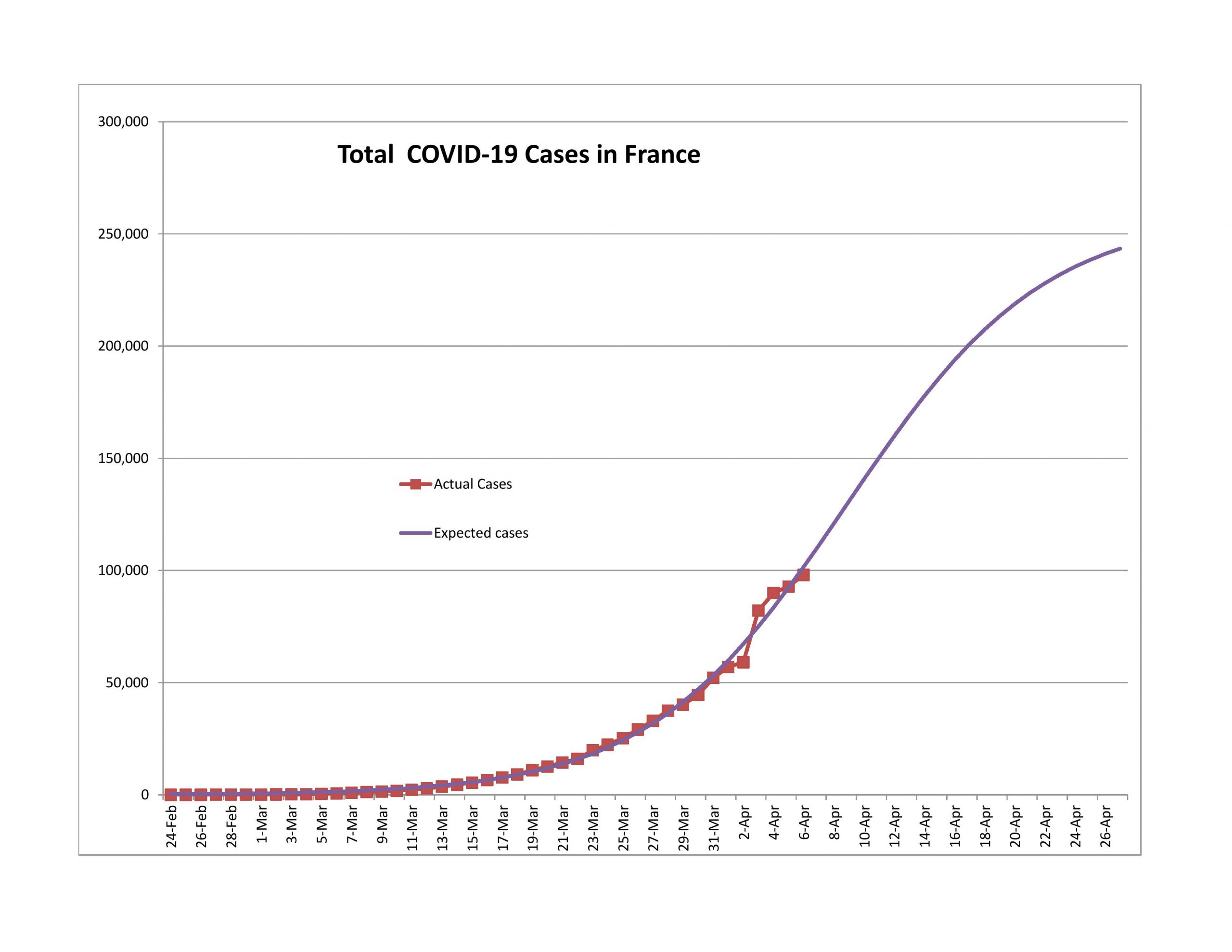
On 4/3 of the French government announced that they had only been counting deaths in hospitals and as such reported 23,000 new cases. Since that time the model for France has been posting negative forecast errors, and is slowly returning to a normal shape. I would expect in a week that the curve will look normal, and that the crisis in France would end about the same time as for the US.
Closing
That’s all for now. For those talking about these posts on Facebook, please note that I don’t interact there much. It’s best to comment at my blog or email me if you want my attention.

Thanks. Appreciate the extra time and thought that went into this update.
Now that the remaining states that have not implemented stay-at-home to any degree are ‘relatively inconsequential’ things should be falling into place, as your model predicts. I still feel however that the next steps (loosening) should be based on a more gradual return to normalcy with better testing at the core, rather than an approach that allows too many people to take unneeded risks. What is deemed acceptable for second wave numbers is at the heart of this and should be the paramount question to answer rather than economic concerns at this point in time.
Gradual means wondering if this is what we are up against (and how much it actually matters, yet to be seen.)
First Squawk
@FirstSquawk
? 5h
LOCKDOWN LIFTED IN WUHAN CHINA, CROWDS RUSH TO TRAINS TO LEAVE CITY – NYT
More really interesting data and discussion. Thanks for taking the time to do these projections, and for providing the commentary that makes them more understandable.