
I’ve said this before, but I like it when research destroys a preconceived notion of mine. ?Today’s post stems from an exchange that I had with Jackdamn (what a name) on Stocktwits, talking about a chart created by?dshort.
S&P 500 Percent Off High Since March 9, 2009. Chart by Doug Short. $SPX $SPY $DIA
? Jack Damn (@jackdamn) Sep. 3 at 09:39 AM
I responded:
@jackdamn over a 7.5 year period, how frequently do you get 5-10%. 10-15%, 15-20%, 20%+ drawdowns? This graph looks tame to me. $$
? David Merkel (@AlephBlog) Sep. 5 at 02:52 PM
To which he responded: That’s a great question. ?And it is a great question, but I’m not going to answer it directly here… because I think I am answering a better question.
Let me take you through my thought process, because I went through four different ways of trying to answer the question before settling on the better question, and getting the answer.
How do you summarize an area of a price graph in order to make comparisons of different periods? ?How do you determine when the market has been near highs for a long time, or far away for a long time? ?How does the intensity/distance below the high matter? ?If you are looking at troughs, where does one begin and another end?
I started by trying to identify the troughs individually, and the difficulty was trying to establish that in a mechanical way that did not require interpretation. ?I stumbled around playing with minimum periods between troughs, recovery levels before a new trough could start, moving averages to establish when a new trough was genuinely significant. ?Sigh.
I tried a lot of different things, and I could create rules that mostly made the troughs look decent, but I could never get it to be fully mechanical or lack arbitrariness. ?Why this trough?and not that? ?The same criticisms can be applied to dshort’s graph as well.
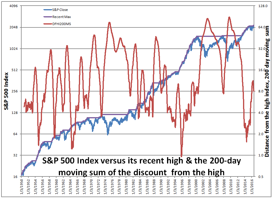
I finally pulled out of my mental gymnastics when I concluded: couldn’t I just take the area under the maximum line in percentage terms and use that as a measure, say over a 200-day period? ?200 days is arbitrary, and so is the measure, but that is less than most of the measures that I considered, and at least this one corresponds to a relatively simple calculation.
So if you look at the red line in my graph above, you will note that it has dipped below 2.0?five times in the last 66 years, in 1954, 1959, 1964, 1995 and 2014. ?These observations followed periods where the markets moved to new highs rather smartly and without a lot of downside volatility. ?Then there were 3 times that the measure peaked?higher than 64, in 1975, 2003 and 2009. ?These times followed incredible market falls, and were great times to be putting money into the market.
Below you can see ?a table of values for how often the measure is below a given threshold. ?It’s only above 64 about 5% of the time, and below 2 about 3.5% of the time. ?My main thought is this measure is this: high values of the measure probably are a “buy signal.” ?Low values of the measure aren’t necessarily a “sell signal.”
That signals are asymmetric should not be surprising. ?The largest factor in most long-term market moves, the credit cycle, is also asymmetric. ?It’s like my continuing series, Goes Down Double Speed. ?Bull markets have shallower moves and longer duration, the same way that the bull phase of the credit cycle goes. ?Extend credit, extend credit, extend credit… loosen standards, loosen standards, loosen standards… tighten spreads, tighten spreads, tighten spreads, etc. ?Then in the bear phase it is DENY CREDIT!! TIGHTEN STANDARDS!! SHEPHERD LIQUIDITY!! SURVIVE!! ?Short and sharp. ?Painful. ?Prices are lower, and yields higher at the end.
To close this off, where is this indicator now? ?It’s around 8, which is near the 40th percentile… kind of a blah figure, not saying much of anything… which is good in its own way. ?The market meanders and hits a few new highs, sags a little, comes back, hits a few new highs, etc. ?Not many people believe in it, but we are inches off the highs. ?Odds are we go higher from here, but not aggressively higher.
One final note: we are in the fourth and final phase of the credit cycle now, so don’t get too aggressive. ?Debt is getting higher inside nonfinancial corporations. ?Be wary, and do your fundamental due diligence on balance sheets.
| Percentile | DFHI200MS |
| 1% | 1.33 |
| 5% | 2.42 |
| 10% | 3.21 |
| 20% | 4.50 |
| 30% | 5.73 |
| 40% | 8.18 |
| 50% | 11.67 |
| 60% | 17.42 |
| 70% | 27.47 |
| 80% | 36.52 |
| 90% | 49.83 |
| 95% | 63.10 |
| 99% | 83.08 |