Photo Credit: eflon?|| The?title of the article comes from a comment Greenberg supposedly made to Buffett when AIG was much bigger than Berkshire Hathaway — times change…
============================
The?title of the article comes from a comment Greenberg supposedly made to Buffett when AIG was much bigger than Berkshire Hathaway [BRK] — times change…
It’s come to this: AIG has sought out reinsurance from BRK to cap the amount of losses they will pay for prior business written. ?It’s quite a statement when you are willing to pay $10 billion in order to have BRK pay 80% of claims over $25 billion, up to $20 billion in total. ?At $50 Billion in claims AIG is on its own again.
The agreement covers 80% of substantially all of AIG?s U.S. Commercial long-tail exposures for accident years 2015 and prior, which includes the largest part of AIG?s U.S. casualty exposures during that period. AIG will retain sole authority to handle and resolve claims, and NICO has various access, association and consultation rights.
The pact covers such product lines as workers? compensation, directors? and officers? liability, professional indemnity, medical malpractice, commercial automobile and some other liability policies.
Now, AIG is not among the better P&C insurance companies for reserving out there. ?2.5 years ago, they made the Aleph Blog Hall of Shame for P&C reserving. ?Now if you would have looked on the last 10-K on page 296 for item 8, note 12, you would note that AIG’s reserving remained weak for?2014 and 2015 as losses and loss adjustment expenses incurred for the business of prior years continued positive.
For AIG, this puts a lot of its troubles behind it, after the upcoming writeoff (from the WSJ article):
AIG, one of the biggest sellers of insurance by volume to businesses around the globe, also said it expects a material fourth-quarter charge to boost its claims reserves. AIG declined to comment on the possible size. Its fourth-quarter earnings will be released next month.
For BRK, this is an opportunity to make money investing the $10 billion as claims on the long-tail business get paid out slowly. ?It’s called float, which isn’t magic, but Buffett has done better than most at investing the float, and choosing insurance business to write and reinsure that doesn’t result in large losses for BRK.
I expect BRK to make an underwriting profit on this, but let’s assume the worst, that BRK pays out the full $20 billion. ?Say the claims come at a rate of $5 billion/year. ?The average payout period would be 7.5 years, and BRK would have to earn 9.2% on the float to break even. ?At $3.75B/yr, the figures would be 10 years and 6.9%. ?At $2.5B/yr, 15 years and 4.6%.
This doesn’t seem so bad to me — now I don’t know how bad reserve development will be for AIG, but BRK is usually pretty careful about underwriting this sort of thing. That said BRK has a lot of excess cash sitting around already, and desirable targets for large investments are few. ?This had better make an underwriting profit, or a small loss, or maybe Buffett is ready for the market to fall apart, and thus the rate he can earn goes up.
All that said, it is an interesting chapter in the relationship between the two companies. ?If BRK wasn’t the dominant insurance company of the US after the 2008 financial crisis, it definitely is now.
Full disclosure: long BRK/B for myself and clients
My last post on this generated some good questions. ?I’m going to answer them here, because this model deserves a better explanation. ?Before I start, I should say that in order to understand the model, you need to read the first two articles in the series, which are?here:
If you are curious about the model, the information is there. ?It includes links to the main article at Economic Philosopher’s blog ( @jesselivermore on Twitter).
On to the questions:
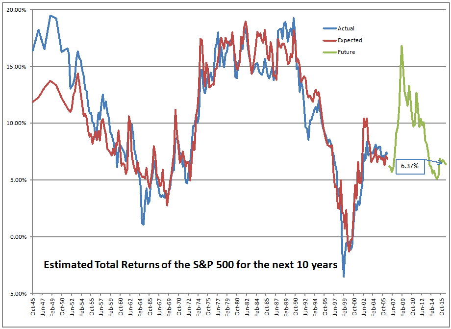
Is this nominal or real return? Where can I find your original blog post explaining how you calculate future returns? Similar charts using Shiller PE, total market cap to gdp, q-ratio etc. all seem to imply much lower future returns.
This is a nominal return. ?In my opinion, returns and inflation should be forecast separately, because they have little to do with each other. ?Real interest rates?have a large impact on equity prices, inflation has a small impact that varies by sector.
This model also forecasts returns for the next ten years. ?If I had it do forecasts over shorter horizons, the forecasts would be lower, and less precise. ?The lower precision comes from the greater ease of forecasting an average than a single year. ?It would be lower because?the model has successively less power in forecasting each successive year — and that should make sense, as the further you get away from the current data, the less impact the data have. ?Once you get past year ten, other factors dominate?that this model does not account for — factors reflecting the long-term productivity of capital.
I can’t fully explain why this model is giving higher return levels, but I can tell you how the models are different:
This model focuses in investor behavior — how much are investors investing in stocks versus everything else. ?It doesn’t explicitly consider valuation.
The Shiller PE isn’t a well-thought-out model for many reasons. ?16 years ago I wrote an email to Ken Fisher where I listed a dozen flaws, some small and some large. ?That e-mail is lost, sadly. ?That said, let me be as fair as I can be — it attempts to compare the S&P 500 to trailing 10-year average earnings. ?SInce using a single year would be unsteady, the averaging is a way to compare a outdated smoothed income statement figure to the value of the index. ?Think of it as price-to-smoothed-earnings.
Market Cap to GDP does a sort of mismatch, and makes the assumption that public firms are representative of all firms. ?It also assumes that total payments to all factors are what matter for equities, rather than profits only. ?Think of it as a mismatched price-to-sales ratio.
Q-ratio compares the market value of equities and debt to the book value of the same. ?The original idea was to compare to replacement value, but book value is what is available. ?The question is whether it would be cheaper to buy or build the corporations. ?If it is cheaper to build, stocks are overvalued. ?Vice-versa if they are cheaper to buy. ?The grand challenge here is that book value may not represent replacement cost, and increasingly so because intellectual capital is an increasing part of the value of firms, and that is mostly not on the balance sheet. ?Think of a glorified Economic Value to Book Capital ratio.
What are the return drivers for your model? Do you assume mean reversion in (a) multiples and (b) margins?
Again, this model does not explicitly consider valuations or profitability. ?It is based off of the subjective judgments of people allocating their portfolios to equities or anything else. ?Of course, when the underlying ratio is high, it implies that people are attributing high valuations to equities relative to other assets, and vice-versa. ?But the estimate is implicit.
So?I?m wondering what the difference is between your algorithm for future returns and John Hussman?s algorithm for future returns. For history, up to the 10 year ago point, the two graphs look quite similar. However, for recent years within the 10-year span, the diverge quite substantially in absolute terms (although the shape of the ?curves? look quite similar). It appears that John?s algorithm takes into account the rise in the market during the 2005-2008 timeframe, and yours does not (as you stated, all else remaining the same, the higher the market is at any given point, the lower the expected future returns that can be for an economy). That results in shifting your expected future returns up by around 5% per year compared to his! That leads to remarkably different conclusions for the future.
Perhaps you have another blog post explaining your prediction algorithm that I have not seen. John has explained (and defended) his algorithm extensively. In absence of some explanation of the differences, I think that John?s is more credible at this point. See virtually any of his weekly posts for his chart, but the most recent should be at http://www.hussmanfunds.com/wmc/wmc161212e.png?(DJM: the article in question is here.)
I’d love to meet and talk with John Hussman. ?I have met some members of his small staff, and he lives about six miles from my house. ?(PS — Even more, I would like to meet @jesselivermore). ?The Baltimore CFA Society asked him to come speak to us a number of times, but we have been turned down.
Now, I’m not fully cognizant of everything he has written on the topic, but the particular method he is using now was first published on 5/18/2015. ?There is an article critiquing aspects of Dr. Hussman’s methods from Economic Philosopher. ?You can read EP for yourself, but I gain one significant thing from reading this — this isn’t Hussman’s first model on the topic. ?This means the current model has benefit of hindsight bias as he acted to modify the model to correct inadequacies. ?We sometimes call it a specification search. ?Try out a number of models and adjust until you get one that fits well. ?This doesn’t mean his model is wrong, but that the odds of it forecasting well in the future are lower because each model adjustment effectively relies on less data as the model gets “tuned” to eliminate past inaccuracies. ?Dr. Hussman has good reasons to adjust his models, because they have generally been too bearish, at least recently.
I don’t have much problem with his underlying theory, which looks like a modified version of Price-to-sales. ?It should be more comparable to the market cap to GDP model.
This model, to the best of my knowledge, has not been tweaked. ?It is still running on its first pass through the data. ?As such, I would give it more credibility.
There is another reason I would give it more credibility. ?You don’t have the same sort of tomfoolery going on now as was present during the dot-com bubble. ?There are some speculative enterprises today, yes, but they don’t make up as much of the total market capitalization.
All that said, this model does not tell you that the market can’t fall in 2017. ?It certainly could. ?But what it does tell you versus valuations in 1999-2000 is that if we do get a bear market, it likely wouldn’t be as severe, and would likely come back faster. ?This is not unique to this model, though. ?This is true for all of the models mentioned in this article.
Stock returns are probabilistic and mean-reverting (in a healthy economy with no war on your home soil, etc.). ?The returns for any given year are difficult to predict, and not tightly related to valuation, but the returns over a long period of time are easier to predict, and are affected by valuation more strongly. ?Why? ?The correction has to happen sometime, and the most likely year is next year when valuations are high, but the probability?of it happening in the 2017?are maybe 30-40%, not 80-100%.
If you’ve read me for a long time, you will know I almost always lean bearish. ?The objective is to become intelligent in the estimation of likely returns and odds. ?This model is just one of ones that I use, but I think it is the best one that I have. ?As such, if you look the model now, we should be Teddy Bears, not full-fledged Grizzlies.
That is my defense of the model for now. ?I am open to new data and interpretations, so once again feel free to leave comments.
[bctt tweet=”As such, if you look the model now, we should be Teddy Bears, not full-fledged Grizzly Bears.” username=”alephblog”]
Are you ready to earn 6%/year until 9/30/2026? ?The data from the Federal Reserve comes out with some delay. ?If I had it instantly at the close of the third quarter, I would have said 6.37% — but with the run-up in prices since then, the returns decline to 6.01%/year.
That puts us in the 82nd percentile of valuations, which isn’t low, but isn’t the nosebleed levels last seen in the dot-com era. ?There are many talking about how high valuations are, but investors have not responded in frenzy mode yet, where they overallocate stocks relative to bonds and other investments.
Think of it this way: as more people invest in equities, returns go up to those who owned previously, but go down for the new buyers. ?The businesses themselves throw off a certain rate of return evaluated at replacement cost, but when the price paid is far above replacement cost the return drops considerably even as the cash flows from the businesses do not change at all.
For me to get to a level where I would hedge my returns, we would be talking about?considerably higher levels where the market is discounting future returns of 3%/year — we don’t have that type of investor behavior yet.
One final note: sometimes I like to pick on the concept of Dow 36,000 because the authors didn’t get the concept of risk premia, or, margin of safety. ?They assumed the market could be priced to no margin of safety, and with high growth. ?That said, the model does offer a speculative prediction of Dow 36,000. ?It just happens to come around the year 2030.
Until next time, when we will actually have some estimates of post-election behavior… happy investing and remember margin of safety.
[bctt tweet=”Are you ready to earn 6%/year until 9/30/2026?” username=”alephblog”]
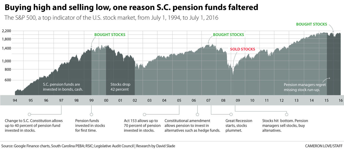
If you want a full view of what I am writing about today, look at this article from The Post and Courier, “South Carolina’s looming pension crisis.” ?I want to give you some perspective on this, so that you can understand better what went wrong, and what is likely to go wrong in the future.
Before I start, remember that the rich get richer, and the poor poorer even among states. ?Unlike what many will tell you though, it is not any conspiracy. ?It happens for very natural reasons that are endemic in human behavior. ?The so-called experts in this story are not truly experts, but sourcerer’s apprentices who know a few tricks, but don’t truly understand pensions and investing. ?And from what little I can tell from here, they still haven’t learned. ?I would fire them all, and replace all of the boards in question, and turn the politicians who are responsible out of office. ?Let the people of South Carolina figure out what they must do here — I’m a foreigner to them, but they might want to hear my opinion.
Let’s start here with:
Central Error 1: Chasing the Markets
Credit: The Courier and Post
Much as inexperienced individuals did, the South Carolina?Retirement System Investment Commission [SCRSIC] chased the markets in an effort to earn returns when they seemed easy to get in hindsight. ?As the article said:
It used to be different, before the high-octane investment strategies began. South Carolina?s pension plans were considered 99 percent funded in 1999, and on track to pay all promised benefits for decades to come.
That was the year the pension funds started investing in stocks, in hopes of pulling in even more income. A change to the state constitution and action by the General Assembly allowed those investments. In the previous five years, U.S. stock prices had nearly tripled.
Prior to that time, the pension funds were largely invested in bonds and cash, which actually yielded something back then. ?If the pension funds were invested in bonds that were long, the returns might not have been so bad versus stocks. ?But in the late ’90s the market went up aggressively, and the money looked easy, and it was easy, partly due to loose monetary policy, and a mania in technology and internet stocks.
Here’s the real problem. ?It’s okay to invest in only bonds. It’s okay to invest in bonds and stocks in a fixed proportion. ?It’s okay even to invest only in stocks. ?Whatever you do, keep the same policy over the long haul, and don’t adjust it. ?Also, the more nonguaranteed your investments become (anything but high quality bonds), the larger your provision against bear markets must become.
And, when you start a new policy, do what is not greedy. ?1999-2000 was the right time to buy long bonds and sell stocks, and I did that for a small trust that I managed at the time. ?It looked dumb on current performance, but if you look at investing as a business asking what level of surplus?cash flows the underlying investments will throw off, it was an easy choice, because bonds were offering a much higher future yield than stocks. ?But the natural tendency is to chase returns, because most people don’t think, they imitate. ?And that was true for the SCRSIC,?bigtime.
Central Error 2:?Bad Data
The above quote said that “South Carolina?s pension plans were considered 99 percent funded in 1999.” ?That was during an era when government accounting standards were weak. ?The?standards are still weak, but they are stronger than they were. ?South Carolina was NOT 99% funded in 1999 — I don’t know what the right answer would have been, but it would have been considerably lower, like 80% or so.
Central Error 3: Unintelligent Diversification into “Alternatives”
In 2009, I had the fun of writing a small report for CALPERS. ?One of my main points was that they allocated money to alternative investments too late. ?With all new classes of investments the best deals get done early, and as more money flows into the new class returns surge because the flood of buyers drives prices up. ?Pricing is relatively undifferentiated, because experience is early, and there have been few failures. ?After significant failures happen, differentiation occurs, and players realize that there are sponsors with genuine skill, and “also rans.” ?Those with genuine skill also limit the amount of money they manage, because they know that good-returning ideas are hard to come by.
The second aspect of this foolishness comes from the consultants who use historical statistics and put them into brain-dead mean-variance models which spit out an asset allocation. ?Good asset allocation work comes from analyzing what economic return the underlying business activities will throw off, and adjusting for risk qualitatively. ?Then allocate funds assuming they will never be able to trade something once bought. ?Maybe you will be able to?trade, but never assume there will be future liquidity.
The article kvetches about the expenses, which are bad, but the strategy is worse. ?The returns from all of the non-standard investments were poor, and so was their timing — why invest in something not geared much to stock returns when the market is at low valuations? ?This is the same as the timing problem in point one.
Alternatives might make sense at market peaks, or providing liquidity in distressed situations, but for the most part they are as saturated now as public market investments, but with more expenses and less liquidity.
Central Error 4: Caring about 7.5% rather than doing your best
Part of the justification for buying the alternatives rather than stocks and bonds is that you have more of a chance of beating the target return of the plan, which in this case was 7.5%/yr. ?Far better to go for the best risk-adjusted return, and tell the State of South Carolina to pony up to meet the promises that their forbears made. ?That brings us to:
Central Error 5: Foolish politicians who would not allocate more money to pensions, and who gave?pension increases rather than wage hikes
The biggest error belongs to the politicians and bureaucrats who voted for and negotiated higher pension promises instead of higher wages. ?The cowards wanted to hand over an economic benefit without raising taxes, because the rise in pension benefits does not have any immediate cash outlay if one can bend the will of the actuary to assume that there will be even higher investment earnings in the future to make up the additional benefits.
[Which brings me to a related pet peeve. ?The original framers of the pension accounting rules assumed that everyone would be angels, and so they left a lot of flexibility in the accounting rules to encourage the creation of defined benefit plans, expecting that men of good will would go out of their way to fund them fully and soon.
The last 30 years have taught us that plan sponsors are nothing like angels, playing for their own advantage, with the IRS doing its bit to keep corporate plans from being fully funded so that taxes will be higher. ?It would have been far better to not let defined benefit plans assume any rate of return greater than the rate on Treasuries that would mimic their liability profile, and require immediate relatively quick funding of deficits. ?Then if plans outperform Treasuries, they can reduce their contributions by that much.]
Error 5 is likely the biggest error, and will lead to most of the tax increases of the future in many states and municipalities.
Central Error 6: Insufficient Investment Expertise
Those in charge of making the investment decisions proved themselves to be as bad as amateurs, and worse. ?As one of my brighter friends at RealMoney, Howard Simons, used to say (something like), “On Wall Street, to those that are expert, we give them super-advanced tools that they can use to destroy themselves.” ? The trustees of?SCRSIC received those tools and allowed themselves to be swayed by those who said these magic strategies will work, possibly without doing any analysis to challenge the strategies that would enrich many third parties. ?Always distrust those receiving commissions.
Central Error 7: Intergenerational Equity of Employee Contributions
The last problem is that the wrong people will bear the brunt of the problems created. ?Those that received the benefit of services from those expecting pensions will not be the prime taxpayers to pay those pensions. ?Rather, it will be their children paying for the sins of the parents who voted foolish people into office who voted for the good of current taxpayers, and against the good of future taxpayers. ?Thank you, Silent Generation and Baby Boomers, you really sank things for Generation X, the Millennials, and those who will follow.
Conclusion
Could this have been done worse? ?Well, there is Illinois and Kentucky. ?Puerto Rico also. ?Many cities are in similar straits — Chicago, Detroit, Dallas, and more.
Take note of the situation in your state and city, and if the problem is big enough, you might consider moving sooner rather than later. ?Those that move soonest will do best selling at?higher real estate prices, and not suffer the soaring taxes and likely?diminution of city services. ?Don’t kid yourself by thinking that everyone will stay there, that there will be a bailout, etc. ?Maybe clever ways will be found to default on pensions (often constitutionally guaranteed, but politicians don’t always honor Constitutions) and municipal obligations.
Forewarned is forearmed. ?South Carolina is a harbinger of future problems, in their case made worse by opportunists who sold the idea of high-yielding investments to trustees that proved to be a bunch of rubes. ?But the high returns were only needed because of the overly high promises made to state employees, and the unwillingness to levy taxes sufficient to fund them.
[bctt tweet=”Seven central errors committed by the South Carolina Retirement System and politicians” username=”alephblog”]
Most days, I don’t trade. ?I study.? I model. ?I muse. ?I plan.
There are some clever traders out there. ?I am not one of them. ?What little trading I do is done efficiently and effectively to get the best prices for assets that I want to buy and sell, but that’s not where most of the money is made in investing.
I can be like a chef who goes out to the market in the morning and buys the best ingredients available that day at great prices, except that my period of analysis is years, not a day. ?The point is that I consider the deals that the market is offering, and choose attractive ones that will benefit my clients and me for years to come. ?(I am still the largest investor that I manage money for — I eat the exact same meal that I serve to clients.)
What trading I do divides into two categories, which are designed for two different time horizons. ?The first time horizon is long — 3-10 years in length. ?Can I find companies with good or better business prospects trading at prices more attractive than the businesses that I currently own?
This is mostly a patient thing, unless I conclude that I got something materially wrong, in which case I try to be quick to sell. ?Patience is needed, because investing is like farming. ?It doesn’t grow overnight. ?It will take time for value to be built, and time for people to recognize that the company is better than they thought it was. ?It won’t be a linear process, either, unless something unusually good happens. ?There are setbacks with almost every?winning investment. ?Keep your eyes on the main drivers of growth in value, and whether management is using excess cash to the best?ends, which will vary by company.
At least half of my winners spent time as an unrealized capital loss at some point. ?My timing is sometimes nonideal, but ideal timing is not required for great results if the time horizon is years. ?So I watch?and monitor, and occasionally trade away the position when I find something with materially better prospects.
As an aside, not all RIA clients would like this, because it looks like I’m not doing that much. ?I sometimes wonder how much better money management would be if clients were happy with portfolios that don’t change much and don’t have many of the current hottest and most recognizable companies in them. ?Portfolios filled with?unknown companies in boring but profitable industries… difficult to talk about at parties, but often more profitable.
What I have mentioned above is 85% of what I do. ?The shorter-run movements of the market provide the other 15% as ideas and companies go in and out of favor in the short run. ?I mentioned that my timing is often not the best. ?This gives me an opportunity to do a little better.
20% is a significant move — it’s enough to justify the trading costs. ?If the company is still a good one, the fall in price gives me the opportunity to lower my average cost modestly. ?Note that this is a modest change — I’m not trying to be a hero or a home-run hitter. ?I learned better when I was younger that making timing decisions on that level is too undisciplined. ?It is far better to edge in and edge out around a core position — with a good company, a lower price means lower risk, and a higher price means higher risk, so this method is always taking and shedding risk at appropriate levels.
Edge in, edge out — trades like this happen a few times a month — more frequently when the market is lively, less often when it is sleepy. ?Hey, don’t force things. ?This is gradual reallocation of money from less to more attractive homes for capital. ?The time horizon here is 3-12 months, and offers the ability to make a little more off of core positions.
Over 5 years, companies that I own might have a grand total of 5-10 trades from edging in and out. ?It will always be a mix of both buys and sells — few companies don’t have moves of 20%+ down amid growth. ?(As some will note, if markets are efficient, why is there such a large gap between 52-week highs and lows for individual stocks? ?Really, markets aren’t efficient — they are just very hard to beat.)
Now, others will come up with different ways of managing multiple time horizons in investing, but this method offers a decent balance between the short- and long-terms, and does so in a businesslike, disciplined way. ?And so I edge in and edge out.
[bctt tweet=”This balances the short- and long-terms, and does so in a businesslike, disciplined way.” username=”alephblog”]
Data Source: Media General || Note: Do not cite or republish this graph without publishing the limitations paragraph below.
=====================
Before I start this evening, I want to state again that I welcome comments at this blog. It may not seem so from the last few months, but I have shaken the bugs out of the software that protects my blog, which was hypersensitive on comments. The only thing I ask of commenters is that you be polite and clean in your speech. Disagree with me as you like — hey, even I have doubts about my more extreme positions. 😉
Limitations
The graph above and the text explaining it could very easily be misused, so I am giving a detailed explanation of how I calculated the figures so that people looking at them can more easily critique them and perhaps show me where they are wrong. ?Please use the above figures with care.
I summed up the net income data for 2706 firms in the Media General database used in the AAII Stock Investor Pro screening software. ?Those firms had:
Seven years of historical earnings data (2009-2015)
Earnings estimates that go out to 2018, and
An estimate of the diluted common shares of each
In short, it is all of the firms trading on US exchanges (that Media General covers) that have seven years of earnings history, and significant analyst coverage extending out for two years. ?Please note that not all fiscal years are equivalent, and that the historic data is on fiscal years, aside from 2016YTD, which is a trailing twelve months figure. ?That means 2016YTD is largely from the first half of calendar 2016 and the last half of calendar 2015.
Note that companies that went out of existence between 2009 and today are not reflected in these figures. ?They represent only the companies that exist as publicly traded firms today. ?Also note that foreign firms trading on US exchanges are in these figures.
The projected Non-GAAP earnings are the product of average sell-side earnings estimates and the most recent estimate of fully diluted common shares. ?2016, 2017 & 2018 are the current, next year, and two years ahead estimates of adjusted earnings, which are?Non-GAAP.
Remember that sell-side estimates are designed (in theory) to eliminate transitory factors and provide an estimate of run rate earnings for the future. ?Whether that is true in practice is another matter, as we may see here.
There is one more piece of data that you need before you can interpret the above graph: because of foreign firms that are included, the total market capitalization underlying the graph is $28.8 Trillion.
Analysis
After my recent piece?Practically Understanding Non-GAAP Earnings Adjustments, I felt there was something more to say, because regularly I would see earnings estimates that were higher than historic earnings by a wide margin, which would make me say “How does it get from here to there?” ?The answer is simple. ?It doesn’t.
Why? ?We’re comparing apples and oranges. ?GAAP earnings deduct many expenses out that were incurred in prior periods, but deferred. ?GAAP earnings also have?unusual and extraordinary charges that are expected not to occur. ?Non-GAAP earnings exclude those (among other things, sometimes excluding interest and taxes). ?As such, they are considerably higher than GAAP earnings.
Take a look at this table of price-earnings ratios.
Year
2009
2010
2011
2012
2013
2014
2015
2016YTD
2016
2017
2018
P/E
36.61
24.84
22.13
23.26
21.01
21.70
29.69
30.68
18.68
16.02
14.06
Note: the same warning on the graph applies to this table.
Note that the current market capitalization is being applied against historic net income 2009-2016YTD. ?2016-2018 are on projected non-GAAP net income estimated by the sell-side. ?Obviously, in 2009 the market capitalization was much lower, and so the P/E then would have been higher. ?Survivorship bias will have some impact here, but I’m not sure which way it would go.
See how much lower the P/Es are for the sell-side estimates (these would be bottom-up, not top-down). ?Figures like this get cited by pundits who say the market isn’t that expensive.
Also, note how GAAP earnings have shrunk since 2014, and haven’t grown much since 2009. ?I know only the media compares actual to prior, which is an anachronism, but maybe we need to do that more.
Summary
That leaves us with a few sticky questions:
Which is a better measure for growth in value? ?GAAP or non-GAAP earnings? ?(I think the answer varies by industry, and how long of a period you are considering.)
Should we allow non-GAAP earnings to be published? (Yes, after all management is going to explain the non-GAAP adjustments orally as they explain why the quarter was good or bad.)
Does this mean that the market is overvalued? ?(Not necessarily. ?Rational businessmen are still buying some firms out, which partially validates current levels. Also, free cash flow is not affected by accounting rules, so questions of overvaluation should not rely on accounting methods. ?If it is overvalued on one, it should be overvalued on all, etc.)
Should we create a fifth main statement for GAAP accounting, that formalizes non-GAAP and gives it real rules? (Probably, but like most of GAAP, there will be some flexibility and industry-specific rules.)
As for me, this will give me a little help in making adjustments to earnings estimates as I try to think through valuation issues, and give me some rough idea as to whether the hockey stick that the sell side illustrates is worth considering or not, or to what degree.
Again, comments are welcome. ?Please note that my findings are tentative here.
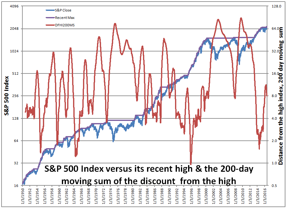
I’ve said this before, but I like it when research destroys a preconceived notion of mine. ?Today’s post stems from an exchange that I had with Jackdamn (what a name) on Stocktwits, talking about a chart created by?dshort.
S&P 500 Percent Off High Since March 9, 2009. Chart by Doug Short. $SPX$SPY$DIA
To which he responded: That’s a great question. ?And it is a great question, but I’m not going to answer it directly here… because I think I am answering a better question.
Let me take you through my thought process, because I went through four different ways of trying to answer the question before settling on the better question, and getting the answer.
How do you summarize an area of a price graph in order to make comparisons of different periods? ?How do you determine when the market has been near highs for a long time, or far away for a long time? ?How does the intensity/distance below the high matter? ?If you are looking at troughs, where does one begin and another end?
I started by trying to identify the troughs individually, and the difficulty was trying to establish that in a mechanical way that did not require interpretation. ?I stumbled around playing with minimum periods between troughs, recovery levels before a new trough could start, moving averages to establish when a new trough was genuinely significant. ?Sigh.
I tried a lot of different things, and I could create rules that mostly made the troughs look decent, but I could never get it to be fully mechanical or lack arbitrariness. ?Why this trough?and not that? ?The same criticisms can be applied to dshort’s graph as well.
I finally pulled out of my mental gymnastics when I concluded: couldn’t I just take the area under the maximum line in percentage terms and use that as a measure, say over a 200-day period? ?200 days is arbitrary, and so is the measure, but that is less than most of the measures that I considered, and at least this one corresponds to a relatively simple calculation.
So if you look at the red line in my graph above, you will note that it has dipped below 2.0?five times in the last 66 years, in 1954, 1959, 1964, 1995 and 2014. ?These observations followed periods where the markets moved to new highs rather smartly and without a lot of downside volatility. ?Then there were 3 times that the measure peaked?higher than 64, in 1975, 2003 and 2009. ?These times followed incredible market falls, and were great times to be putting money into the market.
Below you can see ?a table of values for how often the measure is below a given threshold. ?It’s only above 64 about 5% of the time, and below 2 about 3.5% of the time. ?My main thought is this measure is this: high values of the measure probably are a “buy signal.” ?Low values of the measure aren’t necessarily a “sell signal.”
That signals are asymmetric should not be surprising. ?The largest factor in most long-term market moves, the credit cycle, is also asymmetric. ?It’s like my continuing series, Goes Down Double Speed. ?Bull markets have shallower moves and longer duration, the same way that the bull phase of the credit cycle goes. ?Extend credit, extend credit, extend credit… loosen standards, loosen standards, loosen standards… tighten spreads, tighten spreads, tighten spreads, etc. ?Then in the bear phase it is DENY CREDIT!! TIGHTEN STANDARDS!! SHEPHERD LIQUIDITY!! SURVIVE!! ?Short and sharp. ?Painful. ?Prices are lower, and yields higher at the end.
To close this off, where is this indicator now? ?It’s around 8, which is near the 40th percentile… kind of a blah figure, not saying much of anything… which is good in its own way. ?The market meanders and hits a few new highs, sags a little, comes back, hits a few new highs, etc. ?Not many people believe in it, but we are inches off the highs. ?Odds are we go higher from here, but not aggressively higher.
One final note: we are in the fourth and final phase of the credit cycle now, so don’t get too aggressive. ?Debt is getting higher inside nonfinancial corporations. ?Be wary, and do your fundamental due diligence on balance sheets.
Before I write this evening, I would like to point out?what is going on with Horsehead Holdings [ZINCQ]. ?There was an article in the New York Times on it recently. ?It’s an interesting situation where an equity committee exists in a bankruptcy, largely because the management team looks like it is not trying to maximize the value of the bankruptcy estate, but is perhaps instead trying to sell the company off to creditors cheaply in an effort to receive a benefit later from the new owners. ?Worth a look, because if the equity committee wins, it will be unusual, and if the debtors win, it very well may take value that legitimately belonged to the equity.
That said, I don’t have a strong opinion because I don’t have enough data. ?But I will be watching.
=-=-=-=-=-=-==-=-=-=-=-=-=-=-=-=-=-=-=-=-=-=-
I received a letter from a reader yesterday on a related topic from my most recent article. ?Here it is:
Hi David,
First of all, it’s nice to find you (and Ed Yardeni and Mohamed El-Erian) working when most analysts seem to be at the beach. That said, a question:
In early ’09, as you will recall, the big banks were begging for relief from mark-to-market accounting for their holdings of mortgage-backed securities, on the grounds that these securities weren’t trading at all.
“Ridiculous!” said Jeremy Grantham. “Put 2 percent of your holding out to auction and you will learn its market value quick enough.”
At the time, I thought Grantham had a fair point. Now I’m not so sure.
What was your view on that issue? John Hussman has said repeatedly that it was the FASB’s relaxation of the mark-to-market rules that set off the dramatic resurgence in stock prices that we have seen (and which he deplores).
Was the FASB’s change of policy warranted, under the circumstances?
And should the mark-to-market rule now be restored?
Here was my reply:
Hi,
I wrote a lot about this at the time.? I remain in favor of mark-to-market accounting.? The companies that got into trouble from the effects of mark-to-market accounting had engaged in sloppy risk management practices, and got caught with their pants down.
The difficulty that most of the complaining companies had was a mix of liquid liabilities requiring prompt payment, and relatively illiquid assets that would be difficult to sell.? It was the classic asset-liability mismatch — long illiquid assets financed by short liquid liabilities.? Looks like genius during the bull phase.? Toxic during the bear phase.
On Grantham’s comments: my comments Saturday night are pertinent here for two reasons — anyone selling illiquid CDO tranches, subordinated mortgage bonds, etc., immediately prior to the crisis would find two things: 1) the bids were non-existent or really poor, and 2) if the trade did take place, it would be at levels that reset the pricing grid for that area of the market a LOT lower, leaving the remaining securities looking worse, and a diminution of GAAP equity.
(As an aside, the diminution of GAAP equity might affect the ability to do secondary IPOs of stock at attractive prices, but in itself it did not affect solvency of most financial firms, because statutory accounting allowed for investments to held at amortized cost.? As such the firms could be economically insolvent, but not regulatorily insolvent unless they ran out of cash, or their short-term lending lines of credit got pulled.)
The regulators were pretty lenient with most of the companies involved — the creditors weren’t.? They enforced margin agreements, and pulled discretionary credit lines.
I’m not of Hussman’s opinion that relaxation of the mark-to-market rules had ANY effect on stock prices.? In general, GAAP accounting rules don’t affect stock prices, because they don’t affect free cash flow, unless the GAAP rules are embedded in credit covenants.? Statutory accounting does affect free cash flow, and can affect the prices of stocks.
This post may be a little more complex than most. It will also be more theoretical. For those disinclined to wade through the whole thing, skip to the bottom where the conclusions are (assuming that I have any). 😉
Asset Prices are (Mostly) Validated by a Thin Stream of Transactions
One thing that I have been musing about recently is how few transactions exist to validate the pricing of various markets. ?I’ll start with two obvious ones, and then I will broaden out to some more markets that are less obvious. ?(Hint: markets that have a high level of transactions relative to the underlying asset value have a lot of speculative “noise traders.”)
Let me start with the market that I know best as far as this topic goes: bonds. ?Aside from some government and quasi-governmental bonds, very few bonds trade each day — less than a few percent. ?It’s very difficult to use the small volume of trades to price the whole market, but it can be done.
When I was a bond manager for a semi-major insurance company, I was the only one of the top managers that was a mathematician, and?familiar with all of the structures underlying the bonds. ?I could create my own models of bonds if needed, and I often did for interest rate risk analyses (which was still a responsibility amid bond management). ?Combined with my knowledge of insurance accounting, it made me ideal to do a certain monthly task: making sure all of the bonds got priced.
The first part of that isn’t hard. ?The pricing service typically covers 90-98% the bonds ?in the portfolio. ?What I would receive on the first day of the month was a list of all the bonds the pricing service could not calculate a price for. ?I would take that list and compare it to last month’s?list of the same bonds and add to it any new bonds we had bought that month, and who the lead dealer was. ?I would then ask the dealers for their prices on the bonds (which were typically illiquid). ?I would compare those prices to the prices of the prior month, and maybe ask a question or two about the prices that were out of line. ?That would usually elicit a comment from my coverage akin to, “The analyst thinks spreads have widened out for that credit because spreads in that industry have widened out, and a less liquid bond would widen out more. ?The why the price fell more (or rose less).
After that was done, that left me with a small number of utterly illiquid bonds that we had sourced totally privately, or where the dealers who had originated the bonds had ceased to exist. ?All of those deals lacked options to accelerate or decelerate payment, so it was a question of modeling the cash flows and applying an appropriate yield spread over the Treasury or Swap yield curve. ?[Note: the swap curve gives the yield rates at which AA-rated banks are willing to trade fixed rate exposures in their own credit for floating rate exposures in their own credit, and vice-versa.]
But what is appropriate and how did the three methods of getting prices differ? ?The second question is easier. ?They didn’t differ much at all. ?The dealers and I were likely doing the same things — just with different sets of bonds. ?The pricing service, on the other hand, was much more complex, and the other two methods relied on its results.
It was was called “grid” or “matrix” pricing, though it was much more complex than a grid or a matrix. ?The pricing service models would look at all of the most recent trades that had happened in the bond market, and use all of the prices to estimate yields that were adjusted for the options inherent in the bonds that could accelerate or decelerate payments. ?From that, they would piece together yield curves that varied by industry and collateral type, credit rating (agency or implied by a model that involved stock prices and equity option prices), individual creditors, etc. ?Trades on different days were adjusted for market conditions to make the?pricing?as similar as possible to the end of the month. ?After that the yield and yield spread curves generated would be applied to the structures of individual bonds with a adjustments for whether the bonds were:
premium or discount
large deals that were widely traded or small illiquid deals
callable or putable
senior or subordinate or structurally subordinate (a bond of a subsidiary not guaranteed by the parent company)
secured or unsecured
bullet or laddered maturities (sinking funds, etc.)
different currencies
and more
And there you would have a set of self-consistent prices that would price most of the bond universe. ?That’s not where transactions would necessarily take place… particularly with illiquid securities, what would matter most is who was more incented to make the trade happen — the buyer or the seller.
Implicitly, I learned a lot of this not just from modeling for risk purposes, but from trading a lot of bonds day by day. ?How do you make the right adjustments when you compare two bonds to make a swap, and, how much of a margin do you put in as a provision to make sure you are getting a good deal without the other side of the trade walking away? ?It’s tough, but if you?know how all of the tradeoffs work, you can come to a reasonable answer.
One more note before the summary. ?The less common it is for a bond or group of related bonds to trade, the more effect a trade has on the overall process. ?It becomes a critical datapoint that can redefine where bonds like it trade. ?Illiquidity begets volatile prices changes in the grid/matrix as a result. ?On the bright side, illiquidity is usually associated with small sizes, so it doesn’t affect most of the market. ?There is an exception to this rule: trades done during a panic or the recovery from a panic tend to be sparse as well. ?The trades that happen then can temporarily change a wider area of pricing. ?I remember that vividly from the whipsaw markets 2001-3, especially when the bond market was restarting after 9/11. ?If that crisis had happened later in the month, the quarterly closing prices might not have been as accurate.
Summary for Part 1 (Bonds)
The bond market is complex, far more complex than the stock market. ?Pricing the market as a whole is a complex affair, but one for which prices are reasonably calculable. ?For the average retail investor investing in ETFs, the bonds are liquidi enough that pricing of NAVs is fairly clean. ?But even for a large ugly insurance company bond portfolio, pricing can be significantly accurate. ?Next time, I’ll talk about a related market that has its own pricing grid(s) — mortgages and real estate. ?Till then.
In the time I have been managing money for myself and others in my stock strategy, I set a limit on the amount of cash in the strategy. ?I don’t let it go below 0%, and I don’t let it go over 20%.
I have bumped against the lower limit six or so?times in the last sixteen years. ?I bumped against it around five times in 2002, and once in 2008-9. ?All occurred near the bottom of the stock market. ?In 2002, I raised cash by selling off the stocks that had gotten hurt the least, and concentrating in sound stocks that had taken more punishment. ?In September 2002, when things were at their worst, I scraped together what spare cash I had, and invested it. ?I don’t often do that.
In 2008-9 I behaved similarly, though my household cash situation was tighter. ?Along with other stocks I thought were bulletproof, but had gotten killed, I bought a double position of RGA near the bottom, and then held it until last week, when it finally broke $100.
But, I had never run into a situation yet where I bumped into the 20% cash limit until yesterday. ?Enough of my stocks ran up such that I have been selling small bits of a number of companies for risk control purposes. ?The cash started to build up, and I didn’t have anything that I deeply wanted to own, so it kept building. ?As the limit got closer, I had one stock that I liked that would serve as at least a temporary place to invest — Tesoro [TSO]. ?Seems cheap, reasonably financed, and refining spreads are relatively low right now. ?I bought a position in Tesoro yesterday.
As it is, my actions are that of following the rules that discipline my investing, but acting in such a way that reflects my moderate bearishness over the intermediate term. ?In the short run, things can go higher; the current odds even favor that, though at the end the market plays for small possible gains versus a larger possible loss.
The credit cycle is getting long in the tooth; though many criticize the rating agencies, their research (not their ratings) can serve as a relatively neutral guidepost to investors. ?Corporate debt is high and increasing, and profits are flat to shrinking… not the best setup for longs. ?(Read John Lonski at Moody’s.)
I will close this piece by saying that I am looking over my existing holdings and analyzing them for need for financing over the next three years, and selling those that seem weak… though what I will replace them with is a mystery to me.
Bumping up against my upper cash limit is bearish… and that is what I am working through now.


